Crafting an awesome portfolio website is no easy task. But it’s a necessity for creatives who want to share their work, land jobs, and get their name out in Google.
If you’re not sure how to design a great portfolio then this guide will help. Even if you already know how to create websites from scratch, this post should still have valuable suggestions and practical advice that you can follow and apply to improve your site’s experience.
Usability is absolutely crucial to any great website. That’s why you need to think about the user first and start designing from there. These tips will set you on the right track no matter what kind of work you do.
Organizing Work Clearly
When you design a portfolio gallery you want to showcase your best work. But you also want to show off your work in an easy-to-browse manner.
This means adding features like tags to sort your work, or labels to help visitors skim your work and find what they want. Let’s say a designer specializes in mobile apps, landing pages, and corporate sites.
That person should arrange their portfolio with labels so visitors can sort by one of those areas.
If a potential client just wants to hire you for landing page work then they probably don’t need to see your mobile design work. Yet portfolio organization goes beyond just tags & labels.
Have a look at the portfolio site of Merijn Hos. This uses a strong grid layout to help draw the eye to each piece as you scroll through the page.
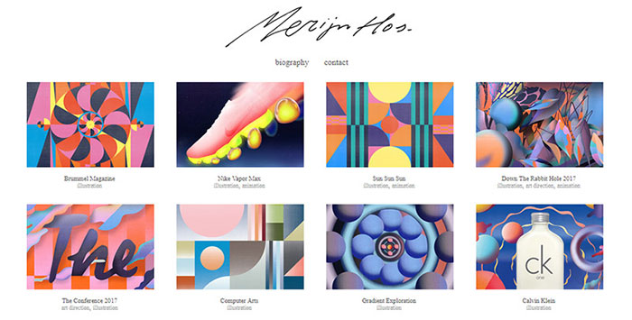
I always recommend grid-style designs because they help to frame visual work so nicely. And they work especially well with responsive techniques if you’re designing for mobile too(which you should be). Now how about creative writers or coders. How do they show off work that has no visuals? A few suggestions:
- Make small thumbnails for each project
- Link to samples of the work/screenshots of code
- Just list the project title/subject, then describe the work
It can be harder to sell your services without a visual medium. But that doesn’t mean it’s impossible. I think the best option for a writer/coder is to use the project’s logo, or some photo representing the project. That way you can still have thumbnails that grab attention.

Graphic designer Heather Shaw has a really nice site with a brilliant example of labeled portfolio work. As you scroll through each piece in the grid you’ll find a project name along with a small label of the work done. That helps visitors tell at a glance what you can do for them and what sort of work you’ve done for others in the past.
Launch On A Trusted Platform
This is probably an ovestated piece of advice but it’s overstated for a reason. How you launch your portfolio plays a huge role in the final output of your site. Many people like to run with free services like Tumblr. And generally that’s okay. But really, if you do professional work you want to launch a professional site. I can’t think of any better platform to run than WordPress.
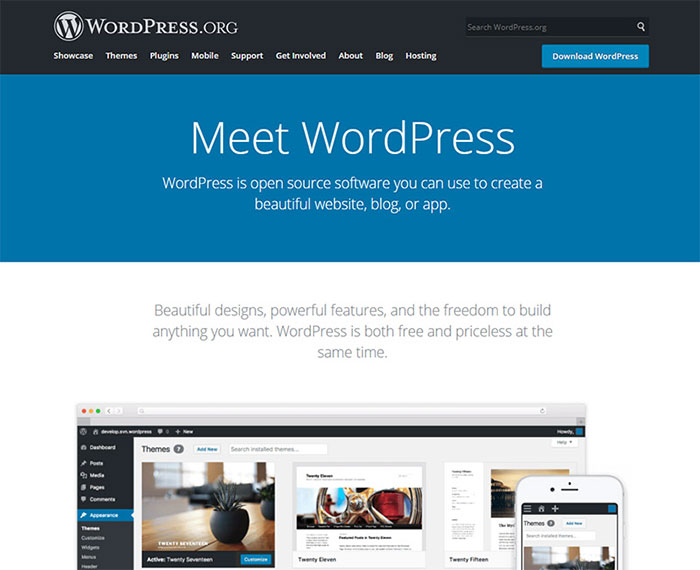
With WordPress you can find a bunch of free themes and plugins to customize your site. Not to mention WordPress is totally free and managed by a massive team. All you’d need to figure out is the technical side like the domain, hosting, and initial setup.
A web designer or web developer would have no trouble doing that. But a photographer or digital artist may struggle. Thankfully there are free setup guides to help non-techie artists launching their WordPress portfolio for the first time. And truthfully that’s the hardest part: just getting online.
Once you get a website up you can usually let it run on its own. Maybe log into the admin panel to update every so often. If you’re dead set against managing your own WordPress setup(or paying for hosting) then you can try other free options. Most website builders you’ll read about actually cost money.
And that’s okay if you want to spend money, but many creatives just want to get their portfolio online & hosted securely. In that case try Portfoliobox. It’s an awesome tool that’s totally free for all users forever to host their portfolio items.
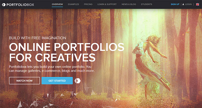
Naturally they do have a “pro” option if you want to upgrade for more themes and custom features. But that’s not necessary if you want to run it all through the Portfoliobox system. I haven’t found much else out there with so many great features like Portfoliobox offers (again, free for life).
It’s certainly not the perfect choice for every scenario and it comes with a learning curve. But that learning curve should be easier than WordPress if you’re not familiar with any website management tools. Ultimately you can’t go wrong with either one. Just try to stick with a trusted platform and veer away from the more experimental CMS’.
Brand Yourself
When you’re first launching your site it’s important to add a pinch of branding into the mix. This isn’t easy and very few creatives think about a personal branding strategy. But at some point you’ll really need to consider how you want to brand your site. It can be through imagery, through type, through colors or artwork or anything similar. You just want a design that says “this is me and this is my site”.
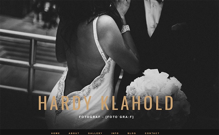
Take a look at the portfolio of Hardy Klahold. It’s a pretty clean site with a fullpage hero header that immediately grabs your attention.
But that photo isn’t of Hardy. It’s an example of Hardy’s work. You’ll notice the main branding is the typography on the page. And that’s perfectly fine! People will recognize that type and think to themselves “oh, it’s a personal site”.
That’s one of the best things you can do with branding: clarify your site’s purpose. The homepage of Tobias van Schneider does this as well, but using a fullscreen photo of himself.
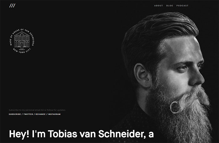
Tobias has a large portfolio of work and many people already know his name. But for anyone new to his site they’ll get to see what he looks like and get a clear indicator that this is definitely his personal portfolio.
I really like this with more creative jobs like artists, musicians, and writers, because people don’t always see their faces. Clients love to know what you look like and it’s a great way to digitally “introduce yourself” to potential clients before a phone call or meeting.
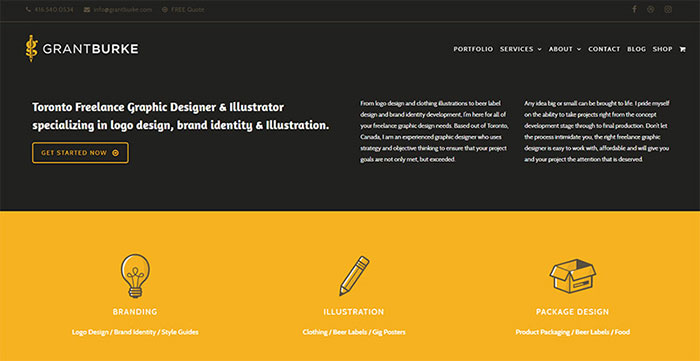
Grant Burke takes a different approach with his header featuring a bunch of extra content. He uses a bunch of icons to show off the different services he offers through his portfolio. Plus the main header includes a small writeup about himself which is a nice personal way to connect your name to the digital world.
Not to mention he also includes full contact details at the very top of the page. That is a solid technique to land clients fast which makes a nice segue into the next section.
Offer Clear Contact Details
If a person wants to hire you then make sure they know how. You can show off the best quality work in the world and have the most usable site in existence. But none of that matters if people can’t send you a simple email or reach out with ease. Take a look at the Oana Foto contact page which loads dynamically from the menu.
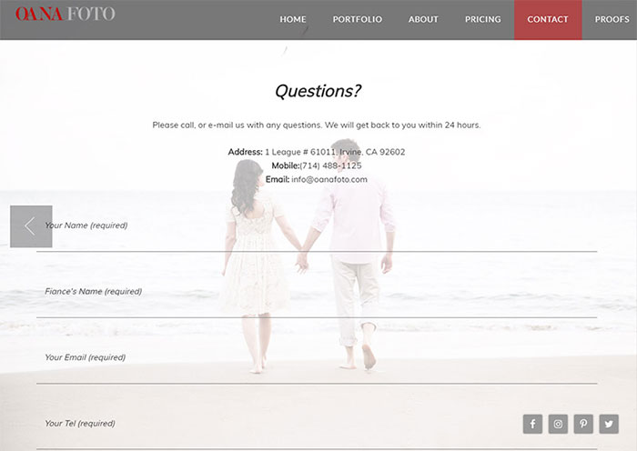
This uses animated effects to transitions between different page sections. It’s actually a really neat effect and I don’t see it too often. But the contact form itself should be the main focus. From that page you should know exactly how to send an email. It also includes listed phone numbers and the email address itself if you don’t want to go through the somewhat lengthy contact form.
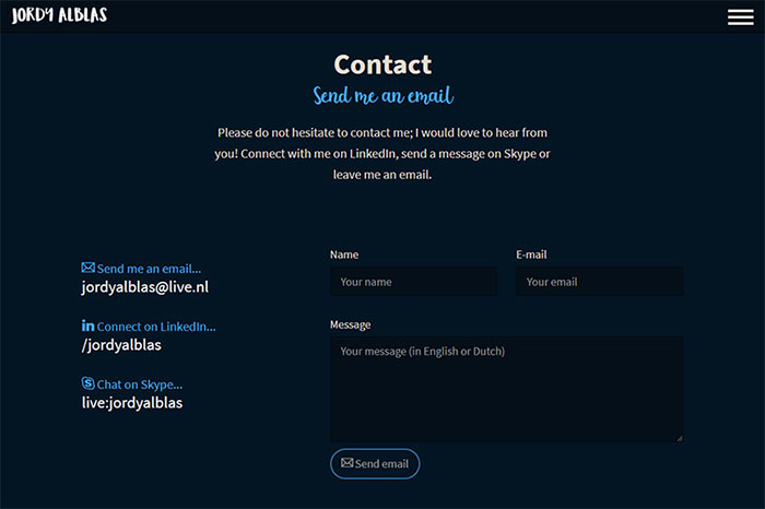
For a simpler example check out the contact section for Jordy Alblas. This uses darker inputs along with only 3 fields. That’s much less intimidating for new visitors who want to send a quick message. To the left you’ll notice Jordy’s Skype, LinkedIn page, and the full email address. There is no direct phone number like the Oana Foto page above, but adding a phone number to your page is a debatable topic anyways. Now if you want to go even simpler try this page on for size.
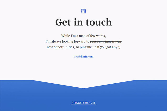
If you click the “contact” link it’ll scroll you all the way down to the bottom email section. And there you’ll find… just an email address. Nothing more. May seem a little basic but this works wonders. Not everyone needs a full contact form on their website. However I do recommend protecting your address to hide it from scrapers. Nothing worse than getting a bunch of spam messages.
Look Into Single Page Design
I’m a big fan of single page design for its simplicity and usability. It’s hard for a user to get confused if they only have one page to look at. So if you can design around a single page layout I highly recommend it. That doesn’t mean it’s the absolute best choice for every portfolio. But I do think it’s a good choice for creatives who prefer minimalism over detailed & complex websites.
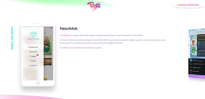
The portfolio of Rogie King is one nice example. As you scroll down through the page you find a ton of works organized into sections. But there is no navigation because there’s no need for one. This is the beauty of a single page design: everything gets organized together and feels cohesive by default.
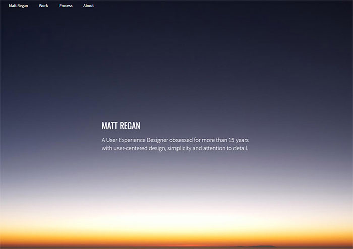
Take a look at Matt Regan’s page to see another fine example. This page uses a sticky navigation that follows you along. It also has an auto-scroll feature where you can click the links in the nav to jump to that particular section. It’s one example of single page design done right. And I have to say this is probably one of the better layouts you could study to design a clean & usable portfolio on your own.
Place A Focus On The Work
This advice really can’t be repeated enough. Make sure your homepage clearly shows exactly what kind of work you do and the type of jobs you’re looking for. While it is true that “people hire people”, you want to show off your work and yourself whenever possible. This should be evident right from your homepage and I always encourage creatives to add a simple gallery into the homepage, ideally above the fold.
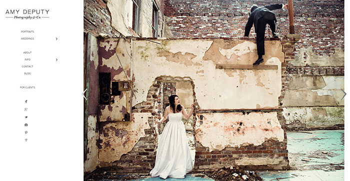
Have a look at the main site for Amy Deputy. Her portfolio work filters through a slideshow with huge arrows and supersized photo samples. Those are really easy to skim through and the entire portfolio is incredibly user-friendly. Based on the corner logo you can also tell what she does at a glance. That’s the kind of clarity you should be going for. You’ll find a very similar design style on the portfolio of Justin M Maller.
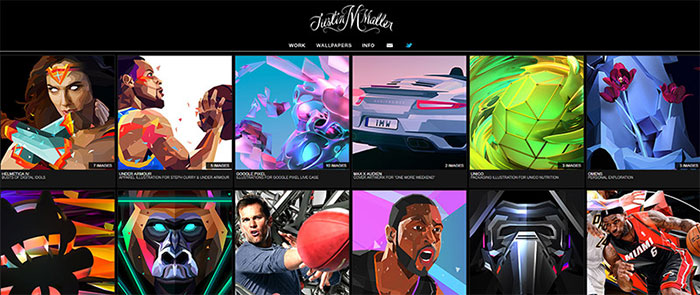
Dark backgrounds grab attention and place focus right on the colorful work samples. Visitors can quickly skim through the grid-style portfolio and see if Justin’s work can be useful on any future projects. And this is just one example of how you could design your portfolio homepage. The actual specifics don’t matter so long as the page is clear, easy to use, and demonstrates exactly what you can offer.
Wrapping Up
I certainly hope these tips can help every creative person launch their own portfolio site. Doesn’t matter whether you design custom lamps on Etsy, paint commissioned work in acrylics, or design incredible mobile app interfaces from scratch.
All of those skills are uniquely valuable and deserve a showcase online. But take these tips with a grain of salt and always try to add your own ideas into the mix.
If you toy around with design techniques while focusing on the user experience you can craft a magnificent portfolio website every single time.
The post A Guide To Usable Portfolio Websites For Digital Designers & Creatives appeared first on Design your way.
Source: http://ift.tt/2DEUOJO


No comments:
Post a Comment