What are the graphic design principles? Let’s start from the graphic design definition.
Graphic design means the planning of imagery and even lettering or fonts, in order to create a visual image that draws attention.
Graphic design is a sought-after skill, and in an aesthetic society, there is a constant need for designers to produce attractive advertisements, banners, logos, websites, videos, or website content.
It isn’t only professionals who are able to produce shareable content. In a technological society, it is possible to add design elements to your photographs using style filters on your phone.
However, understanding graphic design principles go beyond technology. Instead, it means understanding how to get your message across visually in a way that draws attention to your message.
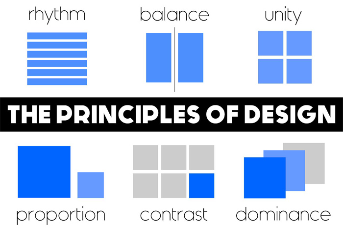
What are the graphic design principles? These can be summed up in eight basic elements. These principles of design will assist you with visually representing your message. Keep them in mind when you work with visuals and graphics.
Graphic design basics:
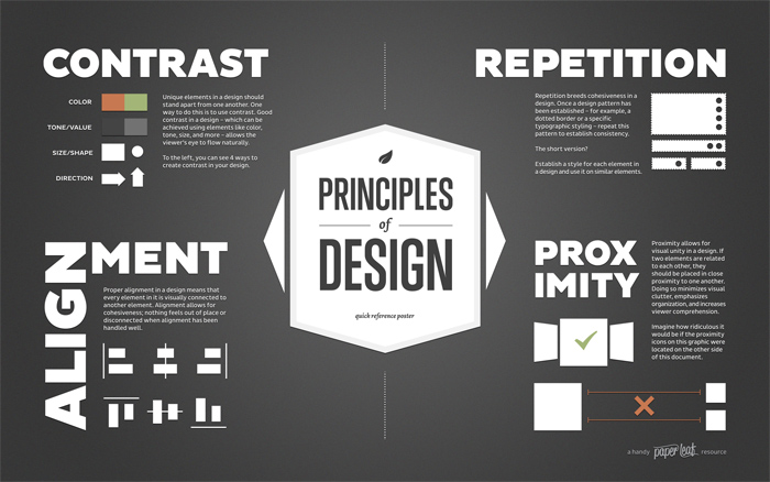
Balance
Balance in design means that when a page is divided (either horizontally or vertically) both sides of the page hold equal weight. When creating your design, check to see that no one part of your page holds too much weight. If the balance is out, this should be done with intention, in order to create emphasis or express a message.
Proximity or Unity
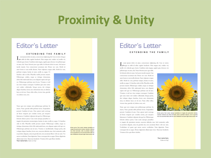
What does proximity mean? This concept means how closely different elements of a design are placed on the page. It occurs when all of the different elements on a page have been placed in a way that makes sense to the observer. When images are placed close together, they perceived to be connected.
Colour, line, and texture may also be used to create unity. In order to create good design, ask yourself whether title elements are grouped together, or whether contact information is in one space? How do different elements of your page interlink?
Alignment
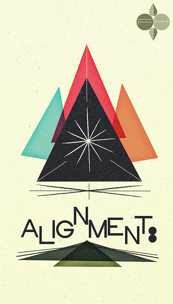
Alignment looks at how text or visuals come together on a page. You can align with the left, center text or use ragged edges. Alignment helps to create a sense of order or flow, assists with reading, and might even bring a sense of visual excitement.
When aspects of your design are aligned, this will create a sense of connection between them. If elements of your design are out of alignment, this should be done with intention.
Repetition and Consistency
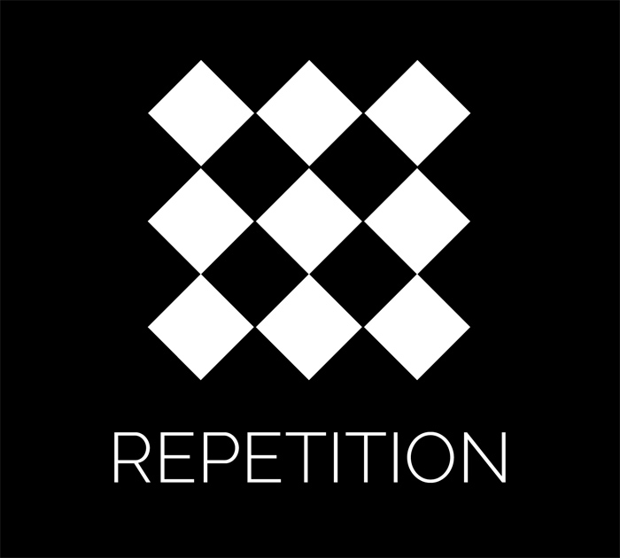
Repetition helps to tie together your design so that you are able to create a sense of consistency. If your document has different aspects, as web pages or multipage documents do, using a consistent colour, font, heading or image helps to create unity. Look for factors such as where you place your page numbers, logos, and how text is aligned.
This should be consistent across all pages. Repetition of colour or font assists with uniting different elements of your design. You could also check that the style of your graphics or illustrations remains consistent throughout.
Contrast
Contrast guides a reader where to look first. This can be created through colour, but might also be used through tone, such as the contrast between dark and light elements of a page. Lines (thick contrasted with thin) may be used to create contrast. You could also use different styles of fonts.
Round or soft edges, squares versus circles, and big vs small elements all assist with creating contrast. Enough contrast assists with keeping the text readable. If all elements on a page are given even weight, when some aspects are more important than others, a design lacks contrast.
Point, Line, and Shape
Point, line, and shape are important elements of design. Points may be a single dot on a page or merge together to create an image or texture. Line is a series of points and may be used to define or connect objects. Lines sometimes merge together in order to create depth or texture and can be straight or organic.
Joined together, lines create shapes, which help us to recognize objects. The way that line, shape, and point work together helps to create imagery, as well as flow or dimension, adding depth and movement to your page.
Hierarchy
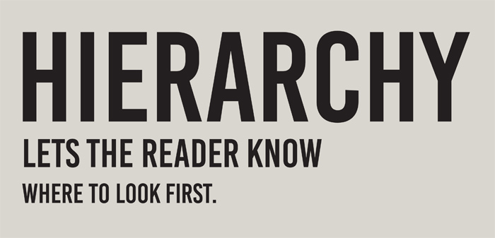
Hierarchy means that the most important aspect of your design, or your message, is given the most weight. This can occur based on where you position your message.
A message placed in the top center of the page, in a large font, will be given more weight than a subheading, for example. Using bright colours to attract the eye, or framing your message with shapes, is another way of giving weight to important aspects of your page.
In order to establish hierarchy, it’s important to decide what your most important message is. This could be a quote or information on how to proceed with a sale. Once you’ve decided your most important element, you can make it pop. Secondary messages come next.
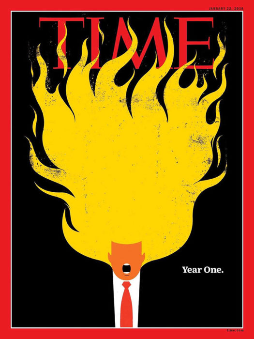
We naturally look at the largest elements of a design first, so when establishing hierarchy, scale is important. This is why newspapers or magazines use large headings to attract attention, but present articles with a smaller font, which is easier to read.
Shape and contrast also add an element of hierarchy to a design. A shape which stands out will gain the most attention. When shapes are used repetitively throughout a design, the shape that is different is the one the eye focuses on first.
An example of design hierarchy could be a twitter profile, where photos are different to the shape and colour to the tweets, indicating their importance in the hierarchy.
Colour
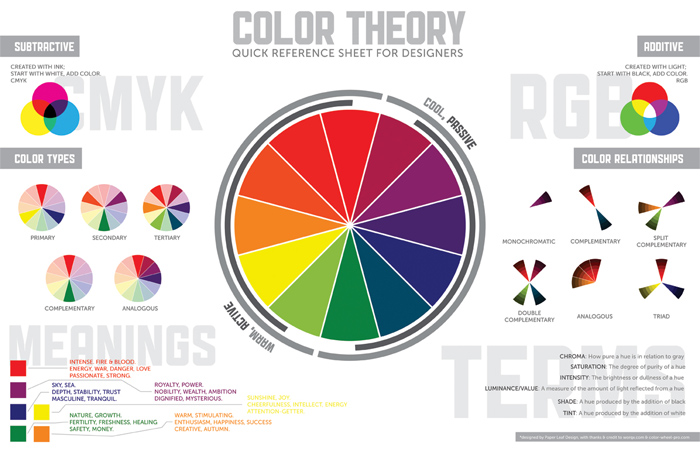
Colour creates the atmosphere or feeling of the design. Bright, summery colours give a different feel to deeper, richer colours. Each colour carries a message. Grey is considered to be an intellectual colour, and colours mixed with black give a corporate or professional image.
Blue is seen to be peaceful, while red is passionate, motivated, warm or even angry. Yellow is associated with happiness, and green non – profits, or the outdoors.
If you are unfamiliar with colour, Spark Posts makes colour suggestions based on the image you begin with.
Colour is not only important when it comes to imagery though. Consider making your text pop by adding a contrasting colour gradient behind your writing.
Framing
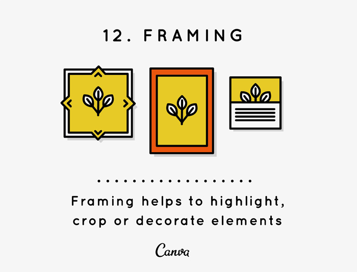
Framing is an important part of photography, but can also be used with visual design. Framing means cropping your image, in order to direct the eye to the most important aspect of your message.
This means cutting out the background of an image. In a profile photo, for example, concentrating on the person is more important than the buildings behind him. This will help you to get your message across well, ensuring good design.
Visual Concept
A visual concept is a message behind the design. What is the message you would like to put across, and how do you bring this forward? Allowing your visual concept to speak out is the difference between excelling, and downloading an image from a library.
When you design with intent, your message is strong. Pick fonts carefully, and have enough unity and repetition that there is a sense of connectedness to your design.
When designing, coherence is everything. Good graphic design is about establishing a message, and putting this message across in a way that is appreciated. Aesthetics which are visually appealing, and which make a statement last, unlike trends, which always have a shelf life.
Additional concepts used in design
Different designers may use different terminology for aspects of a design. Proximity may be referred to as grouping, for example. Some may speak about emphasis, using different graphic design principles to create focus, or get a message across.
Designers may speak of harmony, flow or hierarchy. However, these are often just different terms for expressing the same elements and principles of design.
Ending thoughts on these graphic design principles
The graphic design principles, also known as the principles of composition, will help you to create effective designs. They can be applied to any visual task, in order to ensure an aesthetic result.
There are seldom single ways of applying a graphic design principal, but using your creativity will enable you to get results. By making use of design principles, you can be assured of an attractive result.
If you liked this article about the graphic design principles, you should check out these as well:
- Graphic Design Courses: Learn Graphic Design Online
- Graphic Design Definition: What It Is And What Does A Graphic Designer Do
- Graphic Design Basics: Tips for Beginners
The post Graphic design principles: Definition and basics you need for good design appeared first on Design your way.
Source: http://ift.tt/2oygeUe


No comments:
Post a Comment