Few images are as recognizable and important in the world of motor racing as the Bugatti logo. Of course, each manufacturer has its emblem that proudly places on the body of the vehicles, but not all have elegance and a great history to support them.
This logo has been maintained in good shape over the years, preserving the good taste and family spirit that characterizes it, common among designers of Italian origin. Let us briefly remember its birth and how it became one of the world’s most important brands.
A growth story
It all started with Ettore Bugatti, a young Italian whose passion for engineering and vehicles would end up in manufacturing some of the most powerful cars in the world. Since he was a teenager, he always worked with car manufacturers, which helped him develop experience and confidence in his skills. Finally, in 1909, he founded the company that would bear his name, E. Bugatti.
The company began as a family project, where every detail was discussed among the Bugatti. Even the logo was a product of their teamwork. They sought to capture the concept of luxury in an image, which would end up being a banner.
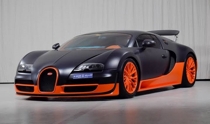
Since its foundation, its philosophy was to create high-performance vehicles that were separated from the economic offers of the market, using all possible resources to build true works of art. Their outstanding performance was enough to be able to easily participate in different speed competitions.
Knowing the logo and family influence

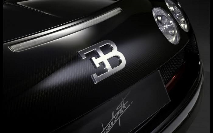
Bugatti logo may not seem like a big deal, but it has a meaning behind each element. To begin with, an oval is the basis for this symbol, in which a set of points that enclose the name Bugatti are embedded. The points are a symbol to indicate pearls or safety wires, with 60 in total. The selected colors, especially for the letters, allow it to contrast.
The letters at the top are a tribute to Ettore Bugatti, being an inverted E linked to a B, or what is the same, the initials of his name.
The Bugatti family also has another wink, although less known. It turns out that Ettore’s younger brother, Rembrandt Bugatti, designed details in the radiator tube of the Royale Type 41 car, the most expensive model that could be obtained on the market in 1926.
The inclusion of the statue, “The elephant in the circus” was another way to give prestige to the brand, in addition to the use of the Bugatti symbol.
Representing elegance through the form

The Bugatti logo is a work analyzed by an artist of the time, the father of Ettore Bugatti, who worked in the manufacture of furniture and jewelry. As his son’s wish was to make elegant vehicles, he decided to use an oval as the main element, since it looks elegant and technological.
Additionally, the silver frame that borders the oval is a way of stylizing the design to make it more attractive; the same company has confirmed it multiple times.
The colors of motor racing
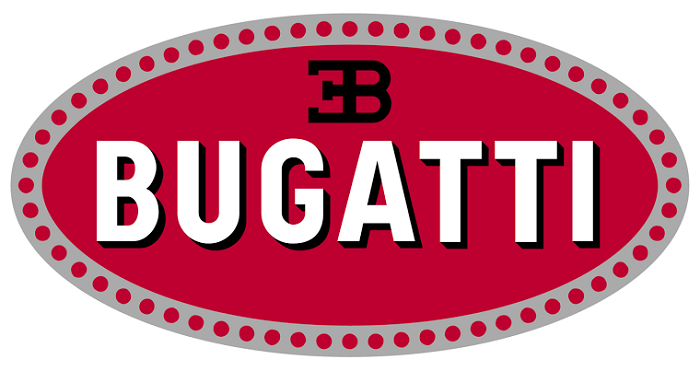
The Bugatti emblem includes several of the most used colors in the car industry. The red background represents passion and energy, something dynamic and fast. The white of the main typography symbolizes elegance, purity, and nobility. Finally, there is the black for the shadows and the initials, which are used to represent excellence and a job well done.
A simple typography

The brand has a clear name that allows it to be easily read from a distance. To avoid becoming a boring letter, a three-dimensional effect was added with the use of shadows. Nothing too exaggerated but that gives it character, considering that the white color is already simple enough.
What they wanted with the logo

As we mentioned previously, Ettore Bugatti wanted every part of his company to look elegant and represent the best in the world. For this, he not only needed the most powerful and luxurious cars of the time but also required that the brand be recognizable.
Designing the logo required someone with experience, who knew what shapes and colors could use to create something avant-garde. Luckily, the entire Bugatti family was talented. In this case, it was the father, Carlo Bugatti, who specialized in the manufacture of furniture and musical instruments with the Art Nouveau style, the responsible behind the logo.
Carlo offered to help his son in the conception of the brand, and now a day they show the pride they have for the result, who do not even use an alternate logo for race cars.
The company’s emblem was the first thing Carlo designed. For this, he opted for the union of his son’s initials in an avant-garde manner. The combined letters E and B would become a fundamental part of the brand, who do not stop using them in each product.
The meaning of the points
No one knows for sure what was the inspiration for the points that border the Bugatti logo. One of the recurring stories is that these are a simple way to draw pearls as if it were jewelry. It makes sense when you consider that Carlo Bugatti worked with jewelry.
Another theory suggests that they are a way of indicating the brand’s superior technology. Bugatti, unlike other luxury cars, used security wires instead of gaskets. Seen from a blueprint, these wires are very similar to the brand logo.
A logo that remains intact
The Bugatti logo is so important to the company that it has never been changed. Even with the arrival of new administrators after Ettore, it was decided that the logo would be the same. In this way, no matter how many years go by, it is understood that it is the same brand.
There are very few important variations in the logo. When it is installed on a vehicle, the edge is chrome, but for printing and other uses, it can be seen in gray or white. On other occasions, instead of using the full logo, just the EB initials are placed.
Bugatti in the world
After more than 100 years of experience, Bugatti has established itself as one of the best brands in the world. It is in position 13 in worldwide popularity. Bugatti car users indicate that they are facing unique and beautiful products with worldwide relevance.
Bugatti is one of the few car companies that worries to an excessive extent about the appearance of its products. Vehicles must not only be powerful but must look good. Acquiring a Bugatti product is a symbol of elegance and status.
Understanding the Bugatti origins is essential to analyze the logo. Born from the founder’s family, it reflects the values and goals that have always been proposed since the creation of the manufacturing company. The pride they have is unique, keeping it intact in each of their vehicles, showing that it is always the same company.
If you enjoyed reading this article on the Bugatti logo, you should read these as well:
- The Amazon logo: Its meaning and the history behind it
- The Pepsi Logo: The old, the new, its meaning and history
- The Disney logo: All there is to know about the Walt Disney brand
The post The Bugatti logo and how this emblem became a symbol appeared first on Design your way.
Source: https://ift.tt/2sA8ZzZ


No comments:
Post a Comment