An excellent Album Cover can help decide the fate of an album. While some people may argue that album covers shouldn’t be focused much upon, and all the attention should be given to music inside, your album cover design creates the first and most long-lasting impression about your album to the viewers and potential customers. Listening to music is a hearing experience; there is no visual reference to listening to music on albums. Hence, your album cover acts as a strong visual representation of the entire album inside. When people browse through the albums in store, a great album cover design helps them pick your album out of the lot. Even for an audience that is on the internet, your album cover can be the first entry point for them to learn in greater depths about you.
The process of designing Album Art isn’t as tedious as it might feel. You need the right mindset and the right approach towards it. Here are 8 essential rules that will help you design a great album cover:
1. Get to know the band:

If you’re a designer who’s designing an album cover for a band, it is a good practice to start by understanding where the band is coming from. Just like designers need to know what a company is all about before designing their logo, it is essential to follow the same process for music albums as well. Communicate with the band members separately and individually if they’re a group, and understand each of their perspective and emotions related to the band. Next, try and understand who the audiences are; the band is trying to cater to. They might not have thought about these aspects themselves, but subconsciously there’s always a target audience, and identifying them helps to create a great album cover.
2. Understanding the inspiration:

As a music artist or a band, they might have found some source of inspiration that pushed them forth with each music record on that album. There might be a constant role model, or a brief moment of experience at a party, witnessing some art or conversation. Similarly, your album cover design must have a source of inspiration as well. When you communicate with the band members or the artist, ensure you ask them the right set of questions, and understand better about their roots and history. Doing this helps understand the characteristics and personalities of the members involved or the memory that inspired them. This allows you to translate the thought behind the album cover much better, as you could try making a visual representation of what their inspiration was.
3. Colour:
Once you’re decided on a rough idea as to what the cover design should look like, you can now focus on different elements of designing an album cover. To start with colour is one very important element in designing an album cover. The choice of colours is always a thoughtful selection when it comes to album cover design. Many album covers are monochromatic; because they invoke emotions that differ from the emotions, you feel when you see a vibrant or colourful album cover. Each colour can invoke different emotion of a person; it is known as Color Psychology.
Hence to depict different moods, it is essential to make use of different colours. If the album is happy and light using the colour yellow or other bright colours might complement the feel of the album whereas for melancholy and darker music use of faded, dull and darker colours like grey and dark blue justify the vibe. Another important aspect to remember is the colour scheme which talks about how different mixing colours complements the overall design, and which colours look good together for what purpose.
4. Typography:
Generally, many designers believe that the typeface of a band should not be changed on the album cover. Many bands have a distinctive font for their band that essentially becomes synonym to their identity. While using such a distinctive feature on the album art could help customers identify them from a glance, not all artists have such a distinctive typeface. Hence typography still holds value in designing an Album cover. The font that a designer uses could talk volumes about the band. No decision in designing is without any thought behind it. Typography isn’t necessarily just putting the name of the band and getting done with it. It talks about all the possible places you would like to place content. There are a bunch of different fonts to experiment with.
You could use a Serif font. Serif fonts are fonts with the little leg at the end of the letters. Generally, such fonts are taken to be more serious and formal. Such fonts generally work best for classical, opera and acoustic music. Sans serif, on the other hand, means fonts without Serif. These fonts don’t have the little leg at the end of letters. Sans serif is a much modern font family, and it is streamlined much more than Serif. Sans serif is often used with a variety of music genres like indie rock and electronic.
Script fonts are fonts that are used to enact hand-lettering and handwriting strokes. There is a wide variety of script forms that can encompass the most traditional and ornate fonts to the most playful and messier ones. Script fonts can be used for a wide range of emotions and music types. Whereas display fonts are often decorative. They are meant for display, as the name suggests. Generally, such fonts are found on signage and book covers. However specific niche or genre of music can make use of such fonts to add to their album cover just as Gothic. Gothic display fonts are often used to create album covers for heavy metal bands. You could use a bubbly font for children’s music album. The possibilities are endless.
5. Using the right image:
Image or graphic element takes up most of your album design. It is going to be the centre focal point of attention of your album cover. General habit or trend is to use the picture of the solo artist if he/she is a solo artist or to use an image of the lead singer or any member of the band that audience most relate to. However, you don’t need t to stick to photographs these days for your album cover. You could make use of graphics, illustrations and collages as well.
There is certain psychology attached to images as well. Generally, there are practices in photography that helps photographers take more engaging pictures. They use different guidelines such as rule of thirds, golden ratio and much more. Similarly, while designing album art, using such principles should be a prerequisite to click a great image that captivates the viewers’ attention. It is seen over some time that people tend to catch human faces on album cover much faster than anything else. It holds their attention the fastest. A face has the potential to convey many emotions through various expressions. It also has the potential to modulate or change how the viewer feels if the image is captured nicely and the colour and the fonts complement the entire album cover design.
6. Minimalistic Approach:
While there are excellent instances of maximalist album covers too, it is often seen that the minimalistic approach works better on album covers. It creates a statement in album cover design. Minimalism also is a trending design style which is difficult to go out of style, as it’s very timeless.
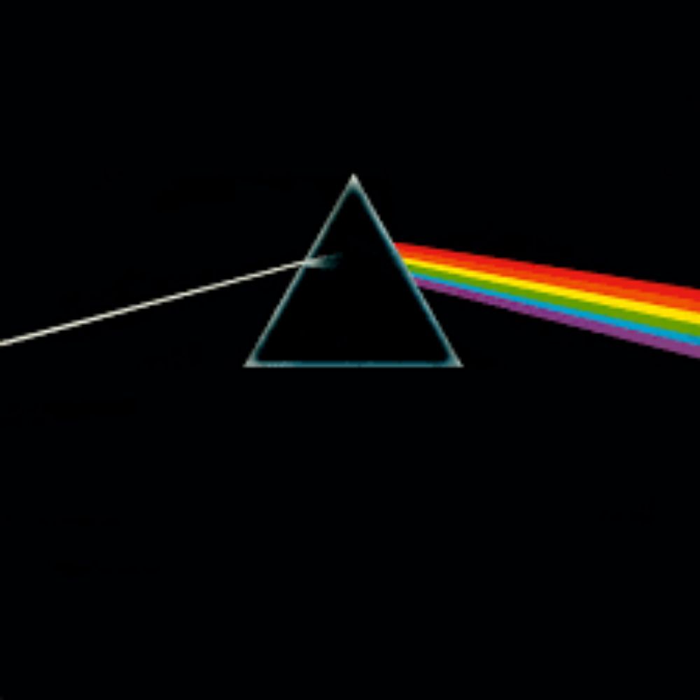
For instance, Pink Floyd’s The Dark Side of the Moon album cover has made its presence remarkable over time. The album was released in record stores during 1973. The album art shows a basic concept of physics that most of us remember studying. A light ray enters the prism and spreads out to different colours of the rainbow on its way out. The background is kept black for enhancing the simple thought. This album art resonated with many people as they perceived the album art to be saying that before you listen to this music, you’re feeling full and bored, but as you listen to the album, you’ll feel a range of mixed emotions. Hence using a minimalistic design approach, the band had successfully depicted the feel of the songs, and how they intend their audience feels after listening to the album with bare minimum elements.
7. Optimize for all spaces:
In today’s era, more people stream music rather than buy a physical album. Hence realizing the potential places your album cover is going to be displayed at, becomes essential. Most of the users generally prefer streaming music over services like iTunes and Spotify. Since you know the size restrictions of such thumbnails, you need to look at your design from an overall viewpoint if it would look good downsized to that extent. This is another reason why maximalism doesn’t work as good in album cover design.
Hence it is essential to practice that once you’re done designing your album cover, you check how it looks resized to proportions of such music streaming applications, and if it still makes sense and is visually appealing. If the answer is yes for both, you’re good to go. However, if it is no to either one, you might need to reconsider your design. Since you already know about this tip now, you could save much time by keeping in mind from the inception that this design needs to look good on a much smaller canvas too. That way, you’d save time and be more efficient.
8. Cover the essentials:
You might create the best possible album cover of the decade. However, it is of little or no use if you forget to add all the essential details. While designing an album cover, you need to be aware of not the aesthetical values or elements but also including the necessary information and other elements as per the niche. For music albums, there are a few elements that the album cover must-have.
Firstly, the band and the album name should be made distinctly clear. You need to position it on the spine of the album cover as well. This is particularly important for classic albums that are sold offline, as they are arranged in a rack many times where only the side of the album cover is exposed for the viewers. Hence writing the name on the sides of the album cover is essential for people to recognize your album cover and the artist and name of the album. However, if you’re going for a digital-only approach, you can very well skip the need to add name and other details as it would be available separately in other section.
Apart from this, you need to include a list of tracks that the album has. Make sure you also include licensing and legal information. Lastly, you should also pay attention to the inner jackets of the album cover. It needs to follow the same design principle as the outside of the album cover. Otherwise, it needs to feel like an extension of the same. This helps the album look consistent and aesthetically nice.
These were the 8 essential rules for designing an album cover. Keep practising, and use different sources of inspiration for creating your next album cover. Keep in mind that all designing elements you use for creating an album cover should complement each other. They should add value to the overall design. It should give the first impression and at the same time a summary about what the album is about.
The post How to Design an Album Cover: 8 Essential Rules appeared first on Web Design Blog | Magazine for Designers.
via https://ift.tt/35WFarL


No comments:
Post a Comment