We all heard about the Game of Thrones TV-Show series until now. It has captivated a lot of people worldwide. From great characters to amazing effects Game of Thrones has really brought a lot of action into our lives.
For sure one thing that got your attention was also the Game of Thrones font. Not only does it look good but it really fits the scenes. So yes, we do have to say that the show is very creative in how they used all the details. This is why we decided to search for several similar Game of Thrones font options that you might want to use.
Game of Thrones is a fantasy drama that has been watched globally. The creators behind it are David Benioff and D.B. Weiss. It has broken a few records and its fan base is huge.
Game of Thrones font options
There are many fonts similar to the Game of Thrones one. As the show features powerful families that want to gain control over the kingdoms you should expect some fights. Another thing that you should expect is also that the fonts used to be strong and classic.
Because of this, there are many fans that created their own versions of the Game of Thrones font. They can be downloaded for free so here are some that you can get your hand on right away:
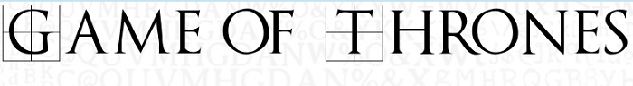
Game of Thrones Font
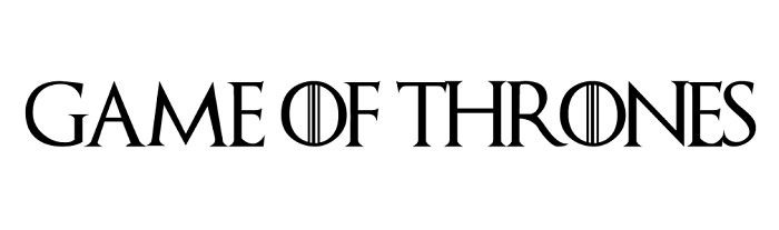
You don’t need a Game of Thrones font generator to get this one. It consists of uppercase letters inspired by the logo of the TV-Show series. If you are a designer that wants a similar one you can take advantage of this one. Download this font because it has the potential to help you in your work.
The font is a gothic one and it was created by Charlie Samways. You can use it for both personal and commercial work. However, for the commercial part, you need to download the license.
Mason Serif Regular Font
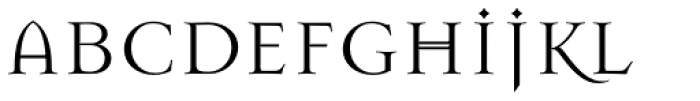
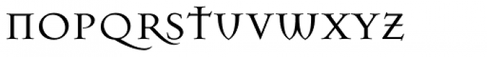
Jonathan Barnbrook has created this font in 1992. This means that 19 years needed to pass before the series were premiered. So, we can say it was original and for sure is a very good option for a Game of Thrones font.
It comes in different styles and it can be used especially for history-related designs or events. Make sure you add it to your collection, it can be useful.
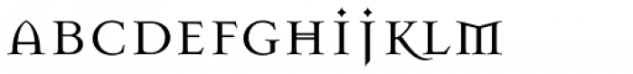
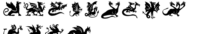
Hodor
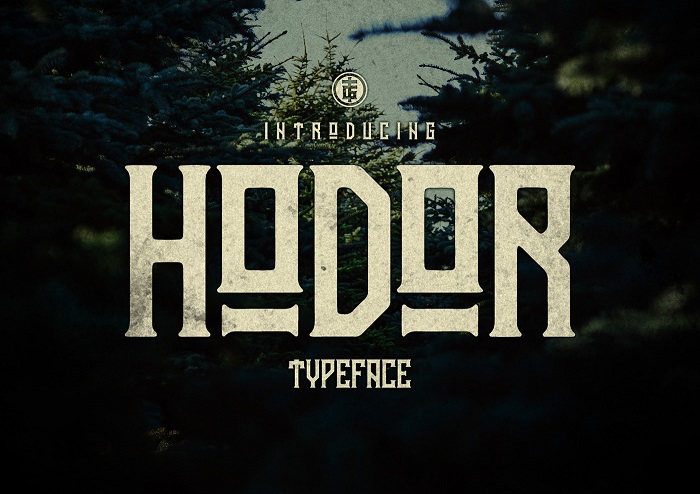
When you say Hodor you immediately think about one of the well-known Game of Thrones characters. He had just one line and it is up to you to discover it. However, this time we will focus on the Hodor font. It’s quite obvious it was inspired by the Game of Thrones series.
The TGIF STD are the guys that did the project. Its design has a simple look that goes well on retro and vintage projects. The font is going to look amazing on posters, banners and so on. It has uppercase numerals, lowercase basically all you need.
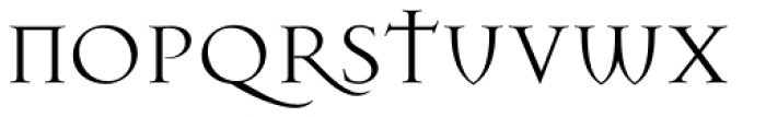
Mason
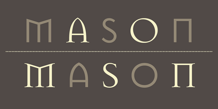
This Mason Font was created in 1992 and the designer’s name is Jonathan Barnbrook. He created this font in order to show the opposite emotions. The show connects with this because it is a drama full of love and battle scenes. So, this Game of Thrones font alternative can be a good choice if you want to express the opposite emotions.
Your Royal Majesty Font
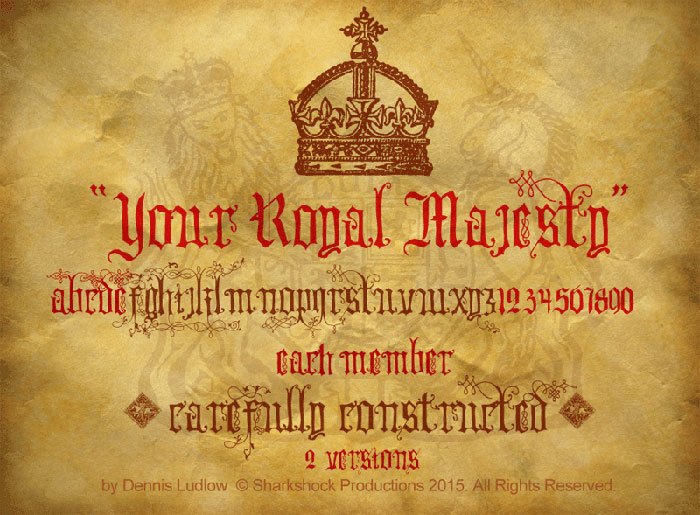
If you want a Game of Thrones font that brings royalty in your designs this is the one. It shouldn’t be used in simple projects because it is going to look bad. However, in books, magazines, and events it could be a good choice. Just try it out and see if it fits your idea.
Trajan Pro
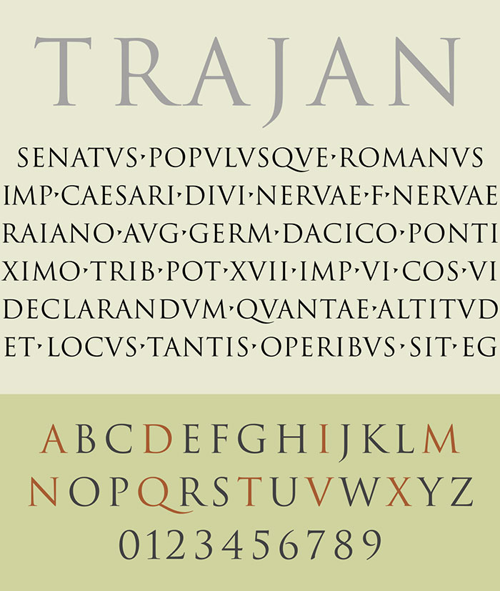
The curves and angles that this font has been similar to other TV-shows fonts. It has different style options and you can use them depending on your requirements. This is the font that has been used in the popular TV series called Game of Thrones.
It is a classic and elegant typeface that can look good on billboards and basically any advertising designs. The designer behind it is Carol Twombly.
House Gothic 23
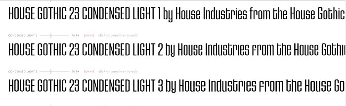
The House Gothic has more than 20 fonts together with a cool family text. Each of these sets has both bold and light letters that can be used. It is a good Game of Thrones font option that designers need to consider.
Trajanusbricks
Because it was designed by FontsBay, this font comes in an all capital letter format. Due to this, you see it has a unique design together with two sets of capital letters. So, stop your search for the Game of Thrones logo font and give this a go.
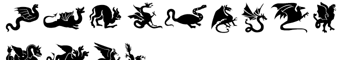
Winter is Coming
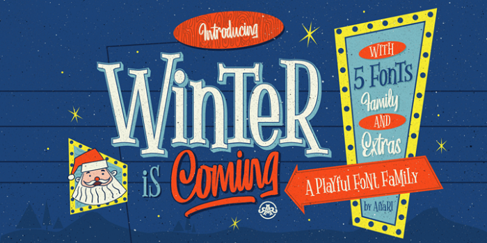
The Winter is coming font is going to surprise you as its main inspiration is the hand lettering from the winter season used in the 50s. It has 5 font styles and it also contains a bonus graphic. Download the pack in order to see it.
In terms of use, you can use it for logo designs, social media texts and many more.
Medieval
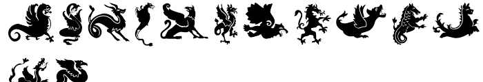
As the setting of this fantasy drama is in medieval times this is a good font option. It goes really well with the scenes and the atmosphere. Having 12 files with different effects means you can try more combinations to go with.
Using this Game of Thrones font alternative, you will be able to transform anything in a Game of Thrones statement!
Warnock
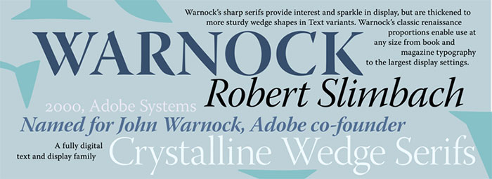
It combines a modern and elegant approach. The designer, Robert Slimbach gave its name after John Warnock. Warnock was the co-founder of Adobe that had the vision to bring big changes in art software.
Latin, Cyrillic and Greek character sets are all included in different weights. This means it can perform various typography tasks. If you don’t believe us try it yourself.
Ending thoughts on choosing a Game of Thrones font
In conclusion, finding Game of Thrones font choices are not that hard if you do some research. The main idea is to go for a style that you like and you consider relevant for the project you have. Check the ones we mentioned above and see if they can help you out.
If you enjoyed reading this article about Game of Thrones font, you should read these as well:
- Typography prints: Amazing examples you should check out
- Car Ads: 70 Creative And Clever Print Advertisements
- Need some wedding fonts? Try these options for your print
The post Game of Thrones font examples (Pick one from here) appeared first on Design your way.
Source: https://ift.tt/2ryEzOf


No comments:
Post a Comment