In this piece, we will look at some of the most appetizing-looking bakery websites available. We will look at the numerous design aspects, features, and capabilities that make these websites stand out, from beautifully designed websites that include mouth-watering photos of cakes and pastries to websites that showcase innovative and creative baking processes.
This article will provide you with inspiration and assistance on how to design a visually appealing and engaging website that truly portrays your enthusiasm for baking, whether you’re seeking for inspiration for your next baking endeavor or simply admire the art of baking.
Which are the most delicious-looking bakery websites?
Boudin
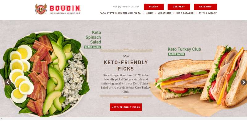
We simply adore Boudin’s attractive header CTAs. The bakery website embraces the premises of a classic breakfast, brings you back in time, and makes you want to taste their delicious treats. All of this is achieved through a simple combination of solid reds and pale browns!
You will also like the attractive hero header in the same fashion as the sliders, as well as the unobtrusive use of serif types. All of this is polished with quality, mouth-watering images of pastries. All of them are bordered with grandiose frames that never fail to impress. In terms of function, this bakery website is easy to navigate and features a well-structured menu.
SusieCakes
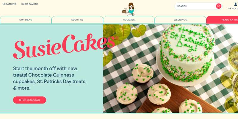
Susie Cakes, on the other hand, make use of the classy, minimalist trend. The CTAs are clear and embedded in a hero header, and the story is told through wonderful images and compelling taglines. The bakery website uses recognizable brand colors. It does so to the extent that even social media shortcuts don’t look foreign or unfamiliar. All in all, this is the definition of a well-executed website design.
SusieCakes’ bakery website does a great job retaining customers with sticky menus. These menus take you to the desired location wherever you are on the website. There is also an integrated Instagram feed where all fan photos and hashtags are displayed in real-time. What an awesome idea!
LA Baking Co.
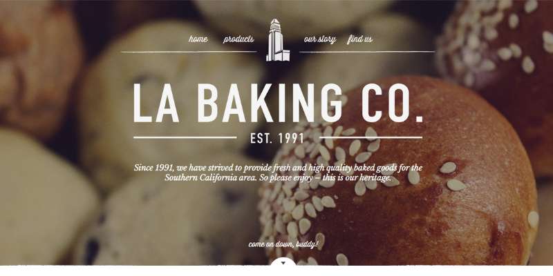
Check LA Baking Co. if you are looking for a simple bakery website design. There is only one page where all information is displayed, and users scroll to find the section they need. This may not be the perfect SEO solution, but it guarantees usability.
On the right-hand side, you will find a secondary menu with further usability options. For instance, you can change the language from English to Spanish.
Jillycakes
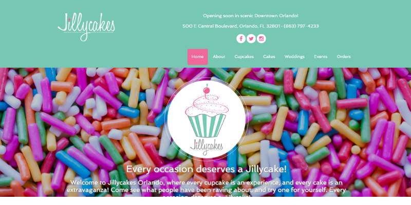
Jillycakes is one of those bakery websites you simply can’t forget. At first sight, it looks like a standard bakery shop with a logo and a simple menu. It is when you start scrolling that the magic happens!
The bakery website uses sticky navigation on an otherwise static background. In such a way, it creates the perfect scrolling effect for every visitor. Jillycakes also has an Instagram feed that displays all of its cakes and other tasty delights. A special footer section is dedicated to their best reviews, recommendations, and awards.
Buzz Bakeshop
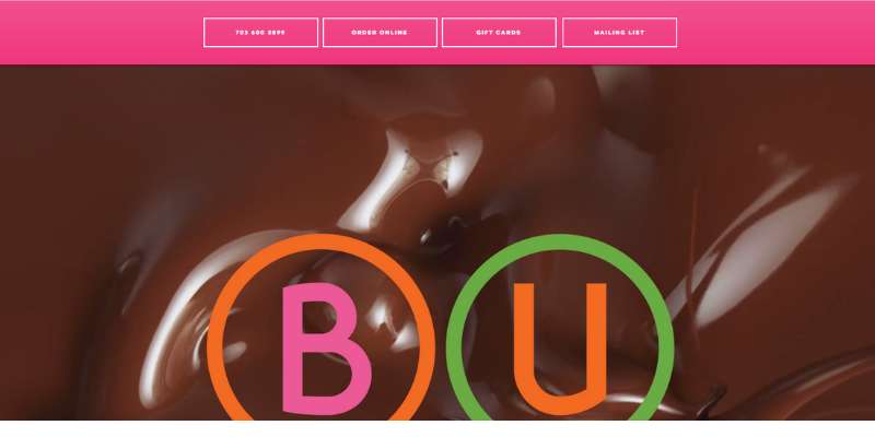
The best bakery websites are simple. They feature mostly high-quality images to inspire random visitors to come to the bakery and coffee shop. If you agree with this, Buzz Bakeshop has the perfect example for you.
This bakery website is minimal in terms of menus and content layout. The nicest touch is probably the patterned background. Given that content is limited, the spotlight is shared between the background and the high-quality images.
Dubravica
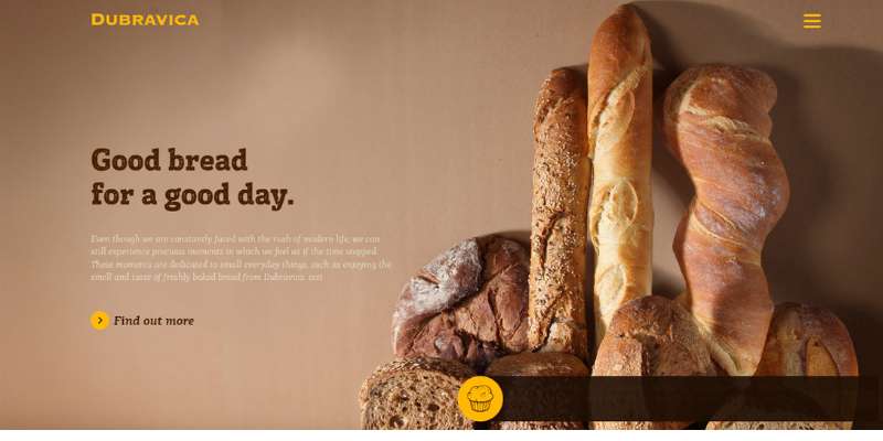
Dubravica is another great bakery website. The web designer did an excellent job introducing a sophisticated, retro vibe to the upscale coffee shop and bakery. If you want your website to look like that, learn from his use of earthy palettes and excellent gold branding.
Golden branding, however, can only work on a clean and simple homepage, ideally with a full-width breathtaking image of the perfect meal. The bakery website also inspires with captivating taglines, well-distributed CTAs, and off-canvas menus. All images in their gallery come with an awesome hover effect, and make you wish you could try their bakes immediately! No wonder the bakery business is doing so fine!
Porto’s Bakery
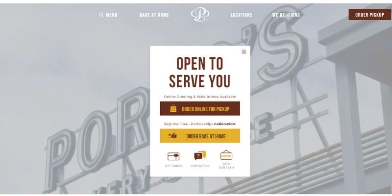
Porto’s Bakery proved that minimal design does not necessarily come with limited features. This bakery website brings function over form and offers both a balanced and appealing look. They will invite you with an amazing background video of how they make and sell their goods.
You can consider adding a similar carousel feature to your bakery website. It is a very attractive trick to distribute all necessary information. This feature works well for announcements, events, gift cards, opening hours, and more. Navigation, however, remains simple and friendly on all pages.
Magnolia Bakery
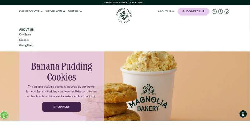
Magnolia may not be among the best bakery websites in terms of function, but it deserves attention. 1/3 layout website design is not seen all that often, particularly not as good as on this bakery website.
You will appreciate the earthy colors on the website, as well as the traditional, user-friendly menus. The Magnolia bakery site features multiple portals that take you where you need to be within seconds.
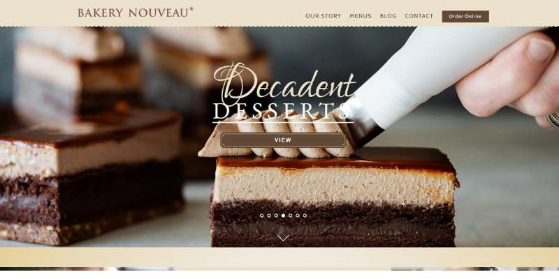
Bakery Nouveau
Bakery Nouveau is another bakery website that prefers simplicity. They focus on images and showcase their products, employees, and their work. The signature colors of their brand and bakery websites are warm, inviting beiges.
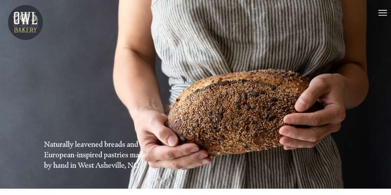
OWL Bakery
This bakery website makes use of parallax scrolling, which makes it one of the most advanced best bakery websites on this list. Text content is neatly divided into sections, which are then interspersed with detailed images of all their specialties.
The website also has an e-store component which is easy to use, so you can put goods on the wishlist or even order and pay online.
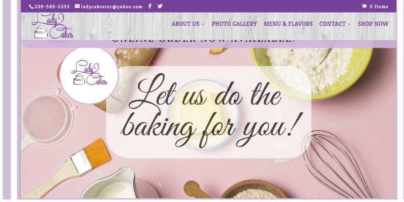
LadyCakes Bakery
Here comes a bakery website that put all its cards on upfront design. The first thing you see is a friendly image of the owner, followed by cake images and videos, and a publicity page. If you are also proud of your bakery business, there is plenty you can learn from this bakery website.
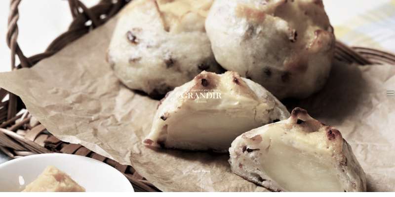
Grandir
Grandir is a very popular Japanese bakery. Their website provides a perfect blend of Japanese minimal design and rich Western layouts. Once you see this bakery website, you will wish you could go to Japan and try their awesome cakes.
Partake
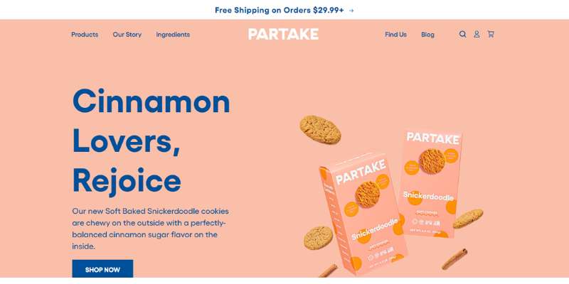
Partake Foods uses a warm, pastel color palette to make visitors feel welcome. It sells gluten-free vegan products, and its entire web design follows this idea. You will not only enjoy browsing through their pages but also learn a lot about common allergens and nutritive values.
What we appreciate about this bakery website is brand alignment. The colors they use are consistent with their branding and packaging, so you immediately know which bakery that is.
The Suisse Shop Bakery
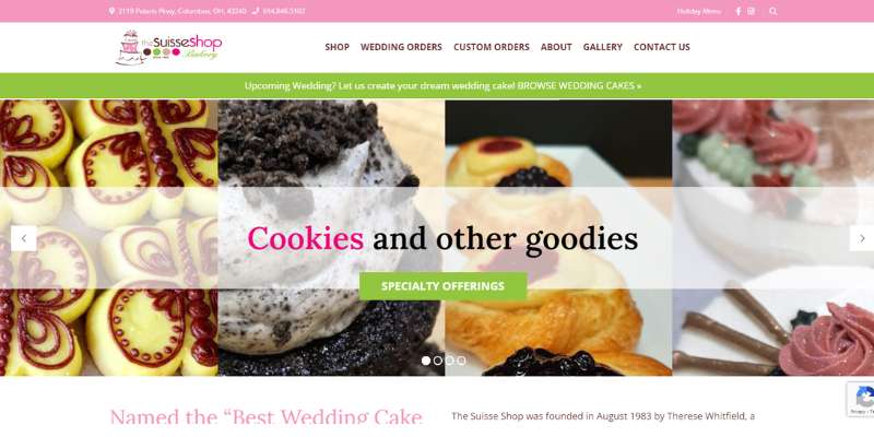
This bakery website is elegant and simple, in line with their best-seller: wedding cakes.
There is a beautiful central image slider with a hovering menu on top. Each of their pages features a testimonial section, so you are instantly informed about the product you are looking to order.
Passarella’s website
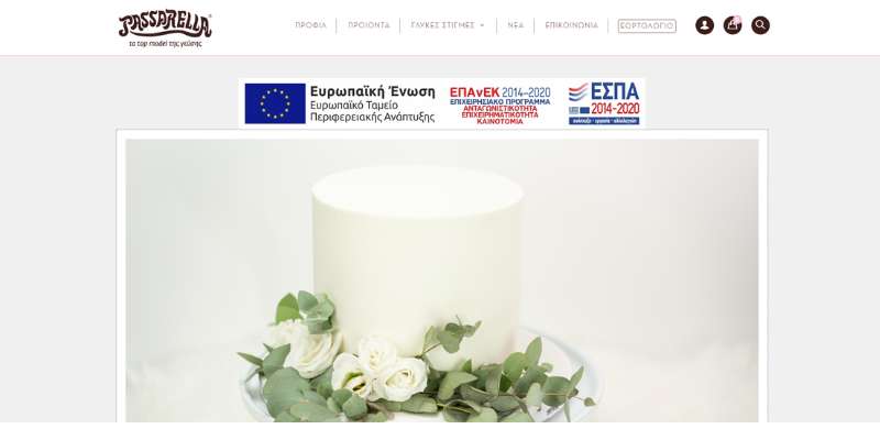
Passarella’s bakery website combines Greek typography with classic pastel colors. Every image on this bakery website comes with a long descriptive section, which works perfectly for SEO. Many other bakery websites neglect this function.
Alessi Bakeries
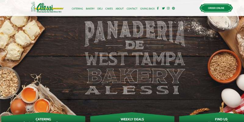
Alessi is a leader in the world of baked goods, and part of this success can be assigned to its great bakery website. You will enjoy their cohesive design, signature-green highlights, and catchy fonts.
La Newyorkina
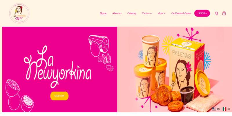
While looking for web design inspiration, focus on the experience of the user. Visiting a bakery website, the same as going to a pastry shop, needs to be fun.
La Newyorkina makes good use of this rule. Their bakery site is soaked in enchanting imagery and lively colors.
Gruber Bakery
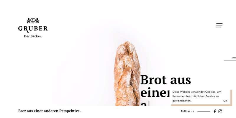
This bakery website is gorgeous due to one simple reason: excellent use of white space. To reinforce the effect, the wholesale bakery also uses modern typography. Other important features are pseudo-3D borders, and video trailers for their products.
They’ve managed to turn something as traditional as baked goods into contemporary art!
Lune Croissanterie
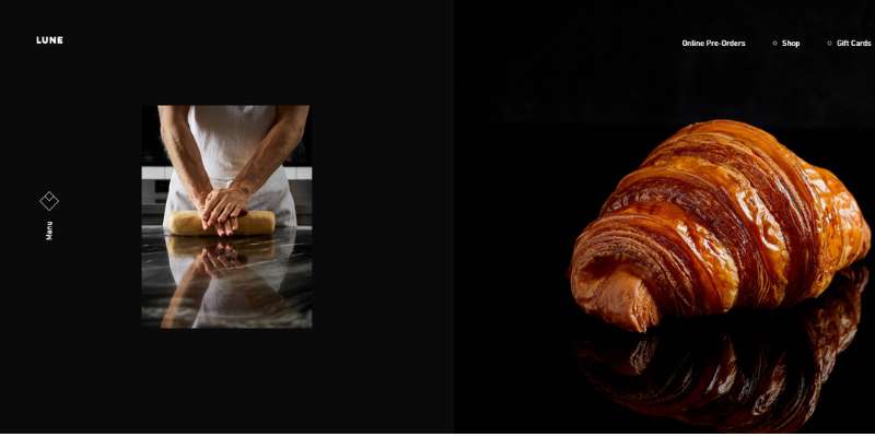
This inspiring bakery offers only one type of product to its potential customers but still stands out from the crowd. Since the bakery specializes in only one product, it is easy to keep up a minimalist design with a call to action and an asymmetry-themed layout.
Bavarian Bakery
The Bavarian Bakery website is exceptionally engaging. They not only offer mouth-watering images but also engaging videos and welcoming music.
As you land on their homepage, you are introduced to their huge, central logo to familiarize yourself with the brand. Next, the bakery website lets you order baked goodies with only one click, thanks to the simple call to action. This bakery website also uses parallax scrolling and sticky menus.
La Cannelle de Martini
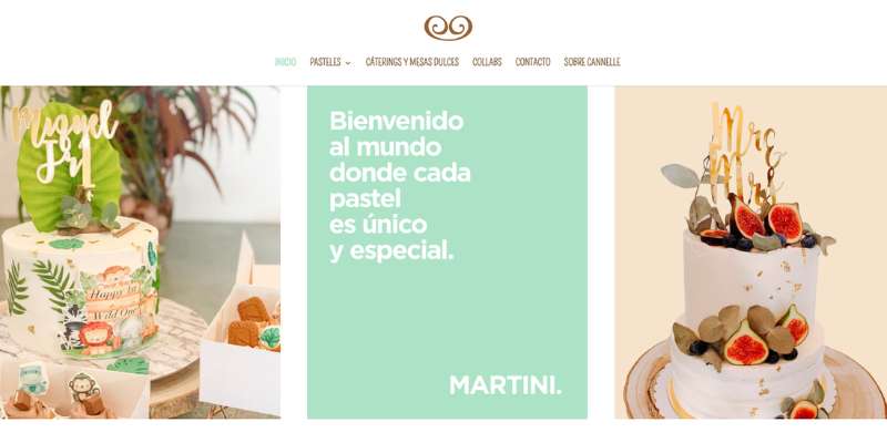
This bakery website welcomes you with a new pastry image every day. If you want to learn more about their product, make use of the great scrolling experience. As you move down the page, images simply ‘paint’ themselves in front of you. They use many fun animations you can consider for your website.
King Arthur Baking Company
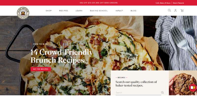
Let’s assume for a moment that simplicity is not your thing. Let’s think, rather, that you want to display your offerings in a fantastic, memorable way. A good feature to look at is the broken grid layout used by King Arthur Baking Company.
We love their bright colors, and their detailed, crisp-clear images. Despite the rich displays, this great bakery website is still simple to use. An extra benefit is the King Arthur Baking company blog where you can learn more about their work and their mission.
Back Door Donuts
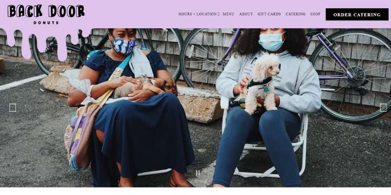
Back Door Donuts is another very good bakery website to learn from. Looking it at, you will get an instant wish to teleport yourself and try some of their excellent door donuts.
Back Door Donuts has a prominent homepage with a slideshow of hero images, all displayed on an attractive palette. You will also like the frosting drip effects that any great bakery website should consider.
Cobs Bread
Cobs Bread’s website is exceptional in many different ways. Their structured web design relies on red as the main color, which contributes to an elegant and sophisticated vibe.
The hero header has a unique, split-screen layout. The left-hand side is fixed and displays a beautiful image, while on the right side, there is a slider that presents its different features. This great bakery website also has a descriptive call to action, video background, integration, and much more.
Vienna Bake
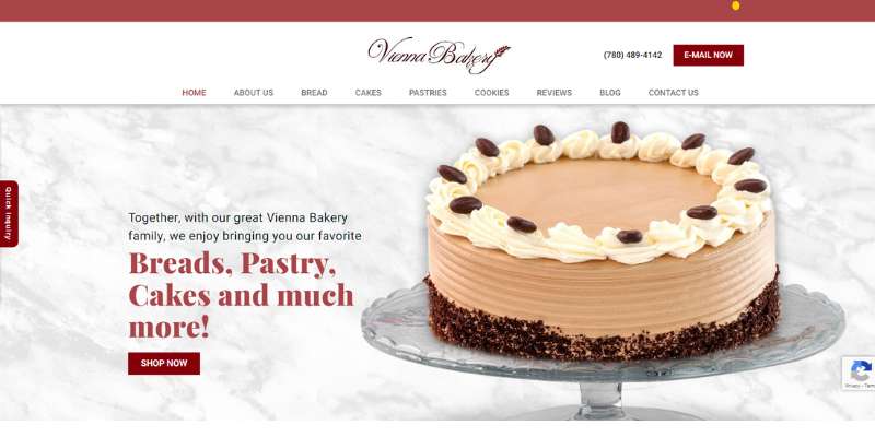
Vienna Bakery made many good choices when it comes to web design, especially in terms of fonts. The bakery is also well-known for its social media presence, as well as scalable design for multiple device types.
Wildwood Bakery
The Wildwood Bakery web design inspires visitors with earthy colors and effective animations. The site has a unique energy that will make you order their goods on spot!
Gilles Marchal
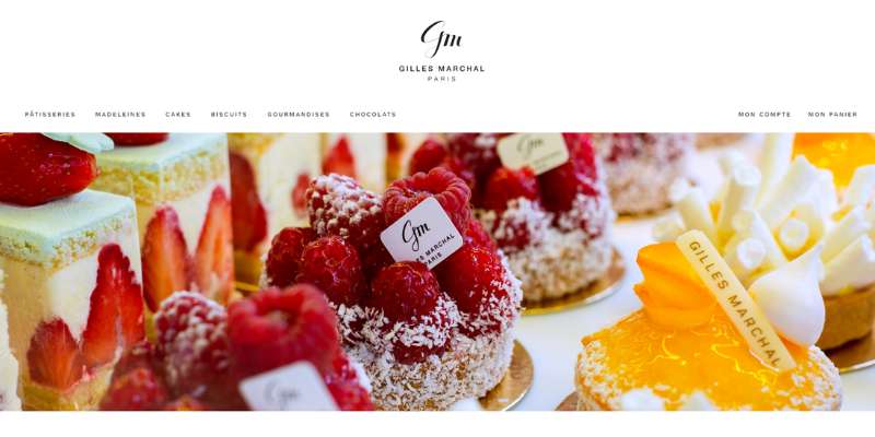
Gilles Marchal teaches us what bakery website design is all about. the website brings together animated text boxes, slider effects, and colored brush strokes. What may attract you, even more, is top-quality confectionery photography. No wonder they are doing so well!
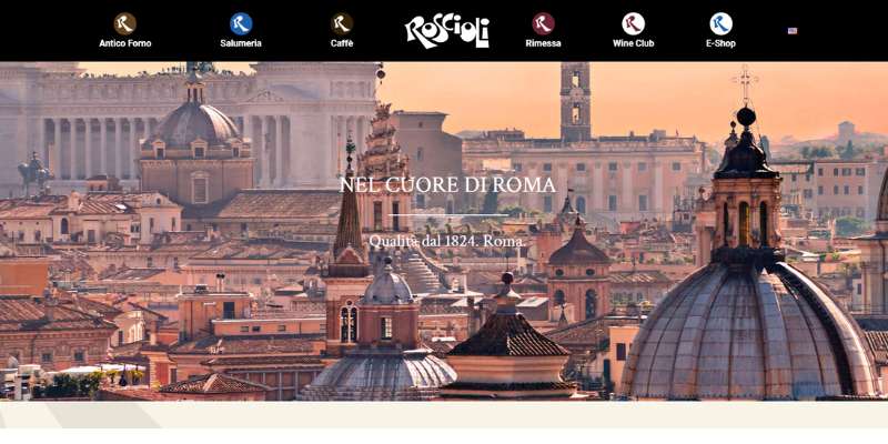
Roseioli
This bakery website is all about usability and easy navigation. They aim (and succeed!) to give you a virtual tour of their production and to present their fresh bread and cakes the best way they can.
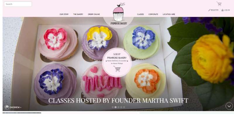
Prim rose bakery
The Prim rose bakery also has a strong web presence. Their core advantage is the eCommerce functionality for easy online ordering.
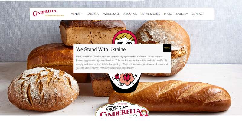
Cinderella
This bakery transmits the novelty of its name to its web presence. Simple, yet inviting design that tells a story is their core feature. We are also talking of responsive features that adapt and interact with the visitor.
PATISSERIE
This luxurious and appealing website makes use of quality product imagery. They also enable online ordering with an e-store feature. Ready for a piece of cake? Check them out!
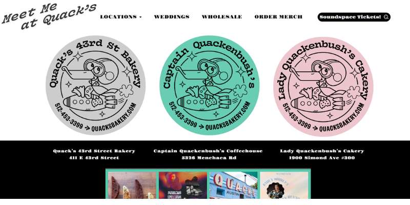
Quacksberry
The true value of this website design lies in styling and spacing. What is also worth mentioning is their background video which sets the mood from the very beginning. The website renders impeccably on different devices.
Terra Breads
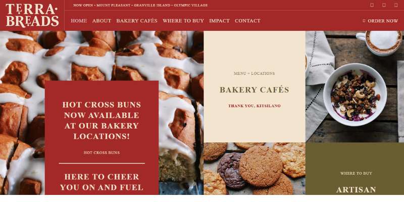
Even if you own a simple, traditional bakery, you can impress visitors with daring web design. Better yet, the stunning features will not necessarily compromise the functioning of your website. You can still have both – form and function!
If this sounds like a sweet deal, check the modern version of the Terra Breads website. We love the stylish arrangement on their home page, as well as the interesting menu options. Images are displayed in the grid layout, and there is a sticky header you simply can’t ignore. Excellent choices for a bakery website!
FAQ about bakery website design
What should be the main focus of a bakery website?
The primary goal of a bakery website should be to present the bakery’s products and services in an appealing and enticing manner.
This can be accomplished by using high-quality photographs, clear explanations, and a simple ordering mechanism. Location information, pricing, and contact information are also vital things to offer.
How can I create a user-friendly bakery website?
A bakery website that is user-friendly should have a clear and succinct layout, easy-to-find information, and intuitive navigation.
To establish a sense of organization and clarity, use headers, subheadings, and whitespace. To ensure that your website appears fantastic on all devices, use a responsive design.
What kind of content should be included on a bakery website?
A bakery website should have a product menu, pricing information, and contact information. To add value to clients, it may also be beneficial to provide educational resources such as blog entries, recipes, and instructional videos.
To develop trust with potential consumers, consider employing narrative and customer testimonials.
How can I use social media to promote my bakery website?
For promoting a bakery website, social media might be an effective technique. Employ social media buttons to make it simple for people to share website content on their own social media sites.
Utilize social media posts to highlight new goods, promotions, and other bakery news.
How can I make my bakery website stand out from competitors?
Use high-quality photos, an appealing and easy-to-use layout, and a distinct brand identity to set your bakery website apart from the competition.
Consider giving educational tools such as recipes and instructional films to first-time clients, as well as incentives or discounts. Build credibility and trust with potential customers by using customer testimonials and social proof.
How can I optimize my bakery website for search engines?
Use relevant keywords in page names, meta descriptions, and content to optimize a bakery website for search engines.
Employ headings and subheadings to establish a logical structure that search engines can understand. Use descriptive filenames and alt tags to optimize photos and other media for SEO.
What are some effective ways to showcase bakery products on a website?
Use high-quality photographs that accentuate the visual attractiveness of each product to exhibit bakery products on a website.
Employ thorough descriptions to provide more information about each product’s ingredients and flavors. Try using filters or categories to help users find specific products.
How can I use email marketing to promote my bakery website?
Email marketing can be an excellent strategy to promote a bakery website and create consumer relationships.
Send email newsletters to subscribers to deliver news, promotions, and educational resources. To encourage repeat purchases, use personalized messages and unique offers.
What are some important legal considerations for a bakery website?
Allegen labeling, privacy rules, and food safety standards are all legal considerations for a bakery website.
Verify that all ingredient and allergen information is correct and up to date. Add a privacy policy that explains how consumer information is utilized and safeguarded.
How can I use customer feedback to improve my bakery website?
Consumer comments can be an extremely useful source of information for developing a bakery’s website. Customer surveys or feedback forms can be used to obtain information about the user experience and areas for improvement.
Utilize this input to improve the user experience and better fulfill the demands of customers by making adjustments to the website’s design, content, or functionality.
If you enjoyed reading this article about bakery websites, you should check out this also:
- Top 6 Side Hustles for Creative People
- The Best Startup Websites You Can’t Afford To Miss
- 9 Ways to Manage and Grow Your Salon Business with the Right Software
The post The Most Delicious-Looking Bakery Websites for You appeared first on Design Your Way.
Source: https://ift.tt/Rv0lqjW


No comments:
Post a Comment