Probably one of the most known brands that the entire world has heard off until now is Nike. This brand shows that if you have a powerful visual identity you don’t even have to state your name anymore. Footwear brands are constantly searching for new points of differentiation. The Nike font is a good example of how this brand got so popular.
Simplicity together with innovations is the key here. Nike is a sportswear company that is based in the USA and it is now one of the biggest suppliers of athletic shoes and apparel.
It is known that the name was taken from the Greek language, meaning victory. A goddess represented this back in mythology. So, let’s discover more details about the Nike font and how did it get chosen.
How did the Nike font get in the logo?
Just do it is the well-known slogan of the Nike company. It was created back in 1988 in an agency meeting. The font that stands behind this brand is the Futura Condensed Extra Black that was done by Paul Renner. Futura is more or less a commercial typeface. The typeface now is also known as the Nike Font as it got so popular.
Actually, the origins of the font started in 1928 when Bauer Type Foundry created the simple clean font. Later on, it was redesigned in 1936 by Paul Renner.
Why did Nike use Futura?
Futura has a powerful design that you can see right away. It can be used for branding elements and we can see how Nike did a great job with this. Together with the logo the font also sends a message towards the viewers.
It’s related to strength because of the bold version used, it shows dynamism as it is inclined together with stability given by the geometry of the Futura. Together with the rest of the image you get a very clear message. The message is that Nike is a very strong brand and if you get their products you will also be associated with that.
Futura Font
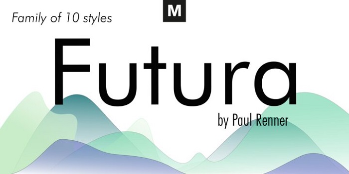
We can say that Futura is the result of the entire twentieth century of Geometric Sanserif. Its forms are ancient and it really looks like something you would see in old sanserif typeface back to 1820. Some of the geometric aspects survived among the big impact brought by Gothics and it still looks modern.
What are some alternatives for the Nike Font?
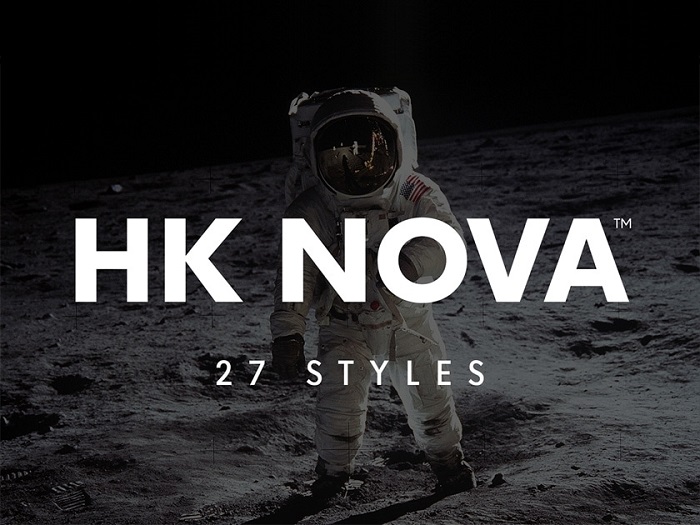
HK Nova
Among the Nike fonts options that we found the HK Nova has a nice geometry and it comes with 27 styles. Download it and see for yourself if it can be your choice.
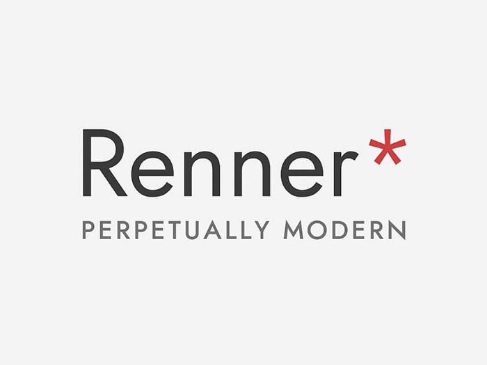
Renner
This is a free typeface similar to the Nike font. It was created by Owen Earl and the font wants to keep a similar vibe. The goal of this font is to work for any project, especially in this agitated digital era. Because of this, it starts from the same design that Paul Renner did.
You can see some similarities like the x-height and the fact it has different weights. It works in different languages and it has tabular and proportional numbers. So, stop searching for a Nike font generator and go with Renner.
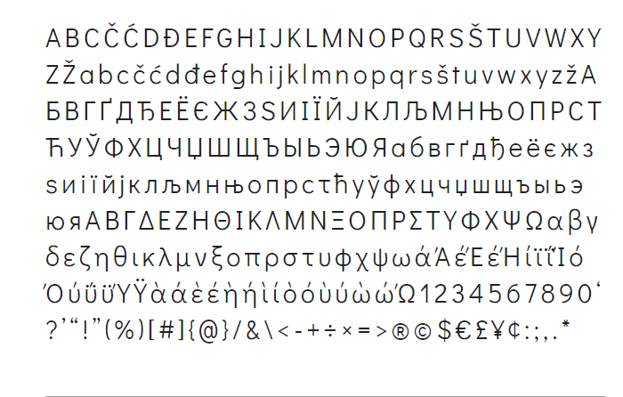
Didact Gothic
One of the best alternatives that you can go with for the Nike font is the Didact Gothic. You already know it is a sans-serif font. It was created to present each of the letters to showcase each letter like the forms from elementary classrooms.
League Spartan
A simple font that is easy to use. Download this Nike font free alternative and start using it.
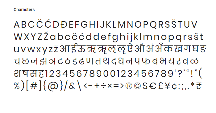
Poppins
The typefaces that have geometric shapes are always popular. Poppins is a good example of what a font with traditions means. It goes well for both the Devanagari and Latin systems.
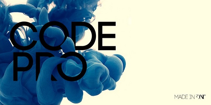
Code Pro
One of the things that we see in this font similar to the Nike logo font is the energy it sends. This is mainly because the typeface is bold and striking. The letterforms are geometric, dense and you can feel the power due to their size.
If you want a font that shows it can dominate this is the one to use. You can also take advantage of its lowercase style when you want to go for a little less intense option. We can also observe that the letters have a bigger space so they get separated from its Uppercase.
Twentieth Century
This geometric sans-serif typeface has been created by Soll Hess. The year it got published was in 1959. This was created with the scope in mind to be a competitor for the Nike font that was having a big success. Similar to Futura this has a slightly larger x-height that works better for body text.
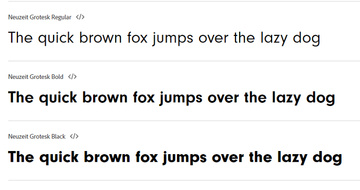
Neuzeit
The Neuzeit is a simple sans-serif typeface. Its creator is the German designer called Wilhelm Pischner. The original year when it got launched is 1928. Some updates were released to the font also in the 60s. The idea behind that was to bring more variety to the font options.
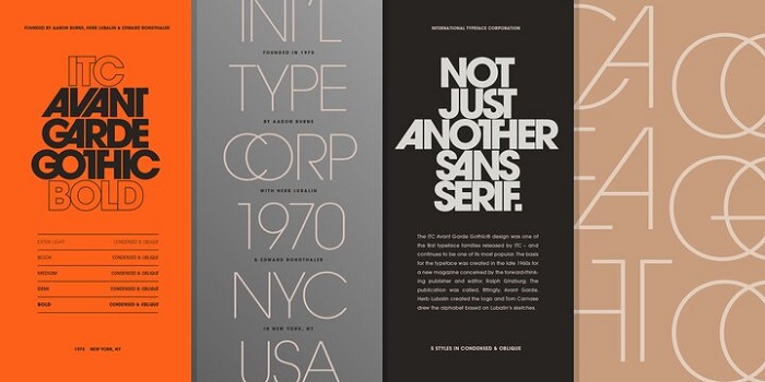
ITC Avant Garde
Check this Nike font similar to the typeface. Herb Lubalin is the man that designed it back in 1977. The goal he had was to bring his magazine logo in the typography world.
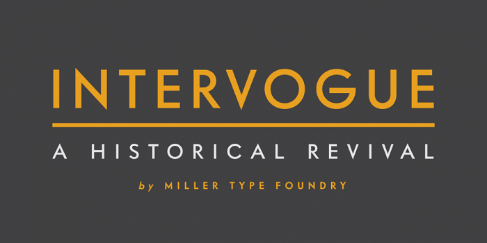
Intervogue
This font was released in the 30s and as you can see it is a geometric sans serif. It has its own details and people liked it a lot during that time when it was called simply Vogue.
Intervogue appeared more recently in order to bring this classic in the digital world. You will see that it has seven different weights that are complete with true obliques.
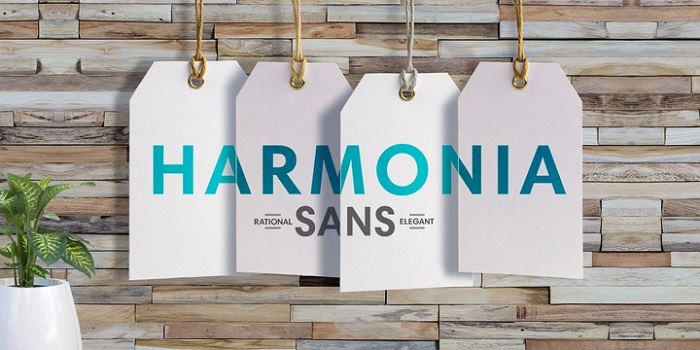
Harmonia Sans
Have a look at this sans-serif font that can be a reliable alternative for the Nike font. The creator of it, Jim Wasco designed it back in 2010. It can be available in five weights and it has condensed and monospaced versions that can be used.
Neutraface
This is a beautiful font that can be used for various projects you might have. It has a sharpness that people are going to appreciate and it can sustain different functional designs.
Erbar-Grotesk
Because it was released in 1926, we can really consider this font as one of the first sans serifs. For sure it can be a Nike font alternative as it has 11 styles to choose from.
FAQ about the Nike font
What is the Nike font called?
The Nike font is named “Futura Bold”. This font has become synonymous with the Nike brand and is easily recognized all over the world.
Why did Nike choose the Futura Bold font?
The Futura Bold font was chosen by Nike for its bold, modern, and timeless look, which reflects the company’s inventive and forward-thinking brand image. The font’s clean lines and geometric shapes exude power and athleticism, making it ideal for a sports brand.
Can I use the Nike font for my own projects?
No, the Nike font is not free to use, and the firm fiercely guards its intellectual property. Illegal use of the Nike font or emblem is strictly prohibited and may result in legal action.
Is the Nike font available for free download?
Unfortunately, the Nike typeface cannot be downloaded for free. Nike owns the font and uses it exclusively for branding and marketing purposes.
How can I get permission to use the Nike font?
If you want to utilize the Nike font in your own project, you must first obtain authorization from Nike’s legal department. This can be a time-consuming process, and Nike may refuse authorization for non-commercial or personal projects.
Can I modify the Nike font for my own use?
No, you cannot alter the Nike font for personal use. Nike’s legal department rigorously enforces its intellectual property rights, and any change or modification to the font is deemed an infringement of those rights.
What are some alternatives to the Nike font?
There are other Nike font variations that offer a similar impression of power and athleticism. Gotham, Bebas Neue, and Proxima Nova are some popular choices.
What other brands use the Futura Bold font?
Many businesses, like Volkswagen, Louis Vuitton, and Chanel, use the Futura Bold font. It has evolved into a classic font associated with luxury and high-end brands.
Does Nike use different fonts for different products or campaigns?
While Nike’s core font is Futura Bold, the firm does employ multiple fonts for special goods or campaigns. The Jordan brand, for example, frequently use the Helvetica font in its branding and marketing materials.
How has the Nike font evolved over time?
While the core design of the Nike font has stayed similar over time, the font has undergone various modest alterations and revisions. Nike released a revised version of the font in the 1990s, with somewhat bolder lines and sharper angles. To create a more dramatic and impactful look, the font is often employed in all caps today.
If you enjoyed reading this article about the Nike font, you should read these as well:
- Typography prints: Amazing examples you should check out
- Car Ads: 70 Creative And Clever Print Advertisements
- Need some wedding fonts? Try these options for your print
- Nike Print Magazine Ads
The post What font does Nike use? The Nike font question Answered appeared first on Design Your Way.
Source: https://ift.tt/Itnq3ZB




No comments:
Post a Comment