Creating a high-quality woodworking website can be difficult, especially if you are unfamiliar with web design. You can, however, obtain inspiration and ideas for your own website by visiting some of the top woodworking websites available.
In this article, we’ll look at some of the best woodworking website designs, emphasizing their distinct features and benefits. These websites demonstrate the best in woodworking website design, ranging from elegant and sophisticated to rustic and down-to-earth.
This article will offer the direction and examples you need to construct an amazing woodworking website, whether you’re a woodworker trying to create a website for your business or simply seeking inspiration for your next project.
The best woodworking websites
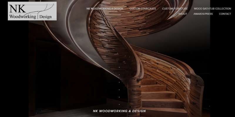
NK Woodworking & Design
The website for NK Woodworking & Design has headlines, bullet points, social networking links, and videos. The “custom staircases,” “about,” “awards/press,” and “contact” tabs are included in the navigation menu. The website also has a helpful blog.
Massachusetts Woodworks
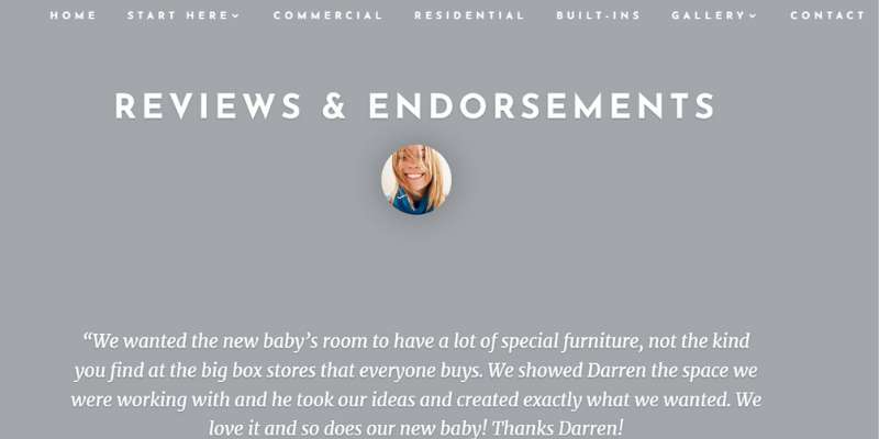
Headers and brief paragraphs are part of the minimalist style Massachusetts Woodworks provides. The “home,” “start here,” “commercial,” “residential,” “contact,” and “gallery” sections are included in the website’s static navigation menu.
Customers’ reviews, a portfolio, and social networking links are prominent website components.
Thanks to the sticky header, users may move throughout the site with ease. Links to social media profiles are included with the contact details.
Tall Guy Woodworking
The following fantastic woodworking website is run by a top-notch Boston carpentry company.
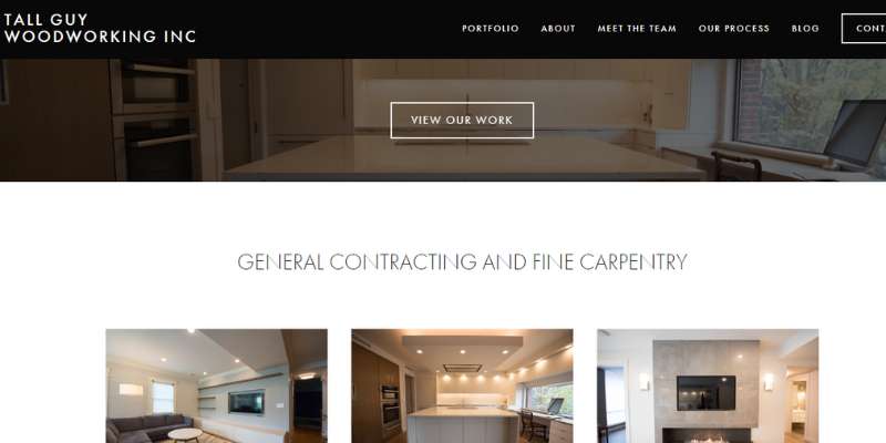
Warm color schemes and images of numerous hand-tool woodworking projects may be seen on the Tall Guy Woodworking website. A CTA button on their hero picture leads to their work portfolio.
This great site includes a polished, contemporary appearance thanks to its simple layout and basic design. The “see our work” button is located in the homepage header, while the “portfolio,” “about,” “meet the team,” “contact,” “blog,” and “our process” tabs are located in the navigation menu.
Bolt Woodworks
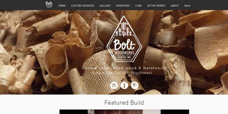
A powerful hero header featuring the company’s logo and social networking icons is included on the Bolt Woodworks website.
The brand’s emblem, fresh wood shavings and woodworking tools, and social networking connections are shown in the hero picture. The primary content section consists of a photo gallery of their hand-tool woodworking creations.
The website is simple to browse because of the organization of the primary material into sections. High-resolution images, a contact form, and fine galleries of photos are some of the essential website elements.
The “inventory,” “custom services,” “contact,” and “home” sections are available on the navigation menu.
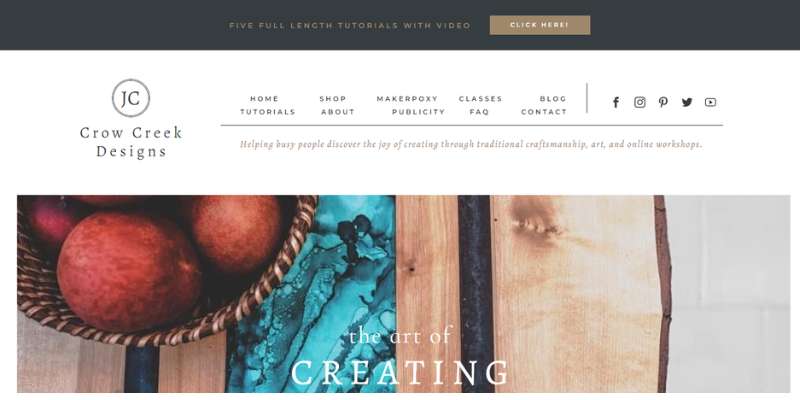
Crow Creek Designs
The owner of this outstanding website is Jess Crow. Her website exemplifies her woodworking skills and how she incorporates both carpentry and art into her fine woodworking projects.
Her website is an excellent example if you’re seeking to develop something similar since she also provides woodworking classes and woodworking education opportunities.
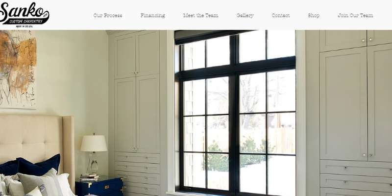
Sanko Custom Carpentry
This blog is distinctive from most woodworking blogs. The typefaces, color scheme, and logo all properly represent the company. The platform has a great look thanks to a simple style and lovely image galleries.
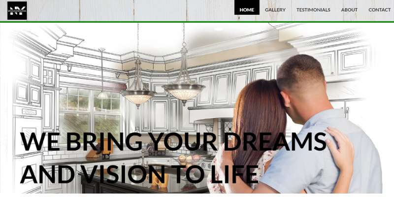
New York Woodwork
The website for New York Woodwork has a vibrant color scheme and a wealth of woodworking tools for users. The tabs for “home,” “testimonials,” “about,” and “contact” are included in the static navigation menu.
Visitors may browse a gallery to see images of earlier work, and the website has a Houzz plug-in that offers current client feedback. A useful map and contact form are on the contact page.
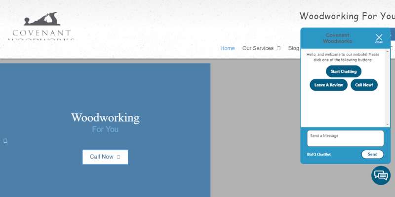
Covenant Woodworks
On the homepage of the website, there is a photo slideshow showcasing different woodworking projects. Videos, social networking icons, and a chat box are notable website elements.
Visitors to the website may read customer testimonials and tool reviews by selecting a tab from the navigation menu.
Mark Antony
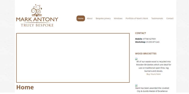
The website for Mark Antony has a sleek, contemporary style that is accentuated by a stunning parallax effect and hovers effect. Against the black backdrop, the sharp, white writing and high-quality photos stand out.
The portfolio page likewise seems clean, simple, and structured. It also welcomes the incorporation of video to showcase more of its work. Also, the squares and rows of the Instagram feed are perfectly aligned.
The off-canvas menu option gives users easy access to other important navigational sites. The entire appearance is sleek, organized, contemporary, and simple.
Ethan Abramson
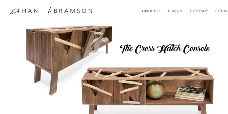
The site’s simple layout shows how Ethan’s store actively employs waste-reduction strategies that are kind to the environment. On a white backdrop, the highlighted item shines out. The essential connections are accessible via a straightforward header and footer. The owner is described in the About section, along with a photo of him.
Offerman Wood Shop
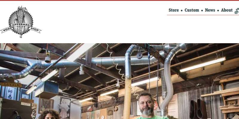
A shopping cart, cookie tracker, and newsletter subscription sign-up are available at Offerman Wood Shop. Pictures of the personnel and specially made wood goods may be seen on the website. On the homepage, visitors may access upcoming events, a FAQ section, the website’s shop, and more.
Angel City Wood Shop
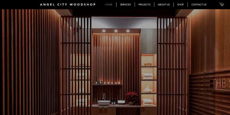
The website’s prominent logo may be seen at the top of each page. The “3D models” page of the navigation menu is one of the special site features that enables users to see 360-degree depictions of items. Consumers may browse for tables, chopping boards, and workstations on the website. The site includes a customer portal.
Boland Woodworking
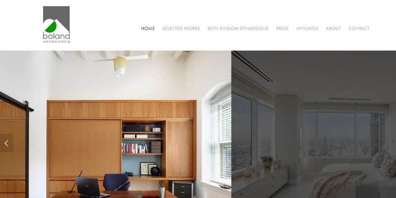
On its webpage, Boland Woodworking has an image slideshow for the header. Woodworking blogs, social media icons, and a contact form are important components. The website has a portfolio that showcases various works.
S&S Woodworking
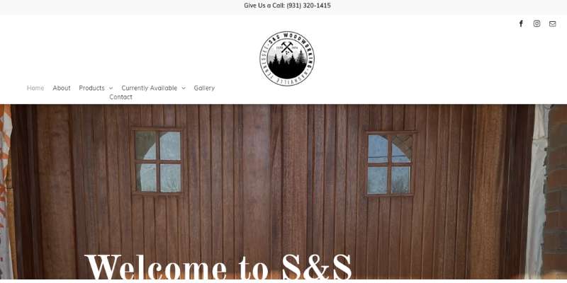
The website for S&S Woodworking offers a user-friendly interface. The company’s logo, social media icons, d a navigation menu are all included in the navigation header.
Call-to-action buttons, client reviews, an Instagram feed, a footer, and a contact form are some essential website elements. The top of the webpage has a slideshow that highlights various business ventures. The website has a valid SSL certificate.
Masterpiece Woodworks
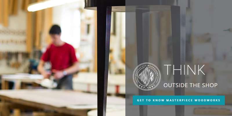
Pictures featuring abstract patterns and white space are shown on the Masterpiece Woodworks website. The site’s layout includes customer testimonials, a contact form, and call-to-action buttons. Users may get news updates about the company on the special “shop talk” page.
Robert Shaw Manufacturing
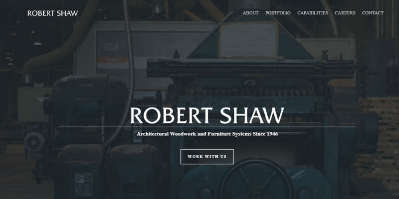
On the site, Robert Shaw Manufacturing has a big hero header with the name of the business and a call-to-action button. A fixed header, a simple layout, plenty of white space, fast links, a footer, and a contact form are important components.
The “about,” “portfolio,” “capabilities,” “careers,” and “contact” sections are included in the site’s navigation menu.
1767
The 1767 website has a chat room, high-quality images, and client endorsements. On the safe website, customers may explore the company’s online shop and make purchases.
A shopping cart, customer accounts, a footer, and social networking buttons are important elements. This website prominently displays the phrase “Always FREE delivery in the U.S.!” at the top of each page and has a current SSL security certificate.
Heights Woodworking
This website has a minimalistic style. A hamburger-style menu and the company’s history are important aspects. Beautiful images serve as both attractive backdrops and concise explanations of the company’s many services.
Dovetail Wood Arts
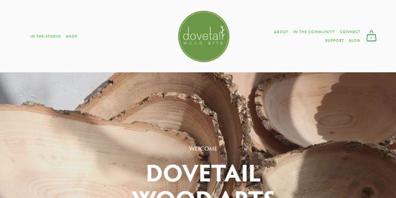
The Dovetail Wood Arts website has a simple layout and extensive, in-depth images of the business’s wood art creations. The blog, map, and subscription form for the newsletter are important website elements. The website has a lovely online store where wood art may be purchased.
Urban Homecraft
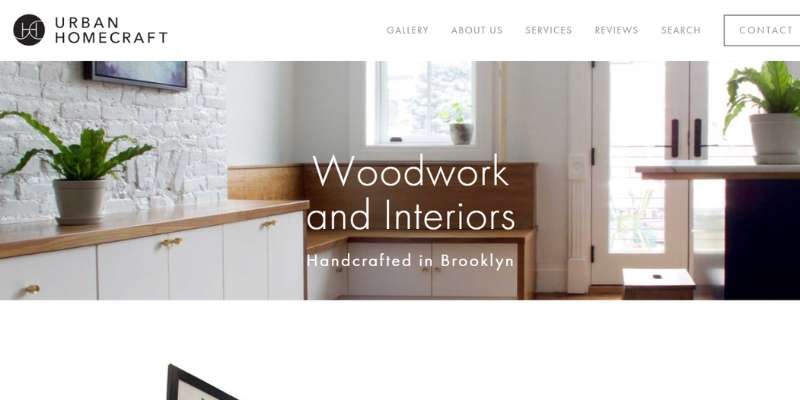
On its website, Urban Homecraft keeps things simple with plenty of images and concise pieces of text. A contact form, a call-to-action button, and social media icons are some of the key elements. The “home,” “gallery,” “services,” “price,” “FAQs,” “blog,” and “contact” sections are included in the navigation menu. The Houzz plug-in on the website also provides consumer and media evaluations.
Sam Beauford Woodshop
The website’s material is well-organized and simple in practically every aspect. The hero header has a big, understandable title, a full-width picture connected to carpentry, and a CTA with a lovely parallax effect. Additionally, it uses a grid style to display the Instagram feed.
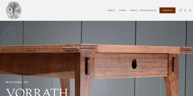
Vorrath Woodworks
Vorrath Woodworks chooses to have a simple website with high-quality images. The tabs “about,” “work,” “contact,” and “press/testimonials” are included in the navigation menu.
Users get direct access to the company’s social media sites because of the site’s clickable social media buttons. The master craftsmen’s excellent woodworking creations are shown in a magnificent photo collection.
The information is all organized and visitors can easily navigate and access it.
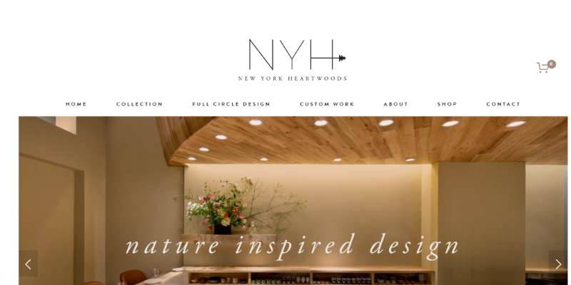
New York Heartwoods
The website for New York Heartwoods features a clean, sophisticated layout. The tabs for “home,” “collection,” “contact,” and “about” are included in the navigation menu. The website has an online shop and a helpful blog.
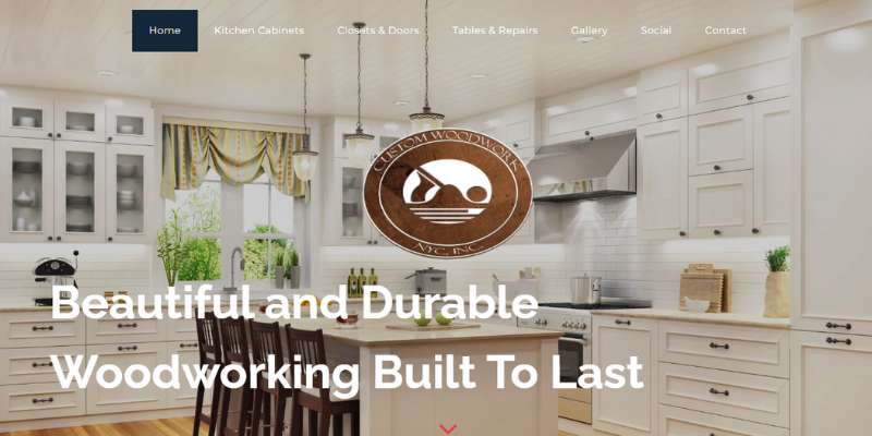
Custom Woodwork NYC
A positive user experience is provided by the website. The woodworking intricacies of each project are shown in its high-resolution images.
Call-to-action buttons, a project gallery, and a contact form are important components. To increase security, a reCAPTCHA button has been added to the website.
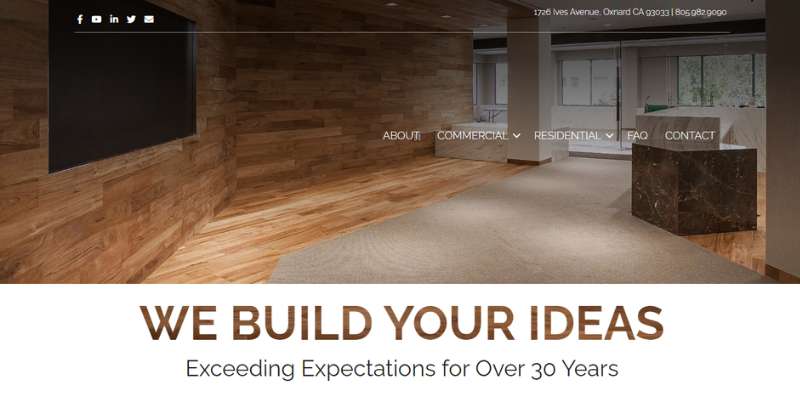
California Woodworking
The website of California Woodworking has social media icons, a ton of white space, and images of completed woodworking projects. Together with comprehensive service descriptions and USPs directly on the homepage, the website also has an instructive customer review area.
Winchester Woodworks
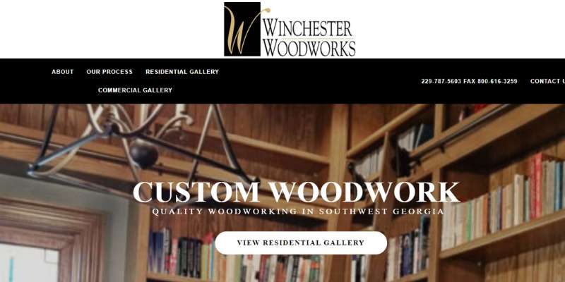
Winchester Woodworks provides detailed images of its creations. The header slideshow, call-to-action buttons, map, and footer are notable website elements. Using the website, visitors may set up a consultation.
A&P Woodworking
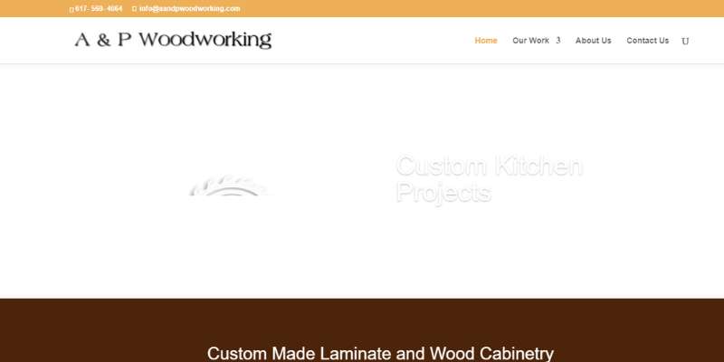
An SSL security certificate is present on this website. A search bar, a contact page, a fixed navigation menu, and call-to-action buttons are important characteristics.
Visitors to the website may quickly reach Facebook and Twitter by clicking on the social media buttons, or they can use the straightforward contact form at the bottom of the webpage.
Nesbuilt Design
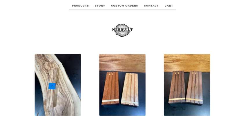
Nesbuilt Design Co., Pat Nesbitt’s website, opens with a slide presentation. Given that his woodworking expertise is immediately apparent when you visit the website, this is an intriguing interpretation of the portfolio area. He also has an intriguing part about himself.
Brooklyn Millwork
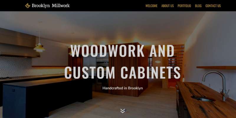
Brooklyn Millwork’s website has a simple layout. The “welcome,” “about us,” “contact us,” and “office furniture” sections are included in its static navigation menu.
Visitors may examine images of the company’s work or read the most recent entries in the woodworking blogs, both of which improve the website’s SEO.
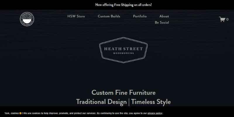
Heath Street Woodworking
Merissa Piper’s Heath Street Woodworking is a fantastic illustration of a small company website. There are multiple distinct sections where you can see her work, the color scheme is attention-getting, and the “About” section sounds like it was written by a real person.
FAQ on designing a woodworking website
What color scheme should I go with for my woodworking website?
A woodworking website’s color palette should be consistent with the brand and communicate a sense of craftsmanship and warmth. Consider using natural wood tones, earthy colors, and other complementary colors.
You can also use brighter colors to add contrast and intrigue.
How can I make my website look professional while also highlighting my woodworking skills?
Use high-quality photographs and content, make your website easy to use, and provide clear information about your woodworking services and goods to make your website look professional and highlight your woodworking expertise.
Consider employing a professional design that includes a custom logo, uniform font, and a simple layout. Provide clear contact information as well as links to social media profiles.
What are some vital aspects of a woodworking website?
A gallery exhibiting your woodworking goods, information about your woodworking process, a list of services offered, and an online store are all essential aspects of a woodworking website. A blog, customer reviews, and a FAQ area could also be valuable.
How can I make it easier for people looking for specific products or information to traverse my website?
Use clear and simple labels for each page and area, include a search bar, and make sure your menu is easily accessible and arranged to make your website easy to use.
To break up language and make the content easier to skim, use headings and subheadings. Try employing filters and sorting tools to assist visitors in finding the products or information they seek.
How can I present my woodworking items in an appealing and instructive manner?
Use high-quality photographs and videos that highlight the nuances and characteristics of each product to exhibit your woodworking items in a visually appealing and instructive manner.
To give visitors a closer look, consider using a virtual tour or 360-degree view. You might also give details on the materials used or the history of each piece.
What kind of information should I post on my woodworking website to keep people interested?
Provide useful and entertaining articles about woodworking and craftsmanship to engage visitors. Consider creating blog entries or articles about woodworking techniques, design inspiration, or project tutorials.
You may also include useful materials such as product instructions, maintenance advice, and a glossary of woodworking words.
How can I improve my website’s visibility and attract more customers by optimizing it for search engines?
Use relevant keywords in your content, including meta tags and descriptions, utilize alt text for photos, and make sure your website is mobile-friendly and loads quickly to optimize it for search engines. Try obtaining links to your website from other related websites and promoting your content through social media.
Should my woodworking website contain an online store, and if so, how should it be designed?
Customers can acquire your woodworking products more easily if you have an online store. Make the store user-friendly and simple to use, and only ask for the information needed for the transaction.
Consider including a custom order or customized product option, as well as clear information regarding payment methods and shipping policies.
How can I make my website mobile-friendly for visitors who use smartphones or tablets to view it?
Choose a responsive design that automatically adjusts to fit the screen size of the device being used to make your website mobile-friendly.
Make sure your website loads swiftly and has readable fonts and photos. Try employing larger buttons and touch-friendly features for a better mobile user experience.
What are some best practices for creating easy-to-use and effective woodworking websites?
Using a clean and consistent design, prioritizing ease of use and accessibility, providing clear and concise information about your woodworking products and services, and showcasing your craftsmanship with high-quality images and content are all best practices for designing user-friendly and effective woodworking websites.
It’s also critical to keep your website up to date with new items, content, and special offers, as well as to test its usability and performance on a number of devices and browsers.
Finally, consider incorporating consumer input and making adjustments depending on user behavior to continuously improve the effectiveness of your website.
Conclusion on these woodworking websites
Woodworking websites are a terrific place to start regardless of your objectives, whether you want to promote your vast collection of project designs, sell more items, and go full-time, or establish yourself as an industry authority in the field of woodworking and makers.
As you get closer to your objective, you may always make adjustments to it. So we give you the best woodworking websites to gain inspiration from.
If you enjoyed reading this article about woodworking websites, you should read these as well:
- Digital Marketing Scams to Look Out For
- Top SEO Benefits of Building a Responsive Website
- Why Your Design Agency Should Consider Invoice Finance
The post Top-notch woodworking websites to inspire you appeared first on Design Your Way.
Source: https://ift.tt/S2IYkuA


No comments:
Post a Comment