I’ve been thinking a lot about the Louis Vuitton font lately. Trust me, it’s lit!
Check this out:
🕰️ It’s timeless, you know?
💅 It’s got that elegance and class we all crave
🤔 But hey, what about the alternatives?
That’s right, my friends! Today, we’re diving into an article called “The Timeless Louis Vuitton Font And Its Alternatives.” We’re gonna explore this iconic font and some cool alternatives that you can use for your own projects.
So, are you ready to embark on this stylish typographic journey with me? Let’s get going and unleash our inner designer! 🚀🎨
The French luxury fashion house and business Louis Vuitton Malletier, also known as Louis Vuitton, was established in 1854.
The majority of the brand’s goods, including ready-to-wear, shoes, watches, jewelry, accessories, sunglasses, and books, bear the LV monogram.
One of the top international fashion houses is Louis Vuitton. It offers its goods for sale online, through lease sections at upscale department stores, and through independent shops.
The Famous Louis Vuitton Logo
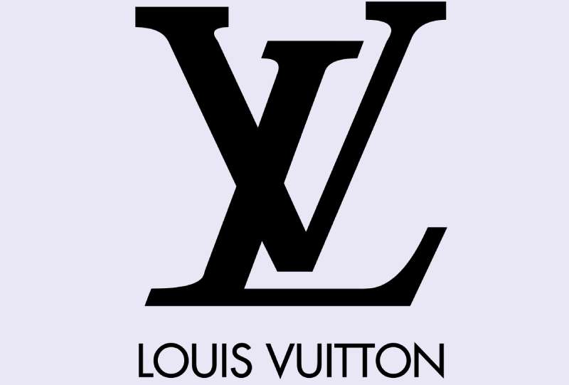
The LV monogram is the primary visual element of the official Louis Vuitton logo. It is an italicized, serif, capitalized L that is positioned slightly to the left and at the bottom of a capitalized V that represents the company’s founder’s initials.
The name “Louis Vuitton” was also written below the logo. The fonts have always been black on a white backdrop, though they have experimented with other colors in recent years, most notably the brown monogram. The hand-drawn typeface, which is reported to have been somewhat inspired by roman fonts, has remained the same.
Louis Vuitton Date Code
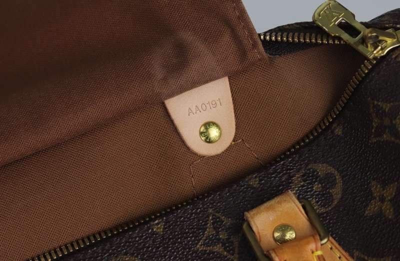
Today’s Louis Vuitton products all carry date codes. Louis Vuitton handbags don’t have serial numbers; rather, they have “date codes” stamped on inside tags, directly on interior linings, or in a secret position on the bag’s exterior. These date codes are used to pinpoint a Louis Vuitton handbag’s manufacturing date and location, not to confirm its authenticity.
Letters and digits are used to create Louis Vuitton date codes. The numbers represent the month and year of the production date, while the letters identify the nation in which the product was manufactured. Please take note that pre-1980 Louis Vuitton products do not carry date codes, and on some older materials, the date codes may have faded.
About the Louis Vuitton Font

The custom “LV” monogram is composed of weighted thin strokes and big, chunky serifs. The Georgia typeface gives it a powerful and strong appearance. The ‘Louis Vuitton’ wordmark and text are written in Futura, which creates a pleasing aesthetic harmony by offsetting the two types. On their website, Georgia is also used for text, with Austin Roman and LV Clemence employed occasionally producing a rather confusing typographical hierarchy.
Paul Renner created the geometric sans-serif typeface Futura, which was published in 1927. As a contribution to the New Frankfurt project, it was created. It is inspired by the Bauhaus design movement of the time and is based on geometric shapes, particularly the circle.
Louis Vuitton Date Code Fonts
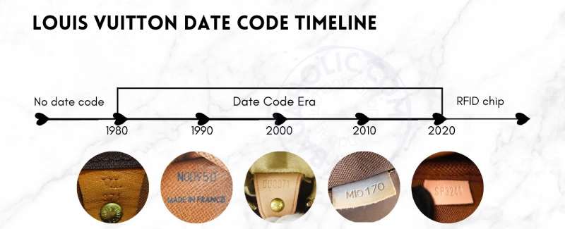
Throughout the years, Louis Vuitton has employed a number of fonts for date codes to indicate the location/manufacture date and to deceive counterfeiters. Depending on the year and manufacturer location, date codes use either serif or sans serif fonts (for example, different Speedy bags have both serif and sans serif date codes).
Font Pairing With Louis Vuitton Font
Ford antenna Font With Louis Vuitton Font

Use the ford antenna font in combination with this warm font family if you want to grab the audience’s attention.
Alternatives Of Louis Vuitton Font
Cochin Font
The serif font family includes the Cochin typeface. It is a serif typeface in transition. Georges Peignot created the font in 1912, shared it, and Linotype published it in 1914.
He made this font for the G. Peignot et Fils foundry in Paris. It stands apart from other fonts on the market thanks to its OpenType and TrueType features, numerous stylistic alternates, texture ligatures, swashes, and glimpses. Italic, bold, roman, and bold italic are among the font’s italic, bold, and roman weights. Some of the characters have minor x-height slopes.
Glamor Font
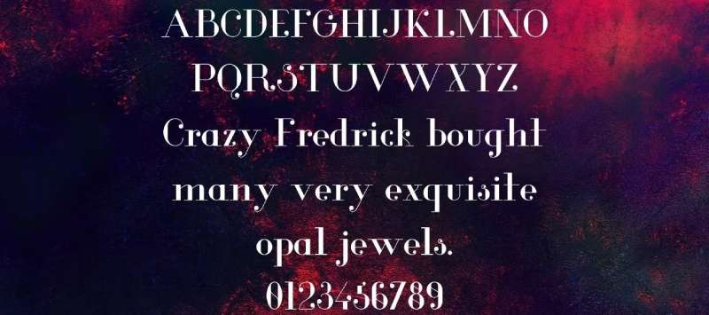
This font has a lovely calligraphy typeface and a very appealing appearance. This family was designed by Supersemar Letters. This amazing font only comprises uppercase letters, numbers, and punctuation. It has a wide range of letters. The glyphs and styles in this family include regular, light, bold, italic, and others. It is appropriate for formal design tasks like certificates, letterheads, and business cards. This fantastic typeface is intended for large projects such as vehicle wraps, emblems, and much more. It can be utilized for individual tasks.
Hernik Sans Serif Font
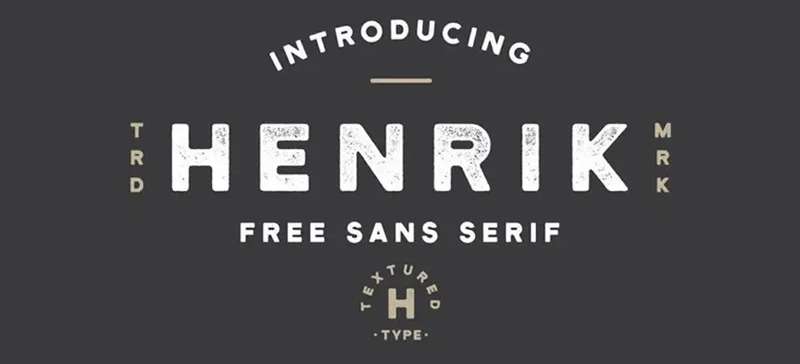
Henrik Font is a straightforward sans serif typeface with a respectable, crisp texture. It has made with the partnership of Hustle Supply Co. and Font Forestry. Henrik Font is only available in one regular style using Opentype and WOFF files. Also, this single style supports a huge number of languages and up to 150 characters. To get the retro look, each letter was carefully constructed with a very adaptable and beautiful texture. This amazing font is hence the finest choice for very stylish antique designs.
NeoplantaBG Font

Neoplanta BG is the perfect font for all your amusing designs. The Regular font subfamily is used. The font is free for personal use and was created by Stjepan Fileki. You may build intriguing designs, covers, shop and store names, and logos using Neoplanta BG. Equally ideal for branding initiatives, home furnishings designs, product packaging, or just as a chic text overlay on any backdrop image, the Neoplanta BG font is available for purchase.
Sharp Sans Font
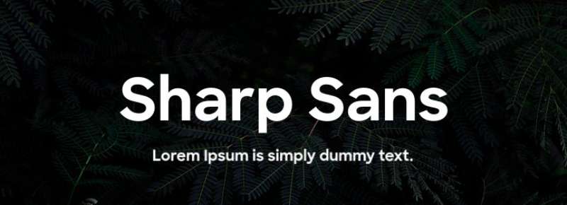
By Lucas Sharp and distributed by Sharp Type, Sharp Sans is a geometric sans-serif typeface. The family’s initial iterations date back to 2009. The previous versions, which include recognizable real italics, were dubbed Sharp Sans Display No.1 and Sharp Sans Display No.2, and an entirely redrawn update was released in 2016. Sharp Sans Display No.1 gained notoriety for serving as the campaign’s primary typeface for Hillary Clinton in 2016.
Trueno Font
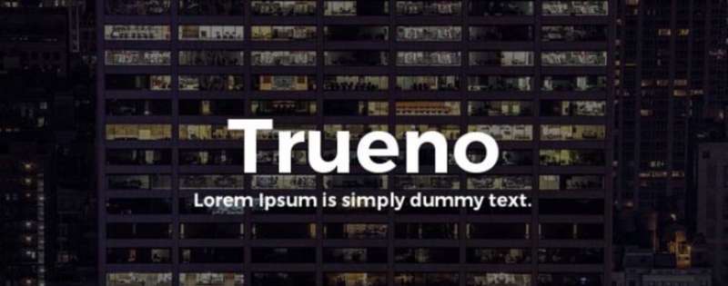
In the marketplaces for type design, Trueno Font is a sizable and astounding font family. For the first time since 2014, it was designed and released by Mr. Julieta Ulanovsky, an Argentine font designer. The typeface distinguishes stroke with its tidy appearance, clear lines, and sturdy construction. Along similar lines, many designers are currently using that amazing typeface in their work.
Alternatives to the Louis Vuitton Font include:
Use Of Louis Vuitton Font
This elegant typeface is employed for a variety of intriguing uses. This lovely typeface can be used for a variety of tasks, including branding, logo creation, fashion magazines, quotations, and other imaginative designs.
This typeface is also appropriate for designing home goods.
This family is utilized by many graphic designers for many projects including business cards, websites, templates, blogs, and other locations.
You may also use this font family for thumbnails and video channels. For many confidential duties, such as signatures, it works well.
FAQs on the Louis Vuitton font
What is the name of the Louis Vuitton font?
Louis Vuitton’s signature font is referred to as “LV Monogram.” It’s a special font developed for the Louis Vuitton label.
Is the Louis Vuitton font unique to the brand?
To answer your question, the LV Monogram font is exclusive to Louis Vuitton. It was designed for Louis Vuitton exclusive and is featured solely in the company’s wares and advertising.
What type of font is used for the Louis Vuitton logo?
The LV initials are incorporated into a stylized pattern in the Louis Vuitton monogram. The LV Monogram typeface, a sans-serif with clean lines and a modern style, is frequently used in conjunction with the monogram.
Can I use the Louis Vuitton font for my own projects?
No, the Louis Vuitton typeface is legally protected as the property of Louis Vuitton and cannot be used without permission. Without Louis Vuitton’s express written consent, its use is strictly prohibited for both non-commercial and profit purposes.
Is the Louis Vuitton font available for download?
Since it is the company’s intellectual property, the Louis Vuitton font is unfortunately not freely downloadable. The font is protected and is only available to approved users within the Louis Vuitton organization.
What is the history of the Louis Vuitton font?
Georges Vuitton, Louis’s son, created the first version of the Louis Vuitton typeface in the late 19th century. The font has become instantly recognizable as belonging to Louis Vuitton, having been designed specifically for use on the label’s trademark trunks and luggage.
What is the significance of the Louis Vuitton font in the fashion industry?
Louis Vuitton’s signature typeface is readily recognizable all over the world thanks to its prominent role in the brand’s visual identity. Its modern aesthetic and minimalist design evokes feelings of opulence and refinement, making it an influential emblem in the fashion world.
How can I create a similar font to the Louis Vuitton font?
Because of copyright restrictions, it’s not a good idea to try and recreate the Louis Vuitton typeface. But if you want to make a typeface just for your company, there are plenty of resources online to help you out.
What other brands use a similar font to Louis Vuitton?
Chanel, Gucci, and Prada are just a few of the other high-end labels that employ fonts that are visually comparable to those used by Louis Vuitton. But, in order to stand apart from the crowd, every label puts its own spin on the look.
How can I identify a counterfeit Louis Vuitton product by its font?
You can tell a fake Louis Vuitton product by its font by inspecting it for irregularities in letter size, letter spacing, and spelling. Also, fake Louis Vuitton goods may not employ the LV Monogram font or use a poor imitation of it. To avoid counterfeits, only buy Louis Vuitton items from official stockists.
Ending thoughts on the Louis Vuitton font
Even though the logo has retained the same monogram since it was first created, it has grown to become one of the most recognizable images in the world of high-end luxury clothing. Louis Vuitton has become one of the top brands in fashion design because of its famous emblem, as well as effective marketing and brand recognition.
Yet the aesthetic appearance is created by the way the letters are put together. For starters, the letters themselves have serifs (the term for those tiny “tags” that give letters a more official appearance). Serifs are a common trend among fashion logos to make brands appear more sophisticated.
As you can see, there are various approaches to developing a premium logo. When choosing a certain design element, think about the message you want your logo to portray. To ensure that your final logo appeals to your target audience, keep your brand statement at the forefront of the design.
If you enjoyed reading this article about the Louis Vuitton font, you should read these as well:
- What font does Gucci use? Check it out
- What font does Chanel use for its logo and promo materials?
- What font does Nike use? The Nike font question Answered
The post The Timeless Louis Vuitton Font And Its Alternatives appeared first on Design Your Way.
Source: https://ift.tt/EJiVBPA

No comments:
Post a Comment