Creating websites on Editor X is relatively easy, thanks to its simple design features and the amount of hand-holding it provides. There are ready-to-deploy templates available for almost all types of businesses. If you want to take your website to another level in terms of its visual appeal and functionality, then you need to dive deeper and make the most of the various features of the Editor X website builder.
This post gives you 15 practical design tips and hacks that can help you create amazing websites using Editor X. These design tips are not rocket science, nor do they require additional coding knowledge. Rather they highlight various handy Editor X features that are not very well known or not available with other website builders.
Give them a try in the staging environment and learn how to use them on your website design projects. Remember, EditorX provides you with a vast knowledge base via Academy X, Community X, design classes, webinars and the WiX Help Center.
1. Use Professionally Designed Templates
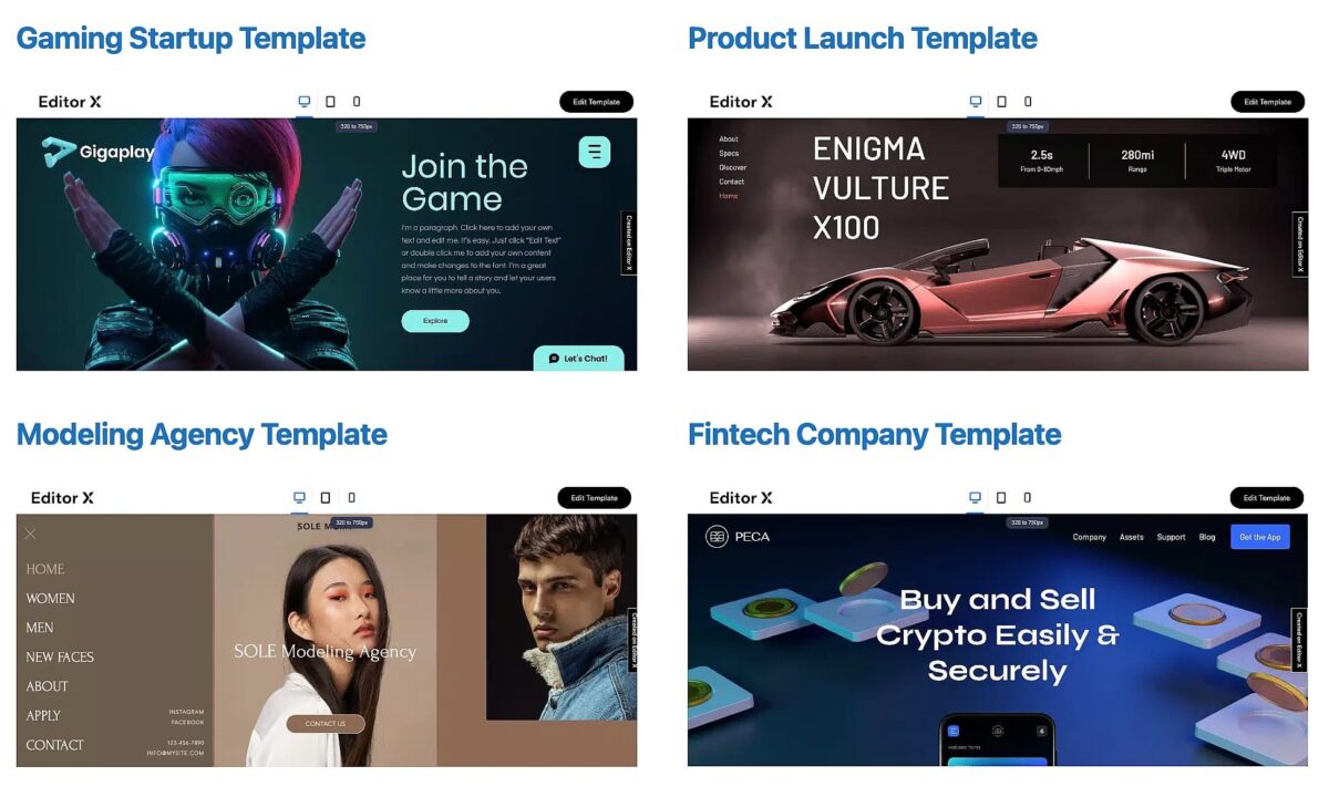
The visually stunning templates provided by Editor X are what help them beat all its competitors. Editor X has website templates for all types of businesses and needs, and they come with all the needed basic functionalities.
So we recommend you first browse through all the templates and choose one rather than building a website from scratch, as it would need too much effort and time.
You can first list the functionalities you need for your project and then check which template offers them best. Always give priority to functionalities, as visual appearances you can easily modify.
There are tons of elements in its design library, like sliders, lists, image or video boxes, and more that you can deploy or alter in the theme of your selection.
2. Utilize Custom Breakpoints
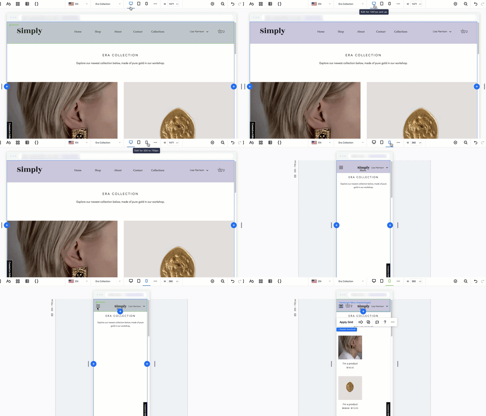
Mobile compatibility is an essential aspect of website designing and plays an important role in search engine optimization. Websites with better user experience on mobile devices tend to score better in search engine result pages. Editor X allows you to design your website based on breakpoints.
Each device works on a different set of breakpoints, and controlling how your website will look for each breakpoint is a huge plus that Editor X provides. This way, you can see different designs for desktop and laptop versions and mobile devices like tabs and phones.
In addition, by controlling the pixel-perfect placement of each of your website content, be it text or media, you can offer a better user experience.
3. Extended Click & Extended Hover Interactions
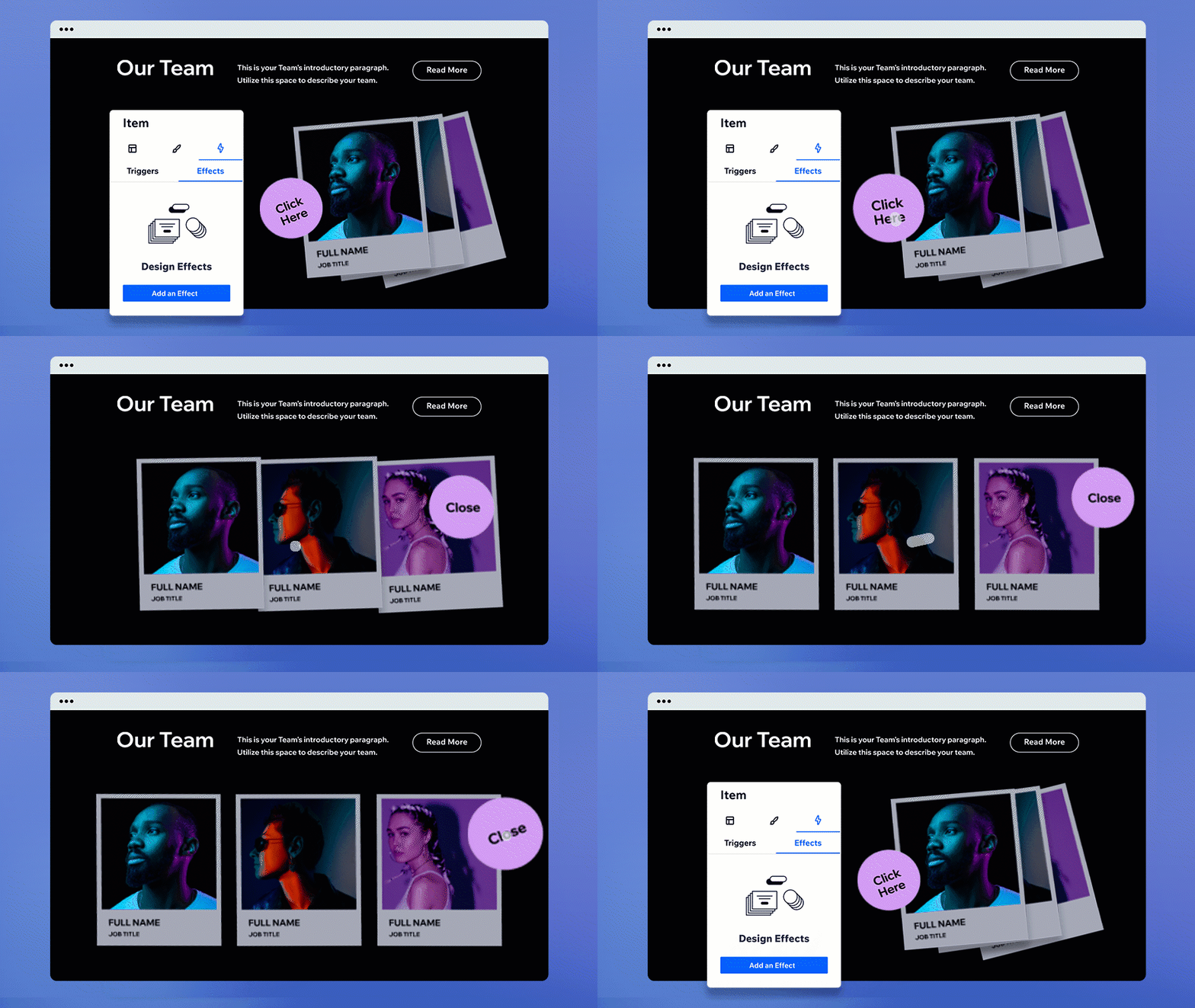
One of the latest design updates in Editor X is the ability to provide a click and hover interactions. Click interactions mean you can trigger an action whenever the user clicks on an element or taps it for touchscreen devices. This action can display more information or open up a form or anything suited to your sales funnel.
You can apply the same even for hover and even set interactions between elements or containers for hover movement. E.g., you can change the product image or push the information box out of it whenever the user puts the cursor on the product. You can set such movements keeping in mind the breakpoint controls to ensure better compatibility.
4. Adding Video Masks
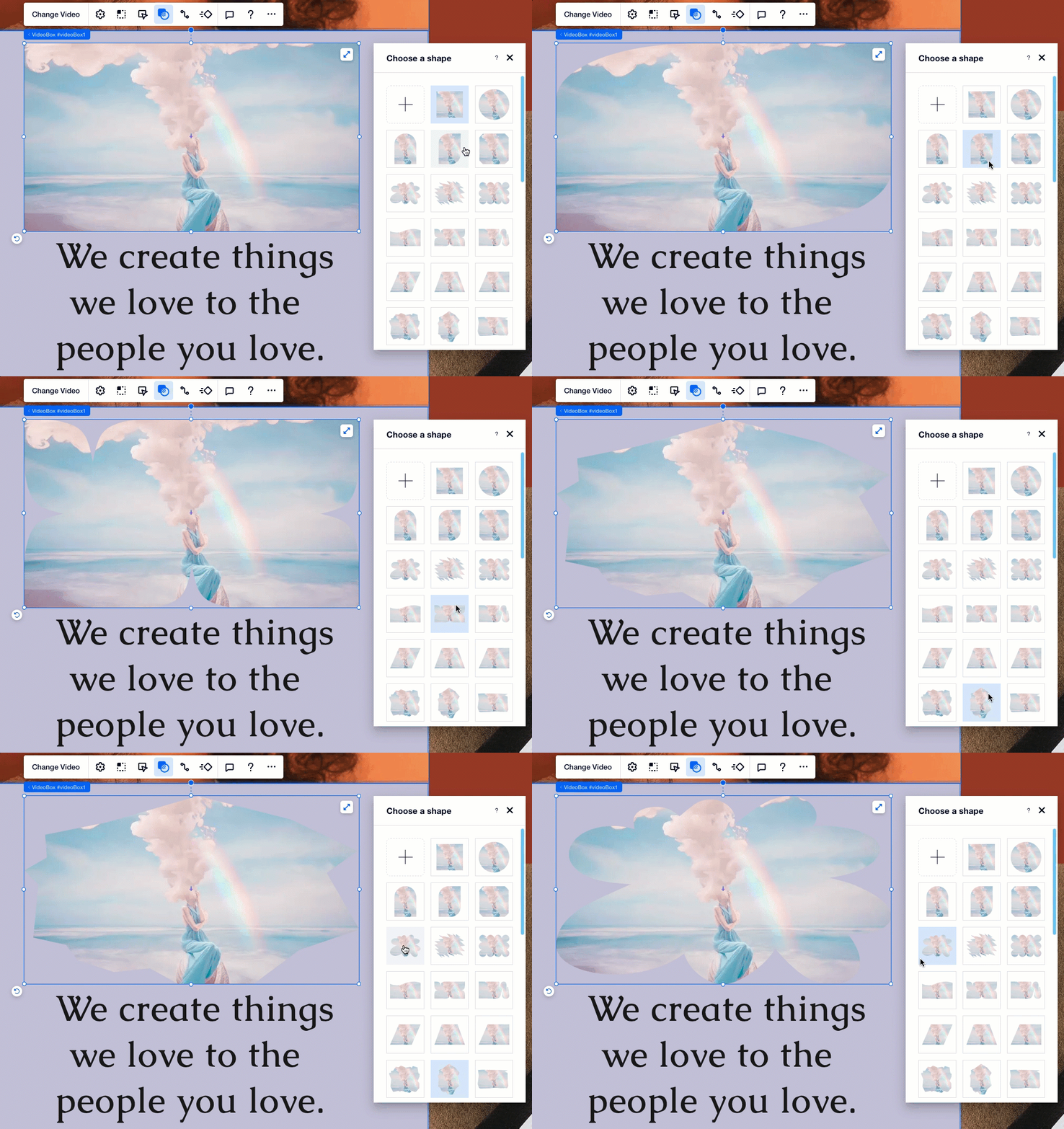
Even small visual design elements can help in building up an aesthetic website. One such design element is video masking. This feature allows you to set up a variety of shapes or images in your videos to make them stand out. You can select from over 6000 shapes, and illustrations offered by Editor X or even upload your files in SVG format.
Applying this design feature is also really easy. First, you must set up your video and then click on it. On the top options, there will be an overlay icon consisting of a circle over a rectangle. Click on that, and various options will open up to let you select a shape or even upload your image. A simple video mask can change the appearance of your website.
5. Smart Docking
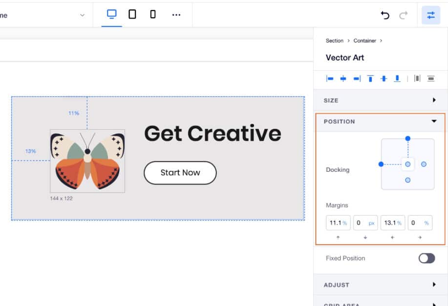
Editor X lets you very smartly control your design element’s position for each viewport size through its automatic docking system. Whenever you drag an element into an existing container, it will, by default, dock to the closest edges. This eliminates the work you need to make it stay in its exact position.
You can always override this by going to the inspector panel and setting the position manually. Editor X also allows you to set margins in either pixel or %. These margins can give you better control over the element’s position and distance from other elements, making the overall design more comfortable and precise.
6. Copy Formatting
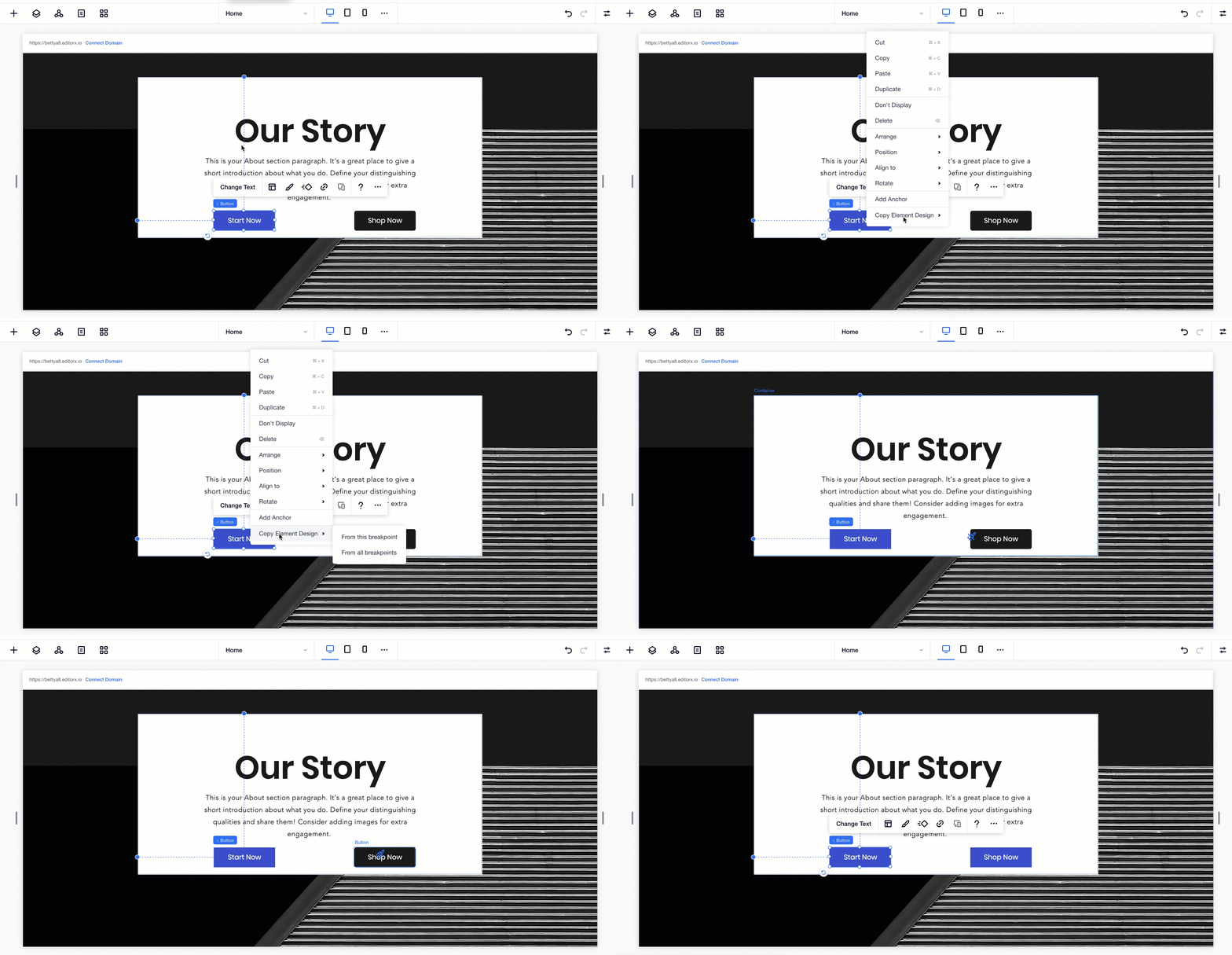
When designing a website, there will be a lot of times that you would have to copy designing attributes from one element to another. This will help you match the visual look, effects, and positioning. Sadly most online website builders do not allow you to copy-paste formatting.
The good news is that Editor X is an exception! It allows you to copy design attributes from a particular element and apply them to another element. This saves a lot of time and energy and also ensures consistency. Editor X also gives options for copying formatting across breakpoints.
7. Custom Font Upload
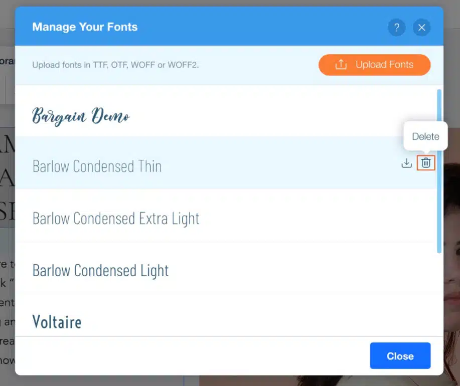
Editor X allows you to upload your custom font for the website. This is a big plus for brands that are very particular about their style guide. They want to showcase all their content in a particular font, which can be achieved through this feature of Editor X.
The uploading process is very simple. First, you need to select a text element and click the fonts drop-down menu, allowing you to upload your font. Once uploaded, you can apply them throughout the design. Editor X also lets you add language fonts which can help you display content in regional languages.
8. Styled Horizontal Menus
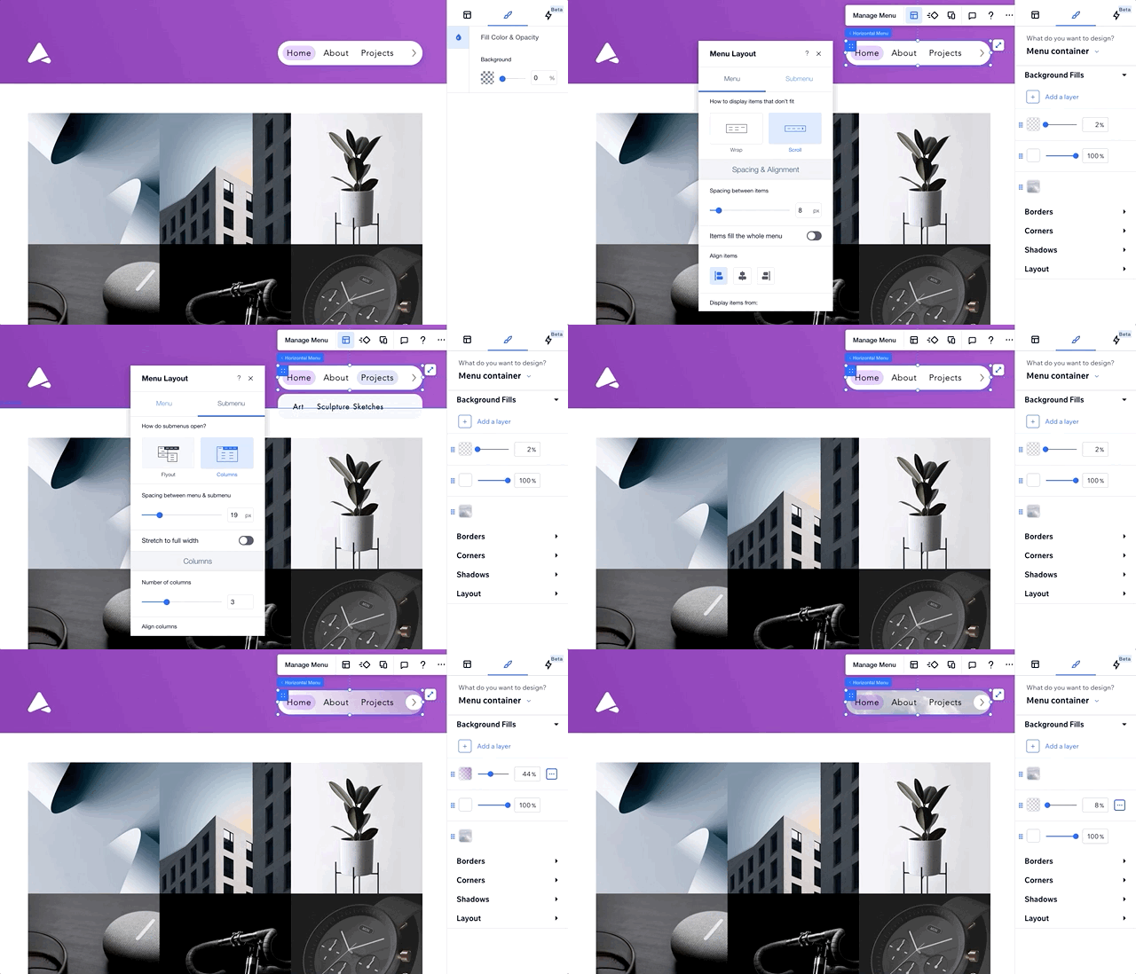
Horizontal menus will always be in fashion as they let you cover more information in a well-designed manner. Editor X offers a wide range of options for setting up a horizontal menu. You can generate layers of sub-menus as per need and style each section in a customized manner.
Taking menu design one step forward, Editor X also lets you apply background colors in the forms of gradients and even images, alter border styles, and a lot more. The process is simple. You need to go to the Menu option in the panel, select Styled Horizontal Menus, and then play around with options to get stunning results.
9. Lottie Animations
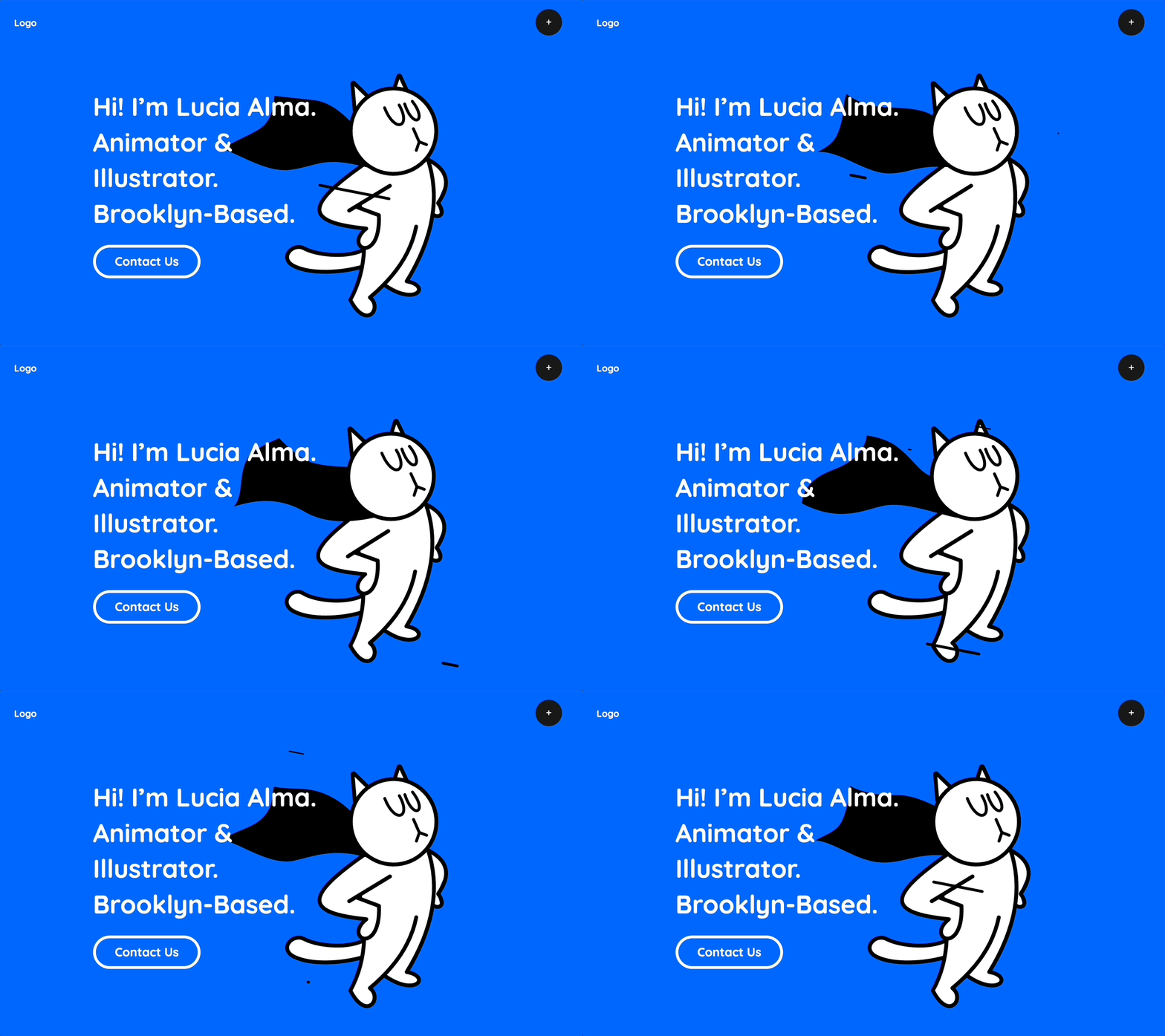
Editor X has integrated Lottie Animations with its designer. When building the website, there will be a Lottie Animations Widget available. You can add vector-based animations to your website based on your design. These animations are very small in size and load quickly. They also resize themselves based on the viewport size.
If you plan to use such animations extensively, we recommend having an account on the Lottiefiles website and linking it to your project. This will give you access to your animation library directly from the widget.
10. Use The Currency Converter
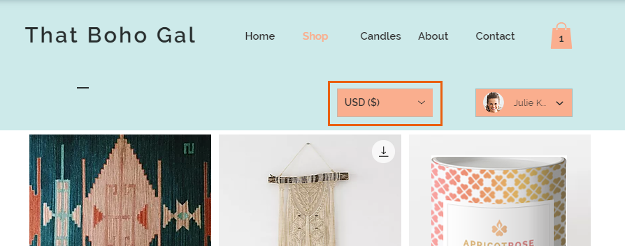
Often, designers ignore certain basic development issues in online stores, such as currency converters. A quick currency convertor on your store’s page is a big plus, especially when selling globally. Users would want to know the price in their regional currency, and this will allow ease in decision-making.
Editor X offers a widget in its Stores that allows developers to set the currency display for the users. The user can also toggle it to the currency of their choice. Do note that the convertor only changes the display of the price but will not affect the final payment currency.
11. Gradients in Section Background
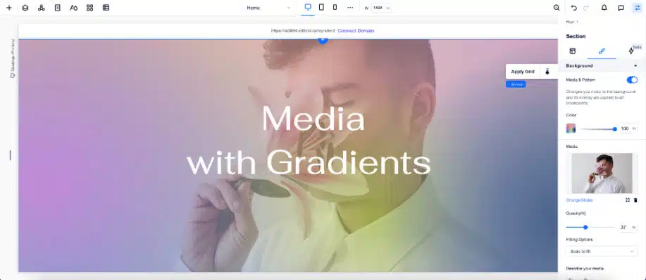
One of the rising design trends is the extensive use of gradients. Vibrant or well-designed gradients can completely change the look of your website. Editor X now allows various design options for adding gradients in section backgrounds. You can add up to eight colors to create a gradient and control its angle and focal point.
Editor X also allows you to create patterns with unlimited color spots. On top of all this, you can also apply a gradient background to your videos and images. Users can save their customized gradients in the design library and use them again in other website designs.
12. Multi-State Boxes
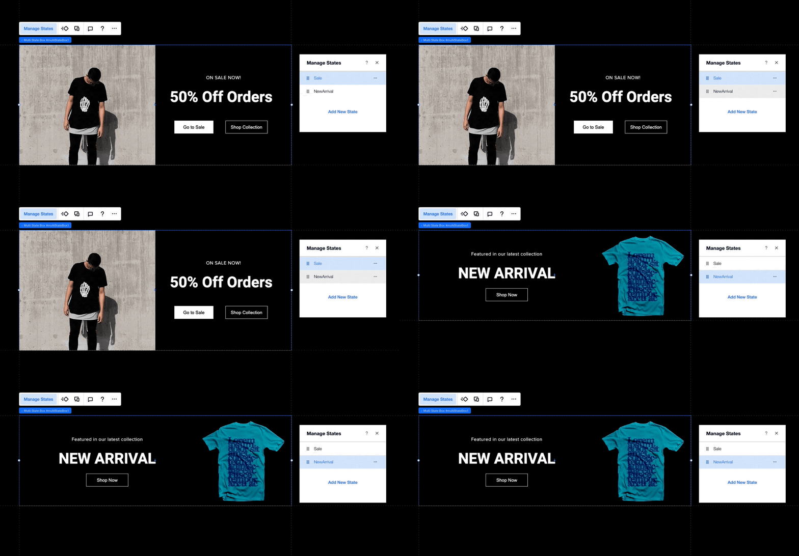
The use of Multi-State Boxes can make your website really smart. Multi-State Boxes or MSBs in Editor X allow different content to be displayed based on certain states or conditions. For example, if you want a certain product to be shown as out of stock, then you can use MSBs to display that easily.
You can go to the Layout Tools in the designing panel and select Multi-State Boxes. Customizing them can be tricky, but with a bit of practice, you will surely master them. You can use MSBs to display product galleries, FAQs, wizards, services, and other content.
13. Scroll Snap Effect
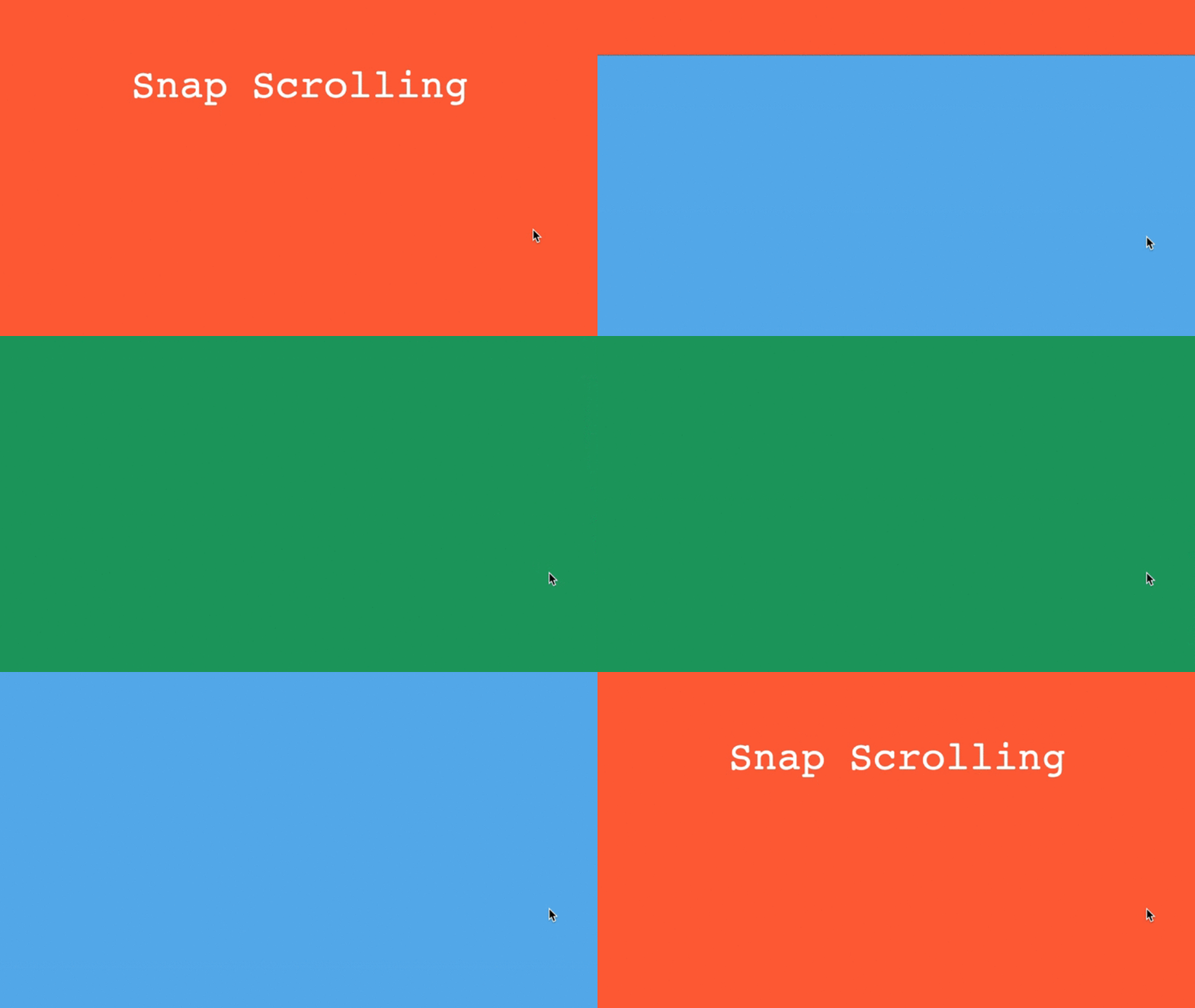
A lot of stylish animations and transitions on the website are controlled by CSS. Scroll Snap effect is one such feature that can let you display the content in the form of cards or simple slide presentations. Technically, this scrolling effect locks the viewport to display certain elements and only opens up a new set after replacing the previous set.
Editor X allows you to set up of Scroll snap effect very easily. You need to set the contents and then tweak the Display Type to the slider, and the active scroll snap aligns with center positioning. In addition, there are advanced options to further control this scrolling and make your website look impressive.
14. Concurrent Editing
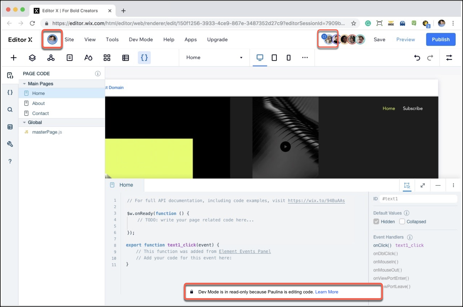
Did you know that Editor X allows collaboration service free of cost with all its website builder plans? Other premium website builders charge additional for this service. This means you can work in a team and assign workflow within Editor X when working on website design projects.
An important part of this collaboration feature set is concurrent editing. This way, your entire team can work together on a website design, and Editor X will cater to all of them. Such an amazing feature can be very helpful for troubleshooting or even brainstorming for a particular section design—a superb feature to enhance your design speed and quality.
15. Design Libraries
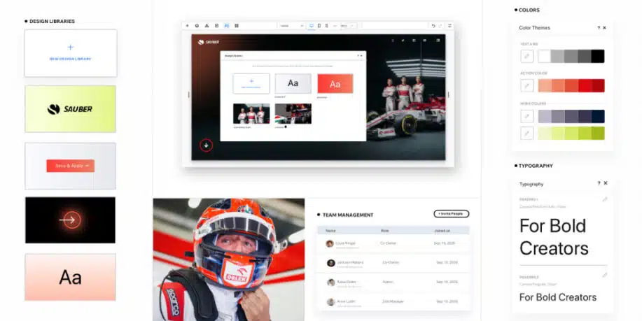
Another important feature Editor X offers for collaboration is sharing the design library. Editor X has thousands of shapes, vector illustrations, and other design elements. You have the feature of shortlisting them and creating your custom design library. You can also add your brand elements like logos, fonts, shapes, elements, and images to this library.
All the users from your team can access this library; hence, they can quickly pick up elements from it and use them for design. Furthermore, editor X offers you the option of keeping your design library private or public and lets you set a permission system for better asset control.
Final Thoughts
In summary, the Editor X list of amazing features extensively long, however, we wanted to highlight features unique only to Editor X for web design and development.
Some of the design features mentioned above are easy to execute and can make your website look visually stunning. At the same time, certain development features, like the scroll snap effect, docking, collaboration, formatting copy-paste, and more, are hacks that can help you save a lot of time and effort in website building. We suggest you also look at Academy X and its resourceful content to learn more Editor X design tips.
The post Editor X Design Tips for Building Amazing Websites appeared first on WebDesignDev.
Editor X Design Tips for Building Amazing Websites was first posted on March 8, 2023 at 4:26 pm.
©2022 "WebDesignDev". Use of this feed is for personal non-commercial use only. If you are not reading this article in your feed reader, then the site is guilty of copyright infringement. Please contact me at jc@ventureupwards.com
via https://ift.tt/omxh0Nj

No comments:
Post a Comment