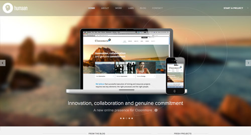
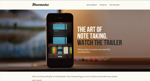
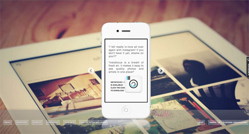
Along with large background photos in general, blurred background images are becoming increasingly popular in web design. The addition of the blur not only creates a cool effect, it also puts focus on the main content, avoiding any legibility problems than can occur when text is overlaid over a detailed image. This post rounds up a collection of great looking website designs all sporting a blurry background.
HappyTables
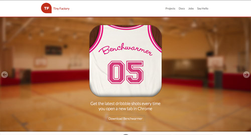
Tiny Factory
Do
IdeaKites
Space Box
Flock
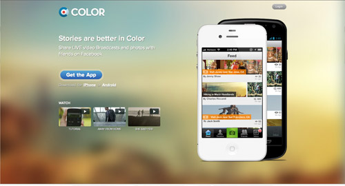
Color
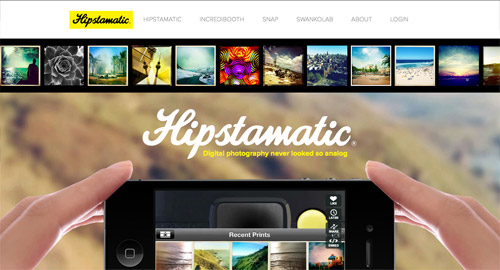
Hipstamatic
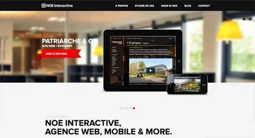
NOE Interactive
GatherContent
Humaan
Cage
Square
Meernotes
instafocus
Source: http://line25.com/articles/web-design-trend-showcase-blurred-backgrounds









No comments:
Post a Comment