One layout trend I’m sure we’ve all noticed recently is the use of full screen horizontal stripes. These horizontal sections are often identified with differing background colours or photos and span the whole screen to create a striping effect as the user scrolls down the page. This post showcases 30 great examples of websites utilizing these horizontal stripes and shows how this layout helps split up the page into clear sections while making use of all the available screen space across all resolutions.
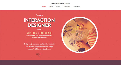
Janko At Warp Speed
Theme Trust
HR Software
Designed To Move
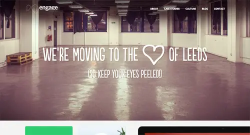
Engage Interactive
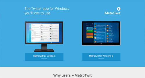
MetroTwit
Fhoke
Hanno
eighty3creative
Lorenzo Verzini
Milk & Pixels
By Association Only
Squarespace
Playground Inc.
SEED SPOT
Cileos
Karma
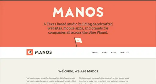
Manos
Always Creative
GRAND
Hook.js
Work by Mark
BrightByte Studio
Kiawah Island Real Estate
Alan Horne
Hum Creative
Theory
Substrakt
Source: http://line25.com/articles/30-websites-featuring-a-horizontal-stripe-layout





















No comments:
Post a Comment