Photography website design, as in websites which are made for photographers or with the main subject being photography, has a few standard ideas around which everything floats.
First of all, the photos must be in the center of attention and not the design. It’s the general idea that content is more important than the design of the site. This is why most of the photography websites are made of a menu and huge photo backgrounds or thumbnails to showcase the work of a certain photographer.
You rarely see text in a photographer’s website unless he wants to be poetic about his pictures. Other than that, most of the photography enthusiasts know that a picture is worth a thousand words and let the pictures speak for themselves.
In this article you will see designs based on WordPress. I know that most photographers opt for a Flash based website, but that’s really annoying to some clients.
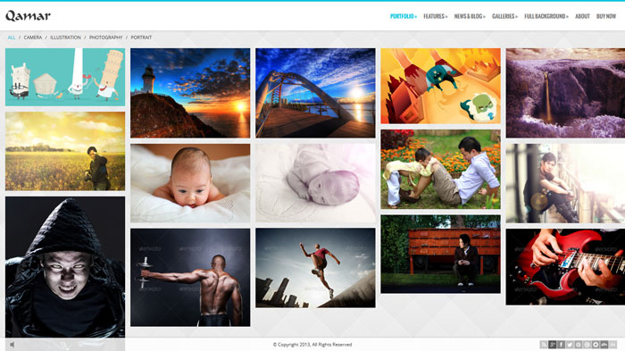
Qamar
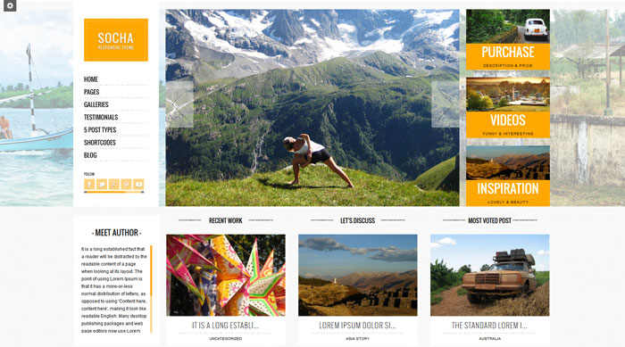
Socha
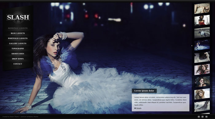
Slash
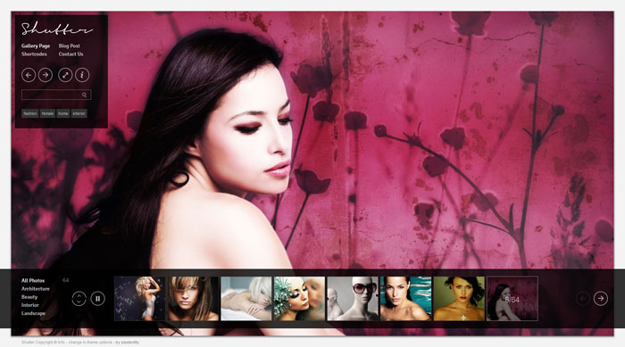
Shutter
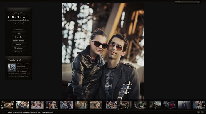
Chocolate
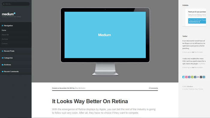
Medium
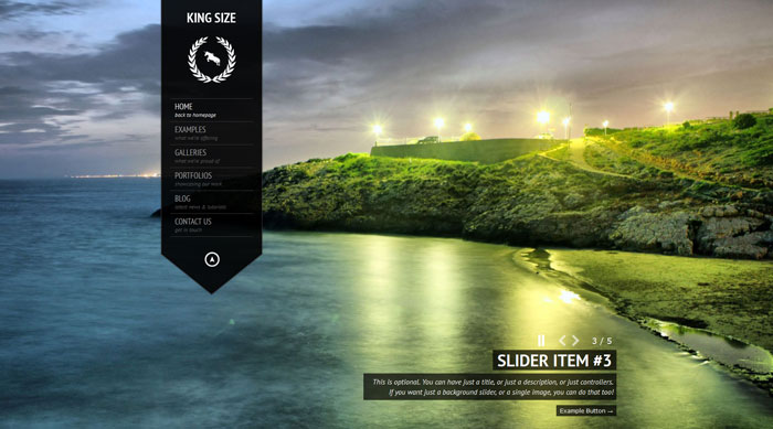
Kingsize
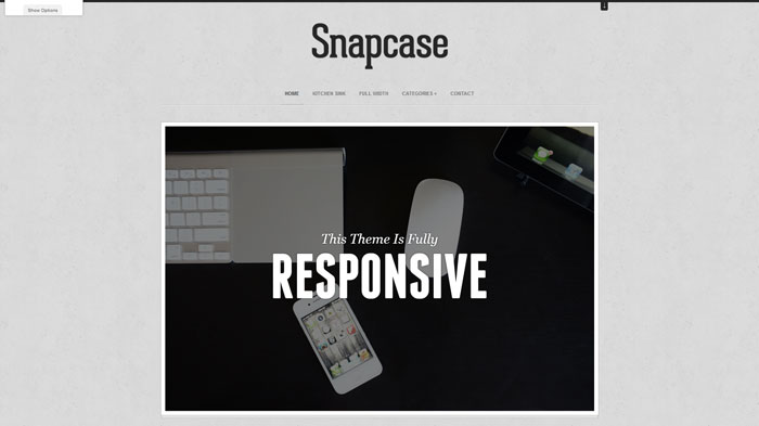
Snapcase
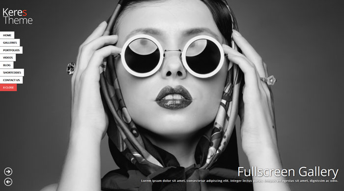
Keres
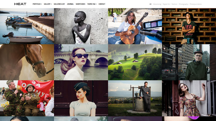
Heat
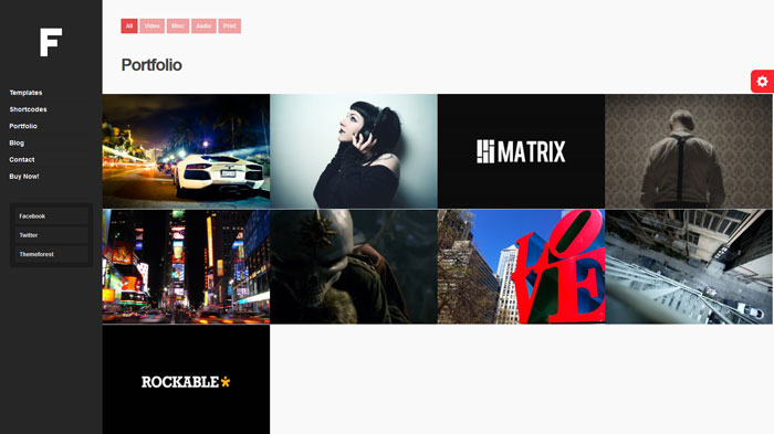
Franklyn
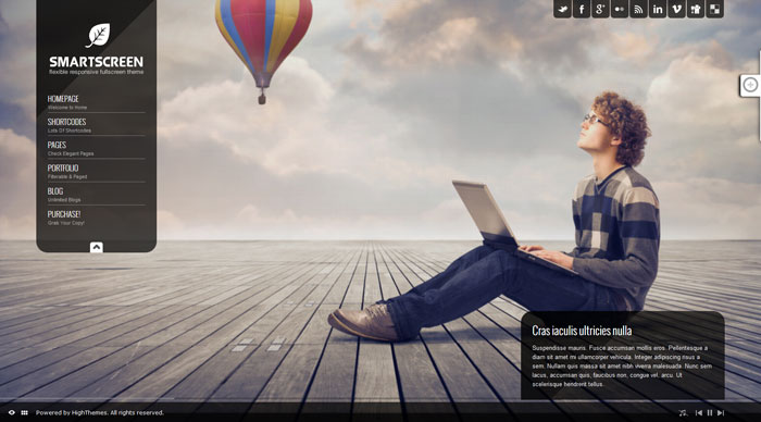
Smartscreen
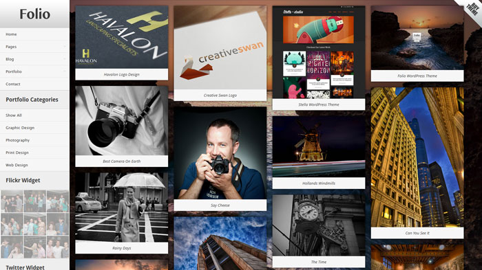
Folio
Photojax
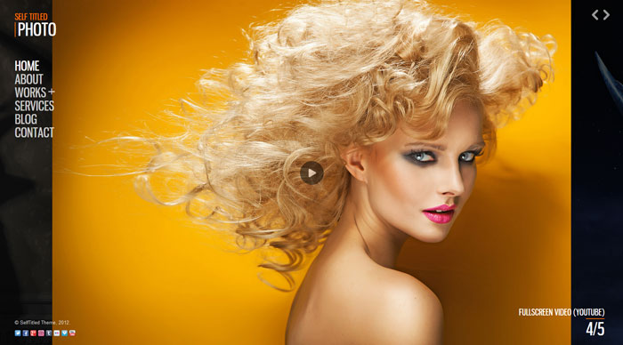
Selftitled
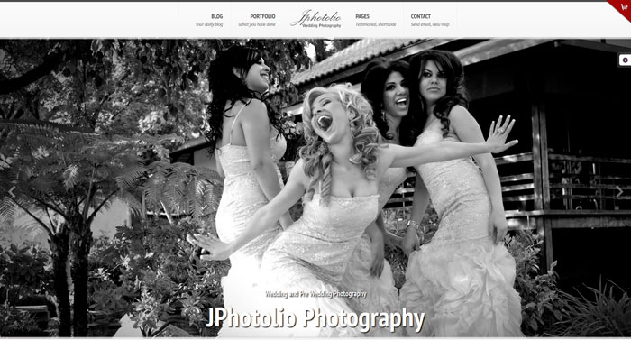
Jphotolio
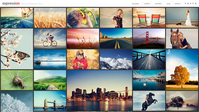
Expression
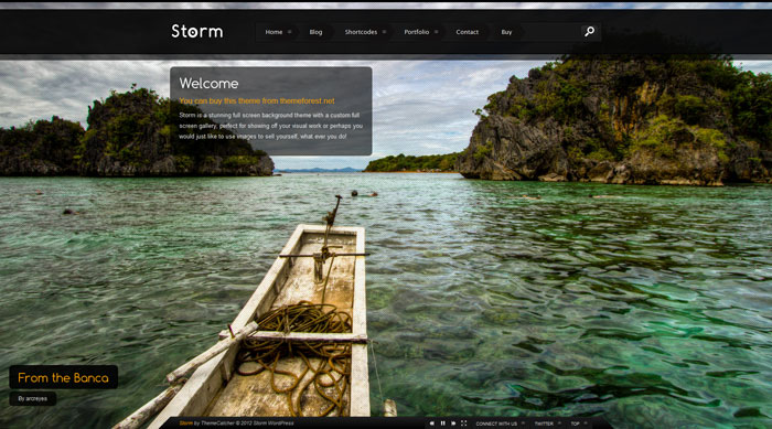
Storm
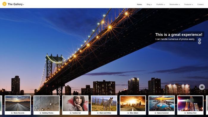
The gallery
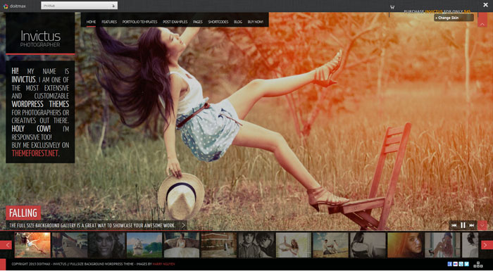
Invictus
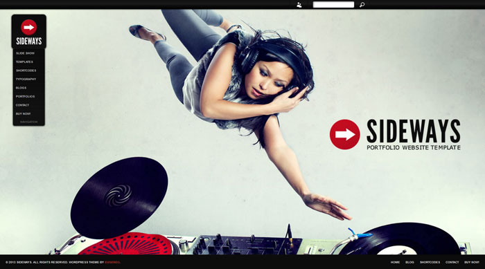
Sideways
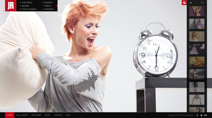
JR Photography
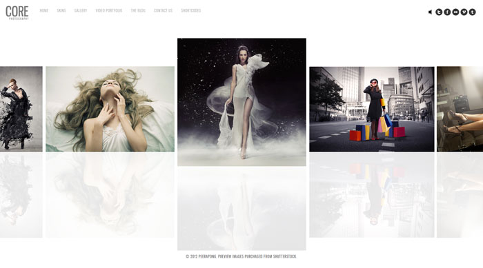
Core
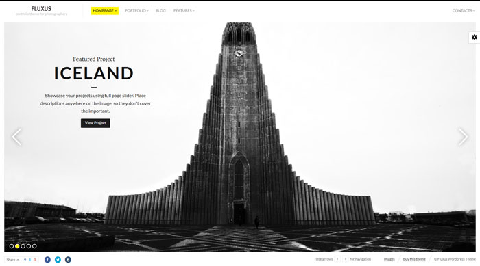
Fluxus
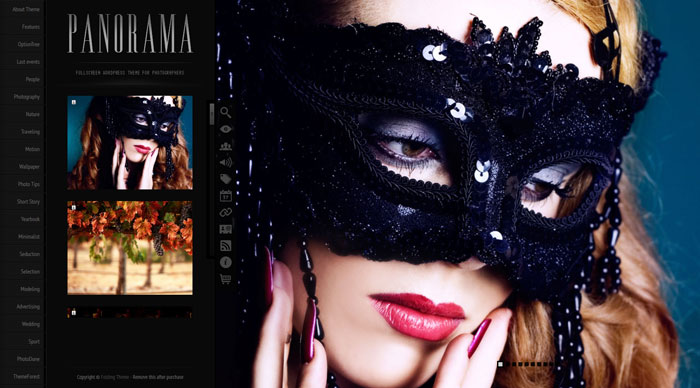
Panorama
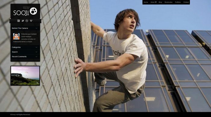
Sooji
Source: http://feedproxy.google.com/~r/DesignResourceBox/~3/vbnaDuddydw/


No comments:
Post a Comment