Web designers constantly look for better ways to do things. They seek simple solutions to specific issues. One of these is the challenge they face when designing user-friendly website navigation.
Their efforts to create simple navigation structures have brought some fruitful results. They formed a set of best practices. These best practices are simple and they are straightforward. In addition, they are easy to implement.
Memorize them and follow them. Thanks to these practices, you will save time and energy. Moreover, both you and your website users will be able to avoid the confusion and stress.
Top 5 Website Navigation Best Practices
Best Practice 1 – Make it easy for your visitor to reach her main goal
Let’s imagine a brick and mortar store has an exciting new product or special. In this case, it usually tells shoppers about it in the show window or a prominent display case.
Similarly, you want to attract customers to your online store. How to do that? By placing an eye-catching image on the home page. Combined with a brief message and a CTA to point your visitors in the right direction it will work just right.
There are two approaches you can use to keep a visitor from going off in a wrong direction. One is using a search bar at the top of the page. Another great approach is taking an advantage of a set of distinctly-defined CTAs.
Best Practice 2 – Always let a visitor know where she is
Place a Current Locator within your website. It has been a standard practice for years. It has proved to be a very effective method for keeping visitors from losing their way.
A megamenu has many virtues. Yet, it can get hard for a visitor when she encounters a megamenu with dozens of different products. In fact, it’s not all that hard for that visitor to make an incorrect choice or become confused and lose his or her way. This can easily be avoided by tracking:
- The visitor’s present location
- Where the visitor came from, and
- Where he or she might be expected to go next
Try using a contrasting color as an indicator of the visitor’s present website location..
A mini-map that tracks the user’s journey is another helpful way to guide a visitor toward his or her goal.
Always keep a fixed menu on top of the page. This helps the user decide where to go next to further explore the site. Menu revisions will more often than not create problems.

Best Practice 3 – Use standard icons and lingo – every time
This is one area where you need to keep creativity on a tight leash. Better yet, avoid any impulse to do something clever.
Users don’t want to spend time figuring out what your icon’s descriptions are trying to tell them. Don’t make them think, and don’t feel a need to entertain them. Save your creativity for areas where it is more likely to be appreciated.
Is a hamburger menu a good choice? It can be an excellent choice.

What about a menu shaped like a colorful peacock with multicolored clickable areas? Don’t even consider it!
How about a bold logo that takes a visitor to the Homepage when clicked? YES; a good idea.
An animated logo that take the user on a mystery journey? No. Only if you never want to see that visitor again.
Best Practice 4 – A maximum of 7 menu items
This one has practically been studied to death. People can generally remember the contents of a list or a string of digits that does not exceed 7 in size.
When the number of items in a menu exceeds 7, users will start to forget what’s on the list. In this case, they must either check back or will make an incorrect choice. A good menu design is clear, concise, and simple.
The same is true with links, and definitely on the home page. Keep the number as low as possible while still being a help to the user.
List only the items that are important for the user. Also, place the two main areas of interest at the top and bottom.
Best Practice 5 – Use a menu type that matches the amount of content
A menu type that works for one website doesn’t always work for another. When you see a menu on another website that would seem to be a good choice for yours, don’t mindlessly copy it.
Different websites, though similar in many ways, typically feature differing amounts of content. The amount of content can play a significant role in determining the necessary menu type.
A single navigation bar is usually best for a small store promoting a single product line. It will also fit one that has a limited inventory.
What about a large online store that sells 50 brands of clothing in all sizes, colors, and shapes? It will be best served by using a vertical collapsible menu. This case also calls for a carefully-structured megamenu.
A Simple Solution to Your Website Menu Design Challenges – BeTheme
Keeping your menu designs evergreen is a must. It is a good way to ensure you’re in tune with current and near-term design trends and best practices. An even easier way to keep up to date and save time and energy as a bonus is to use pre-built websites.
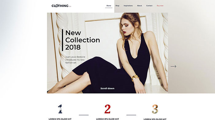
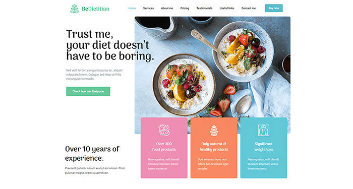
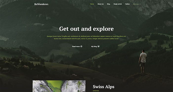
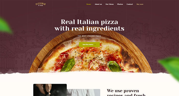
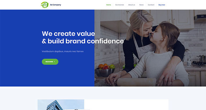
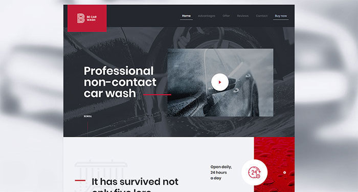
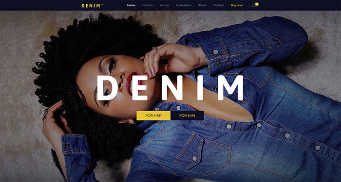
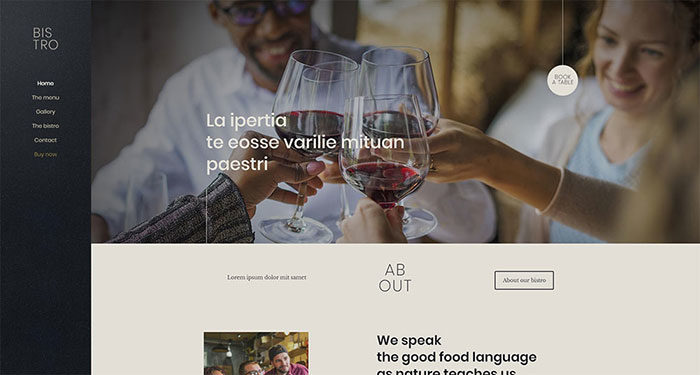
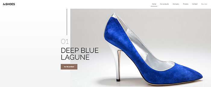
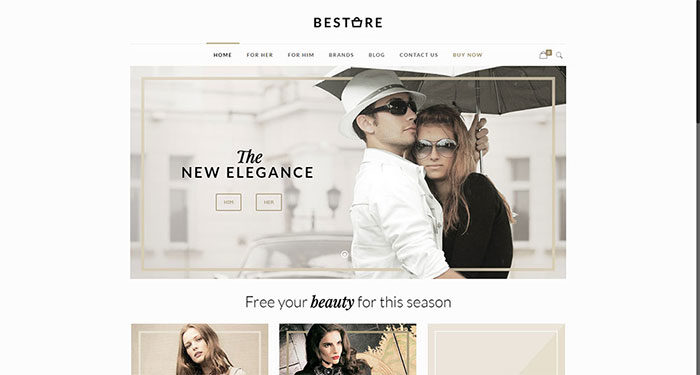
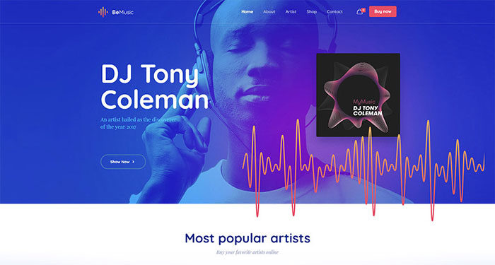
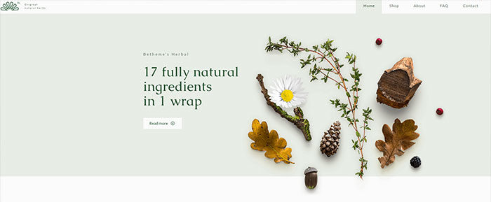
BeTheme offers a selection of more than 330 pre-built websites. They are professionally-designed and categorized by industry. Each design is aligned with a given category’s or niche’s user navigation needs and expectations.
Ending thoughts
Summarizing what’s been covered:
- Never fail to help the visitor move toward her goal at every step of the way
- Let the visitor know where she is, where she came from, and where she might go next
- Use standard icons and lingo so the user knows precisely what to do next
- Limit menu items to no more than seven
- Chose a menu type that considers the size of your website’s content
- Use pre-built websites to ensure user-friendly website navigation
The post Web Designers, Avoid Navigation Issues by Following These Top 5 Best Practices appeared first on Design your way.
Source: https://ift.tt/2I14Hp3


No comments:
Post a Comment