Web designers allow themselves a lot of creative freedom when creating a website, but there are also guidelines which they follow and which should be respected if you want to create a successful project. Consider that if a designer would make a site which has an interesting concept, but is hard to navigate and difficult to understand, then the whole project is almost useless to the client.

Web usability is an approach to make web sites easy to use for an end-user, without the requirement that any specialized training be undertaken. The user should be able to intuitively relate the actions she needs to perform on the web page with other interactions she sees similar contexts, e.g., press a button to perform some action.
Usability is a combination of factors including:
- Intuitive design: a nearly effortless understanding of the architecture and navigation of the site
- Ease of learning: how fast a user who has never seen the user interface before can accomplish basic tasks
- Efficiency of use: How fast an experienced user can accomplish tasks
- Memorability: after visiting the site, if a user can remember enough to use it effectively in future visits
- Error frequency and severity: how often users make errors while using the system, how serious the errors are, and how users recover from the errors
- Subjective satisfaction: If the user likes using the system
How to plan for usability
Many designers ask themselves when is the best time to plan for usability and that is a question with a really simple answer, right before everything. All your answers to questions about purpose and audience will shape the layout of the site.
You have to take into account a few ideas and ask yourself a few questions. For example, why do you want a website? What do you want to do with it? These are important because an e-commerce website will most likely look different than a portfolio one. You should clarify your goals before beginning to design your site.
After that, you should think about your audience. Targeting everyone is stupid. You have to target a specific group of visitors and create your site layout in such a way to make it easier for that group of people to navigate.
Designing a site
The easiest way to sketch the overall site schematic is on a white board. I always enjoyed at the office that we had one of these useful tools. Don’t have a white board? No problem, use sheets of paper. The process is the same.
- The navigation bar should be the starting point. Try to organize the buttons in order of importance from top to bottom or left to right, depending on your site design.
- Try to be concise and decide what content you will put on the pages before actually creating them. Eliminate any pages that the visitors won’t want or that don’t have interesting information to them
- Less clicks, more conversions. Make sure your visitors won’t get lost in content trying to find what they are looking for by putting links on the homepage towards the most important pages.
- If you have an information-rich site, create multiple navigation bars or mega menus. This will make it easier for the visitor to get quicker to what he is interested in.
- Make the menu stand out so that it can be noticed easily. You can do this by making it of a different color, or surround it with a box.

- Use colors that reflect the content and identity of the site or product showcased. If the site or product doesn’t prefer a certain color palette, you’ll have to choose them, but be aware that red and yellow build excitement, blues and greens are calming and you should use a dark body text on a white background to make it readable.
- Make sure you choose the color palette with your target audience in mind. It is known that men prefer blue and orange, while women prefer yellow and red. Young people will like bright primary colors, whereas middle-aged and old people will like pale colors.
- As I mentioned before, readability is really important. You should choose a font that is suitable for your audience and make sure it is readable. If a visitor starts to read a sentence with difficulty, after a paragraph will exit your site and look at your competition instead. Also, there must be some space between paragraphs, a simple detail that is really important
Designing individual pages
Designing the overall design is only one step of the design process. A lot of people think that if you managed to do that, your work is almost done. Far from the truth. Designing the individual pages demands a lot of attention to details. Here are a few tips on how to make your project better.
- Use short sentences (15-20 words) and short paragraphs (3-5 sentences). A lot of people may be lazy readers, but they still are possible clients
- Keep articles on one page. I always hated websites which split articles in two or more pages. A lot of admins are doing this to get more ad impressions to squeeze money from advertisers. This is plain stupid. You will end up losing visitors and advertisers with this move.
- Break up long articles by using descriptive headings. Also, you should use numbered or bulleted lists for easier skimming.
Details that many designers ignore
Till now we covered the basics which every web designer should know and should not forget, but there are other techniques which give you an advantage in front your competition and which it is likely that you haven’t thought of, but as soon as you will read them you will agree that this is the best solution:
- Using a photo of you or your team will add to your credibility. People are looking, consciously or unconsciously, for images of people on web pages because they are more credible than those vectorized graphics or the lack of any images. When browsing your website, people will want to see that you are legitimate. Adding photos of you and your staff represents a big win for you.
- The quality of the site design is an indicator of credibility. People judge a book by its cover and this applies in almost any domain. A clean and modern site design tells the visitors that you care about your image and you are serious about what you are doing.
- People usually don’t scroll. I know you were expecting the exact opposite. You are surely scrolling because you are a designer and you are used to seeing the whole content of the site, but people don’t have this much patience and are not that aware of technology and how websites look and work. This means that you should put the important elements above the fold to ensure a better conversion. Of course, this idea starts a huge debate pro or against the “above fold” idea. Decide for yourself, but make sure to check the studies made on this issue and not just opinions.
- White space is important. The tendency is to put as much content in a page as possible, but that will only backfire in your face. More content leads to a cluttered design which makes it difficult for visitors to find what they are looking for. That is exactly what you are afraid of. More about white space and examples.
After designing: usability testing?
Yes, that is important too. Testing your own site for usability is like trying to find corners in a circle. You will be tempted to think that it’s the best possible design, but your opinion is not that important, the clients matter most.
You have to be aware that big businesses spend loads of money on usability testing for their websites and that doesn’t mean that a small business like yours can’t do it. Everyone of us has friends and relatives and we can ask for their help especially if they don’t know what the site is about or if they are interested in that specific service that the site offers. You should pay attention to what catches their attention on the website and what doesn’t. Their view is different from yours, but is most likely the same as everybody’s in your target audience.
Tools for usability testing
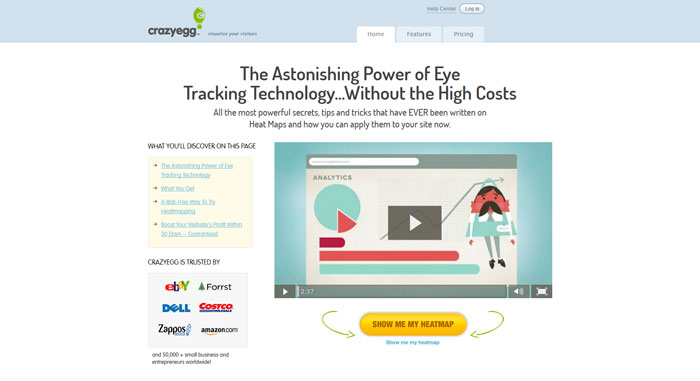
Crazy Egg
Concept Feedback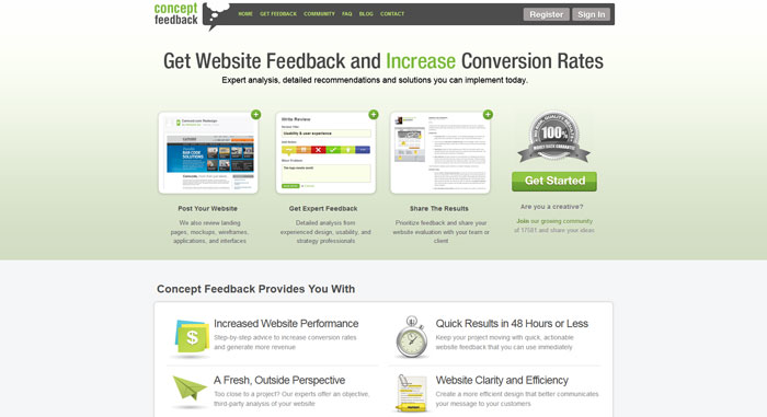
Usabilla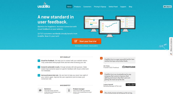
Clicktale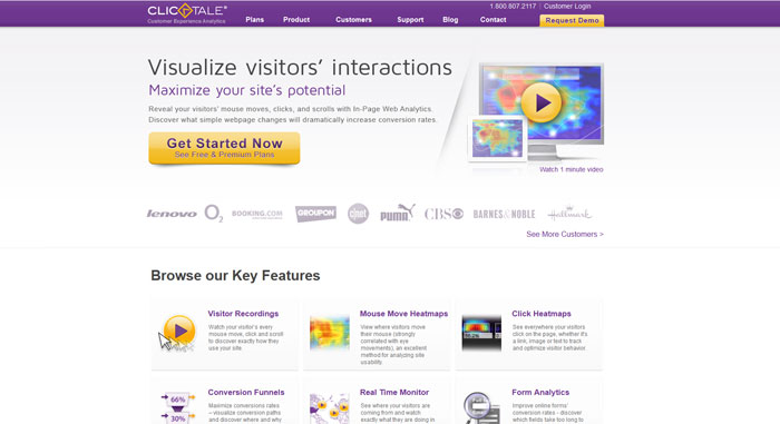
Fivesecondtest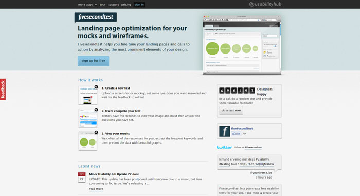
Silverback app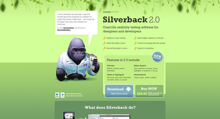
Chalkmark
Feng Gui
User testing
Feedback Army
Clickheat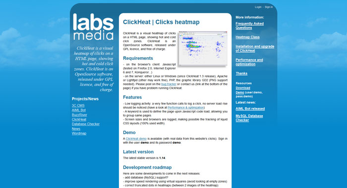
Loop 11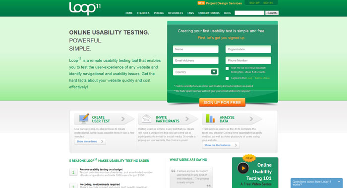
OpenHallway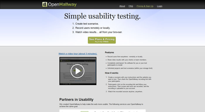
IntuitionHQ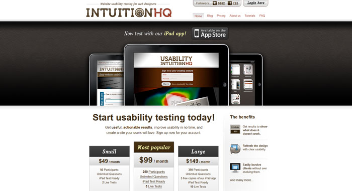
Yes. Google Analytics
Source: http://feedproxy.google.com/~r/DesignResourceBox/~3/JA2JJqDzlBE/


No comments:
Post a Comment