For one page websites scrolling is the solution to see more content, differently from regular websites where you click on a button that gets you on a page, then another one and if you are not focused and the site is not well structured, you can get lost in all the details that the pages have.
This is different with one page websites. Mostly being landing pages, information is not complex, instead they just have a few blocks of text, even fewer images, maybe a video and that’s it.
But what about designing a site like this? How would you do it? Most of the times, you can make them scroll vertically, but there are designers who decide to make things a little bit more interesting and make the websites scroll horizontally.
A lot of UX experts challenge this scrolling technique and say that if it’s not above the fold, then the information is lost for the visitor of the website, while others try and defend the scrolling practice, by saying that it depends on the target audience.
If you ever decide to make a single page website, take a look at these following designs for inspiration. This is an article with a few of latest one page websites. I also wrote another article a while back with one page designs and make sure you check that out too.
hopskoch.com
majuter.us
fundraisingisonthemove.com
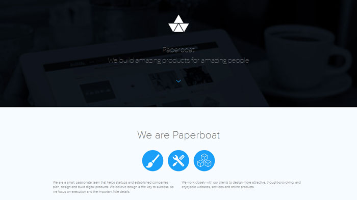
paperboat.io
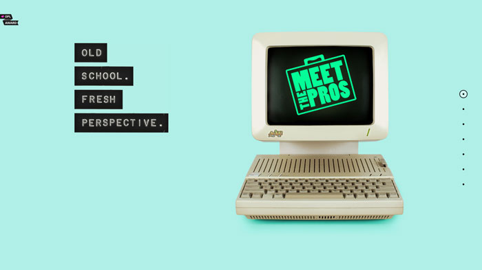
meetthepros.org
raro.ag
cypressdoeskillerapps.com
thesleevetv.com
bysaxon.com.au
shibui.me
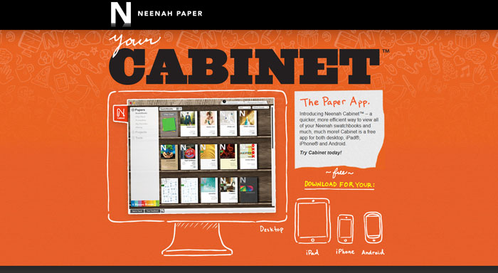
neenahcabinet.com
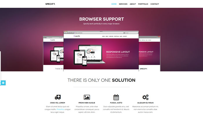
Specify
jeffreydegroot.com
iconic-furniture.com
agathelebon.com
wndrmnt.com
northernpixels.se
vibesdesign.com.au
annoyd.me
un-duo.com
SkyApp
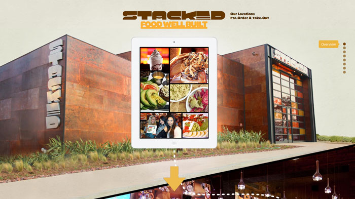
stacked.com
makeshift.io
joscelyngainie.fr
publiqapp.com
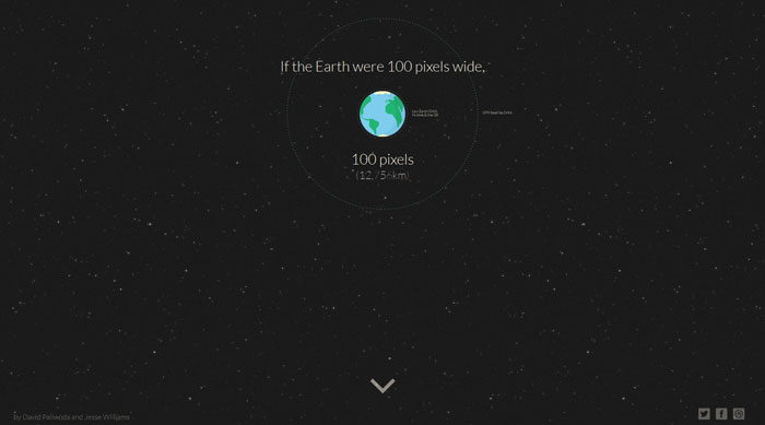
distancetomars.com
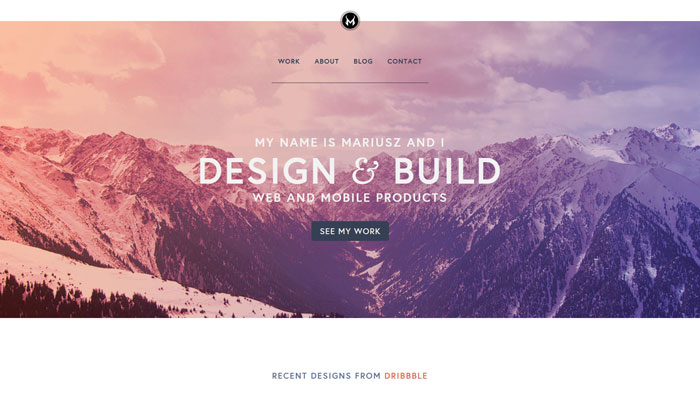
mariusz.cc
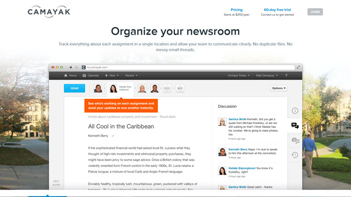
camayak.com
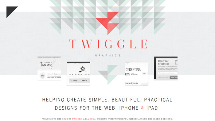
twigglegraphics.com
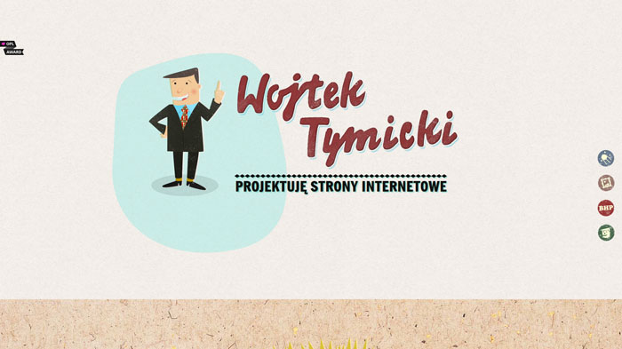
panweb.pl
thisislevelup.com
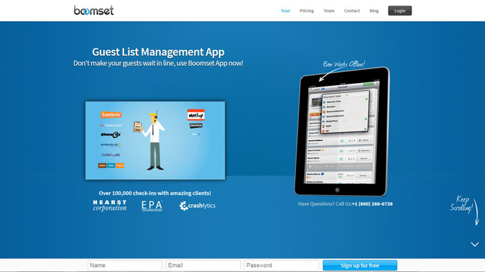
boomset.com
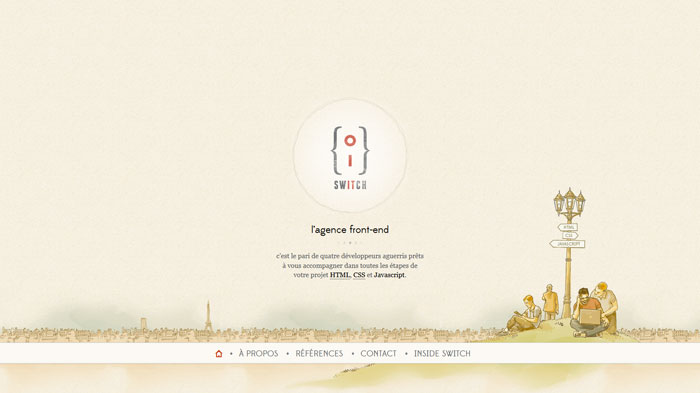
switch-company.com
getgumbo.com
Source: http://feedproxy.google.com/~r/DesignResourceBox/~3/XpVzX6gLIsk/




















No comments:
Post a Comment