I’ve heard from a bunch of people who found my CSS drop down menu tutorial really useful, so today’s we’re going to build another menu with some fancy hover effects. With the Flat design trend being so popular we’ll use adopt this style for today’s menu by using bright solid colours and clean icons. We’ll be using various must-know CSS techniques so this is a great tutorial for any web designers learning the basics.
The Menu Concept

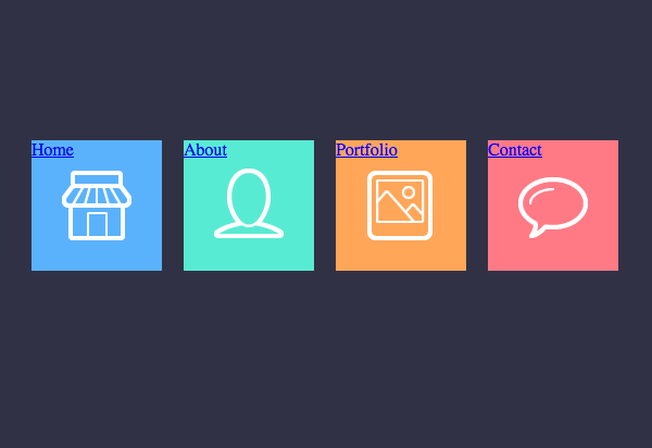
Here’s the menu we’ll be building as part of this tutorial. It’s based on the oh-so-popular flat design trend with solid colours and neat square boxes. The clean icons are courtesy of the Linecons pack and the font we’ll be using via Google Webfonts is Dosis. When each navigation box is hovered the text label appears off to the right, adopting the same colour scheme as its parent menu item.
View the flat style CSS nav menu demo
The HTML Structure
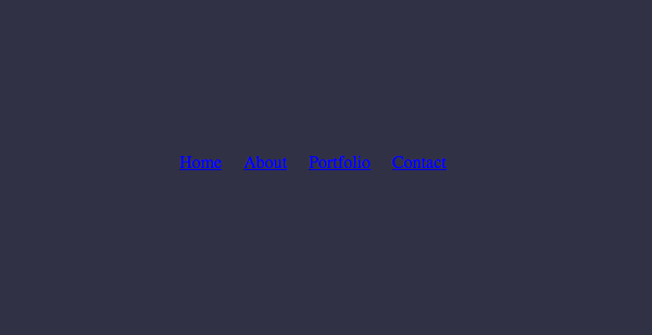
Before getting started with any styling we first need to build the foundations and construct the menu in HTML. HTML5 elements such as nav are widely supported nowadays even across IE with the help of plugins such as html5shiv.
<!DOCTYPE html>
<html>
<head>
<meta charset="utf-8" />
<title>Flat Nav</title>

<link href="style.css" rel="stylesheet" />

<link href='http://fonts.googleapis.com/css?family=Dosis' rel='stylesheet' type='text/css'>

</head>
<body>

<div id="demo">
        <nav>
                <ul>
                        <li>
                                <a href="#">
                                        <span>Home</span>
                                </a>
                        </li>
                        <li>
                                <a href="#">
                                        <span>About</span>
                                </a>
                        </li>
                        <li>
                                <a href="#">
                                        <span>Portfolio</span>
                                </a>
                        </li>
                        <li>
                                <a href="#">
                                        <span>Contact</span>
                                </a>
                        </li>

                </ul>
        </nav>
</div>

</body>
</html>
The HTML begins with the usual document structure of doctype, title and link to the CSS stylesheet which we’ll be populating later. The Dosis font is set up via Google Webfonts and its stylesheet is attached. The actual structure of the navigation menu begins at the nav element, inside which is a typical unordered list. Each list item contains a link, but to give ourselves an extra item to target when styling up the offset text the label of each anchor is wrapped in a span element.
The CSS Styling
nav ul {
        list-style: none; overflow: hidden; position: relative;
}
        nav ul li {
                float: left; margin: 0 20px 0 0;
        }
The menu styling begins by altering the appearance of the unordered list by removing the list bullet points and floating each <li> side by side. To compensate for this the overflow: hidden; declaration is added to the <ul> to clear the floats, then its positioning is altered to allow the location of the hover text to be relative to the parent ul.
nav ul li a {
        display: block; width: 120px; height: 120px;
        background-image: url(icons.png); background-repeat: no-repeat;
}
        nav ul li:nth-child(1) a {
                background-color: #5bb2fc;
                background-position: 28px 28px;
        }
        nav ul li:nth-child(2) a {
                background-color: #58ebd3;
                background-position: 28px -96px;
        }
        nav ul li:nth-child(3) a {
                background-color: #ffa659;
                background-position: 28px -222px;
        }
        nav ul li:nth-child(4) a {
                background-color: #ff7a85;
                background-position: 28px -342px;
        }
Each anchor inside the list element is styled to appear square by adding a width and height of 120px, allowed by the conversion from an inline element to block with display: block;. All the icons were exported from Photoshop in a single sprite image, so the icons.png file is added as a background image to all anchors using the generic nav ul li a selector.
Any unique styling to each individual anchor is then added using an :nth-child selector. This beats adding extra classes to the HTML by simply being able to target each individual li based on its number. The different colour backgrounds are then added and the background position of the icons image is adjusted to locate the correct icon within the sprite.
nav ul li a span {
        font: 50px "Dosis", sans-serif; text-transform: uppercase;
        position: absolute; left: 580px; top: 29px;
        display: none;
}
If this design only featured the square blocks this tutorial would be pretty much complete, but an extra fancy step is to create the offset text effect on hover of each element. This is all done by targeting the <span> that was added to each anchor. First the font styling is set up as the Dosis Google WebFont and its appearance converted to uppercase using the text-transform property.
By default each label is aligned to the top left of every navigation block, but we want them all aligned off to the right of the whole menu. To do this we simply add the position: absolute; declaration and alter the left and top positioning to suit. That position: relative; declaration that was added to the nav ul earlier allows this absolute positioning to be relative to the parent ul, rather than relative to the full width of the browser window.

nav ul li a:hover span {
        display: block;
}

nav ul li:nth-child(1) a span {
color: #5bb2fc;
}
nav ul li:nth-child(2) a span {
color: #58ebd3;
}
nav ul li:nth-child(3) a span {
color: #ffa659;
}
nav ul li:nth-child(4) a span {
color: #ff7a85;
}
All the labels are visible at the same time until they’re hidden with display: none;, they’re then told to reappear on hover of each anchor by adding the opposite declaration: display: block;. The only thing left to do is use the :nth-child selectors once again to give each label the corresponding colour to match the menu block it’s paired with.
The Complete CSS
Here’s the complete CSS should you want to copy/paste into your own designs.
nav ul {
        list-style: none; overflow: hidden; position: relative;
}
        nav ul li {
                float: left; margin: 0 20px 0 0;
        }
                nav ul li a {
                        display: block; width: 120px; height: 120px;
                        background-image: url(icons.png); background-repeat: no-repeat;
                }
                        nav ul li:nth-child(1) a {
                                background-color: #5bb2fc;
                                background-position: 28px 28px;
                        }
                        nav ul li:nth-child(2) a {
                                background-color: #58ebd3;
                                background-position: 28px -96px;
                        }
                        nav ul li:nth-child(3) a {
                                background-color: #ffa659;
                                background-position: 28px -222px;
                        }
                        nav ul li:nth-child(4) a {
                                background-color: #ff7a85;
                                background-position: 28px -342px;
                        }

                                nav ul li a span {
                                        font: 50px "Dosis", sans-serif; text-transform: uppercase;
                                        position: absolute; left: 580px; top: 29px;
                                        display: none;
                                }
                                        nav ul li a:hover span {
                                                display: block;
                                        }

                                nav ul li:nth-child(1) a span {
                                        color: #5bb2fc;
                                }
                                nav ul li:nth-child(2) a span {
                                        color: #58ebd3;
                                }
                                nav ul li:nth-child(3) a span {
                                        color: #ffa659;
                                }
                                nav ul li:nth-child(4) a span {
                                        color: #ff7a85;
                                }
The Final Flat Style CSS Menu Design

View the flat style CSS menu design demo
Source: http://line25.com/tutorials/how-to-create-a-trendy-flat-style-nav-menu-in-css


No comments:
Post a Comment