I was talking with someone the other days and I mentioned the term retina graphics at some point and he immediately stopped me and questioned me about it. What intrigued him was why we should design something just for the visitors who own Apple products and a small number of other devices. For those of you who share his opinion, we should do it because it is the proper way, something like cross-browser optimization but not quite like it.
But what are retina graphics anyway?
Retina is a term used by Apple to describe their the double density pixel screens in their liquid crystal displays which they claim have a high enough pixel density that the human eye is unable to notice at a typical viewing distance. This might confuse people who consider the pixels that we use in our CSS declaration are the same as the device pixels.
CSS pixels are an abstract unit which is used by browsers to draw the content and on a non-retina device, CSS pixels equals to a device pixel. However, on a retina display, one CSS pixel can equal to 4 device pixels.
How we should adapt our websites for retina displays
The technology is new, but there are a few techniques that could be used to adapt your web graphics to retina displays. The idea is to create two versions of your images, one at standard resolution (image.jpg) and another one at 2 times the resolution of the one that you already have and name the latter image@2x.jpg/image@2x.png. That @2x is the way that these images are detected by retina devices.
- Using HTML
<img src="imagename@2x.png" width="200" height="300" />This is the simple approach and it is best to be used on single-page websites with few content images.
- Using CSS Media Queries
.icon {
  background-image: url(image.png);
  background-size: 200px 300px;
  height: 300px;
  width: 200px;
}

@media only screen and (-Webkit-min-device-pixel-ratio: 1.5),
only screen and (-moz-min-device-pixel-ratio: 1.5),
only screen and (-o-min-device-pixel-ratio: 3/2),
only screen and (min-device-pixel-ratio: 1.5) {
  .icon {
    background-image: url(image@2x.png);
  }
}
If you want to target only Apple devices, use the following code:
@media
(-webkit-min-device-pixel-ratio: 2),
(min-resolution: 192dpi) {
    /* Retina-specific stuff here */
}- Using SCSS
If you are using SCSS and want to add retina image support to your website there is a neat piece of code that was made popular by Jason from 37signals.
div.logo {
  background: url("logo.png") no-repeat;
  @include image-2x("logo2x.png", 100px, 25px);
}
This is easier because you are puttin the hi-res alternative image in the same rule as the normal image, instead of putting it in a separate media query or in a different stylesheet.
@mixin image-2x($image, $width, $height) {
  @media (min--moz-device-pixel-ratio: 1.3),
         (-o-min-device-pixel-ratio: 2.6/2),
         (-webkit-min-device-pixel-ratio: 1.3),
         (min-device-pixel-ratio: 1.3),
         (min-resolution: 1.3dppx) {
    /* on retina, use image that's scaled by 2 */
    background-image: url($image);
    background-size: $width $height;
  }
} - Using Javascript
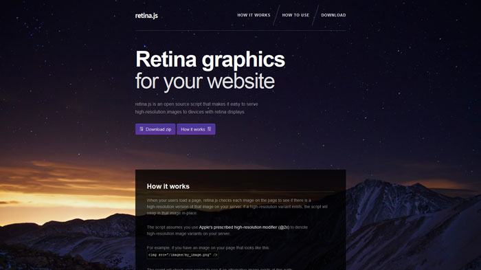
Retina.js is an incredibly useful Javascript plugin that can do all the work for you without breaking a sweat. When your users load a page, retina.js checks each image on the page to see if there is a high-resolution version of that image on your server. If a high-resolution variant exists, the script will automatically swap in that image in-place.
- Using @font-face instead of image icons
@font-face wasn’t initially used at its full potential when it was launched. Everyone was thinking of just using a font on web that they couldn’t use it before, but the applications for @font-face rules are far more useful than that.
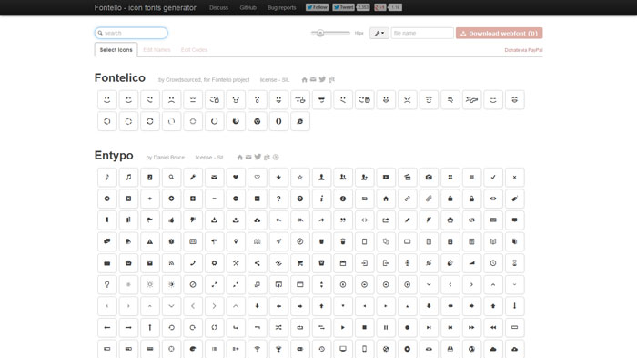
One of the interesting way is by using @font-face as a replacement of image icons. This way, resizing them to look better on retina displays is easier. The best tool for using icon fonts is, in my opinion, Fontello. You can use it to make your own custom @font-face fonts that you can use for your websites instead of loading a whole pack of icons that you don’t use.
Of course, Fontello is not the only place where you will find icon fonts. You can check an article that I previously wrote about icon fonts, containing 20 icon fonts packs that are free to download and 15 other icon packs with flat icons which you can transform into a @font-face pack to use on your websites.
Besides the free services that Fontello offers, you can also check alternative premium sites:
Pictos
Symbolset
- Using SVG images
SVG stands for Scalable Vector Graphics and it does exactly what it says, having support for all the latest versions of the latest browsers, even IE.
It is a resolution-independent technique for presenting graphics on websites. SVG is a vector format that uses XML to define basic properties like paths, shapes, fonts and colors and advanced features such as gradients, filters, scripting and animation.
Once you get to know it well, SVG looks like a really good choice because fidelity is kept on all resolutions. Even though most people are avoiding it at all costs, SVG is quite the alternative to the usual techniques that have been presented so far in this article.
Usage:
.image {
    background-image: url(image.svg);
    background-size: 150px 200px;
    height: 150px;
    width: 200px;
}
and
<img src="image.svg" width="150" height="200"/>
Conclusion
The web is in a continuous evolution and there will always be new things to be discovered and in time will become of regular usage and there is no need to be stubborn and refuse to acknowledge that you have to evolve along with technology.
Source: http://feedproxy.google.com/~r/DesignResourceBox/~3/UtanY3N6fr4/


No comments:
Post a Comment