Writing CSS was a lot easier when you were accessing sites only via your desktop or laptop. Back then, the only issues you had to solve were cross-browser and cross-platfom ones. This seems child play at the moment when you have to make sure that a website looks good on a widescreen desktop monitor and also on a narrow mobile screen at the same time.
The modern solution for this problem is represented by the Media Queries Module which came along with CSS3. What these media queries do is letting you serve styles far more specifically to your visitors’ devices, allowing a tailored experience. This feature is really important because it is in every web designer or project manager’s mind to make the visitor have the best experience while browsing a site.
The description so far seems theoretical, but not practical so let me clear it for you. If a regular site is viewed on a mobile device, the visitor could encounter a few problems like the text being too small which makes for him that he has to zoom in and afterwards to scroll sideways, up and down, just to see a simple text or the navigational elements. If there are drop down features triggered when hovering over them, like you have on Amazon’s website, these won’t work on most mobile devices. The images, if they are large in size, could take forever to load and this breaks one of the fundamental laws of a website which leads to making the visitor exit the page.
Media queries detect devices based on their attributes, so there is no need of browser sniffing scripts like you were used to use in the past. You can target stylesheets directly with media queries for a device’s capabilities, meaning that if a device with smaller screen is detected, CSS rules will be customized to that screen size, serving smaller images and making text clearer.
Let’s get practical
You can insert CSS media queries in three ways:
- With an external stylesheet
<link rel="stylesheet" type="text/css" href="style2.css" media="only screen and (max-width: 480px)" />- Importing a stylesheet within the < style > element
@import "style2.css" only screen and (max-width: 480px);- Within the < style > element as a media rule
<style type="text/css">
  @media only screen and (max-width: 480px){
    /* rules defined inside here are only applied to browsers that support CSS media queries and the browser window is 480px or smaller */
  }
</style>
As you may have guessed, in all these cases the mentioned stylesheet will be applied in the browser when the browser window is 480px or below, and if the browser supports CSS media queries.
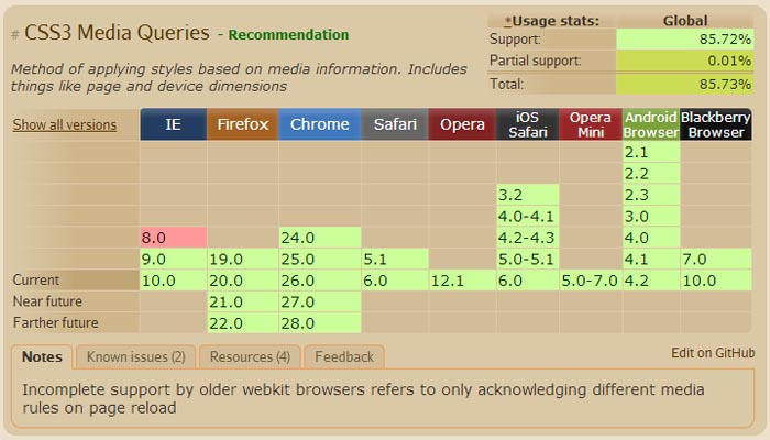
CSS Media queries support
CSS media features
Media queries provide you with several media features that you can use to deliver the stylesheet that is most suitable for the browser or medium.
With length values
- device-height
- max-device-height
- min-device-height
- device-width
- max-device-width
- min-device-width
- height
- max-height
- min-height
- width
- max-width
- min-width
With ratio values
- aspect-ratio
- max-aspect-ratio
- min-aspect-ratio
- device-aspect-ratio
- max-device-aspect-ratio
- min-device-aspect-ratio
There is also an option to have different stylesheets for portrait and landscape orientation:
<link rel="stylesheet" media="all and (orientation:portrait)" href="portrait.css">
<link rel="stylesheet" media="all and (orientation:landscape)" href="landscape.css">
This is useful if you want the menu to be displayed horizontally when the browser screen is landscape and vertically when it is portrait.
If you want to combine multiple media queries, take the following code as example:
@media screen and (min-width: 640px) and (max-width: 960px) {
  .header {
    background: #fff;
  }
}
Targeting standard devices:
/* Smartphones (portrait and landscape) ----------- */
@media only screen
and (min-device-width : 320px)
and (max-device-width : 480px) {
/* Styles */
}

/* Smartphones (landscape) ----------- */
@media only screen
and (min-width : 321px) {
/* Styles */
}

/* Smartphones (portrait) ----------- */
@media only screen
and (max-width : 320px) {
/* Styles */
}

/* iPads (portrait and landscape) ----------- */
@media only screen
and (min-device-width : 768px)
and (max-device-width : 1024px) {
/* Styles */
}

/* iPads (landscape) ----------- */
@media only screen
and (min-device-width : 768px)
and (max-device-width : 1024px)
and (orientation : landscape) {
/* Styles */
}

/* iPads (portrait) ----------- */
@media only screen
and (min-device-width : 768px)
and (max-device-width : 1024px)
and (orientation : portrait) {
/* Styles */
}

/* Desktops and laptops ----------- */
@media only screen
and (min-width : 1224px) {
/* Styles */
}

/* Large screens ----------- */
@media only screen
and (min-width : 1824px) {
/* Styles */
}

/* iPhone 4 ----------- */
@media
only screen and (-webkit-min-device-pixel-ratio : 1.5),
only screen and (min-device-pixel-ratio : 1.5) {
/* Styles */
}
Targeting retina displays
This is useful for including high resolution graphics, but only for the screens that actually make use of them. Retina is defined by the “2″ value.
@media
(-webkit-min-device-pixel-ratio: 2),
(min-resolution: 192dpi) {
    /* Retina-specific stuff here */
}
Alternatively, you could use Thomas Fuchs’ code:
@media (min--moz-device-pixel-ratio: 1.5),
       (-o-min-device-pixel-ratio: 3/2),
       (-webkit-min-device-pixel-ratio: 1.5),
       (min-device-pixel-ratio: 1.5),
       (min-resolution: 144dpi),
       (min-resolution: 1.5dppx) {

/* Retina rules! */

}
Issues with CSS media queries
You probably noticed that it is mentioned in the article that CSS media queries only work in browsers which accept them. They work in most of the modern browsers, but there are also older versions of browsers which don’t and make the experience below average for the person who uses those browsers. To avoid this, there are a couple of tools that are used:
Respond.js
One way of handling these issues is with Respond.js which is a fast & lightweight polyfill for min/max-width CSS3 Media Queries (for IE 6-8, and more). Its goal is to provide a fast and lightweight (3kb minified / 1kb gzipped) script to enable responsive web designs in browsers that don’t support CSS3 Media Queries – in particular, Internet Explorer 8 and under. It’s written in such a way that it will probably patch support for other non-supporting browsers as well.
Although this is a good and useful way of handling certain media query features, it will not cover them all. At the moment it only works for max-width and min-width queries. If you happen to need to use device-width, device-height, orientation, aspect-ratio, color or resolution it won’t do you any good. Another disadvantage of using this is that non-Javascript users will not see the optimized page.
CSS3-MediaQueries-js
css3-mediaqueries.js is a JavaScript library to make IE 5+, Firefox 1+ and Safari 2 transparently parse, test and apply CSS3 Media Queries. Firefox 3.5+, Opera 7+, Safari 3+ and Chrome already offer native support.
The good thing about this Javascript plugin is that it supports the full range of media queries introduced in CSS3, the bad thing about it is that is is pretty big (15kb) and that may cause problems on high traffic sites.
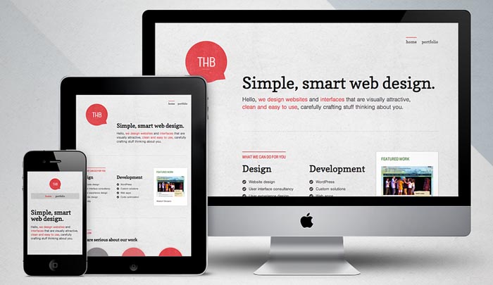
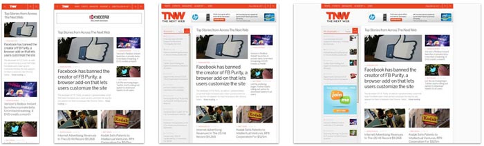
At the end, I’ll showcase a couple of websites which use media queries and implicitly responsive web design to see the difference that these little CSS properties can make. The images are courtesy of mediaqueri.es
Time Magazine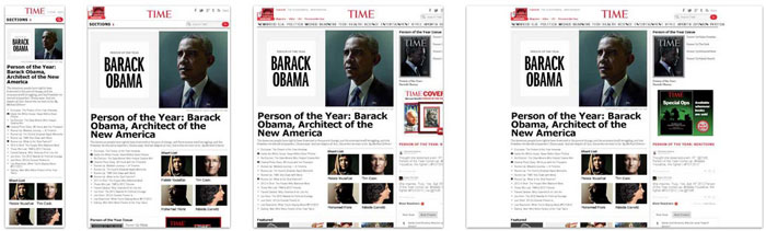
Hicksdesign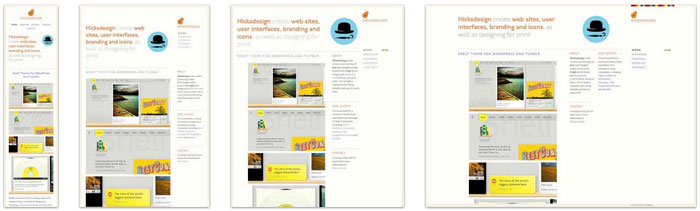
Spigot Design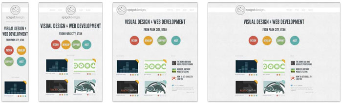
Palantir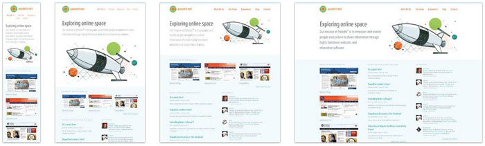
Clean Air Commute Challenge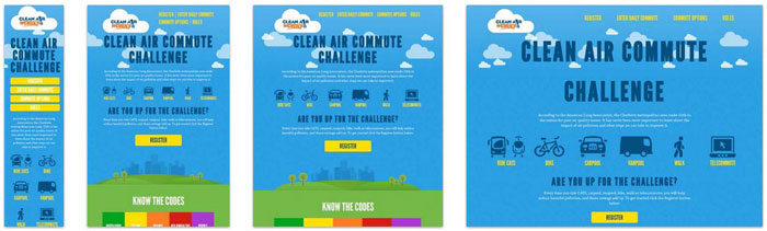
Lancaster University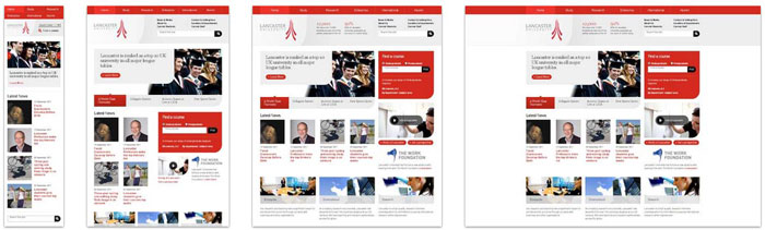
Smashing Magazine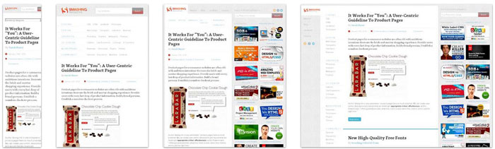
Treehouse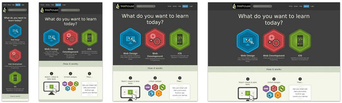
Starbucks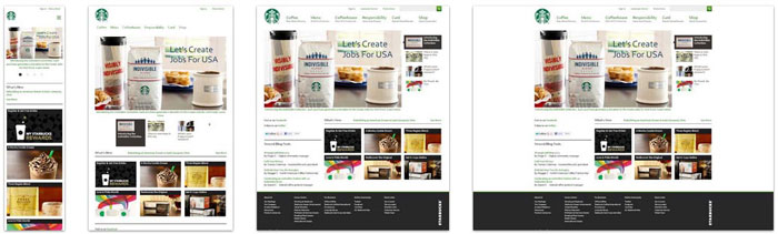
CSS Off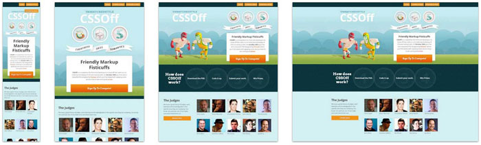
Microsoft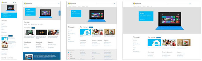
Regent College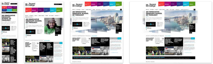
Source: http://feedproxy.google.com/~r/DesignResourceBox/~3/DoC5OoR1CnY/


No comments:
Post a Comment