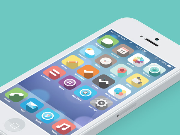
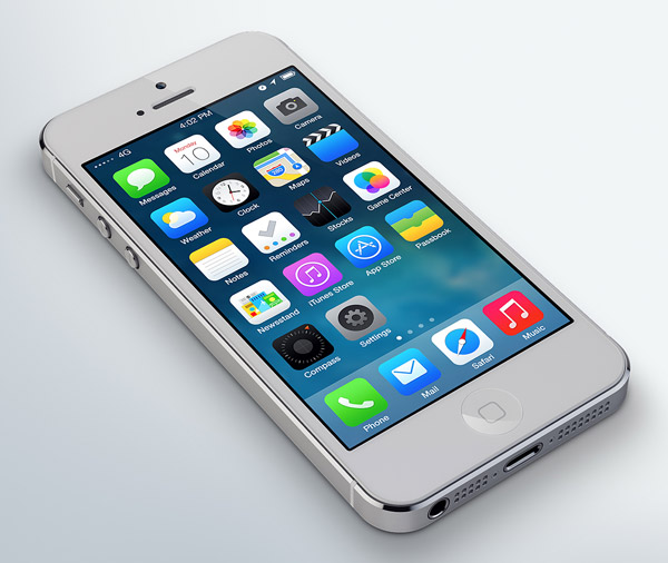
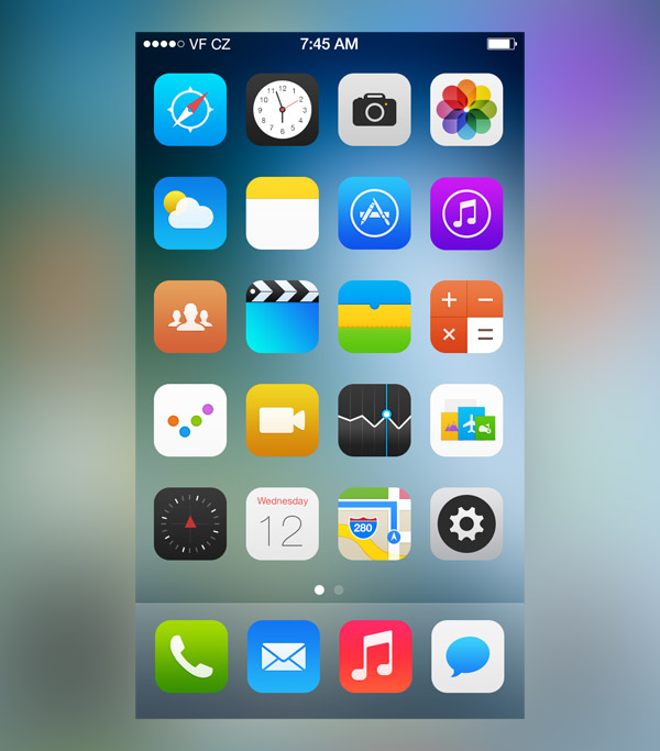
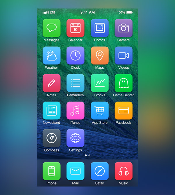
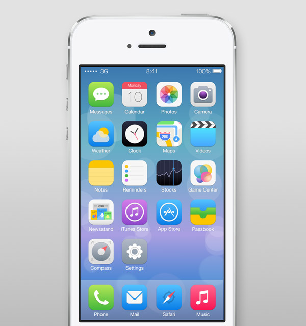
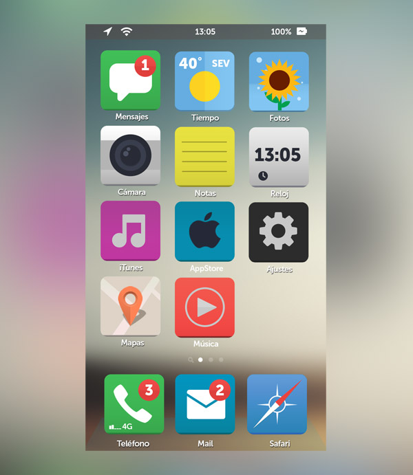
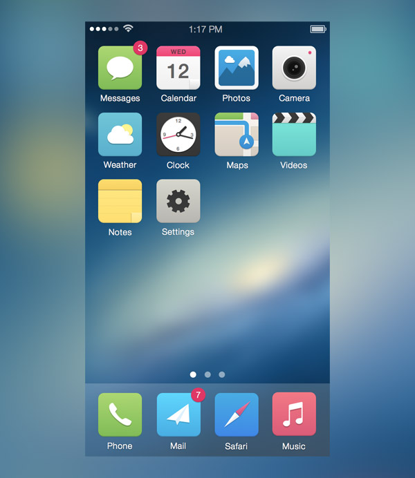
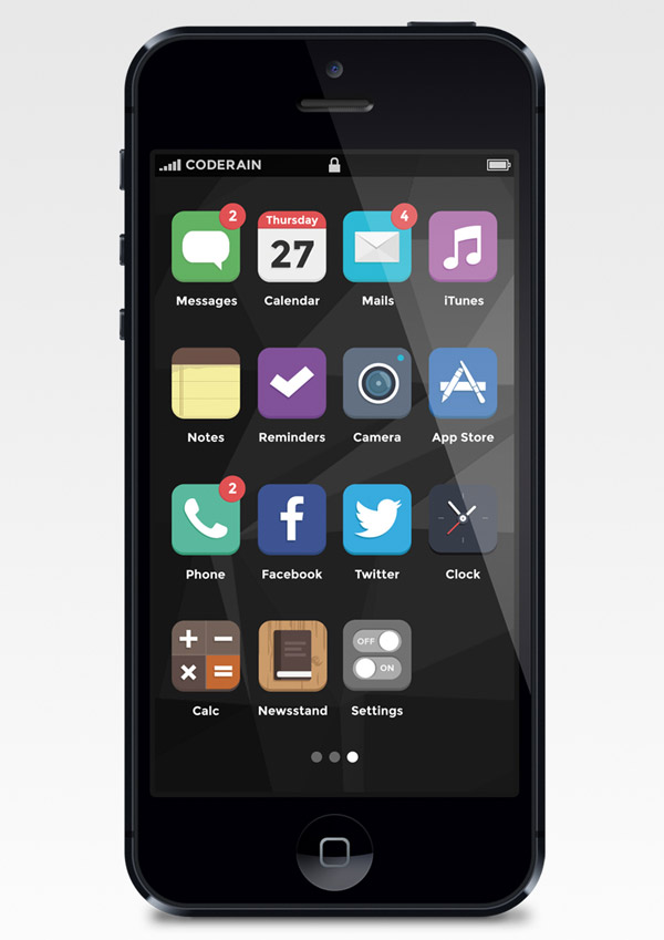
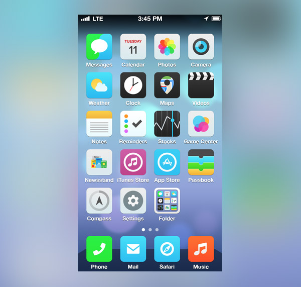
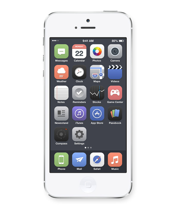
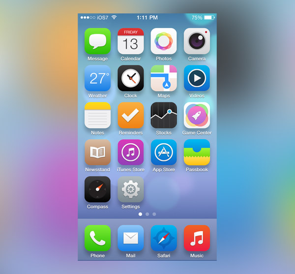
Many of us were a little disappointed in the reveal of the new iOS7 user interface. The garish colour palette, the plain ugly icons and the questionable design decisions have resulted in designers expressing their frustration and sharing their own interpretations of the iOS interface via social websites such as Dribbble and Behance. This post rounds up a collection of 25 iOS7 resdesigns that offer some great ideas and alternatives to Apple’s initial concept.
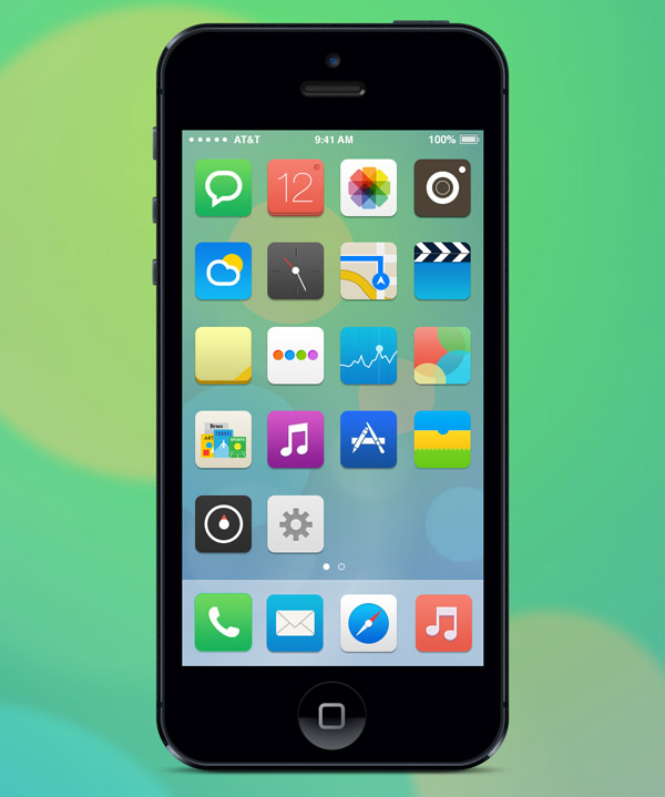
iOS by Jacob Cummings
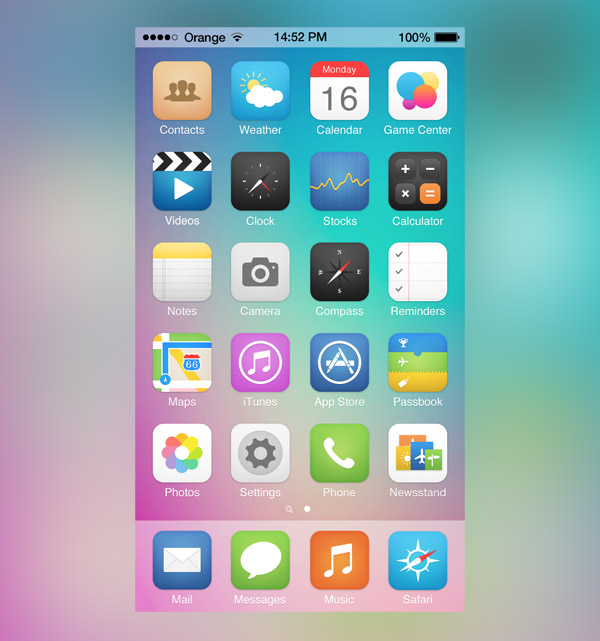
iOS7 Redesign by Leo Drapeau
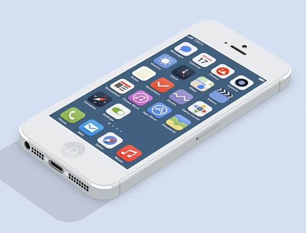
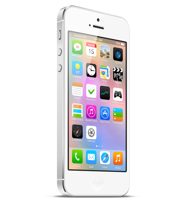
iOS 7 Icons by Jackie Tran Anh
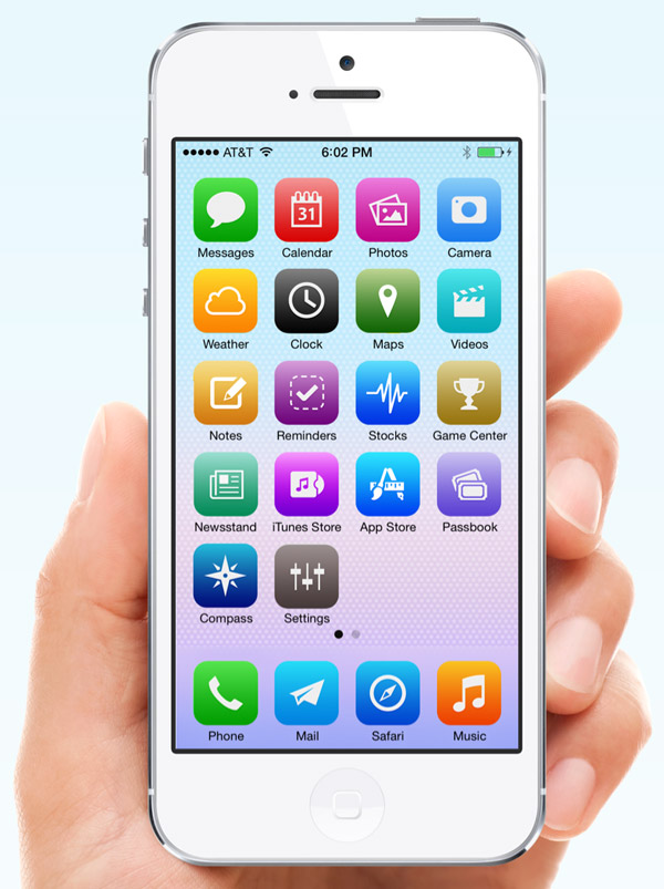
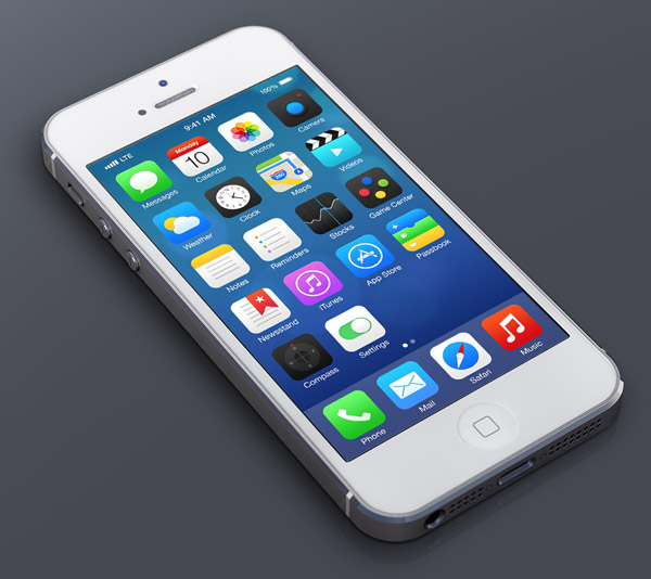
iOS7 Redesign by Michael Boswell
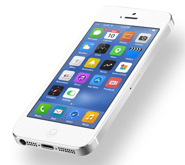
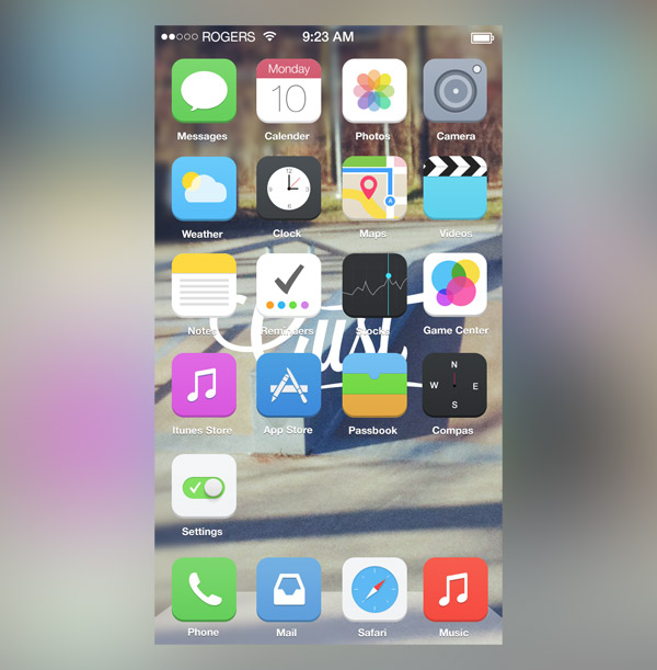
iOS7 by JustD
iOS 7 V2 by Ross Legacy
iOS7 Reimagined by Zane David
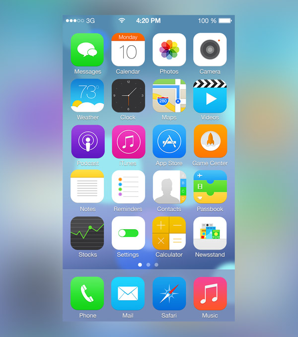
iOS 7 Icons by Alexandr Nohrin
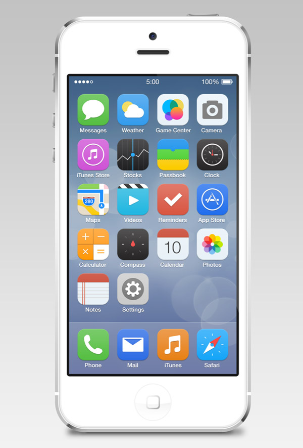
iOS 7 Icons Redesign by Ida Swarczewskaja
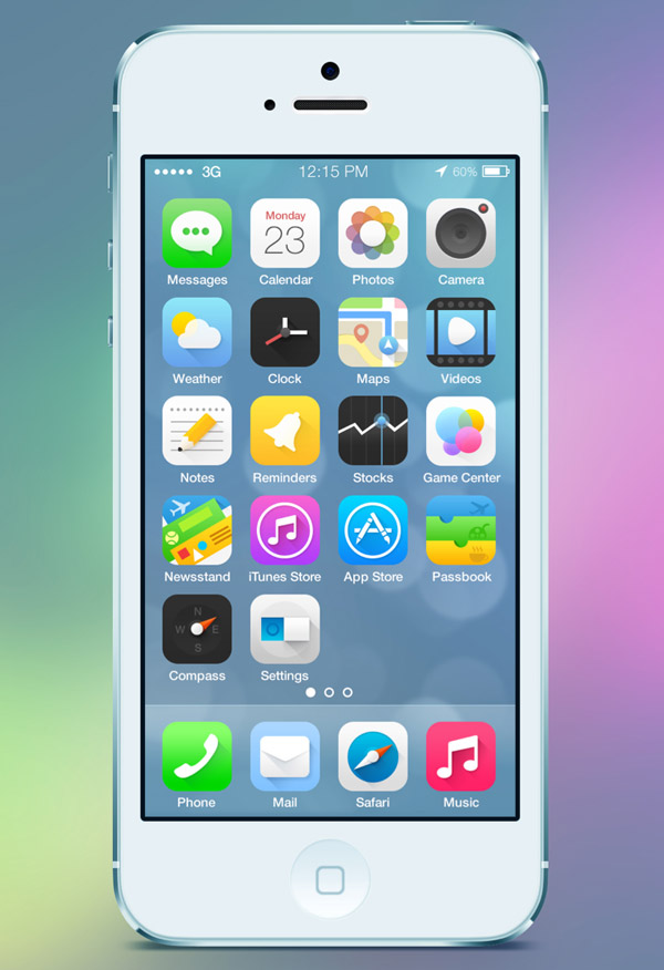
iOS 7 Flat by Dámaso Benítez
iOS7 Alternative Icons by Carlos Gavina
iOS7 Flat Icons by Mialszygrosz
My Own iOS7 by Juan Pisanu
iOS7 Icons by Michael Shanks
iOS 7 Redesign by Johnny
iOS 7 Icons Redesign by Christophe Tauziet
iOS7 Homescreen Redesign by Gil
iOS 7 Concept by Alex Martinov
iOS7 Redesign by Michael Boswell
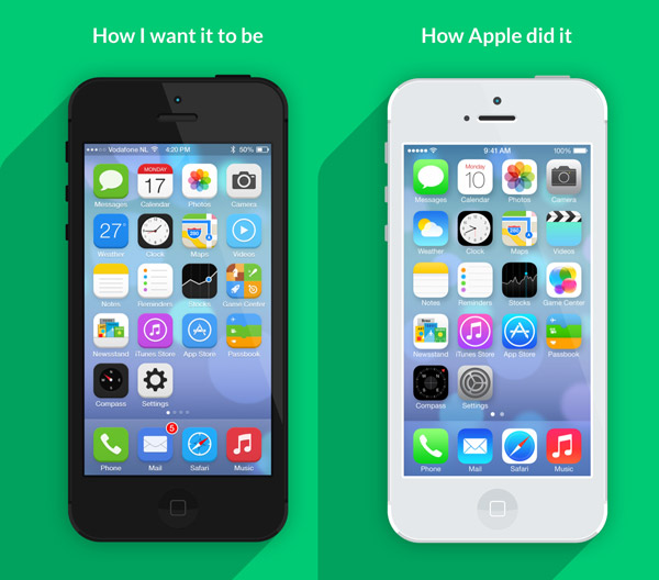
How I want iOS7 to look by Jeffrey de Goot
Final Icons by Vaibhav Bhat
iOS 7 Redesign by Pascal Assaleh
iOS 7 Redesign by Fareast Binsteera
Source: http://line25.com/articles/25-designers-show-how-ios7-should-have-looked

No comments:
Post a Comment