A horizontal scrolling website seems counterintuitive. They don’t seem to be as user-friendly as vertical scrolling websites, but the truth is that sideways scrolling can be a good fit for your website design on occasion.
Creating a horizontal scrolling website is an exercise in an out of the box thinking. This design choice has been a small but growing trend. It’s something different and sometimes that’s what your website design needs.
However, creating an effective and usable website with a horizontal scroll layout is a challenge. Follow these tips and trick to know if one of these layouts if for you and, if it is, figure out how to make a horizontal scrolling website that helps rather than hurts.
Sideways Scrolling Can Be Used to Attract Interest

Creating a website with a side scroll layout (also known as horizontal navigation) has been a controversial web design technique for a long time. It was long considered one of the greatest web design faux-pas.
However, sideways scrolling has been around since the earliest iterations of the internet. It’s only recently begun to make a truly strong comeback. Some consider them the most modern and latest web design layout.
What prompted this change in attitude? Well, with tablets, swiping motions have allowed horizontal scrolling websites to make an effective comeback. This swiping motion makes a horizontal scroll much more viable and user-friendly, even less counterintuitive.
Horizontal scrolling websites have their advantages and challenges. They can create a more intriguing, interesting layout. They typically cause a user to take a look at your website for a little bit longer.
However, that means that your horizontal scrolling website needs to be designed well. You can’t just set it up to use a side scroll layout. You need to think through it carefully. It’s not necessarily an easy form of site design to create, either.
Are You Sure You Want to Use Horizontal Scrolling?

Before you even start down this path, make sure sideways scrolling is for you. This layout, as stated above, is pretty controversial. It’s a major subject of dispute and is frowned upon by a number of advocates of user experience. The only real reason to use a horizontal scrolling website layout is to attract user attention.
A recent study by user experience expert Jakob Nielsen revealed that only 1% of users take a look at the information that is originally hidden by sideways scrolling. However, when you design one of these websites right, it creates a unique and intriguing user experience. You can use the parallax effect to great result with a side scroll layout.
How Horizontal Scrolling Websites Can Be Great for User Experience
There are four specific situations where a horizontal scrolling website creates a good user experience:
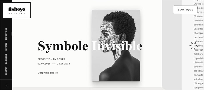
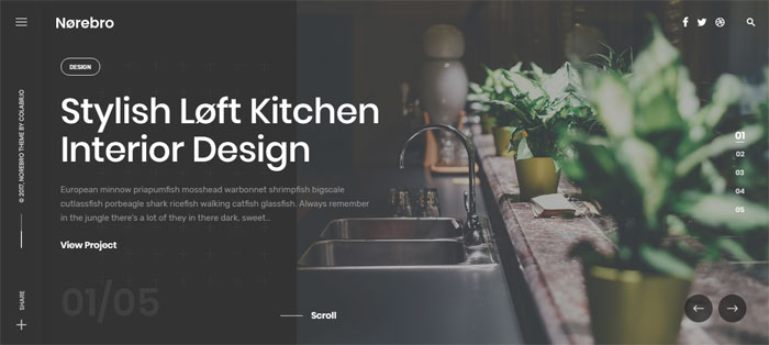
- When it displays several images, as in a design portfolio or photography site.
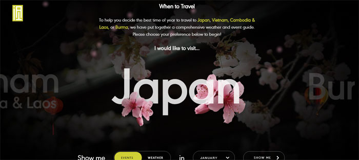
- When it displays information in a large space that is not easy to see at a glance, like a map.
- When it displays slides or discrete sections of info on applications.
- When it displays a large catalog of items or products in such a way that different product categories can be easily shown.
Horizontal scrolling website designs are better for certain website functions than others. Gallery sites often make use of it and so do quite a few portfolio sites. It is an interesting way to allow site visitors to scroll through a set of images.
Occasionally ultra-niche retailers use as well as a way to have a fresh look. Some more typical retailers use it to display features of particular products that they want to highlight.
What is the Appeal of Horizontal Scrolling?

Consistency across device– Horizontal scrolling websites allow for a consistent look on mobile devices and computer screens. Horizontal swiping has become very common on mobile devices.
Many apps use it, after all. Because mobile-focused designs are increasingly important, choosing to use horizontal scrolling as the basis of their websites to save on resources and sign time. This has a catch, though. Sideways scrolling has been less common on desktop sites for a long time, so users may not pick up intuitively that they have to scroll across the screen rather than up and down it to see more content.
This can cause a one-size-fits-all design approach to backfire. The key take ways here is that users are more likely to think about design consistency when they are moving between websites on the device they are currently using.
They’re much less likely to remember exactly how they interacted with the website when they use a different device. Consistent horizontal scrolling may be a better choice if you’re trying to save resources or you expect your site to be more often viewed on mobile devices. However, if you expect users to view it on a desktop screen, you may want to create a sideways scrolling mobile site and a vertically scrolling website.
Browsing through non-critical content—not all content is critical. This secondary information can be communicating in different ways, including photo galleries of example images. This info can be great for a horizontal scroll layout.
It allows users to see a sample of the content and allows them the choice of swiping through or clicking to learn more. It’s fine if site visitors don’t scroll through the entire filmstrip. You just need to be sure that no essential content is hidden away behind a horizontal scroll.
Saving vertical screen space- Instead of displaying all the site’s content all at once on an extremely long page, a horizontal scrolling website introduces users to information in smaller, more digestible chunks of information. A sideways scrolling site is more flexible and lends itself to being extended quite easily (once you get the initial design structure down). You can add content in both vertically and horizontally.
The Control Issue with Sideways Scrolling
Your goal with designing any website is to make sure the site design doesn’t make users think. The content should be where their brains are focused. Navigating through the site and the process of viewing that content should not be where a user’s brain power is invested.
Horizontal scrolling websites are not as intuitive to get around for users as vertical scrolling ones. They tend to have to think it through. It should be obvious how the site moves. Include obvious indicators of how the site works.
Make it friendly to your users. You need to think about how the scroll bar will look, where menus go, and how users will know which particular information is actually important, like calls to action.
A lot of horizontal scrolling websites rely on a browsers scroller function. This is not necessarily the best idea, but you also shouldn’t get rid of the browser’s scroller altogether either. Without it, users have no guideline to go off of.
It creates another hoop to jump through. Instead, include a range of navigational aid above the horizontal scroller. This includes arrows and large scrollers that can zoom across a site. They will make the user experience more smooth and comfortable.
Tips and Tricks for Good Horizontal Scrolling Website Design

Careful Planning
This is true of any website design, not just horizontal scrolling websites. It has special meaning for sideways scrolling however because it’s so easy to get it wrong. Don’t get lazy and start without having a plan.
Take the time to create mock-ups and paper porotypes. Decide where and how everything is going to fit together. There is a lot to think about. Especially because horizontal scrolling website design is not that common, it requires even more thought than vertical websites.
Horizontal Navigation
The biggest issue for users of horizontal scrolling websites is the way that they are navigated. Even if they look great, they can end up being confusing and drive visitors away if they find it hard to get around the site.
The navigation for your horizontal scrolling website should be both obvious and good looking. It should both look and behave as site visitors expect it to. They should not have to click on a side scroll bar and slide it along. A lot of users will make use of their mouse wheel or arrow keys to scroll.
Most have forgotten that you can click on the scroll bar and use that to move through a website. Most people use scroll bars as a visual gauge of their location on a webpage, especially for younger people, who are more likely to be the target audience of your horizontal scrolling website.
You should never try to remove the scrollbar. People do know what it’s for and do find it useful. It’s a good backup for when peripherals fail and there are a few people who will make use of it.
Overall, your navigation should be easy for users to find and easy for them to use. Make sure it’s pretty intuitive so no one feels they have to puzzle out how to move around on our page. If this takes too long, they’ll leave.
Basic Navigation

Stick to your fundamentals of good site navigation. It should be clearly visible and easy to use. A menu is generally a good idea. It allows users to know where they are and where they might be interested in going.
Don’t leave them scrolling through the page to find it, either. This gives you the best of both worlds. They can enjoy your unique horizontal scrolling website design but be able to freely navigate without any trouble.
Make Use of Labels
Horizontal scrolling websites are not as intuitive for users as vertical scrolling ones. Make free but smart use of labels to help them out. This will help avoid making the site too confusing and driving away visitors.
Allow your visitors to know what the items on the page are, rather than having them click around to figure it out. Allow them to get to what they actually want from your site instead of spending time figuring out how your site works.
Users really do want things spelled out for them. They don’t want to feel or look stupid when they don’t know something. They need to be able to figure out what’s going on the site and be able to do so quickly.
Do Not Neglect the Site Content
It can be tempting to let your sideways scrolling site design speak for itself. They tend to be used on trendier sites, especially when they’re image heavy. This is acceptable, of course, but you should also remember that your site has a purpose beyond just being an exercise in unconventional design.
“Look at all this cool stuff” can be fun, but it is rarely the reason you’re creating a website. You need to make sure all the relevant info about hat the site is for, including info about the business, products, services, how to contact you, order forms, and so forth.
A horizontal scrolling website, as cool as it may be, will not make up for a lack of important content. Content is king. You need “contagious content” to get visitors to come back to your site. It’s the only way they’ll really take the tie mot look at your horizontal scrolling website design.
Coding

Coding lends itself to vertical scrolling design more than sideways scrolling design. It is just more intuitive in that context. It’s more comfortable and what designers are more used to. It is thus more difficult to code a horizontal scrolling website and is going to require a bit more effort. You might not even know how to do it yet.
There are a number of tutorials out there that can help you along with coding a horizontal scrolling website. You’ll probably need to break it down to the essential HTML and CSS elements. Learning how to code for a side scroll effect may end up being a project unto itself—which is something else you need to consider before you start designing a horizontal scrolling website.
Ending thoughts on designing horizontal scrolling websites
A horizontal scrolling website may be a good fit for your site design. It has a lot of challenges and does not always look right, but it’s a different and original way to create a website to display information.
If you enjoyed reading this article about designing a horizontal scrolling website, you should read these as well:
- Creating B2B Websites: Tips and showcase of B2B website design
- 34 Of The Best Motion Graphics Studios And Their Work
- Top advertising agencies and their great work
The post Horizontal scrolling website examples to use as inspiration appeared first on Design your way.
Source: https://ift.tt/2zNbDW8


No comments:
Post a Comment