Car logos are an incredibly key part of a car company’s advertising, and often a core element of their identity. You can quickly identify the make of a car by the logo on its front or back, in many cases. A well-designed car logo allows you to know which car brand you’re seeing even without text.
Car badges are even more important for car companies than for many other companies in other industries.
They are literally branded on the car itself. Just take a look at a parking lot or the driveways in your own neighborhood. The car emblems are quite prominent on all of the vehicles there.
These car logos are closely associated with the company and making a change is close to impossible.
Let’s take a look at what makes many of the most popular car logos work and why they mean so much to their respective brands and audiences.
Mercedes-Benz
![]()
Mercedes-Benz uses a distinct 3-pointed star emblem. It is a symbol of the company’s ambition of universal motorization in all domains—land, sea, and air. The circle around that three-pointed star only came into use after the trademark was registered in 1909. A four-pointed star car emblem was also registered at the same time, but it has never seen use.
The star design originally came from the company’s technical director of the gas engine factory, Gottlieb Daimler. When he began in the position, he drew a star above his house on a postcard of the city, telling his wife that someday his factory would become famous because of its success.
Mercedes has not made many changes to their logo since around 1916. Recently, however, they have removed their name from the logo, which has become a popular design choice for companies in many industries. The logo still has an elegant simplicity, highlighted even more by its lack of text.
Vauxhall
![]()
Vauxhall is a British car company affiliated with a German car company called Opel. Both are owned by American car company General Motors. It was founded in 1857. They only came to car manufacturing later, however, in 1903 and started out as a manufacturer of marine engines.
The Vauxhall car logo has gone through several iterations, though they have a constant theme. The Vauxhall emblem has always featured a griffin holding a flag. The current version dates back to 1998 and brought a modern twist to the classical car emblem, stylizing the griffin into a sleek modern circular logo. The griffin and flag in the foreground are silver and the background is red.
Ferrari
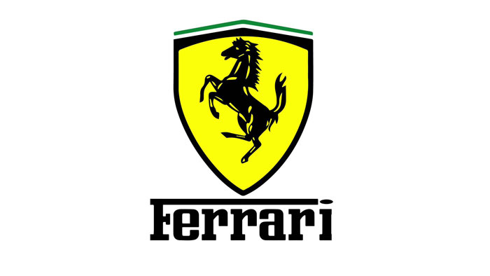
Ferrari has one of the most iconic automobile logos in the world. Their black prancing stallion communicates everything the company stands for: power, speed, and elegance.
The founder of Ferrari, Enzo Ferrari, told the story of the Ferrari car logo only once. The black horse was originally painted on the fuselage of Francesco Baracca’s fighter plane in the First World War.
Francesco Baracca was a national Italian hero and an early flying ace. When Enzo Ferrari met the hero’s mother, she asked him to put the horse on his cars for good luck. He did, keeping the black color of the horse and adding in a yellow background to stand for Modena, the region where Ferrari cars were made.
On top of the Ferrari car emblem is the green, white, and red of the Italian flag, another expression of pride in the company’s roots that also makes clear that Ferrari cars are an example of Italian luxury.
Jaguar
![]()
Jaguar’s logo features a leaping jaguar above the company’s name or—increasingly– on its own. This logo displays the power, speed, and brilliance of the company’s cars and is instantly associated with speed and luxury.
The leaping jaguar car logo has been since 2002, though it received an update in 2012 to give it a more three-dimensional feel. Jaguar has also used a stylized image of a snarling jaguar’s face on occasion.
The sleek leaping cat done in the style of Jaguar’s logo makes ample use of shadow and gradient, emphasizing the graceful lines of its form and the implication of its strength.
Previously, Jaguar used a simple black and white outline of a cat, but that was not nearly as effective or iconic. While easy to identify, it didn’t communicate the same elegant strength that the current logo does.
Audi
![]()
Audi’s logo is simple and elegant. It consists of four interlocking rings all in a line. These four rings don’t just look good, but they also have meaning for the company’s history. Each of the rings represents one of the four car companies that came together to create Audi’s predecessor: Horch, DKW, Wanderer, and Audi.
Interestingly, the Audi car logo is sometimes confused with the interlocked Olympic rings. It was created sometime around 1915 by Lucian Bernhard and modified by Sedley Place in 1994.
The modifications were very slight and the four rings of the Audi car emblem have remained constant for a hundred years, a clear sign of a well-designed car logo. It has a timeless look that worked in the past and will work well into the future.
Lamborghini
![]()
Lamborghini’s logo has a storied history.
The founder of the company, Ferruccio Lamborghini, was working on agricultural manufacturing in 1949, focusing on engines, tractors, and heaters. He originally wanted to start working with Ferrari to engineer supercars, but they turned down his offer. He then hired a team of young engineers and began to make supercars that competed directly with Ferrari, who was then a giant.
The charging bull of Lamborghini reflects the determination and power the company came to embody. It’s strong tones of yellow and black only emphasize it. The bull is also posed so that its strength is on clear display.
The use of the two powerful animals by rivals Ferrari and Lamborghini also makes clear their status in relation to each other. There is some question as to whether this was on purpose, but it certainly makes them instantly identifiable as working in the same niche.
Renault
![]()
Renault was founded in 1899, though its current logo only came into use around 1925. The company used several different car emblems prior to it, including the founder’s initials and even a tank.
Only in 1925 did they start using the diamond shape with their name across the middle. In 1971, this car emblem was overhauled by the Hungarian-French artist Victor Vasarely and updated to its current form.
The car logo incorporates yellow heavily to represent joy, optimism, and success. These are key to the Renault brand—and a far cry from a tank.
Ford
![]()
The Ford logo was first made in 1903. While it has received a few tweaks since its modern typographic letterforms have remained constant.
In 1919, the car company began using a car emblem featuring the word ‘Ford’ written in a manner similar to Henry Ford’s signature surrounded by a blue crest. It pays tribute to the company’s heritage while remaining timeless. It has stayed consistent for several generations.
The current version was used first in the 1960s, though it has had a minor updating tweak applied here and there. The log remains easy to recognize, even at a glance and has an American feel of reliability.
Bentley
![]()
Bentley is a British car company that has become known for opulence, luxury, and celebrity lifestyles. It is based in England and was founded in 1919 by W.O. Bentley, though Rolls-Royce acquired the company in the 1930s.
The Bentley logo is fairly simple, at least in concept. It features a prominent capital B on top of the wings and tail feathers of a bird. It’s remained relatively unchanged, only being updated a little to the shape and layout.
The bird wings and tail are meant to suggest the speed and grace of a bird in flight. The color palette of the Bentley car emblem tends to be limited, sticking to black, white, and silver, a sophisticated monotone fit for an elegant car brand.
Volkswagen
![]()
Volkswagen us a powerhouse. It is the second largest car company in the world. Three of the top ten best selling cars in history come from them: the VW Golf, the Passat, and the well-known VW Beetle.
The Volkswagen name means ‘people’s car’ in German. Their current slogan is “Das Auto”, which means “The Car”. Volkswagen is all about honest, workable simplicity.
The Volkswagen car logo shows this. It features a V and W placed on top of each other. They still look great, however, because of how they follow the form, almost seeming to connect to form two interconnected Vs. It’s both simple and elegant.
This logo wasn’t created by a graphic designer. True to form, it came from a Volkswagen engineer named Franz Reimspiess, who was the one who perfected the Beetle engine in the 1930s. The logo was the winner of an office competition, with a prize of 50 Deutschmarks. Volkswagen has used this in-house developed logo ever since.
Abarth
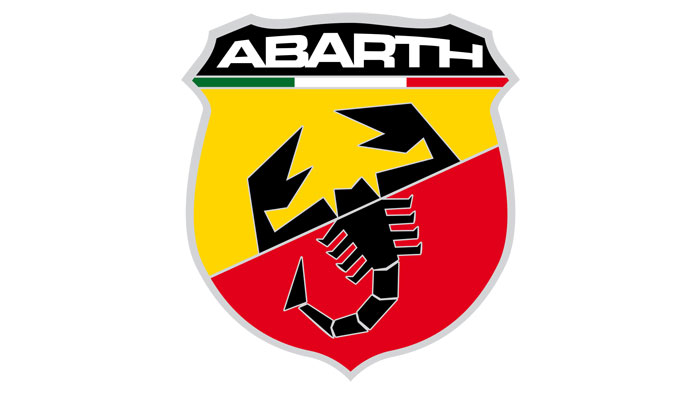
The Abarth car emblem used vivid primary color to draw your attention. It features a prominent scorpion, which is the astrological sign of its founder, Carlo Abarth. The use of this astrological sign is meant to be a symbol for the birth of his motoring company.
It’s an aggressive and bold image, one that is instantly striking and even a bit shocking. Coupled with a shield, Abarth’s scorpion gives off an air of strength and victory, which is perfect for a company that has a proud racing heritage. The Abarth car logo can’t be mistaken for anything else.
Volvo
![]()
Volvo’s logo was designed in the 1950s by the famous Swedish Swedish calligrapher and typographer Karl-Erik Forsberg. It’s meant to showcase the brand’s strength by incorporating the symbol for the element of iron. It also is a play on the traditional symbol for ‘male’. This is all keeping in with Volvo’s rugged image and attitude. Volvo cars are designed in order to take abuse and keep on working very well.
Rover
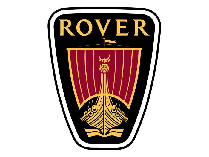
Rover drew inspiration for their car emblem from the Vikings. This choice was made because the Vikings were known to be fearless travelers, the most famous ‘rovers’ of all time, something that Rover wanted to communicate about their cars. Like the Vikings, Rover wants to be seen as a force to be reckoned with.
It is also a very unique logo. The Viking longship appears in very, very few other brands across the world, making Rover’s car logo almost instantly recognizable and easy to associate with the brand.
Cadillac
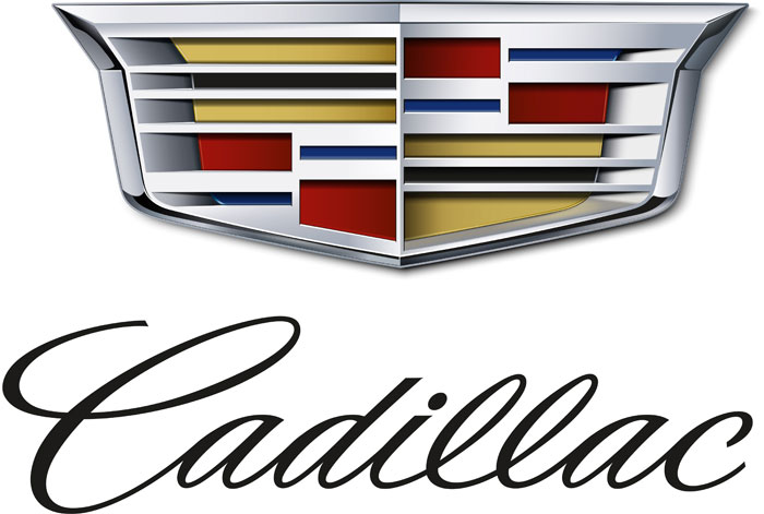
Cadillac started out with the plan of making reliable and affordable ‘horseless carriages’ for the masses. The company set out to design a car logo that reflected this noble mission.
The car emblem itself comes from the family coat of arms of Antoine Laumet de la Mothe, Sieur de Cadillac, a French explorer and the man who founded the city of Detroit back in 1701. This crest is relatively basic and has been in the logo for decades, changing only slightly as the car logo has been updated/
Subaru
![]()
This company’s car emblem is a reflection of their complex history. In 1953, five Japanese car companies merged to form one company, Fuji Heavy Industries (FHI). Subaru was the motor vehicle division of this new massive company. They focused only on the production of motor vehicles and nothing else.
The word ‘subaru’ means ‘unite’ and also refers to the six-star cluster in the Taurus constellation called the Pleiades in the west. The company opted to use this stylized car emblem of the constellation to pay tribute to the union of the five companies.
The Subaru car logo has become associated with high-performance vehicles thanks to how often Subaru cars appear in rally driving competitions. The car logo has become so well-known and so successful that Subaru’s massive parent company, FHI, adopted the Subaru car emblem as its worldwide corporate symbol starting in 2003.
Ending thoughts on designing car logos
Car logos are something we see all the time. Most of us can typically identify a car’s make by its emblem alone, without any accompanying text, at least for more popular and common car brands. Understanding the whys and hows of the ways these car logos work can help you better understand what goes into building a successful logo.
If you enjoyed reading this article about car logos, you should read these as well:
- Best free fonts for logos: 72 modern and creative logo fonts
- Animal logo design ideas and guidelines to create one
- Animal logo design ideas and guidelines to create one
The post Car logos: Showcase of great looking car company logos appeared first on Design your way.
Source: https://ift.tt/2zwC4iV


No comments:
Post a Comment