Travel agencies help those who want to go see the world get to do so. There are hundreds, if not thousands of these travel agencies, and every one of them has a unique travel logo. In that group of travel agencies, there are a wide variety of budgets, specializations, and even focuses.
How to stand out from this varied crowd? A good travel agency logo is key. We live in a world where a quick Google search will yield up many, many travel agencies, every one claiming to offer customers exactly what they want. Competition is fierce and you only have moments to catch and hold a viewer’s attention.
Your travel logo needs to quickly and pleasingly indicate who you are, what you do, and how you can help would-be travelers get to their destination and enjoy their time there. You need to build their faith and confidence in your company right from the first glance. So how can you design a travel logo that helps you do that?
What Goes into a Good Tours and Travel Logo?
First of all, lots of careful thought and consideration. What are you trying to sell? You might be focused on booking flights to and accommodations on Pacific islands, which would affect your travel logo significantly. What is your focus? You might offer historically focused tours of Europe, or plan exotic vacations to largely unknown places.
You could even be a travel agency that is there to help people on a budget go to faraway places with breaking the bank. What you’re doing with your travel logo design is helping build your brand in the mind of potential customers. You’re communicating at a glance what you’re all about.
Second, a dash of inspiration never hurts. Your logo should be unique, recognizable, and even pleasant to look at. When considering possible travel agency logos, remember that it needs to be appealing and eye-catching. An annoying or even repulsive image will not help you out.
What Kind of Images are Featured in Successful Travel Logo Design?
Images are the core of travel logo design. A lot of travel logos make potential clients think about movement. For instance, Orbitz, which has become one of the most popular companies to offer online travel deals, uses a logo that replaces the letter O in their name with a pair of arrows moving in a circular pattern.
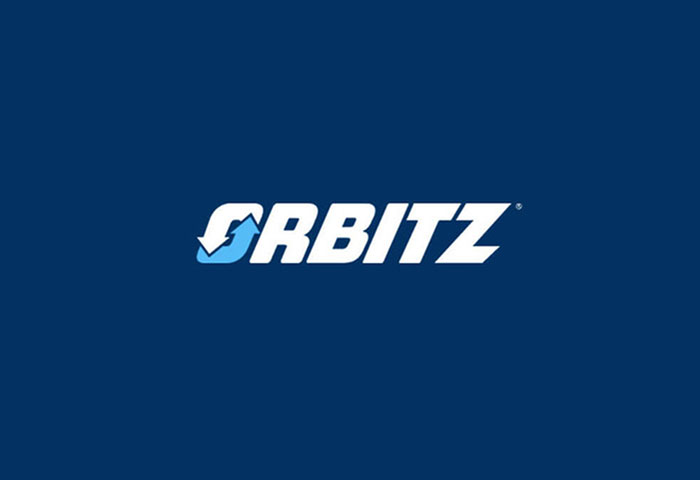
Those two arrows remind customers that the company offers a chance to travel to far-off destinations and return home afterwards. It also lends itself to the idea that life itself is a journey. The circle shape implies that everyone is always on some kind of journey, whether that journey is a vacation like Orbitz sells or a journey through life’s many changes.
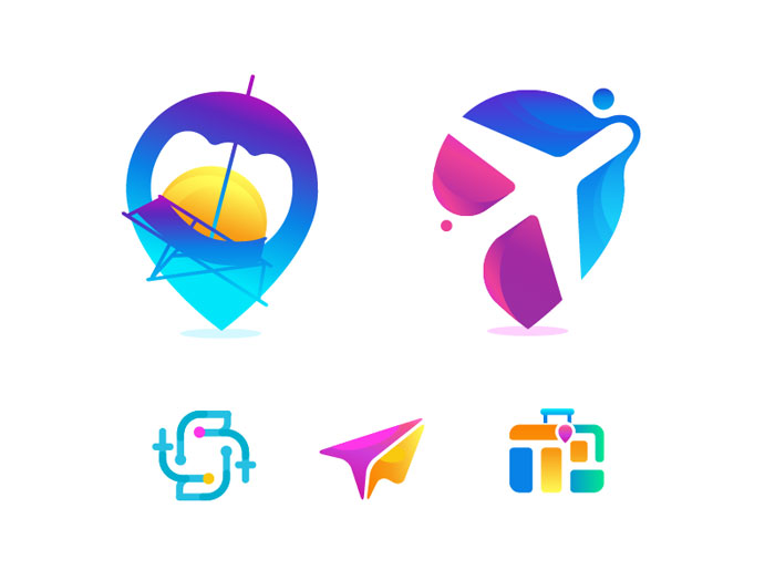
All the creativity on display from all the many existing travel agencies and related companies can make it very hard to design new original travel logos. It is very helpful to find talented designers to design your travel company’s logo and take the ideas in new directions.
What is Successful Travel Logo Typography?
Travel agencies tend to use very conservative typography. For example, the Condé Nast Traveler logo makes use of plain but bold typography. It’s quite obviously designed for use on the cover of a magazine instead of the title of a website. It’s simple text that makes no use of additional graphics. This helps build the whole idea of the Condé Nast brand.
They publish hundreds of magazines about subjects other than travel, meaning that they have a broader reach and popularity they would be foolish not to make use of. This means that using simple and bold typography is better for them than using an unusual typography that doesn’t draw upon the company’s sense of authority and past achievements.
Many newer companies take a different approach. They have to stand out since they don’t; have a long history or a record of success to stand on. It’s more important to make a mark. If people wanted the old and tried, they’d use it after all.
![]()
Kayak is a good example. They are an online travel company that is focused on offering low prices to travelers. They make very creative use of typography in their travel logo. When you first look at it, Kayak’s logo seems very plain. It uses blocky black letters on a yellow background.
If you look closer, however, the logo is more interesting. It links the company to the whole history of travel. The letters look very similar to those used in often in train stations schedules. It makes use of a line drawn horizontally across the logo, a way of showing where letters would fall over to reveal any updated info about arriving and leaving trains.
What Kind of Colors Work Well for a Travel Agency Logo?
![]()
It’s important to remember that travel logos are all about communicating the benefits of taking journeys. Green and blue see a lot of use because they remind people of a globe and what the planet looks like from outer space.
This makes people think of all the places and things they could visit. Many travel related companies have used blue and green very prominently in their logos, including Travel Planet, Happy Holidays, Globus, and LifeMountain. Blue and green get results.
While green and blue are very prominent in the travel industry’s logos, some older companies make use of black and white. Black and white is undeniably simple and classic, dating back to when that’s all anything was printed in, after all.
Newer companies in the industry, however, try to buck these trends and offer something new, though many do still take advantage of green and blue. It’s hard to argue with the results of this classic color combination and the emotions, connotations, and associations it evokes in the average person.
There are many color combinations that can get people excited about travel. Flyography, for instance, uses just about every color you can think of. They wrap these diverse colors around like the liens of yarn in a yarn ball, reminding people of all the airplanes flying all over the world.
This travel logo design concept would simply not work as well if it used fewer colors. By using dozens of colors, it allows people to imagine all the very many places they could travel. It’s different, too, allowing this travel logo to stand out from the crowd of blue and green logos.
Choosing the Right Travel Logo for Your Company
While all these design elements are very important, the most important thing to do when designing a travel logo for your company is that it is a good fit for you and your business. These design guidelines are just that—guidelines.
It’s important to make sure that your travel logo is a good fit for what your company does, what it offers, and what your principles are. If your logo doesn’t communicate at a glance who your company is and what you are about, then it isn’t really going to be much help to you no matter how much effort you put into it.
Some Travel Logo Tips and Tricks
Here are some key considerations to take into account when designs a travel logo. Much like the basic principles discussed above, they are guidelines, though a bit more specific and detailed ones. Use them to help decide on where to start with your travel logo.
Also be sure to take a look at famous travel logos from successful companies that already exist, including travel agencies, travel websites, airlines, and other aspects of the travel industry. While imitating them directly is not as good idea, you can figure out why they work so well and use those ideas in your own travel logo design.
Communicate, Leisure, Fun, and Enjoyment
A travel logo should be appealing and should evoke feelings of enjoyment. Because people going on vacation are looking for fun and want to avoid a hassle, which should be clear in your travel logo that you are offering just that. Have the travel logo design express joy, playfulness fun, and leisure. Make sure people look at it feel a bit happier when they see your logo.
Also be sure that your logo targets specific groups of people. Every travel business has a niche. Some focus on leisure vacationers, while others look to market to business travelers.
Every different group of travelers has a different thing they want out of a travel company, whether it is ease of use or help in finding fun things to do on vacation.
Tailor the happy and helpful mood of your travel logo to their preferences. Make sure it is associated with your target audience’s enjoyment and travel goals. This will help you appeal to them more thoroughly and help make your travel company’s logo stand out even better.
Location is Important
Every truly great travel logo displays some destination. Often, people have a destination in mind when planning a vacation. They can easily identify a place by a distinctive image. Your travel logo should make good use of this tendency.
If you focus on a specific destination, like Hawaii, incorporate iconic elements of that destination into your travel logo, like Hawaiian palm trees, waves, or even volcanoes if you’re feeling really bold. This use of imagery will help make it much clearer what you are all about and opens up a lot of creative possibilities for your logo.
![]()
If you do not focus on a specific kind or set of destinations, you can still make good use of imagery in this way. Wide open horizons, maps, airplanes and airplane imagery, even vehicles can help communicate that you are there to help travelers find their way to where they want to go and back home again.
These kinds of symbols are something you should use. Don’t just stick to boring generic shapes. If you offer help for travelers to a variety of destinations across the world, consider creating a logo that features some iconic imagery associated with key locales like Paris, New York, or Shanghai. Using imagery effectively will help build customer confidence in your travel company.
Make Good Use of Color
![]()
Color plays a key role in how we live our lives. It evokes all kinds of emotion, depending on context and look, and holds associations with a variety of real world objects at just a glance. Brighter colors tend to create a more joyful mood.
Blue and green, as discussed above, are traditional colors that make people think of a globe, and thus make them think of travel. Many travel logos make use of yellow and red as well because they are bright and playful. They help them catch people’s eye. Make sure any set of colors you choose fit for your company’s overall branding scheme and mood.
With rare exception (as discussed above), try to keep a limited color palette. This will make branding easier and will also help prevent customer confusion.
Too many colors can quickly become an eyesore. Remember, your logo will be everywhere on a customer’s travel info, and you don’t want them frowning as they look at it. The colors should be appealing when put together and not a mess.
Use Fonts Well
Font conveys a message as easily as color. While older travel logos tend to make conservative and bold use of font, newer ones often use fun and clever fonts.
They tend to be quite casual, even for those travel agencies that have a higher end or business focus. Like the imagery and colors you use, the font you choose should communicate a sense of joy and relaxation. People want travel to be easy and hassle-free. They want their vacations to be fun memories. Your font should evoke that feeling.
If your focus is more professional, more professional (but still relaxed) fonts should be used. If your company is geared to travel to a specific area, consider using fonts that evoke the feel of the local culture in that area. Try to avoid standard fonts that see a lot of use in everyday life.
This will inevitably make your logo look chap and your entire operation will seem slapdash and unserious. You want a professional look, not a look that makes it seem like the company is run out of a dingy basement. Remember, logos are fairly simple designs, even when they seem complex, and every element can lend itself to the mood they evoke in customers and potential customers.
Convey Your Company’s Message
Above all, your logo is conveying a message. What is your travel company’s chief aim? Before you even start considering the specific elements of your travel logo, write this message down.
Do this whether you are trying to design your own travel logo or whether you are hiring a designer to do it. It is going to be your guiding star, the thing that sets the tone for every element of your travel logo. It’s vital to know what it is.
With this message on hand, you or your logo designer can pick the right imagery, colors, and fonts for your logo to appeal to your target audience. You’ll be able to better communicate what you offer and evoke the sense of happiness and ease that you want.
You can also figure out a way to use your logo to communicate what makes you the better choice for a service than all your many, many competitors that are out there. No matter what your focus is, it’s important to know what your message is as you start to go into designing your travel agency logo.
Appeal to Your Target Audience
Knowing your message means you’ll be more able to identify your target audience, too. You’ll be able to do some research and see what kind of look appeals to them, what draws them to a travel service, and what their travel goals are.
Once you know these things, you can incorporate them into your logo to make it much more appealing. Luxury travelers have different ants than budget travelers who have different needs than business travelers. Knowing your target audience is key to building a truly stand-out and successful travel logo for your company.
More Travel Logo Ideas
Use the outline of a city—if your travel company is focused on one particular city with a distinctive skyline, think about using a modern and sleek outline of that city in your logo. It will instantly evoke the idea of the location you focused on and have a certain timeless appeal, as well.
Use fun or particular evocative colors to make it clear you offer something different and pleasant. You can also do this if you are creating a hotel logo for a hotel with a distinctive shape or even feature. It’s an easy way to demonstrate what makes your business unique.
Make nature prominent- If you are focused on nature tours or other ecologically focused travel, use natural images to evoke the right feel. Flowers, birds, waves, mountains, animals, just about anything will work provided it is the right fit. You can be as specific or general as you like depending on your focus and target audience.
Whatever you use, make sure it communicates joy (and maybe thrills, or relaxation, depending) and not danger; a snarling wolf might not get many travelers to use your services. People do not want to feel like they are at real risk when traveling.
Appeal to families—if your company wants to specialize in selling family travel, have your logo focus on kid-friendliness. Feature beach toys and a sandcastle, or have it be a cute and cuddly mascot. Use fun and kiddy fonts.
Travel is hard for families, both in terms of budget and logistics. If your logo makes it clear right away that your business is family focused, it will make them much more likely to choose your business without doing too much looking elsewhere. To them, it is clear that you are focused on their major concerns right away.
Make generic images appealing—if you cover a broad array of travel plans, don’t hesitate to keep your logo generic, using vehicles like airplanes or general images of travel like distant horizons.
Just because these images are not specific does not mean they have to be boring or plain. Smart use of color, font, and design principles can make them as evocative as an image of the Taj Mahal for a travel company focused on India. You just need to think about it a bit more.
Ending thoughts on travel logo design
A travel logo is a key part of your company’s branding. Take a look at these principles and think it over carefully as you begin your design (or hire your designer). With some thought, it can become a standout logo that helps drive business your way!
If you enjoyed reading this article about Travel logo, you should read these as well:
- Top 10 Worst Logo Makeovers and Lessons We Can Learn From Them
- Camera Logo Design: Its Usage in Photography Branding
- Logo Design: What font styles suit which industries?
The post Travel logo design ideas that you should use in your next project appeared first on Design your way.
Source: https://ift.tt/2LMYT3w


No comments:
Post a Comment