Mobile charts are an important way of displaying a lot of information in an easy to digest way.
Good charts allow designers to quickly communicate complex statistics in a way users enjoy looking at. Even on normal computer screens, chart designs can be hard to pull off. For mobile, however, it can be even harder.
Mobile chart design can be a challenge. It’s vitally important to do it as more and more users view more information on mobile platforms. Charts include pie graphs, bar graphs, and tables.
They can be presented in a variety of ways, but small mobile screens make it even more crucial to do it effectively. Whether you’re creating an app that provides analytic assistance or your site displays weather data, these tips on chart design can help you create better charts.
Advantages of Linear Graphs
Bar charts are a time-tried way of presenting quantitative data. They’re an excellent choice for your dashboard charts if you data works with the chart design. Bar graphs work so well because people naturally asses the length of each bar very efficiently.
It is easy for viewers to compare the values. This process works especially well when the bars are ordered in either ascending or descending order by length of bar. Mobile charts that use 2D position, like scatter charts, or line graphs also provide similar advantages.
Circular and Area-Based Graphs Are Hard to Understand Quickly and Accurately
On the other hand, we have the classical circular chart design. This includes gauges, pie charts, tree maps, and radar charts. They don’t communicate information as well as linear graphs do. These chart designs use area and angle to communicate their data.
It’s harder for people to understand when one area is really bigger than another, especially with nuanced data and complex relationships between data sets.
If you’re looking to use dashboard graphs to quickly and effectively communicate info, these area-based graphs aren’t the best choice. They can’t communicate complex quantitative relationships in a data set very well.
Pie charts are known for being very bad at communicating info. Donut charts are even worse. They are, however, useful for showing overwhelming disparities. For instance, a pie chart can be used to demonstrate that a single source of revenue is providing the large majority of a company’s profits.
Tree Maps
Tree maps are another form of chart. They show hierarchal data sets in a series of nested rectangles of differing sizing. The size of each rectangle corresponds to a numeric value. They can be very useful for displaying complex data in a compact overview.
Use it when users can have the opportunity to explore the dataset at their leisure and look for additional details. They are not a good fit for more simple actionable dashboards.
Gauges
Gauges use angles to communicate data. They are not a great choice for quantitative data. Gauge charts are composed of gauges that resemble analog gauges ion car dashboards. They take up a lot of space and are difficult to interpret quickly.
More Tips for Smart Mobile Chart Designing
Have No More Than 5 Slices in a Pie Chart
If you really think a pie chart would be a good choice, do what you can to keep it to having five slices or less. If there are more slice on a pie chart, the more difficult it is for users to understand what it is saying. You’ll end up with strange solutions to show labels or odd ways to make hover interactions work. If this is difficult for you to do, look into using a different kind of chart.
Order Your Data Series
It’s much easier and faster for viewers to process information in a bar graph it’s sorted in either ascending or descending order. This is only really applicable to bar chart designs. This will not work, however, if you’re working with dates or other forms of time-associated with information.
Don’t Use Randomly Generated Colors
There are some charting frameworks randomly generate colors for the data series. This is not really what you want for your mobile charts. The algorithms are not very likely to select colors that fit your site or apps overall color scheme or provide enough visual distinction between the data series to be easy to read.
The best thing to do for good chart design is select your own colors. Be sure to choose enough colors to display all the data series that could potentially be featured on the charts.
Trend Lines Are Typically a Distraction
Even though trend lines seem like they are a good addition that helps viewers get a better grasp on the data, but they usually hurt more than they help. A viewer is typically able to identify the trends on their own without the visual clutter of a trend line. If you do feel the need to add a trend line, allow users to be able to toggle it off.
Avoid Relying on Tooltips
Tooltips are supplemental or expanded information. Don’t rely on them. Viewers should be able to identify values without them on good charts.
Don’t Include a Legend When You Don’t Need One
Simplify where you can. If you only have one data series, don’t feel you need to add a legend. Instead, just use the chart title to demonstrate what data is plotted on the mobile chart.
Use Grid Lines When It’s Helpful
Grid lines guide viewers’ eyes from axis label to data points. They can be helpful sometimes, but they are not necessary on simple charts. If you opt to use grid lines, decide if you want them on both the x-axis and y-axis. Often you’ll only need it on one side or the other.
Use Real Data in Chart Mock-ups
While you might be tempted to create a beautiful chart without any regard for your data whatsoever for your mock-up, that forgets the purpose of your chart. You should sue real data whenever possible during every stage of your mobile chart design. That is the purpose of your chart, after all.
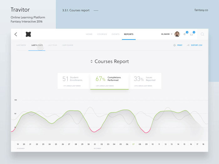
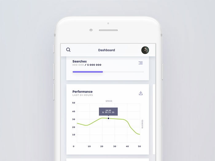
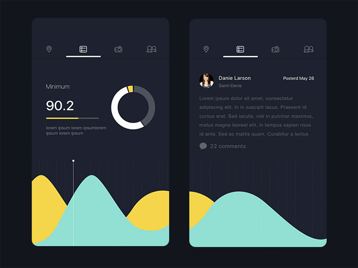
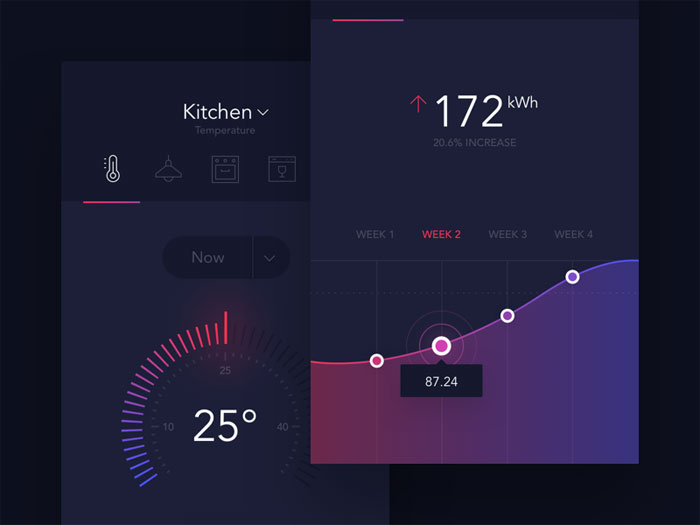
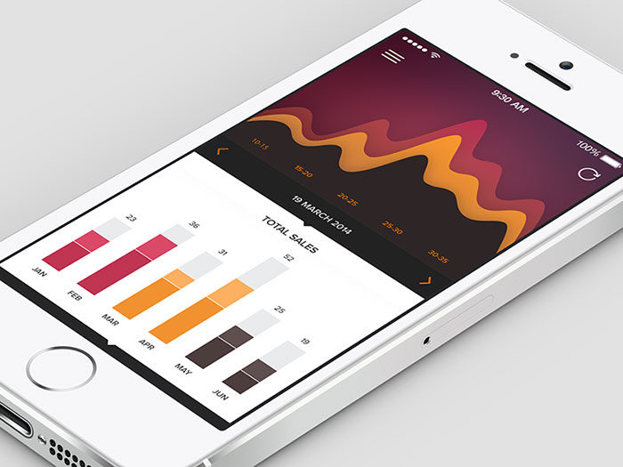
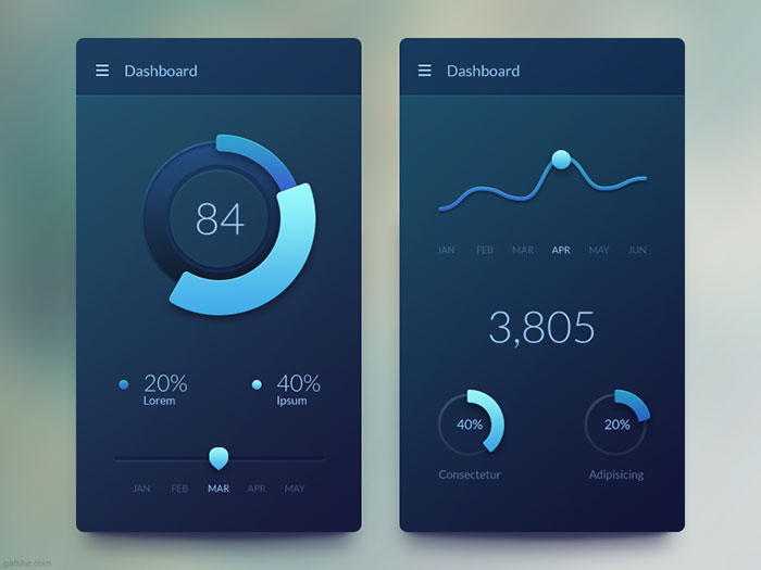
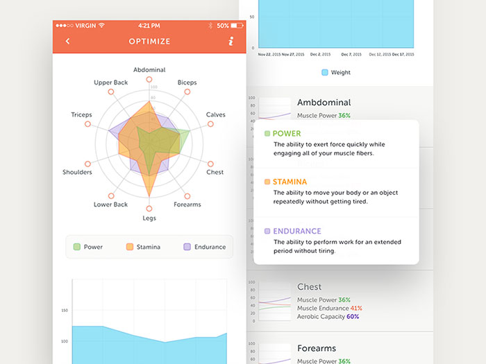
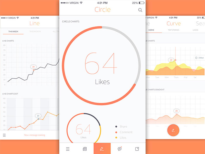
Mobile charts examples
Design can be considered a craftsmanship because you do it until you are good at it and then you keep doing it to be better. The problem is that many developers are really eager to solve functionality problems rather than spending time to solve the interface issues.
A mobile designer must embrace minimalism because he will have to limit the features available on each screen and use them efficiently. Of course, the designer must also pay a lot of attention to usability. If a function cannot be found, is to small to notice, or not large enough to be used, the application becomes unusable.
Designing for mobile seems like a difficult move from designing for web or for desktop applications and a designer must keep an eye on almost everything that he can think of and on what he doesn’t know yet. Seems like a lot of pressure meaning that there’s little time left for imagining how to make the required elements of mobile UI design.
The charts and graphs which are displayed in this article for inspiration should help a mobile app designer to expand his imagination and relieve some of the stress that he comes across while designing an app.
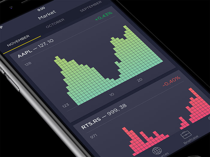
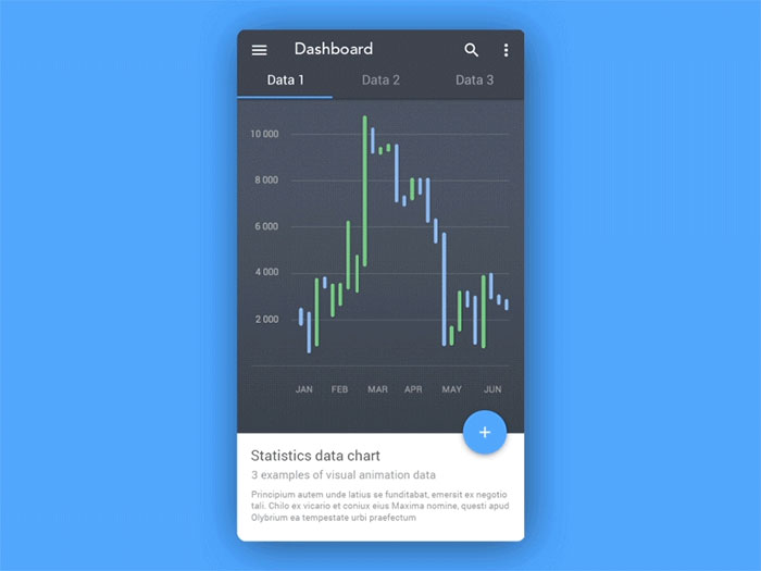
Android – Statistics Data Chart
Arco’s charts and graphs
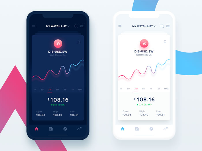
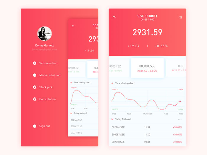
Stock App Design
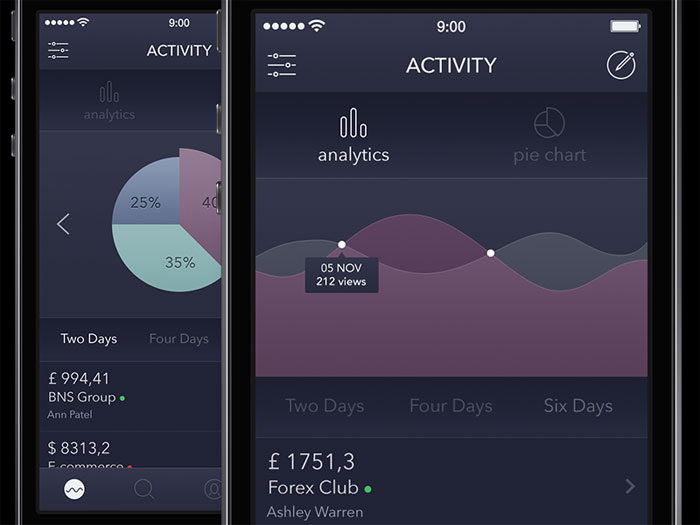
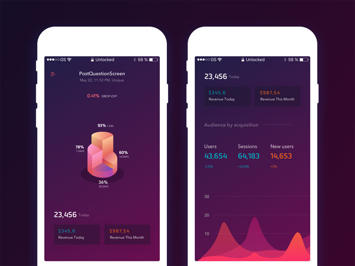
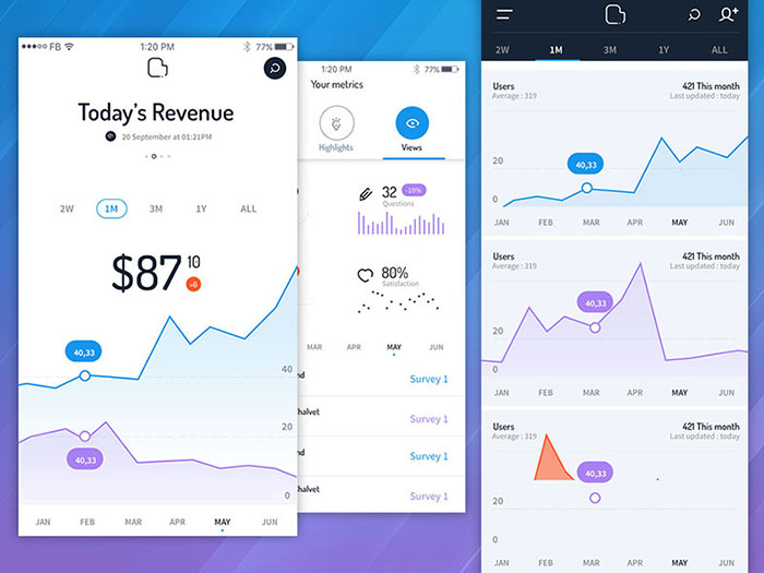
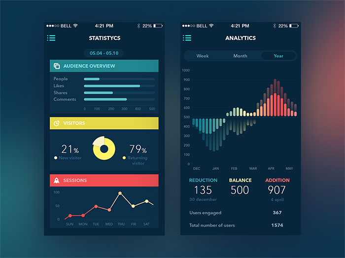
Analytics
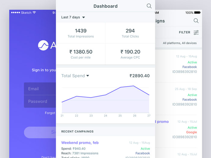
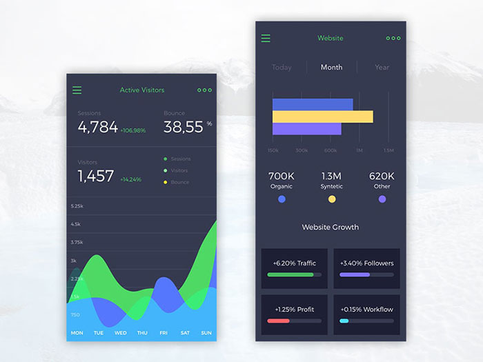
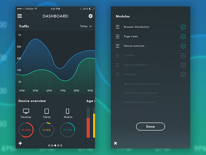
Mobile Dashboard
Optimize – Stats
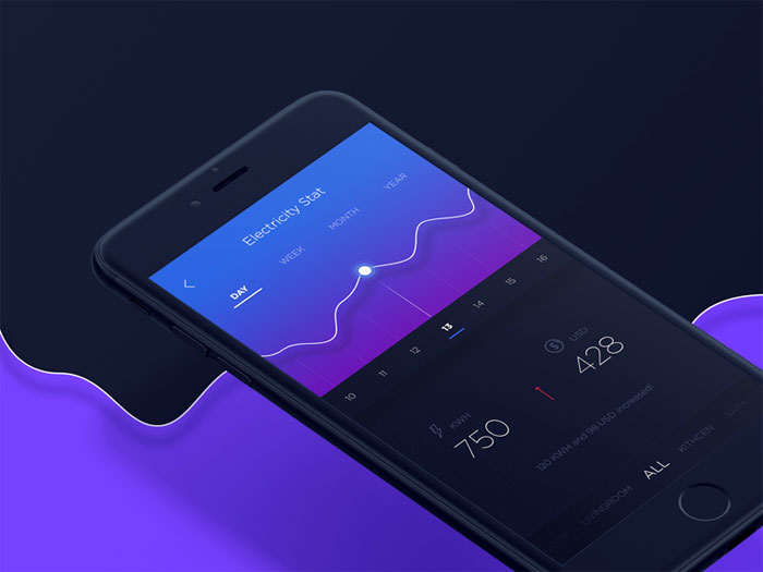
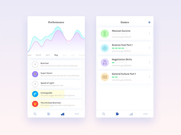
Charts and graphs in mobile UI
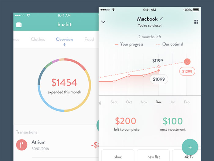
Buckit financial app
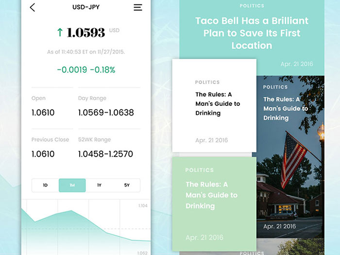
Financial and news app screens
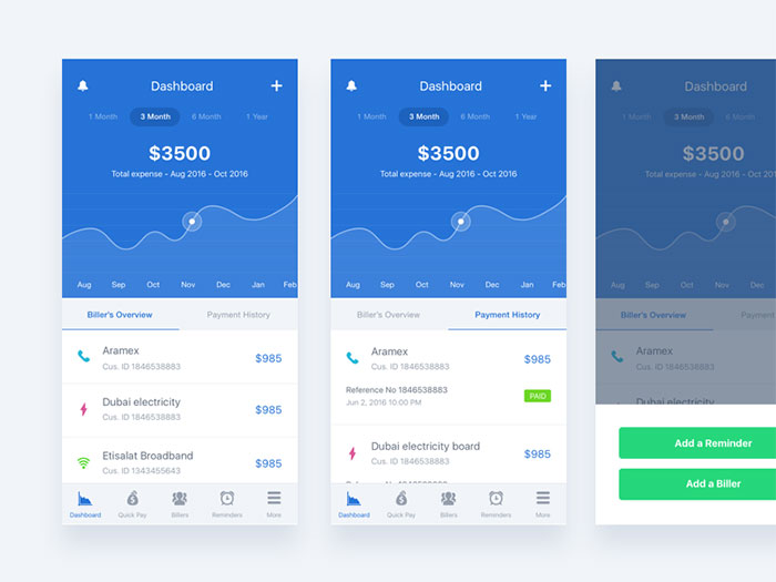
Pay Bills
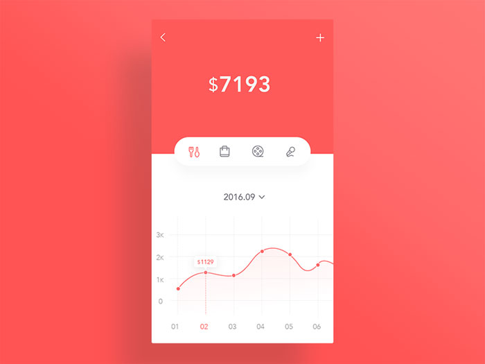
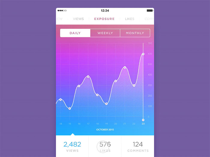
Line Graph Screen
Analytics app screens
Analytics App
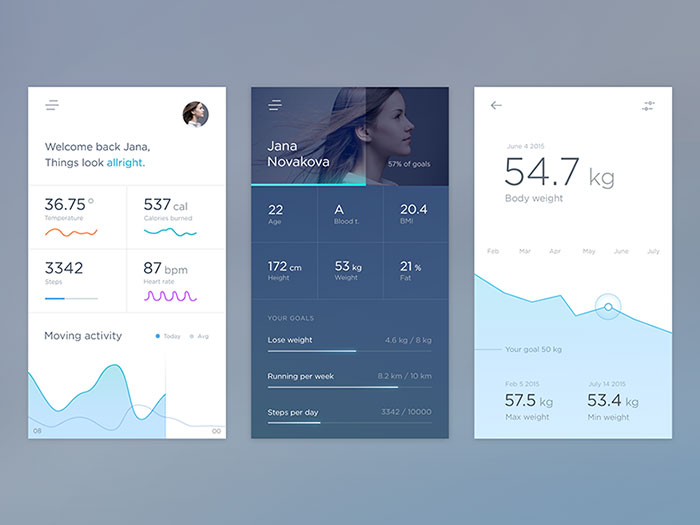
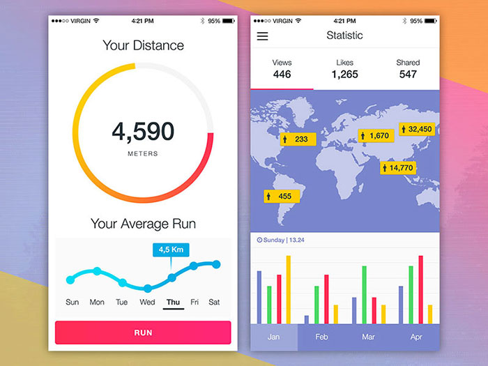
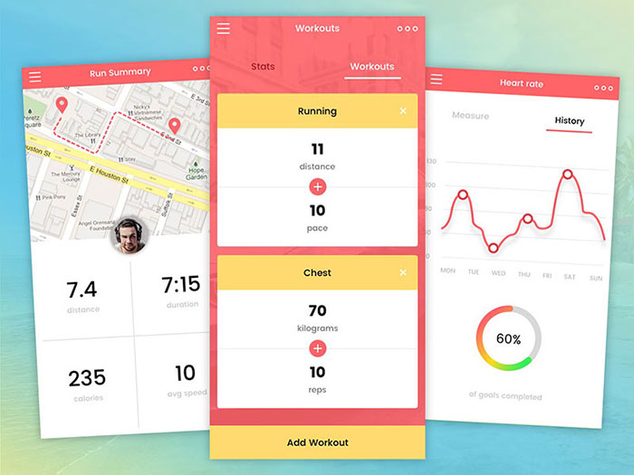
Health App mobile
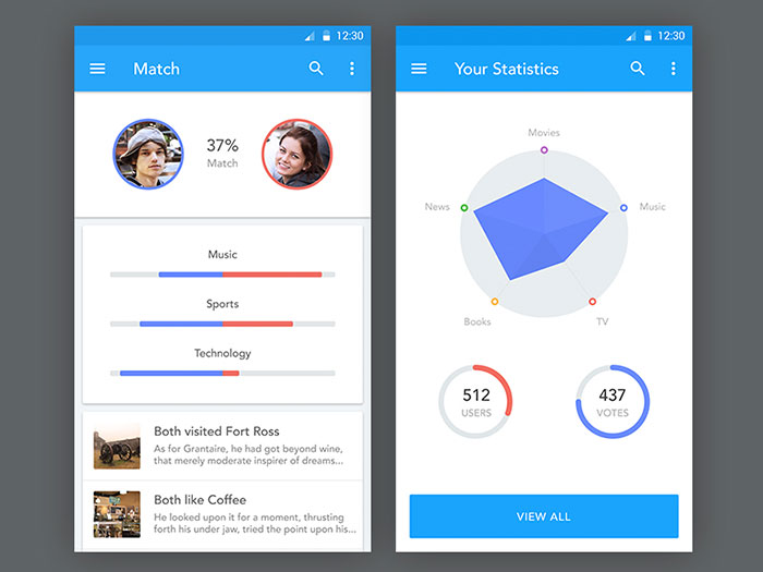
Cycling Match
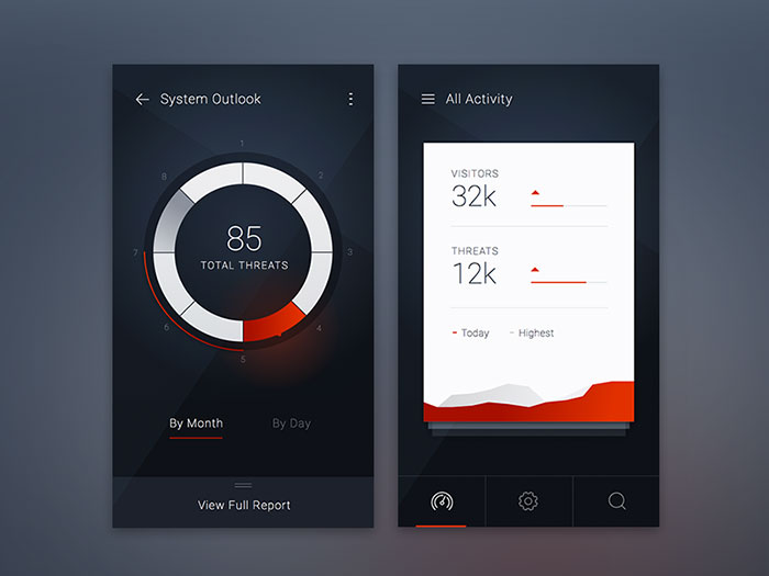
Threat Dashboard Direction iOS
Mobile dashboard
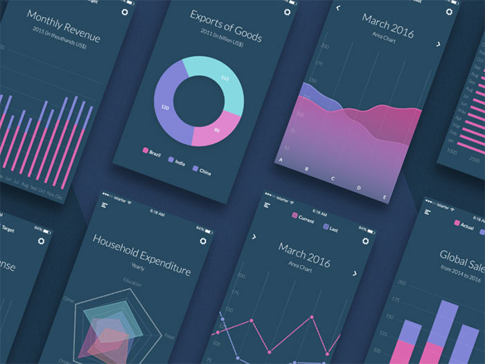
Charts
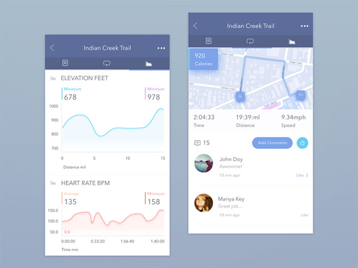
Indian Creek Trail App Concept
Manage modules
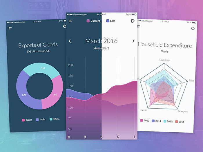
Purple charts and graphs
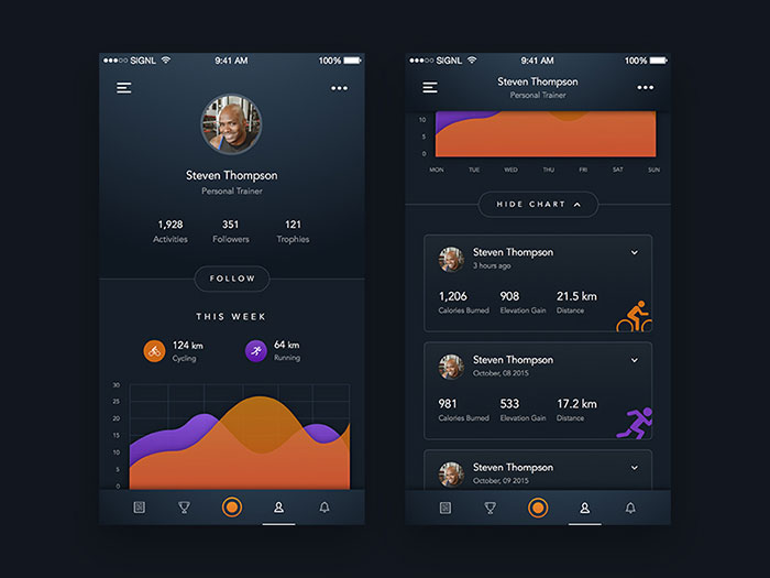
Sport Tracking App – Profile
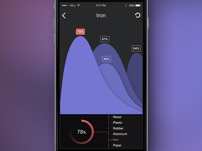
Iron Chart
Noblyn App Redesign
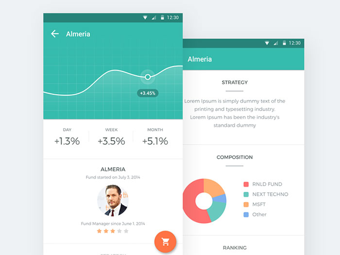
Mobile Investment Platform
Tracking app
Ending thoughts on a mobile chart design
Good charts are important, especially for mobile platforms. Keep in mind some of these tips as you create mobile charts for your site or app.
If you enjoyed reading this article about mobile chart design, you should read these as well:
- Mobile UI Design Inspiration: Charts And Graphs
- Mobile Dashboard Design: Android and iOS UI Examples
- Charts And Graphs Javascript Libraries
The post Mobile UI Design Inspiration: Charts And Graphs appeared first on Design your way.
Source: https://ift.tt/2uc0gB6


No comments:
Post a Comment