The Pepsi logo has not gone through much change over the years — or has it? Many brands have to change their logo design, and as iconic as the Pepsi logo is, it actually has gone through several changes throughout the company’s history.
Pepsi is an instantly recognizable brand and has been for decades, but changing times and new trends have caused shifts in the Pepsi symbol so it is a better fit for the company’s culture, attitude, and goals. In fact, Pepsi has not just changed their logo, but also their name and ingredients. This ‘Pepsi evolution’ has had a profound impact on the company’s logo.
We’re going to go over the history of the Pepsi logos, which is a history of the Pepsi brand as well. It’s a good lesson for anyone looking at logo design. The Pepsi logo has lasted years in one form or another, at least in part because it could adapt and remain recognizable over time. Let’s see what we can learn from the story of the ever-recognizable Pepsi logo.
Pepsi Logo History
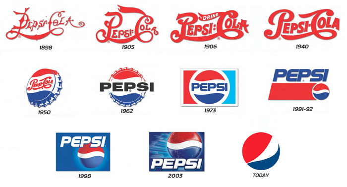
“Brad’s Drink”
Originally, Pepsi was called “Brad’s Drink”. It took the name of its inventory, Caleb Bradham, after he invented in 1893. The name was swapped out for Pepsi only a few years later in 1898, a name that was not trademarked for another five years.
Meanwhile, Coca-Cola, Pepsi’s great rival, was evolving as well. Pepsi attempted to mimic Coca-Cola’s swirly script logo originally and a look back at the original Pepsi logo is strikingly similar to the Coke script. The old Pepsi Cola logo resembled the Coca-Cola one quite a bit. With Pepsi, a long swirly line connected the P of ‘Pepsi’ with the ‘C’ of Cola.
Now, they were not directly trying to mimic Coca-Cola, thought it was a more successful brand at the time. Instead, this elegant script logo was the trend among many brands at the time.
The old Pepsi logo was a white script on red and they stuck with that color scheme from 1898 to 1940. This changed over time to the familiar Pepsi colors we all know now, but white and red have remained a major element of the design for 40 years.
A Major Pepsi Logo Change
In 1940, Pepsi decided to start using a cleaner and more fundamental logo. This was the origin of the now-familiar circular Pepsi logo, as well as the beginning of the Pepsi logo’s inclusion of the color blue.
The choice of the circular design was because the company wanted to be able to incorporate the slogan of Caleb Bradham’s original group, the Original Pure Food Drink. As for the colors, they maintained the red and white color scheme, but added in blue.
This had less to do with Pepsi’s history and more to do with World War II. Pepsi wanted to show its support for the troops fighting in the way and these three colors were a way to do it. These two colors would never leave the design, though there have been variations on the shades of red, white, and blue that the company has used.
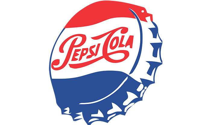
In 1943, Pepsi added design to the bottle cap design, including “Bigger Drink, Better Taste”. Red was the top part of the circle, with blue on the bottom and with white detailing. The bottle cap element of the design was included through the 1960s. It was during this period that the Pepsi logo we all know today began to come into being.
1960s Pepsi Logo and Bottle Design
The Pepsi logo went through another major change in the 1960s. The new bottle design began to feature a serrated bottle cap. The colors remained as red and blue, with an entirely white background.
This was the beginning of the company’s “Pepsi Generation” ad campaign. As a part of this, in 1960, Pepsi dropped the word ‘Cola’ from the logo. It was never used again as a part of the Pepsi logo. In 1962, two bull’s eyes were added to the word Pepsi, which were added to express the company’s domination of the global soft drink market.
Pepsi Logo Changes in the 1970s
![]()
In the 1970s, the Pepsi logo became more minimalistic and much closer to the Pepsi logo we know of today.
The company got rid of the swirling script and all curlicues. The word Cola remained dropped from the logo (and is rarely referred to today in any media). Instead, there was the red and blue circular design that is so very familiar today.
The new Pepsi logo placed the word Pepsi at the center of the circle, with red and blue flares above and below the word respectively.
Outside this minimalistic, smartly designed circle were two trapezoids that could be either red or blue. These could be placed either on the left or on the right. The white that had been one of Pepsi’s original colors was now kept as a tertiary color relegated to the border area, including the circle around the name Pepsi. In many ways, this was Pepsi’s nod to its own history.
What prompted this dramatic break from the more traditional design? The company felt that popular culture was changing substantially. Technology and minimalistic design were taking root.
The old swirly logo and the frills of the bottle cap logo were starting to look painfully dated. They simply did not fit with the times. Simple shapes and clean lines were in, frills and curls were out. Additional details, like the bull’s eyes, were too much and hard to notice.
A cleaner design had other benefits, as well. This more pure and simple design, with its basic shapes and forms, was easier to place on more different kinds of things. It was also more recognizable in the increasingly crowded market. These benefits became more and more important on the global market.
Modernizing the Pepsi Logo
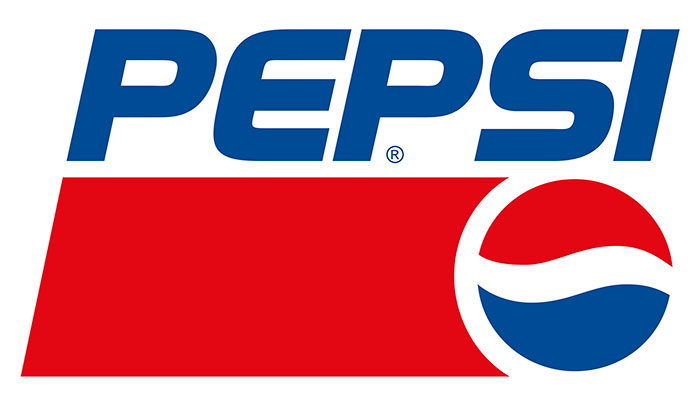
The next major change to the Pepsi logo came in 1991. The company decided that the incorporation of the Pepsi text and the circle was no longer viable. They opted instead to split them apart into different sections of their branding graphics.
They didn’t get rid of them, of course. Instead, they placed the Pepsi name on the top of the label in the familiar trapezoid shape. The red and blue circle was placed to the right side of this trapezoid. This was a significant departure, emphasizing text more than the iconic and simpler circle.
With the word Pepsi no longer a part of the circular element, they needed something else to put in the center to balance out the contrasting red and blue halves. They opted to place a wavy white line, speaking back to their heritage as well as balancing the contrast with a neutral color. It was a refreshing change to see white as more than just a tertiary border color.
Because of this change, a lot of new things became possible for the Pepsi logo. In recent years, Pepsi has made even more changes based upon this separated logo design layout.
Changes to the Pepsi Logo Circle in the Modern Era
![]()
Pepsi celebrated its 100th anniversary in 1998. To commemorate this achievement, they changed their logo.
The background was changed to blue. White was used once again to the name Pepsi. This new Pepsi logo was meant to have a more refreshing look with a three-dimensional appearance that was better fit for the times.
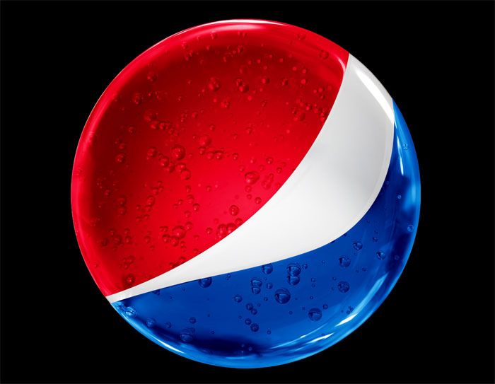
This design remained like this for ten years until it was changed again in 2008, again quite dramatic. The circle again became dominant in the Pepsi logo, getting placed on top of the company’s name.
The swirling white lien that separated the red and blue halves of the circle tilted upward and became much more wave-like, resembling a smiley face and having a very cheerful feel.
There were also variations in the coloring at the top of the circle. This made the logo look more like a sphere, with a 3D quality that made it seem more modern. It seems to pop out at onlookers. Modern audiences expect up-to-date logos to make good use of perspective and proportionality.
This update was done by Arnell group for one million dollars. It was not originally received very well by the public. However, logo designers should note that logo updates are rarely received well at first. It will take time to get a real picture of how the new logo design is doing with your target audience.
The Pepsi logo has gone through many changes since the company’s founding in 1898. It changed with trends, technology, and audience expectations, but it maintained ties to its past and held onto its key iconic points in the face of them, never completely changing into something different.
Pepsi knew that it still needed to keep brand recognition. If it changed entirely, its audience would turn away.
What is the Pepsi Logo Meaning?
The Pepsi logo is simple and always has been, even when it incorporated elaborate swirling text. It was never heavy on the details. The most detailed and subtle element it ever used was its two bull’s eyes which were meant to show that they were the best in the market. Or so you think.
There is actually a lot of meaning in the simple Pepsi logo.
Let’s take a closer look at the company’s origins. Caleb Bradham, Pepsi’s inventor, made the drink at his pharmacy where he first sold it as well. The word ‘pharmacy’ is derived from the Greek word pharmakia, which means sorcerer.
All of this seems very obscure, but we’re getting there. Bradham originally planned—and more or less succeeded- at inventing the modern era’s first energy drink. He was a sorcerer in his own right. At the time of Pepsi’s invention, modern chemistry was starting to work its magic in many areas of life.
When Pepsi switched to the circular logo, they paid millions of dollars to get a logo with secret occult meaning. They hired the eccentric (and debatably insane) designer Peter Arnell of the Arnell Group to make it. As crazy as this sounds, there is symbolism in all the major elements of the simple Pepsi logo.
The three-part logo, with a red top half, a blue bottom half, separated by a wavy white line, represent the American flag, but they also have other meanings. The colors are meant to represent earth’s magnetic field, feng shui, Pythagoras geodynamics, the theory of relativity, and the golden ratio.
As ridiculous as this seems, these meanings are definitely present, a least in the original conception. Peter Arnell wrote a 27-page memo for PepsiCo, which was leaked to Newsweek.
The Pepsi logo apparently contains references to the Parthenon, the Mona Lisa, the golden ratio, the relativity of space and time, and magnetic fields. The logo is meant to emphasize the “perimeter oscillations” of the Pepsi logo, the “gravitational pull” of a can of Pepsi on a supermarket shelf. It is intended to be tied to the rate of expansion of the universe.
Many thought this memo was a hoax. It sounds insane. Design is a catty and small world. This was a huge stumble for Peter Arnell. Many other designers and design firms celebrated and mocked him. Arnell’s expensive lunatic design was no doubt a failure.
Or so it seemed. The new Pepsi logo was a major benefit for Pepsi. Customers liked it. Bottlers liked it. It seemed to help change the momentum of the company. Whatever bizarre rationale was behind the design of the Pepsi logo, it is clearly a well-designed logo.
It is found on cans, bottles, ads, race cars, t-shirts, trucks, and just about anything with any tie to Pepsi. It’s worked so well that people have been known to mistake the South Korean flag for the Pepsi logo, most notably in the 2018 Winter Olympics.
Ending thoughts on the Pepsi logo design
The Pepsi logo has been through several iterations. You can see how market and cultural trends made their mark on it, yet there were core visual and design principals the brand stuck despite those changes.
If you enjoyed reading this article about the Pepsi logo, you should read these as well:
- Best free fonts for logos: 72 modern and creative logo fonts
- Animal logo design ideas and guidelines to create one
The post The Pepsi Logo: The old, the new, its meaning and history appeared first on Design your way.
Source: https://ift.tt/2mrsq7F


No comments:
Post a Comment