Package design starts with the identification of all the requirements: structural design, marketing, shelf life, quality assurance, logistics, legal, regulatory, graphic design, end-use, environmental, etc. Designers must take these requirements into account when designing a package design for a product and if they do and do their work carefully they end up with smart and effective results.
Stafidenios Raisins
Stafidenios® is a raisins product packed for kids. It is made in Greece and the packaging dimensions specifications are that the product could fit into a kid’s cupped hand.
Spine Vodka
TripTea
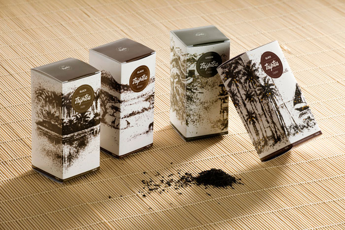
Since the brand, its communication and packaging were designed simultaneously, the semantic component was reflected in all cells at once. Naming the brand was based on two strong associations: first, TripTea is a tea travel, and secondly, TripTea tunes in the familiar and figurative word “triptych” – three-part painting, that completely reveals one key message in different subjects.
In developing the package, this principle also is embodied. We wanted to show the beauty, depth and fullness of the tea only. Therefore packaging was decorated with landscapes countries where it was assembled and produced. All landscapes are handmade directly from the tea variety in the package. This conveys an exotic image of the country as well as the richness of flavors and nuances of the product itself.
Besides the packaging reflects the meaning of the brand name – every sides of the package has one of the landscape of the triptych, that let you an opportunity to present the product at the point of sale in interesting and unusual way.
Gaga Tea
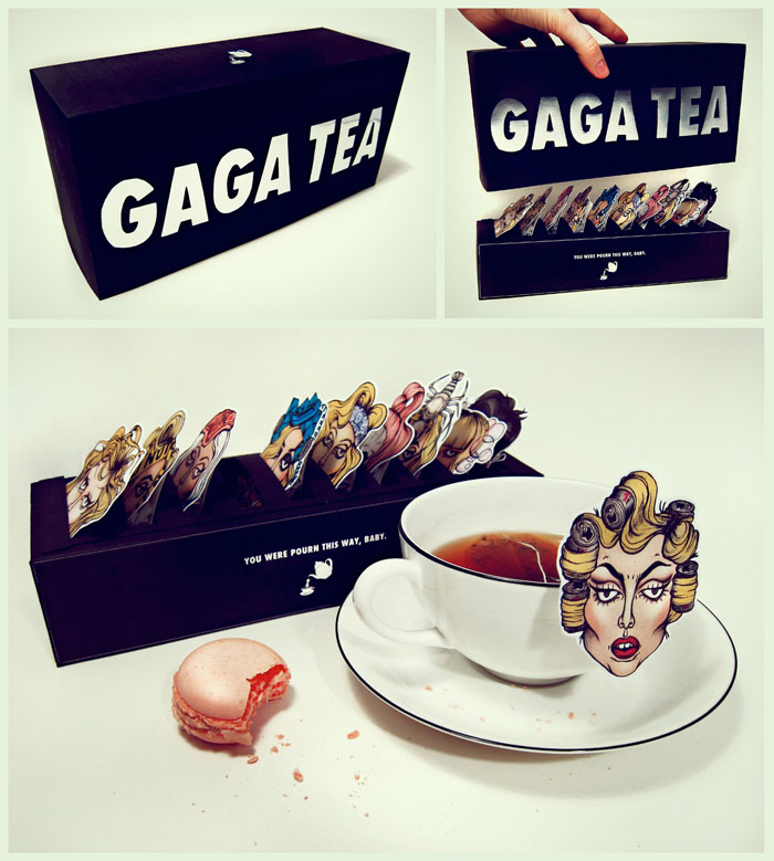
in itself; the various flavours that can be found are countless. Similar to the vast amount of existing tea flavours, Lady Gaga’s closet of characters throughout her career is just as extensive. What better way to portray one of the most dynamic artists of the 21st century, than in the shape of an exclusive tea box consisting of unique flavours inspired by Gaga’s most memorable personas?
The ‘Gaga Tea’-box offers ten unconventional blends; among the choices are ‘Meat Maniac’ (inspired by the infamous meat dress), ‘Diet Coke Dar(jee)ling’ (from the famous Telephone-video Diet Coke-hairdo) and crustacean flavoured ‘Lobster Lover’ (a nod to the Schiaparelli lobster headpiece). There are ten unique tea bags to suit every little monster’s taste buds.”
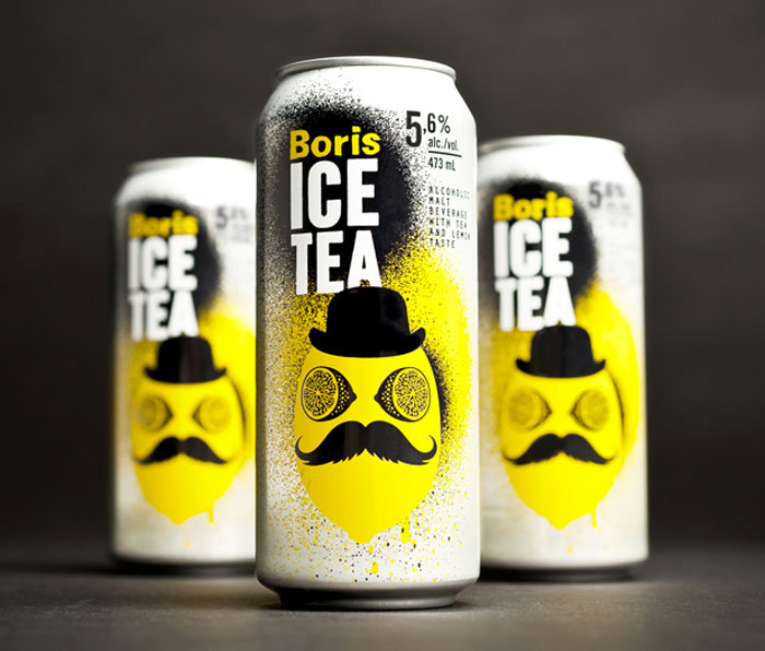
Boris Ice Tea
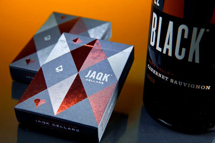
JAQK Signature Playing Cards
JAQK Signature Playing Cards combine distinctive contemporary design with the peerless quality theory11 is known for. The tuck case is an elegant mix of red metallic elements on soft touch French paper.
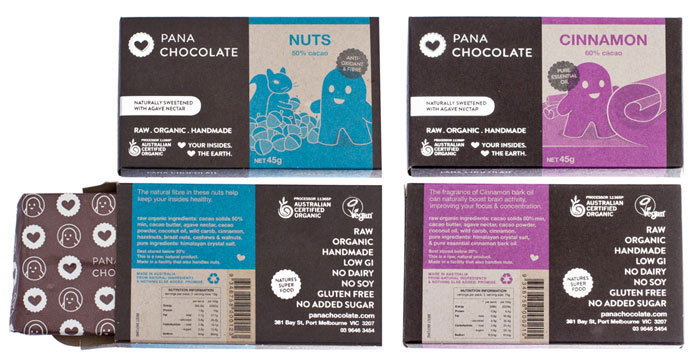
Pana Chocolate
To fit with their ethos, the packaging is eco friendly – recyclable foil, soy based pantone inks, 100% recycled board – the result is a very rough, organic feel which the client adores.Each flavour has a unique coloured strip (PMS) with its own quirky character illustration representing the flavour inside. Each flavour has its own PMS colour, so the drawings needed to work in tones of its represented colour. All colours were chosen to be a full rainbow suite and work together.
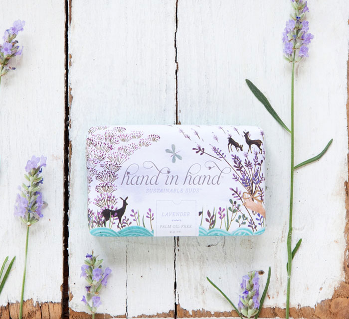
Hand in Hand
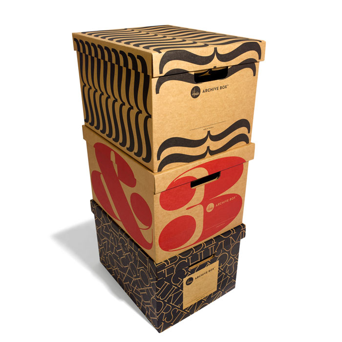
House Archive Box
House Industries introduces the House Archive Box, a new twist on an old idea that brings the foldable storage box out of the closet or storage facility and into contemporary living areas and workspaces
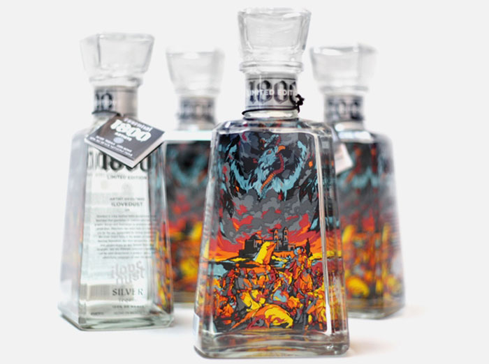
1800 Tequila Limited Edition
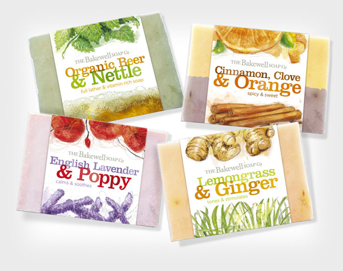
The Bakewell Soap Company
A range of soaps and balms nicely displayed in little wicker baskets caught my eye as a range with a lot of design potential. The Bakewell Soap Company make handmade soaps in an old Victorian mill near Bakewell, Derbyshire where they are supplied to gift shops, for guest houses or sold in wholesale.
The products, beautifully coloured blocks of soap specially blended for different skin types, have a luxury gift or personal treat feel to them which should show in their packaging. Sadly the packaging I found didn’t really live up to this. Although the design was adequate, with a consistent approach across the range, it had a very homemade feel in its finish, especially the bad printing of the wrap around label which looked like it had been done on an inkjet at home.
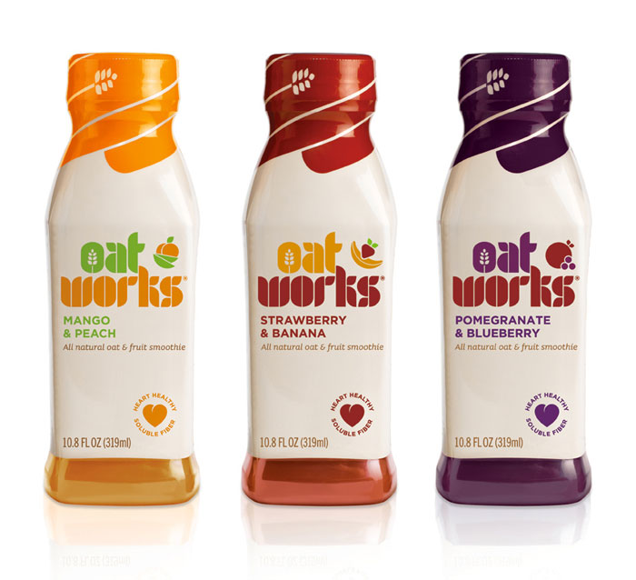
Oat Works
Kranium White
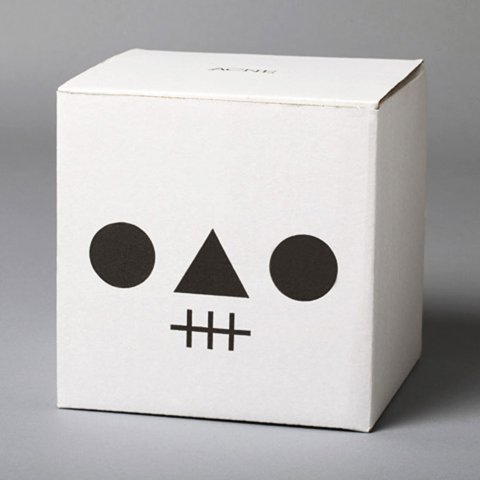
Wooden skull with secret compartment. For keeping memories. Packed in a cardboard box with a graphic Kranium print. Size: Ø 14 cm. Material: Pine wood.
Birdy Juice
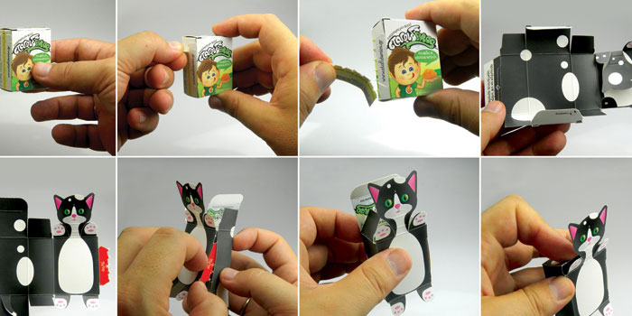
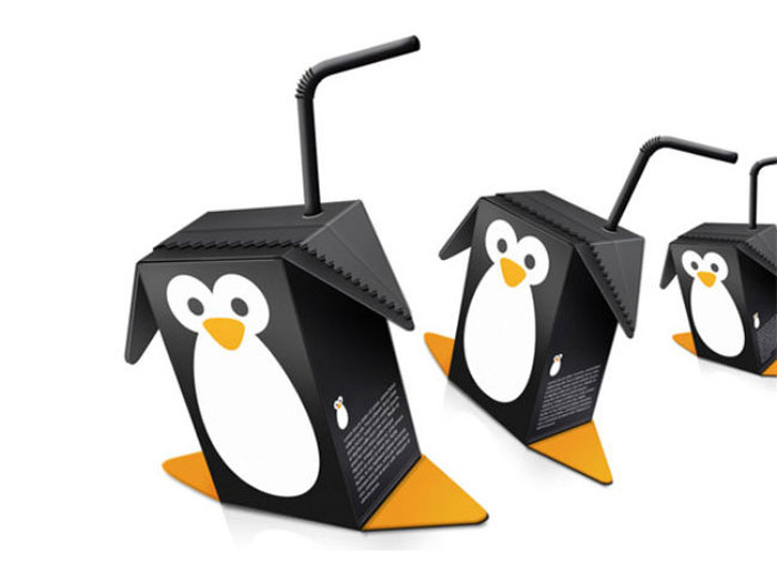
Birdy Juice is a concept for fruit juice using the form of the juice carton to create wings and feet for bird characters. Its basically a product for kids who can play around with the juice packaging as different kind of birds. It also makes it easier and fun to fold out the packaging before it goes in the recycling.
Jack Daniel’s White Rabbit
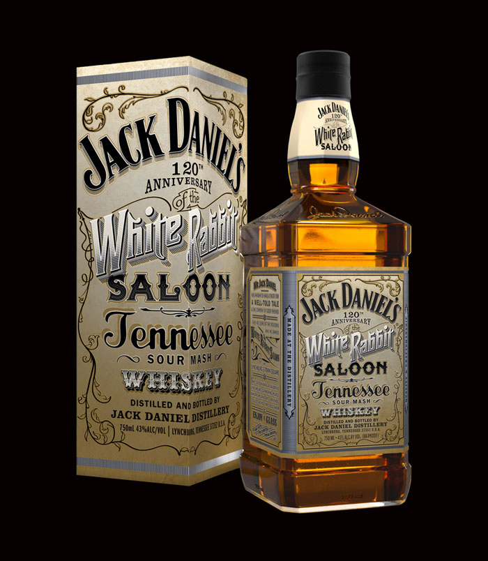
Mr Jack Daniels opened the White Rabbit saloon in Lynchburg town square 120 years ago so his friends would have good a local watering hole. This bottle celebrates the great man’s bar. And the saloon mirror.
Koel Fresh
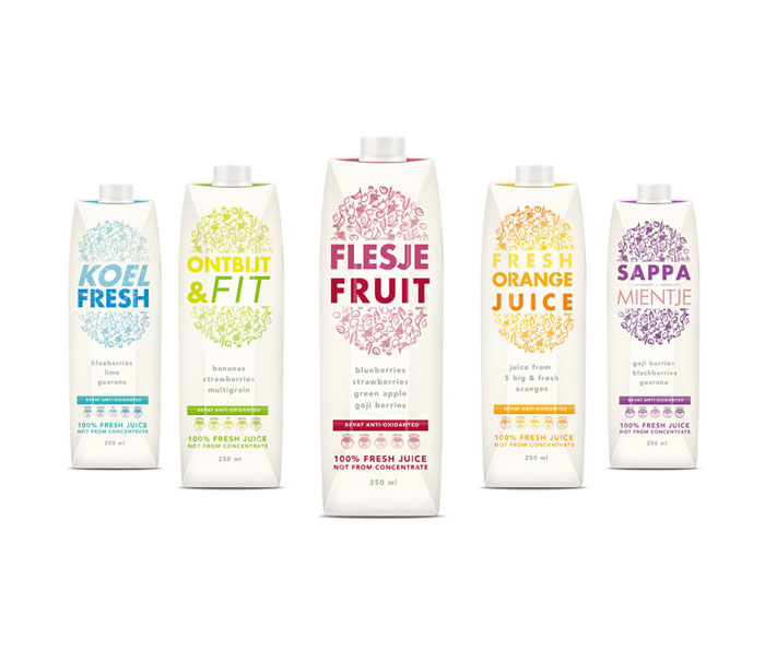
Koel Fresh is a new brand based in The Netherlands. Dot Kite | Lab developed several concepts for the new packaging of the fresh juices. The final design be distributed in The Netherlands, Belgium and Luxembourg.
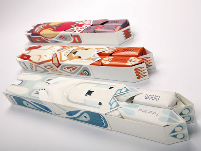
Einem Chocolate
The packages are created as totems of the animals in order to give each kind of chocolates the spirit of the animal it represents.
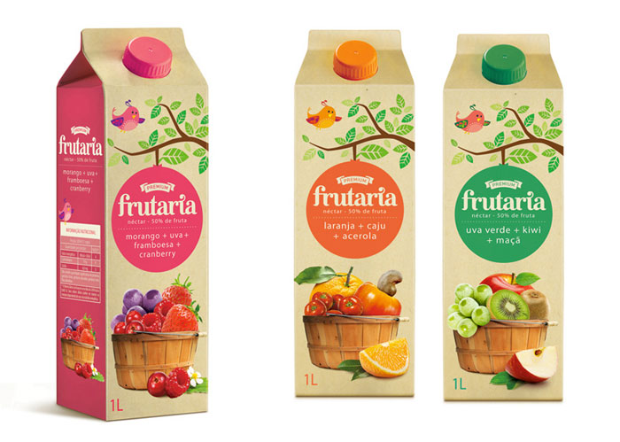
Frutaria
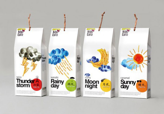
Kiyu Taro
Kiyu Meteorological Station taro production from Jiaxian, Kaohsiung, is an unforgettable delicious snack in the Taiwanese memory. This packaging line boldly attempts to use the product itself different tastes, and does not make sense forming interesting combination with weather images.
The changing weather referred to as touched the senses of taste, the spicy taste of mustard make us cry like a rain; spicy flavors makes you stamping like thundering; fragrant curry, such as the beautiful moonlit night, sweet caramel taste is charming sunny; taste mixed with different levels of integration, the taste buds also will comply with the incredible weather to start cross-sensory journey.
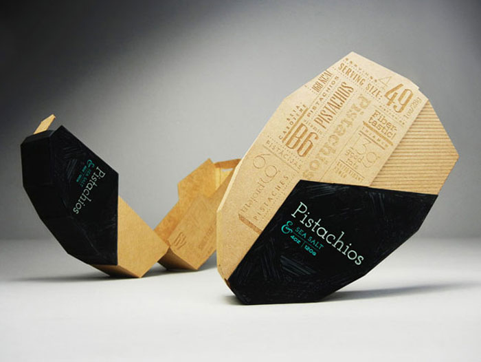
Mighty Nuts
This packaging for pistachio nuts tells a narrative in every detail. The shape and opening mechanism is a reference to pistachios themselves. A crucial part of the thought process was to focus on user experience and second function of the package. The end result is a package where the inside tray holds pistachios but the outer part separates and becomes a tray for the shells – a simple and convenient way to enjoy pistachios instantly.
The graphics are no less important for this solution. The main intention was to create graphics that depict the crunchiness of pistachios, that’s where the hand-made type treatment comes in. Also, to think even further about the consumers, all the nutrition facts are shown on the front panel. However, the engraved design makes this essential information visually appealing and even interesting to look at.
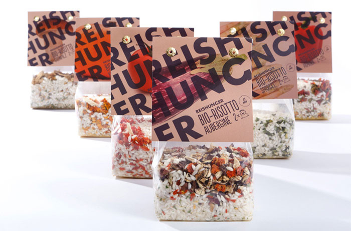
Reishunger Bio-Risotto
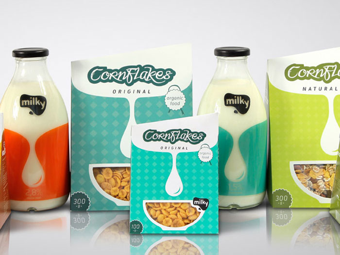
Milky
Folksaga
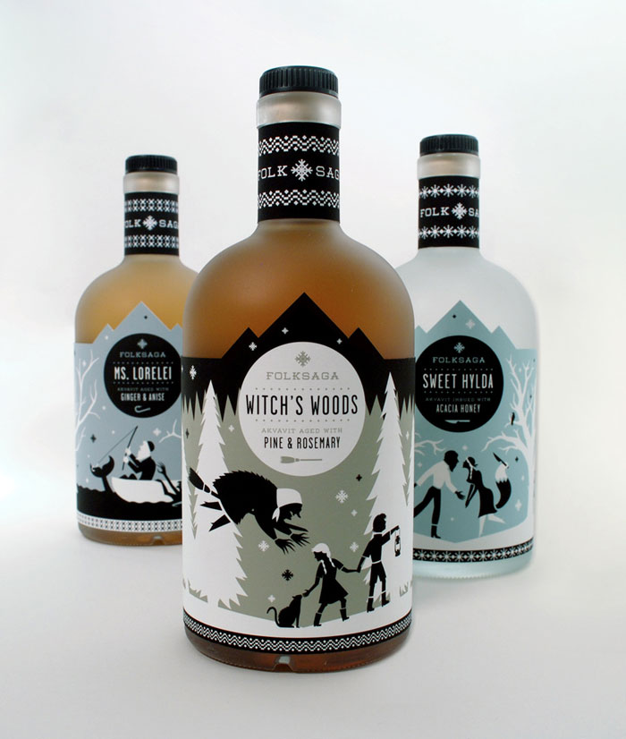
Folksaga is a Swedish distillery of akvavit, a traditional scandinavian liquor flavored with ingredients such as caraway, anise, or ginger. The concept behind the project was to broaden akvavit’s appeal to an American market while maintaining its rich, nordic roots.
Each bottle features a popular folk tale from Sweden. Ranging from murky mermaids to terrible trolls, these mythological characters are always up to no good — preying upon travelers lost in the wild. The project was art directed by Paul Kepple of Headcase Design
Laco Choco
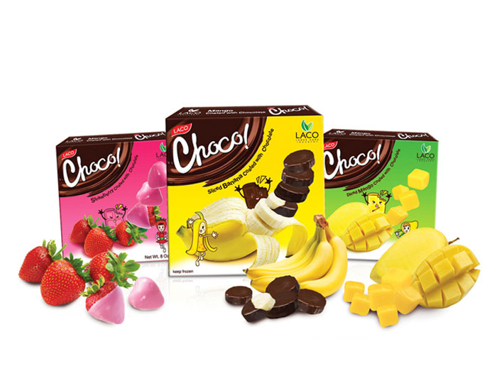
Laco Choco is a dessert line from Laco company. The idea of the packaging is to show that the dessert is made from real fruits. To achieve the goal, the actual product shot is integrated with the fruit shot in an interesting way. In addition, friendly mascots are carefully designed to represent each flavors of the dessert.
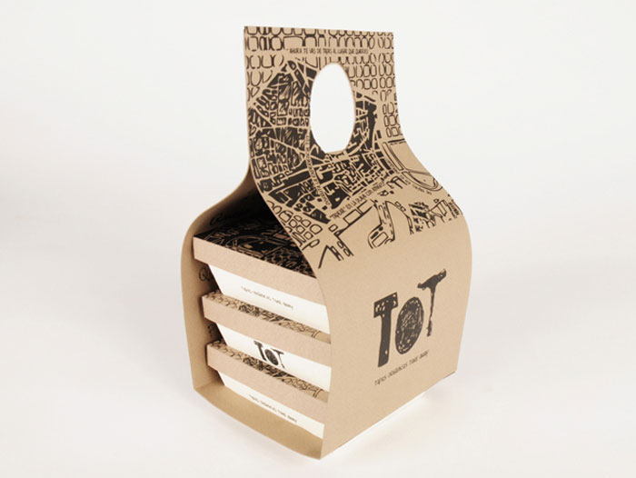
TOT Take-Away
Take-Away Packaging for “Organic Tapas”. The “Tapas” are part of the identity and food culture in Spain. “Tapas” are small appetizers of different kinds of food that people share with friends drinking something in a bar or in a restaurant.
The aim of this project was to create a new concept, offering “Tapas” from organic production and in a take-away manner: people can eat them wherever they want, in a park, at the beach, with friends and whenever they feel like. The packaging is made with cardboard and communicates the identity of the brand.
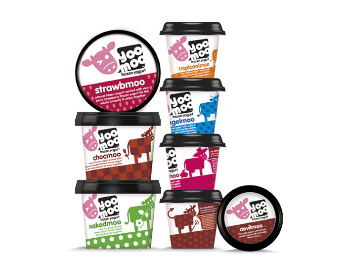
YooMoo
A new take-home range for frozen yogurt brand yoomoo has launched in partnership with R&R Ice Cream, with packaging designed by leading London brand design agency Bulletproof.
Following Bulletproof’s successful creation of the yoomoo brand identity in 2010, the agency was awarded the project as part of its on-going relationship with the brand.
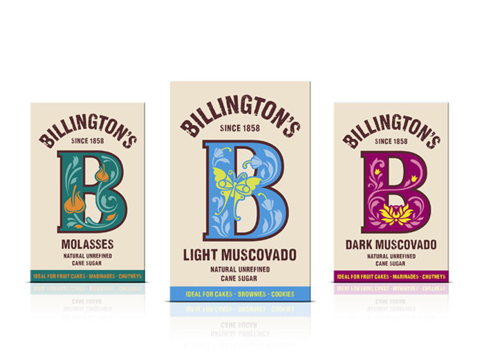
Billington’s
By developing personality through the Billington’s ‘B’, the new design strives to establish an impactful and memorable visual equity for the brand, giving it standout and charisma on shelf.
Known for its unrefined sugars, the new design celebrates the quality of the product inside the pack, inspired by the vibrancy of its Mauritian origins. The decorative ‘Bs’ then portray the personality of each individual product, in a charming and charismatic way.
Source: http://feedproxy.google.com/~r/DesignResourceBox/~3/bq50O7euCe0/

No comments:
Post a Comment