In the past years web frameworks have gained a lot of popularity thanks to their ability to make a designer’s or developer’s life easier. Besides this it has also decreased the amount of time spent on a project, meaning you can get more projects in the same amount of time.
The time issue isn’t the only one that web frameworks, either CSS, HTML or JS ones, have solved. The people who make them also make sure that these helpful tools solve the common code issues that a web designer faces when dealing with a site or a web app.
In this article you have a lot of frameworks from which most haven’t been presented on this site, but you will also find a few that I couldn’t have omitted thanks to their unique properties.
Toast: A Simple CSS Framework
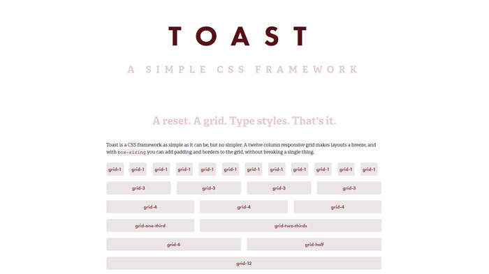
Toast is a CSS framework as simple as it can be, but no simpler. A twelve column responsive grid makes layouts a breeze, and with box-sizing you can add padding and borders to the grid, without breaking a single thing.
flatiron
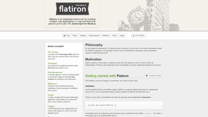
flatiron is an adaptable framework for building modern web applications. It was built from the ground up for use with Javascript and Node.js.
Warp Framework
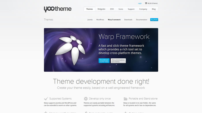
A fast and slick theme framework which provides a rich tool set to develop cross-platform themes.
Mobello
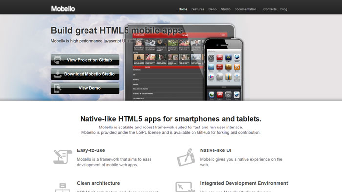
Mobello is scalable and robust framework suited for fast and rich user interface.
Ideal Forms
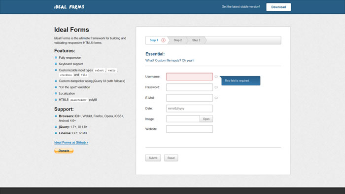
Ideal Forms is the ultimate framework for building and validating responsive HTML5 forms.
Terrific Composer
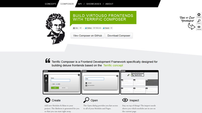
Terrific Composer is a Frontend Development Framework specifically designed for building deluxe frontends based on the Terrific concept
Dgrid
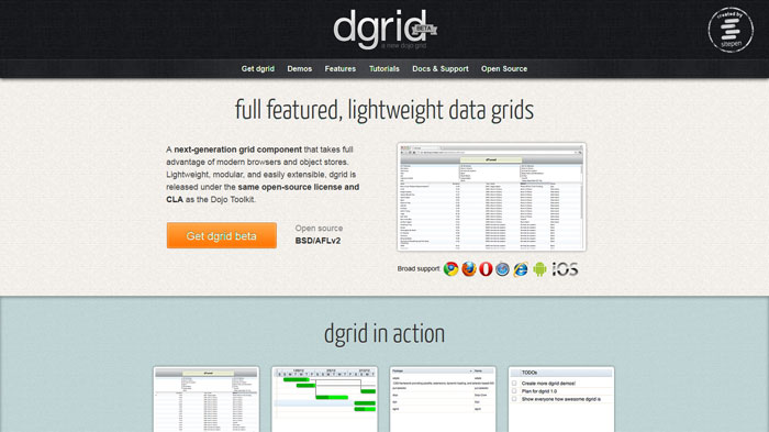
A next-generation grid component that takes full advantage of modern browsers and object stores. Lightweight, modular, and easily extensible, dgrid is released under the same open-source license and CLA as the Dojo Toolkit.
Chico UI
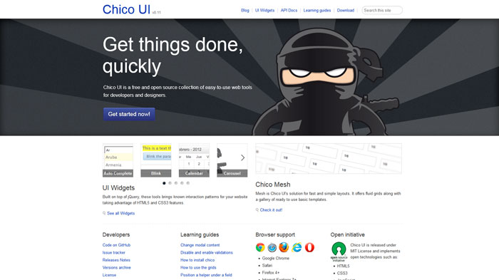
Chico UI is a free and open source collection of easy-to-use web tools for developers and designers.
HTML KickStart
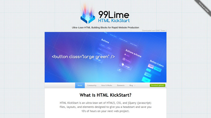
HTML KickStart is an ultra–lean set of HTML5, CSS, and jQuery (javascript) files, layouts, and elements designed to give you a headstart and save you 10′s of hours on your next web project.
Ninja
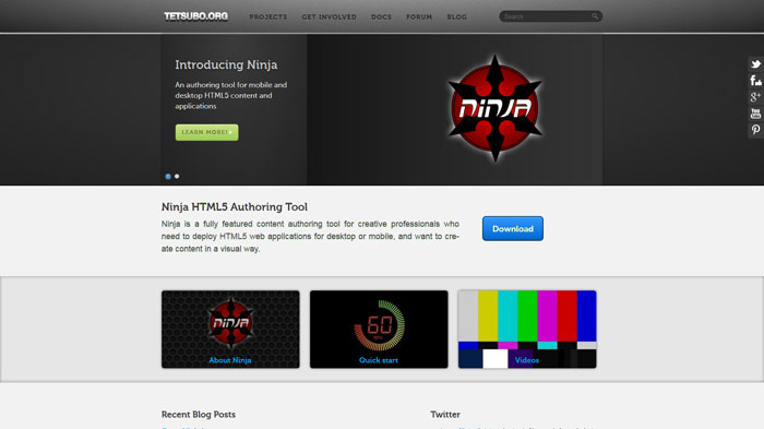
Ninja is a fully featured content authoring tool for creative professionals who need to deploy HTML5 web applications for desktop or mobile, and want to create content in a visual way.
1140 grid
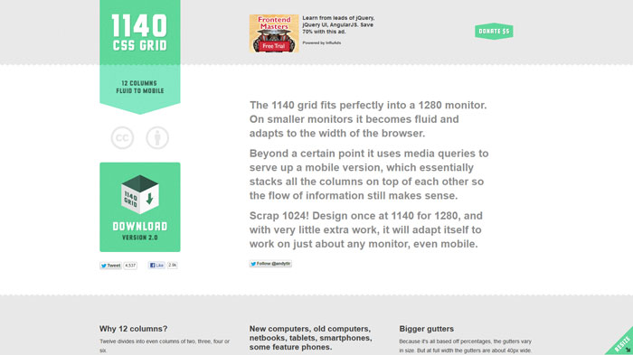
The 1140 grid fits perfectly into a 1280 monitor. On smaller monitors it becomes fluid and adapts to the width of the browser.
Beyond a certain point it uses media queries to serve up a mobile version, which essentially stacks all the columns on top of each other so the flow of information still makes sense.
AngularJS
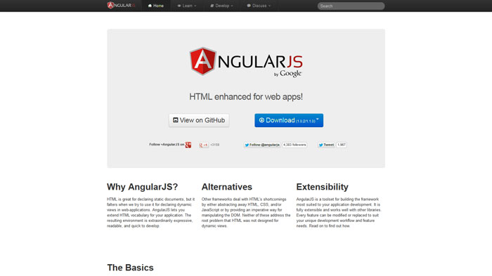
HTML is great for declaring static documents, but it falters when we try to use it for declaring dynamic views in web-applications. AngularJS lets you extend HTML vocabulary for your application. The resulting environment is extraordinarily expressive, readable, and quick to develop.
Foldy960 – A responsive 960 grid from Paravel
Foldy960 isn’t aiming to be Yet-Another-CSS-Framework and we hesitate to use the term “Boilerplate”. Foldy is just a little kit and some extra classes to get you going on making your 960.gs design responsive.
Express
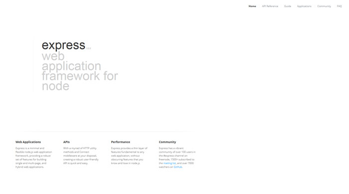
Express is a minimal and flexible node.js web application framework, providing a robust set of features for building single and multi-page, and hybrid web applications.
Neat
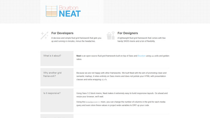
Neat is an open source fluid grid framework built on top of Sass and Bourbon using em units and golden ratios.
HTML Email Boilerplate
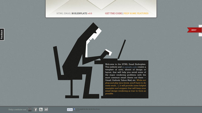
This website and its sample code creates a template of sorts, absent of design or layout, that will help you avoid some of the major rendering problems with the most common email clients out there — Gmail, Outlook, Yahoo Mail, etc. While not plug and play (you know, you’ll have to do some work, it will provide some helpful examples and snippets that will keep your email design rendering as true-to-form as possible.
Responsive GS
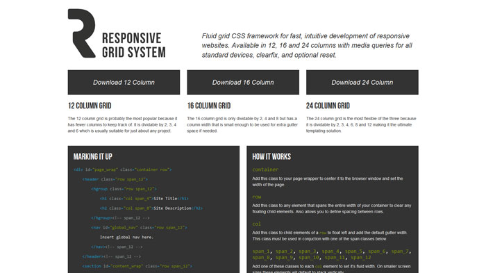
Fluid grid CSS framework for fast, intuitive development of responsive websites. Available in 12, 16 and 24 columns with media queries for all standard devices, clearfix, and optional reset.
Gumby
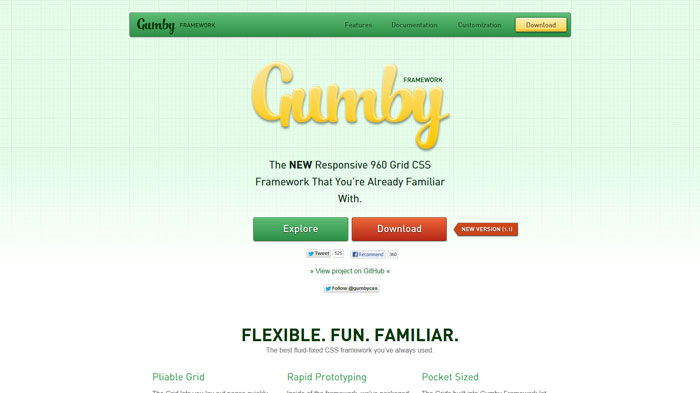
The Grid lets you lay out pages quickly and easily in a natural, logical way. The Gumby Framework’s grid system can be customized and molded to fit your every need — it’s easily adapted to any screen size or application. The possibilities are endless; the results are extraordinary.
Inside of the framework, we’ve packaged up tons of styles and common interface elements to help you quickly put together functional prototypes. Toss together some quick layouts using the included forms, buttons, tabs, and pure CSS dropdowns — then customize away!
The Grids built into Gumby Framework let you quickly put together page layouts for mobile devices and the desktop. You don’t need two different sites — create a rock-solid experience on all kinds of devices with the exact same markup. From iPods to IMAX, build great experiences that fit any screen.
Box – CSS Framework
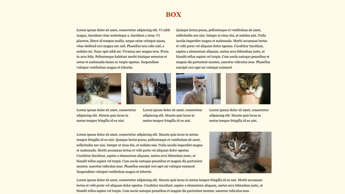
This solution is based on box-sizing: border-box and display:inline-block building principles.
Formalize CSS
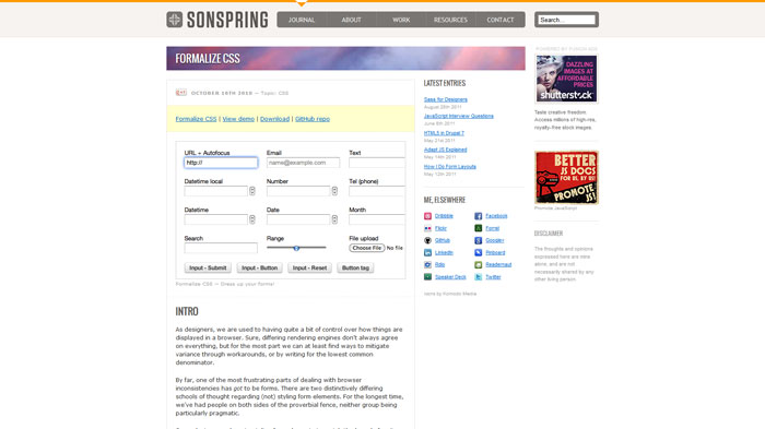
We’ve all been there. You are nearly done with a beautiful site design, only to arrive at the task we all dread – form styling. Depending on operating system and browser, default form elements can look okay or horribly disfigured.
Uni-Form
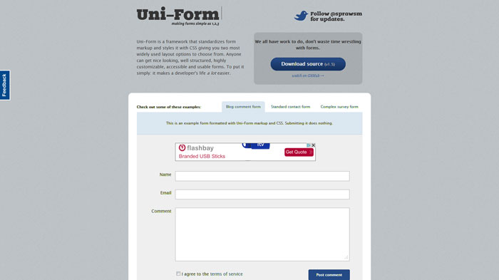
Uni-Form is a framework that standardizes form markup and styles it with CSS giving you two most widely used layout options to choose from. Anyone can get nice looking, well structured, highly customizable, accessible and usable forms. To put it simply: it makes a developer’s life a lot easier.
G5 Framework
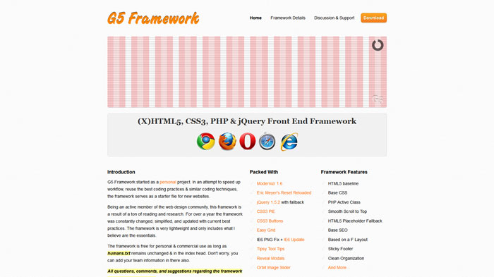
G5 Framework started as a personal project. In an attempt to speed up workflow, reuse the best coding practices & similar coding techniques, the framework serves as a starter file for new websites.
520 Grid System
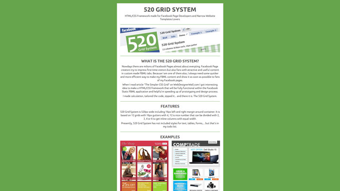
Nowdays there are milions of Facebook Pages almost about everyting. Facebook Page creators try to impress first-time-visitors but also fans with atractive and useful content in custom made FBML tabs. Because I am one of them also, I always need some quicker and more efficient way to make my FBML content and show it as soon as possible to fans
Chibi: A tiny JavaScript micro-framework
Think it’s OK to serve up 30KB of framework over 3G just to manipulate a couple of DOM elements? Of course you don’t because that’s an asshat move and you’re no asshat. You’ll probably instead use a couple of lines of vanilla JavaScript, perhaps a little CSS :active with transitions, all while riding a unicorn bareback through a double rainbow, no hands.
Working on something a wee bit more complex? Unlike fat, grown-up frameworks, Chibi focuses on just the essentials, melted down and mixed with optimization rainbows to create a really light micro-framework that allows you to do awesome things, asshatory free.
Skeleton
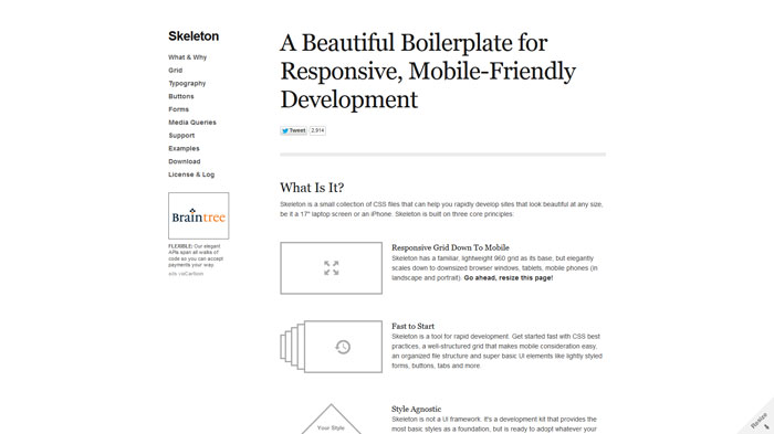
Skeleton is a small collection of CSS files that can help you rapidly develop sites that look beautiful at any size, be it a 17″ laptop screen or an iPhone.
Ingrid
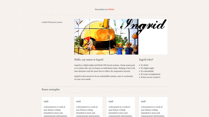
Ingrid is a lightweight and fluid CSS layout system, whose main goal is to reduce the use of classes on individual units. Making it feel a bit less obtrusive and bit more fun to reflow for responsive layouts.
Ingrid is also meant to be an extendable system, easy to customize to your own needs.
LimeJS
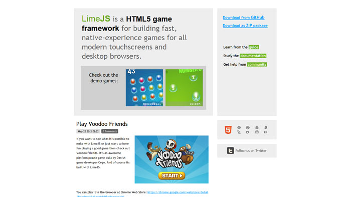
LimeJS is a HTML5 game framework for building fast, native-experience games for all modern touchscreens and desktop browsers.
Treesaver
Treesaver® is a JavaScript framework for creating magazine-style layouts using standards-compliant HTML and CSS.
320 and Up: The tiny screen first responsive boilerplate
Baseline
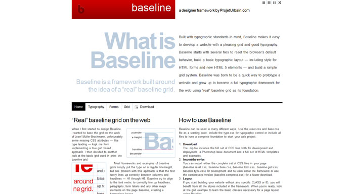
Built with typographic standards in mind, Baseline makes it easy to develop a website with a pleasing grid and good typography. Baseline starts with several files to reset the browser’s default behavior, build a basic typographic layout — including style for HTML forms and new HTML 5 elements — and build a simple grid system. Baseline was born to be a quick way to prototype a website and grew up to become a full typographic framework for the web using “real” baseline grid as its foundation.
Bootstrap
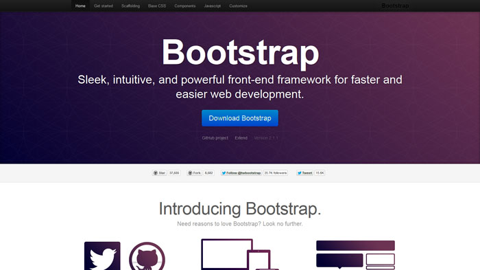
Bootstrap was made to not only look and behave great in the latest desktop browsers (as well as IE7!), but in tablet and smartphone browsers via responsive CSS as well.
Less Framework 4
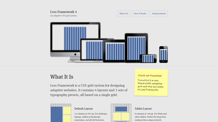
Less Framework is a CSS grid system for designing adaptive websites. It contains 4 layouts and 3 sets of typography presets, all based on a single grid.
Formee
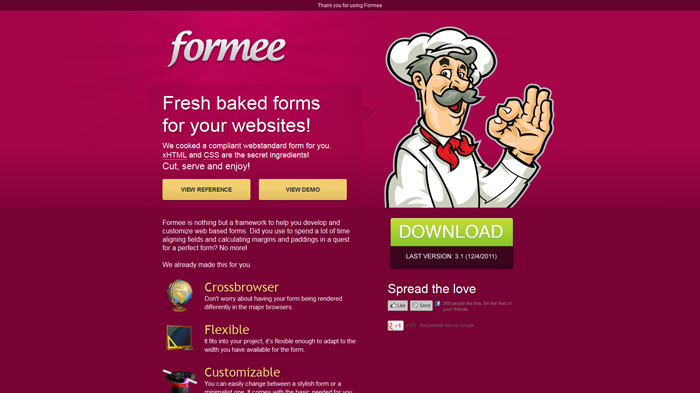
Formee is nothing but a framework to help you develop and customize web based forms. Did you use to spend a lot of time aligning fields and calculating margins and paddings in a quest for a perfect form? No more!
TumblrThemr: Making Tumblr theme development a little less head-desky
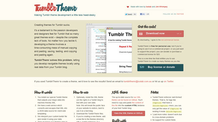
Creating themes for Tumblr sucks.
It’s a testament to the passion developers and designers feel for Tumblr that so many great themes exist – despite the complete lack of tools. No matter how you tackle it, developing a theme involves a time-consuming mess of manual copying and pasting, saving, testing, and copying and pasting again.
TumblrThemr solves this problem, letting you develop navigable themes locally using real data from your Tumblr blog.
Reverie: Versatile HTML5 Responsive WordPress Framework
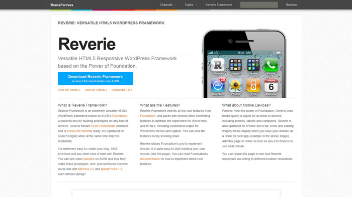
Reverie Framework is an extremely versatile HTML5 WordPress framework based on ZURB’s Foundation, a powerful tool for building prototypes on any kind of devices. Reverie follows HTML5 Boilerplate standard and is hNews microformat ready. It is optimized for Search Engine while at the same time improve readability.
Laravel
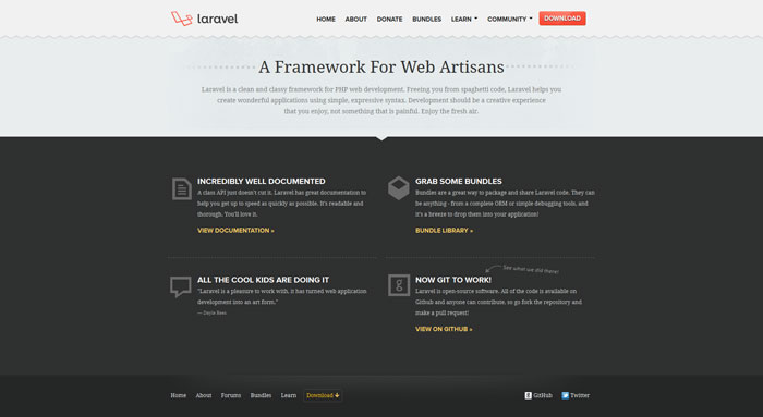
Laravel is a clean and classy framework for PHP web development. Freeing you from spaghetti code, Laravel helps you create wonderful applications using simple, expressive syntax. Development should be a creative experience that you enjoy, not something that is painful.
HTML5 Boilerplate
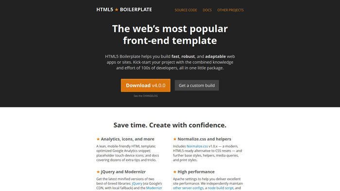
HTML5 Boilerplate helps you build fast, robust, and adaptable web apps or sites. Kick-start your project with the combined knowledge and effort of 100s of developers, all in one little package.
BluCSS
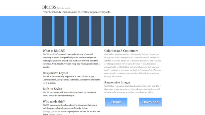
BluCSS is a CSS framework designed with ease of use and simplicity in mind. It is specifically made so that when you’re working on your next project, you don’t have to worry about the essentials. With BluCSS, you can be up and running in less than a minute.
elasticss
A simple css framework to layout web-based interfaces, based on the printed layout techniques of 4 columns but with capabilities to unlimited column combinations. and capacity to make elastic, fixed and liquid layout easily
Kendo UI
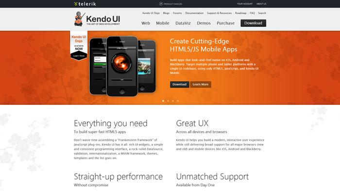
Don’t waste time assembling a “Frankenstein framework” of JavaScript plug-ins. Kendo UI has it all: rich UI widgets, a simple and consistent programming interface, a rock-solid DataSource, validation, internationalization, a MVVM framework, themes, templates and the list goes on.
The Goldilocks Approach
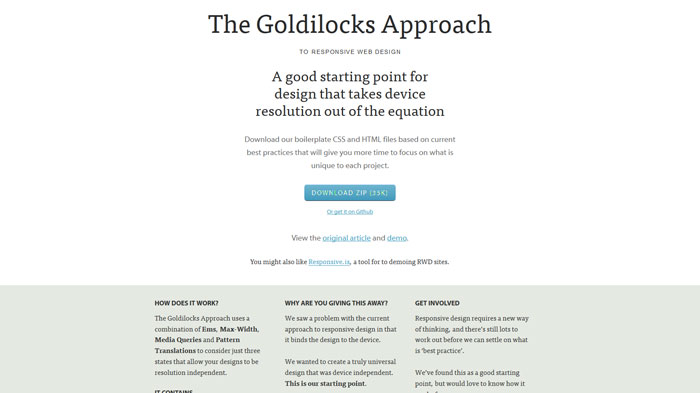
The Goldilocks Approach uses a combination of Ems, Max-Width, Media Queries and Pattern Translations to consider just three states that allow your designs to be resolution independent.
RMSforms – A flexible CSS Forms Framework to Help Style Those Pesky Forms
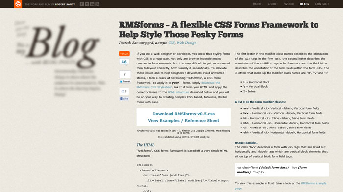
If you are a Web designer or developer, you know that styling forms with CSS is a huge pain. Not only are browser inconsistencies rampant in form elements, but it is very difficult to get an advanced form to layout correctly, both visually & semantically. To alleviate these issues and to help designers / developers avoid unwanted stress, I took a crack at developing “RMSforms”, a CSS forms framework.
Columnal CSS grid system
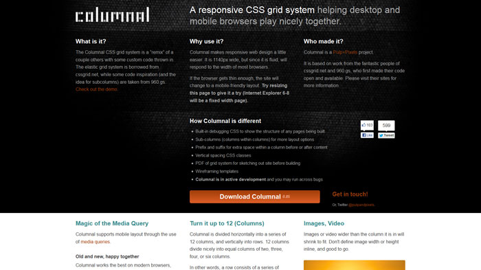
The Columnal CSS grid system is a “remix” of a couple others with some custom code thrown in. The elastic grid system is borrowed from cssgrid.net, while some code inspiration (and the idea for subcolumns) are taken from 960.gs.
The foneFrame template
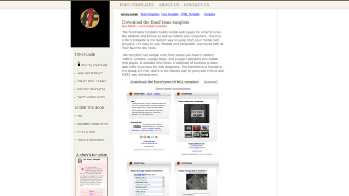
The foneFrame template builds mobile web pages for smartphones like Android and iPhone as well as tablets and computers. This free HTML5 template is the fastest way to jump start your mobile web projects. It’s easy to use, flexibile and extensible, and works with all your favorite dev tools.
The template has sample code that shows you how to embed Twitter updates, Google Maps, and Google Calendars into mobile web pages. It includes SEO hints, a collection of buttons & icons, and other shortcuts for web designers. The framework is hosted in the cloud, it’s free, and it is the fastest way to jump into HTML5 and CSS3 web development.
Less+ Framework
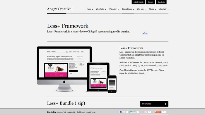
Less+ Framework is a cross-device CSS grid system using media queries.
Padrino
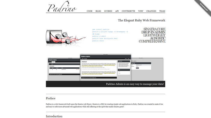
Padrino is a ruby framework built upon the Sinatra web library. Sinatra is a DSL for creating simple web applications in Ruby. Padrino was created to make it fun and easy to code more advanced web applications while still adhering to the spirit that makes Sinatra great!
QUnit: A JavaScript Unit Testing framework
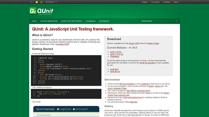
QUnit is a powerful, easy-to-use JavaScript unit test suite. It’s used by the jQuery, jQuery UI and jQuery Mobile projects and is capable of testing any generic JavaScript code, including itself
Gridless
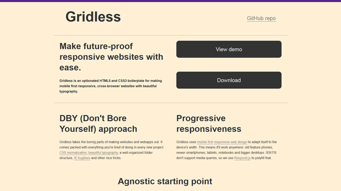
Gridless is an optionated HTML5 and CSS3 boilerplate for making mobile first responsive, cross-browser websites with beautiful typography.
Golden Grid System
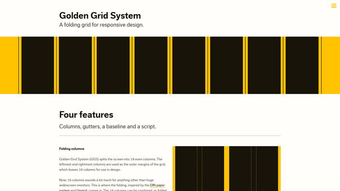
Golden Grid System (GGS) splits the screen into 18 even columns. The leftmost and rightmost columns are used as the outer margins of the grid, which leaves 16 columns for use in design.
The Fluid Baseline Grid System
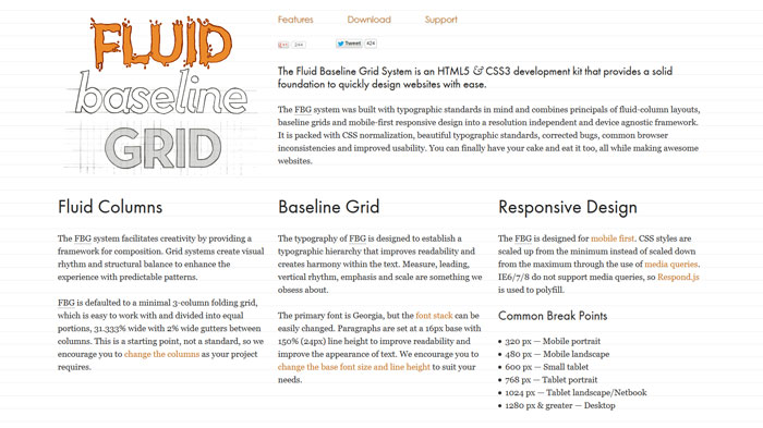
The Fluid Baseline Grid System is an HTML5 & CSS3 development kit that provides a solid foundation to quickly design websites with ease.
Source: http://feedproxy.google.com/~r/DesignResourceBox/~3/SUYRXIzAj8k/


No comments:
Post a Comment