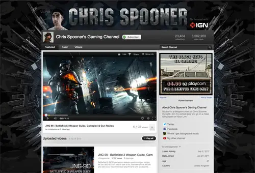
One of the most popular posts here on Line25 is my guide to designing a custom YouTube background. Since then, YouTube has changed the design and layout of channels, plus my own gaming channel has been partnered, providing me with all kinds of new features. If you’re designing a new background for your partnered channel, or one for a client here’s what you should know…
Designing for the new YouTube layout
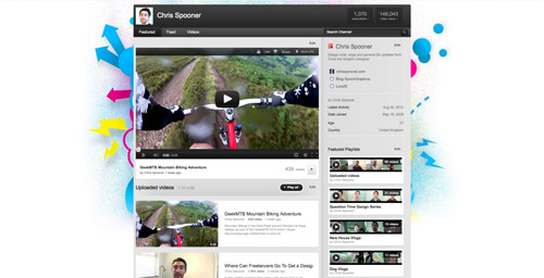
First, let’s look at the new YouTube channel layouts (since 2012) and how you can now tailor your design to suit. In the last tutorial I created a detailed design with containers housing the various sections of the channel, now all that is taken care of with YouTube’s own styling that cannot be altered, leaving you with just the option of selecting a custom background.
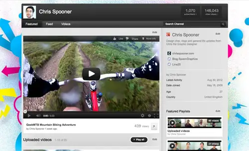
When designing your background keep in mind that anything in the centre won’t be visible and anything at either side of the main content will be subject to the viewers resolution. Try not to include text or important information in these areas as it might be lost.
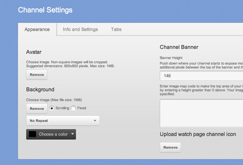
Once you have designed your background, you then have the option of setting the background image as fixed, scroll or repeat, plus the addition of a background colour (useful if you fade out your image to a solid colour to cater for larger resolutions). Partners have a couple more options, but we’ll get to those later!
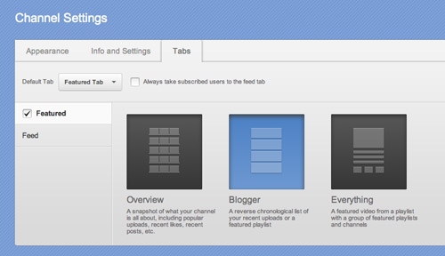
You can’t change the colours or design of the main content area of your channel, but YouTube does provide you with three layout options under the Featured section of your channel settings. Overview lists all your channel updates in a grid format, including videos, likes and feed posts. Blogger is the most popular layout amongst YouTube, giving prominence to your latest uploads. Everything is a useful layout for network channels, giving equal exposure to playlists and featured channels.
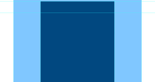
Feeling lost already? Hopefully this YouTube channel Photoshop template will help out. I’ve outlined the main content area and highlighted how much of the screen is viewable in common resolutions. Use this to preview your design and make sure your elements don’t end up getting lost or cut off.
Download the YouTube Channel Template
YouTube channel designs for Partners
When you become a YouTube Partner you are granted a number of additional features. Two of those features directly related to channel design are the ability to adjust the size of the header and add image map links.
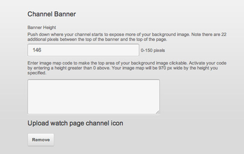
Standard YouTube channels are fixed just a few pixels from the top of the screen, but YouTube partners can adjust the size of the header area by up to 150px. This allows the designer to create a masthead to introduce the channel as part of the background image.
What’s more, you can also make use of image maps to link areas of your background image to outside sources, such as Twitter or Facebook profiles. As Web Designers we forgot all about image maps with table based layouts, but there are some handy image map generators available online to save you having to remember the code.
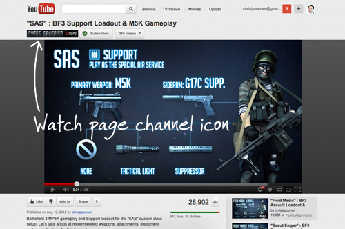
Customisation for Partners doesn’t stop at the channel page. There’s also a number of little tweaks you can make to promote your brand. The first tweak you’ll want to make is to update your Watch Page Channel Icon, this is a custom 170x25px banner that replaces the default button above the video player on the YouTube watch page. Update this under the Appearance section of the Channel Settings page.
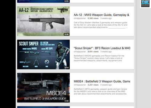
Finally, don’t forget to update the thumbnail of your video uploads with a custom design for maximum exposure. While it’s not part of your main channel design, it’s an important step towards branding your videos and gaining recognition.
Source: http://line25.com/articles/how-to-customize-a-youtube-partner-channel-design

No comments:
Post a Comment