I’m sure we’re all familiar with the popular parallax effect in web design. It has become a great tool to create a fun browsing experience that responds to the user’s controls as they scroll up and down the page. In this tutorial we’ll use a couple of readily available jQuery plugins to quickly put together a cool little single page website of our own, complete with fancy scrolling effects.
This tutorial will be a walkthrough of my design process for a simple portal site that presents all of my websites and social profiles. Each website has its own individual section in a series of ‘slides’ laid out vertically. With the help of some cool jQuery plugins clever scrolling and parallax illusions are added to inject an element of fun and novelty to the site.
View the final fancy scrolling website
The design concept

Before jumping into any code flesh out your design in Photoshop and develop each individual slide. These parallax and scrolling effects work best with full screen designs, so I used repeating patterns or background images to fill the screen. Each section of my site includes a title, description, photo and button.
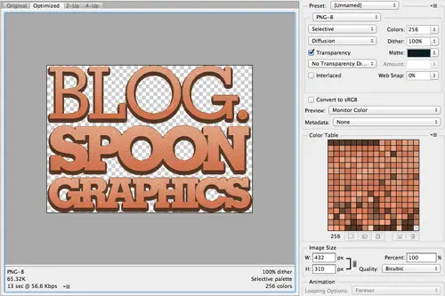
Begin exporting all the required imagery ready for creating the design in HTML and CSS. My design is very image intensive, so I had to be careful not to go overboard with file sizes. Instead of using full alpha transparency with PNG-24, I used PNG-8 image formats with a carefully selected Matte colour.
Repeating patterns are the easiest way to fill the screen with a nice looking background, these can be exported as small image files and will tile to fill the screen with a cool texture.
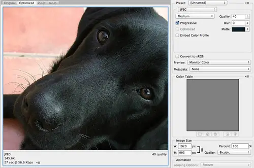
In some sections of my design I use a large background image. Alter the compression of the JPEG image to fine tune the file size. Often you can get away with quite low file sizes while maintaining decent image quality.
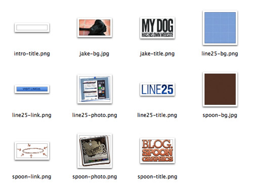
Compile all the graphics into an images folder and group them by section with consistent file names.
The HTML structure
Now we have our concept design in place and all the image resources exported we can begin building the site in HTML and CSS, starting with the HTML structure.
<!DOCTYPE html>
<html>
<head>
<meta charset="utf-8" />
<title>My Sites</title>

<link href="style.css" rel="stylesheet" />

</head>
<body>

<ul class="curtains">
        <li>
                <section id="intro">
                        <h1>My homes on the web</h1>

                        <p>How’s it going? I'm Chris Spooner. I'm a creative Designer, avid Blogger and I'm generally crazy about pretty colours and shapes.</p>

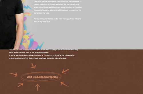
                        <p>Like most people who spend a lot of time on the Interwebs, […] a portal to all the places you can find my content on the web.</p>

                        <p>Fancy visiting my homes on the net? Here you’ll find info and links to my best stuff.</p>
                </section>
        </li>
</ul>

</body>
</html>
Create a simple HTML document and add an unordered list to the body. Later we’ll be using the curtains.js plugin which requires a .curtains class name, so add this to the element now. In the first list item add all the text elements in their relevant tags.
<li>
        <section id="spoon">
                <h2>Blog.SpoonGraphics</h2>

                <a href="http://blog.spoongraphics.co.uk" id="spoon-photo"><img src="images/spoon-photo.png" alt="Visit Blog.SpoonGraphics" /></a>

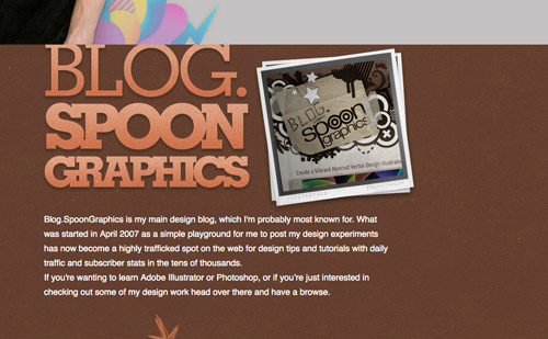
                <p>Blog.SpoonGraphics is my main design blog, […] head over there and have a browse. </p>

                <p class="btn"><a href="http://blog.spoongraphics.co.uk">Visit Blog.SpoonGraphics</a></p>
        </section>
</li>
Continue adding each slide in its own list element. Adding unique IDs to elements such as the photos will make them easy to target with jQuery later for cool scrolling effects.
<section id="cs">
        <h2>ChrisSpooner.com</h2>

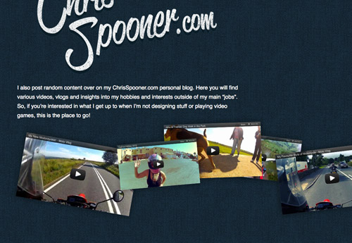
        <p>I also post random content over on my ChrisSpooner.com personal blog. […] this is the place to go!</p>

        <ul>
                <li><a href="http://www.chrisspooner.com"><img src="images/cs-vid-1.jpg" alt="" /></a></li>
                <li><a href="http://www.chrisspooner.com"><img src="images/cs-vid-2.jpg" alt="" /></a></li>
                <li><a href="http://www.chrisspooner.com"><img src="images/cs-vid-3.jpg" alt="" /></a></li>
                <li><a href="http://www.chrisspooner.com"><img src="images/cs-vid-4.jpg" alt="" /></a></li>
                <li><a href="http://www.chrisspooner.com"><img src="images/cs-vid-5.jpg" alt="" /></a></li>
                <li><a href="http://www.chrisspooner.com"><img src="images/cs-vid-6.jpg" alt="" /></a></li>
        </ul>
</section>
Any elements that you want to use as part of a parallax illusion will all need to be added as individual elements. The series of YouTube video screenshots in my design are all added in their own unordered list.
The CSS styling
Once all the individual sections and textual content is added to the HTML, these slides can be styled to match the original design.
body {
        font: 18px/30px Sans-serif; color: #fff;
}

section {
        overflow: hidden; height: 993px;
}
Begin your CSS file with some generic text styling, then set each section element to overflow:hidden; in order to hide any unwanted horizontal scrollbars. Each section of my design measures in at 993px tall, so this is set so every section will be the same size.
#intro {
        background: #c3c2c1 url(images/intro-bg.jpg) left no-repeat;
}

        #intro h1 {
                width: 858px; height: 161px;
                background: url(images/intro-title.png); text-indent: -9999px;
                position: relative; top: 145px; left: 0;
        }

        #intro p {
                position: relative; top: 200px; left: 350px;
                width: 508px; margin: 0 0 30px 0;
        }
        #intro p:nth-child(2) {
                font-weight: bold;
        }
The layout and design of each section is created with simple CSS rules. Background images are used with CSS image replacement techniques to convert the plain titles into cool image based typography to match the original design and CSS positioning is used to move each element exactly into place.
#gaming {
        background: #28323c url(images/gaming-bg.jpg);
        background-size: cover;
}

        #gaming h2 {
                width: 740px; height: 324px;
                background: url(images/gaming-title.png); text-indent: -9999px;
                position: relative; top: 87px; left: 90px;
        }

        #gaming p {
                position: relative; top: 110px; left: 100px;
        }

        #gaming .btn a {
                display: block; width: 728px; height: 176px;
                background: url(images/gaming-link.png); text-indent: -9999px;
                position: relative; top: 70px;
        }
The CSS coding is pretty similar for each section, with just individual measurements for each element’s location differing. Previous sections had used a repeating background image, but for those sections with a single large background image, the background-size:cover; rule is used to ensure the background scales with the user’s viewport if they’re browsing with a screen size larger than the original image.
#cs ul li {
                float: left; box-shadow: 0 0 20px rgba(0,0,0,0.5); line-height: 0;
                position: absolute; list-style: none;
        }
                #cs ul li:nth-child(1) {
                        top: 640px; left: 100px;
                        transform: rotate(10deg);
                        -moz-transform: rotate(10deg);
                        -webkit-transform: rotate(10deg);
                        z-index: 1;
                }
                #cs ul li:nth-child(2) {
                        top: 600px; left: 420px;
                        transform: rotate(-5deg);
                        -moz-transform: rotate(-5deg);
                        -webkit-transform: rotate(-5deg);
                        z-index: 3;
                }
                #cs ul li:nth-child(3) {
                        top: 680px; left: 570px;
                        transform: rotate(-2deg);
                        -moz-transform: rotate(-2deg);
                        -webkit-transform: rotate(-2deg);
                        z-index: 2;
                }
For the series of video thumbnail images each element is styled with transform:rotate(); and z-index rules to match the random layout used in the original concept. The :nth-child() selector makes it easy to target each consecutive list element without the need for additional class names.

Once the CSS styling is complete each slide of the design is stacked in a boring vertical layout, so let’s change that with the help of some cool jQuery plugins.
The cool jQuery stuff
To create the fancy scrolling effects we’re going to use two ready made plugins named Curtain.js and Scrollorama. These plugins make it easy to tap into their functionality with simple parameters.
<link href="js/curtain.css" rel="stylesheet" />

<script src="http://code.jquery.com/jquery-1.8.2.min.js"></script>
<script src="js/curtain.js"></script>
<script src="js/jquery.scrollorama.js"></script>
<script src="js/scripts.js"></script>
First we need to add the jQuery library and these two plugins to our HTML document. Download and add the plugins with <script> tags, followed by a blank Javascript document named scripts.js. This will be where we’ll set up the effects from the plugins. Don’t forget to also add the stylesheet supplied with the Curtain.js package.
$(document).ready(function(){
   $('.curtains').curtain();

});
The first line of code to add to the scripts.js file is to active the Curtain.js plugin. Target the .curtains class that was added to the unordered list. The Curtain plugin rearranges the panels and reveals each one in a smooth sliding motion as the user scrolls down the page.

$(document).ready(function(){
   $('.curtains').curtain();

        var scrollorama = $.scrollorama({
                blocks:'.curtains'
        });

    scrollorama.animate('#intro h1',{
        duration:200, property:'left', end:-860
    });

});
The second plugin, Scrollorama offers more fancy scrolling effects. Initialise the plugin by applying it to the same curtains class. Scrollorama can then be used to create scrolling effects on each individual element. The first being a sliding header in the intro panel. Select the CSS property to target in the parameters, then alter the value for the start or end of the animation. This first example will move the header left by 860 pixels over a duration of 200 pixels scrolled.
scrollorama.animate('#spoon-photo',{
        delay:993, duration:993, property:'top', start:100, end:-300
});
This next example targets the photo in the second panel and scrolls it independently of the main content, creating a subtle parallax effect. To ensure the animation isn’t played immediately a delay of 993 scrolled pixels is added so it only begins after the 993px height of the first panel has been scrolled.
scrollorama.animate('#line25-photo',{
        delay:993, duration:1986, property:'rotate', start:-10, end:10
});

scrollorama.animate('#gaming .btn',{
        delay:2000, duration:993, property:'left', start:-800, easing:'easeOutBounce'
});
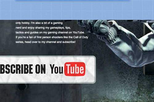
Any CSS property with a numeric value can be animated. In these two examples the photo in the line25 panel is rotated and the button in the gaming panel is moved into view. The 1986px duration of the photo rotation is double the 993px height, so this animation will continuously play as the panel is scrolled, whereas the second has a duration of 993px, so this animation will finish as the end of the panel is reached.
Easing can also be added to these animations. The easeOutBounce profile creates a bouncing effect.
scrollorama.animate('#cs ul li:nth-child(1)',{
        delay:2979, duration:993, property:'top', start:840, end: 640
});
scrollorama.animate('#cs ul li:nth-child(2)',{
        delay:2979, duration:993, property:'top', start:800, end: 640
});
scrollorama.animate('#cs ul li:nth-child(3)',{
        delay:2979, duration:993, property:'top', start:920, end: 580
});
scrollorama.animate('#cs ul li:nth-child(4)',{
        delay:2979, duration:993, property:'top', start:880, end: 620
});
scrollorama.animate('#cs ul li:nth-child(5)',{
        delay:2979, duration:993, property:'top', start:830, end: 660
});
scrollorama.animate('#cs ul li:nth-child(6)',{
        delay:2979, duration:993, property:'top', start:960, end: 600
});
All the video thumbnail images are given individual animations of their top position after a delay of 2979px (each panel is 993px in height, 3 panels need scrolling before this section is visible. 993×3=2979). By starting and ending them at different positions it creates a cool parallax illusion where some move faster than others. This is all while the Curtain.js plugin reveals the panel.
The complete website
Once all the jQuery animations have been set all the fancy scrolling effects can be seen together on the final web page. The Curtain.js plugin alone creates a clever scrolling effect, but the addition of individual animations with help from Scrollorama takes it a step further.
View the final fancy scrolling website
Source: http://line25.com/tutorials/create-a-cool-website-with-fancy-scrolling-effects


No comments:
Post a Comment