I’ve done plenty of retro photo effect tutorials in the past, but they’ve all been done using Photoshop. After playing around with some cool new CSS3 features I managed to create a pretty decent looking retro style image effect using just CSS. With the help of CSS gradients and filters, let’s take a look at how a cool vintage photo effect can be created directly in the browser.
This little technique uses a mix of CSS gradients and filters to combine various colour overlays to create that typical old school analogue photo effect. Currently CSS filters only work in Webkit browsers (Safari, Chrome), but it won’t be long until this fun little tip can be put into practice across all browsers.
How to create a retro CSS photo effect
<div class="retro">
        <img src="images/retrofy-me.jpg" alt="Retro is cool!" />
</div>
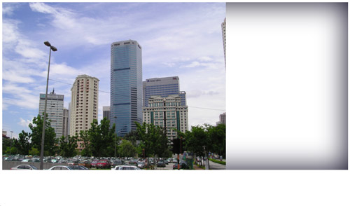
In order to create a retro photo effect, we first need a photo. Add an image to a HTML file as you usually would. Some of the CSS effects rely on a block element container, so the image will have to be within a <div> or <p>.
.retro {
        -webkit-box-shadow:  inset 0px 0px 100px rgba(0,0,20,1);
        background: -webkit-linear-gradient(top, rgba(255,145,0,0.2) 0%,rgba(255,230,48,0.2) 60%), -webkit-linear-gradient(20deg, rgba(255,0,0,0.5) 0%,rgba(255,0,0,0) 35%);
        display: table;
}

.retro img {
        -webkit-filter: sepia(20%) brightness(10%) contrast(130%);
        position: relative; z-index: -1;
}
In the CSS add the above code to instantly create a cool retro effect on any image. Seeing as CSS filters currently only work in Webkit browsers, the other vendor prefixes have been omitted to keep the example clean and tidy. Don’t forget to add standard and -moz- variants of each CSS rule if you want to future-proof your work.
How it works
The CSS begins with a box-shadow rule using the values inset 0px 0px 100px rgba(0,0,20,1);. This creates a dark blue inner glow effect to simulate a vignette. The problem is this box shadow appears below the image and spans across the full page. To fix this position: relative; z-index: -1; is added to the image to send it down a level, while display: table; collapses the div to fit the image dimensions.

Next, the first of two background gradients is added to the parent div. -webkit-linear-gradient(top, rgba(255,145,0,0.2) 0%,rgba(255,230,48,0.2) 60%) creates a vertical gradient flowing from orange to yellow. The rgba values then allow the opacity of the colours to be reduced to allow the gradient to act as a colour overlay.
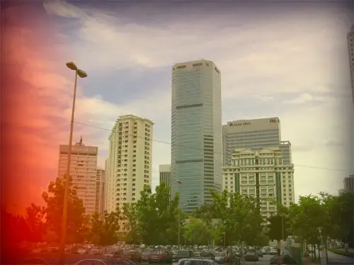
The second gradient -webkit-linear-gradient(20deg, rgba(255,0,0,0.5) 0%,rgba(255,0,0,0) 35%) is added to the parent div and flows from 50% to 0% red and is angled at 20° to simulate a cool light leak effect.
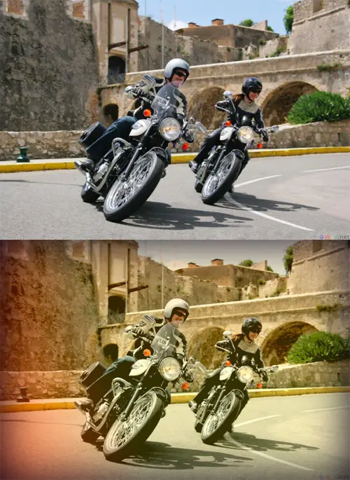
The effect so far works to a certain extent but leaves the image looking very flat. Thankfully we now have a bunch of CSS filters to play around with to alter the appearance of the actual image: -webkit-filter: brightness(10%) contrast(130%) sepia(20%);. The declarations are all pretty self explanatory, but the brightness property bumps up the brightness of the image (by 10%). Contrast brings the flat image back to life by darkening the dark areas and lightening the light areas. Then sepia adds a yellowy-brown tone to the image, but using just 20% helps retain some of the original colours. When all the gradients and filters combined it creates a cool looking effect almost identical to what can be created in Photoshop (if only we had blending modes such as Screen or Soft Light available!).
Source: http://line25.com/tutorials/create-a-trendy-retro-photo-effect-purely-with-css


No comments:
Post a Comment