Web Designers: There’s some good news and some bad news. First, the good news.
There’s a growing need for app presentation websites. These need to promote and sell hundreds of new apps being launched on a daily basis. The more apps that are launched, the more work there will be for app website designers.
This silver cloud can, however, have a dark lining. As the number of website apps increases, fatigue is going to set in among website visitors. All the websites begin to look alike.
It’s up to you to find what app users look for in a website that sets it apart from the rest. Use that knowledge to apply a few tricks of the trade to create an app website.
What you need to know and how to apply it follows.
5 Steps to Building Awesome App Websites
Step 1: Choose a spellbinding color palette
Spellbinding may be a matter of taste. As a minimum, you need to follow a few simple rules when choosing a color palette for an app website.
The color palette needs to:
- Attract attention instantly
- Be on-brand, and
- Visually support your message
How is that accomplished? You’ll see in these examples:
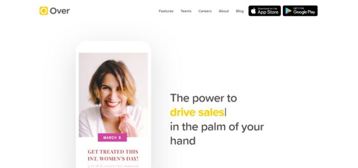
Over has BOLD attention-getting color touches
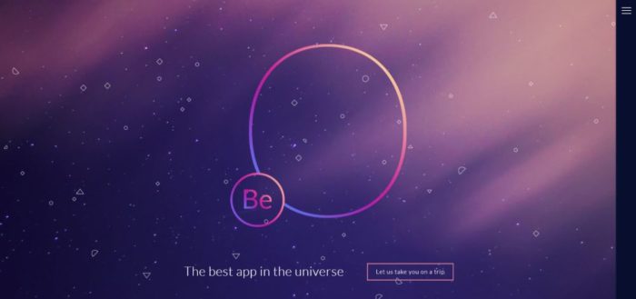
A second great example of an eye-grabbing color palette is featured on this Be Theme pre-built website.

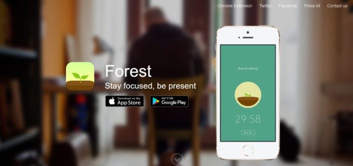
Forest provides a great example of how they align their color palette with their brand—earth colors like greens and browns are plentiful; making the app visually memorable.
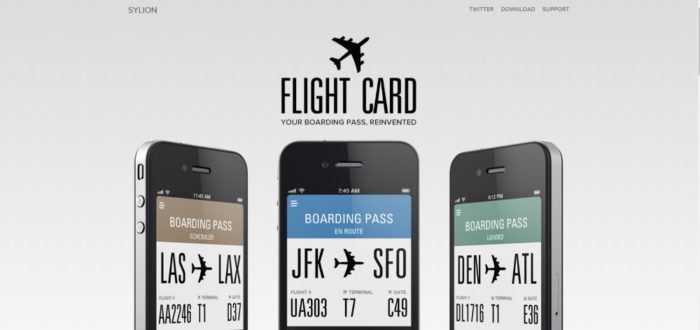
FlightCard uses a subtle, cold color palette that perfectly reinforces their message: boarding passes have become so easy to use that you almost forget that you need them.
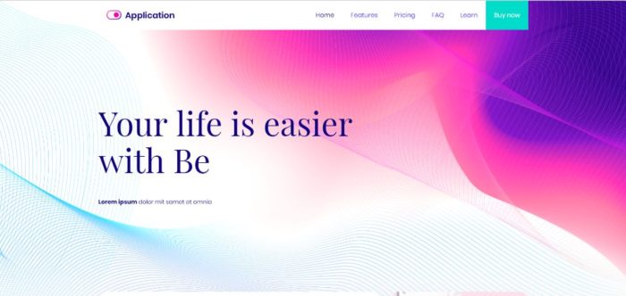
And, if you’re looking for a color palette that will appeal to a larger audience, BeApp2 is an excellent example.
Step 2: Display crystal-clear product pics
People want to know precisely what the app looks like, and they’re not going to bother reading through 6 paragraphs of text to find out.
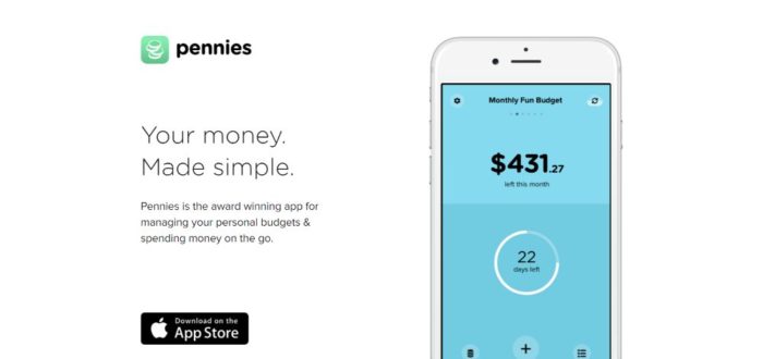
Pennies proudly displays what their app looks likes on a smartphone. These images alone tell you how easy it is to use. You can even see how the color codes work.
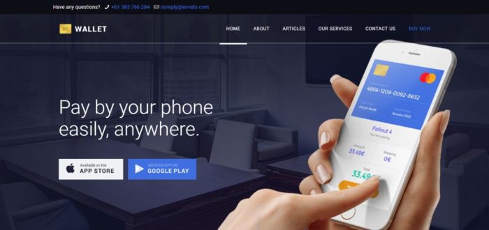
You can do the same with a website based on BeWallet, a pre-built website specifically designed for financial apps; there are SO MANY financial apps out there, and hardly any are being marketed from a decent website).
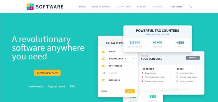
But, you can also go from the specific to a more general pre-built website like BeSoftware to display crystal-clear pics from inside the app.
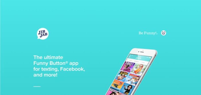
JibJab takes everything a step further. It very shows the before & after; a simple tactic that shows what the app does.
Step 3: Show visitors how the app works
Anytime you market a product designed to do something, people will want to know how it works. An app is no different. A powerful tactic is to help visitors imagine themselves as actual users.
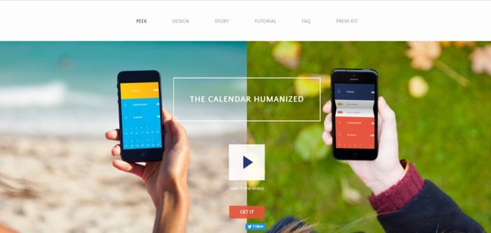
PeekCalendar has a video on the hero section that demonstrates how people can use their app to live better by organizing their daily affairs.
This BeApp3 pre-built website allows you to add product pics and video to show the full app experience; how it looks and how it works.
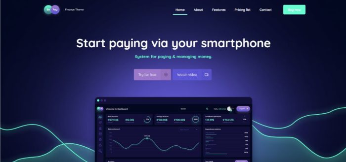
BePay’s Watch Video CTA button is just above the fold, so visitors can immediately view a product demo.
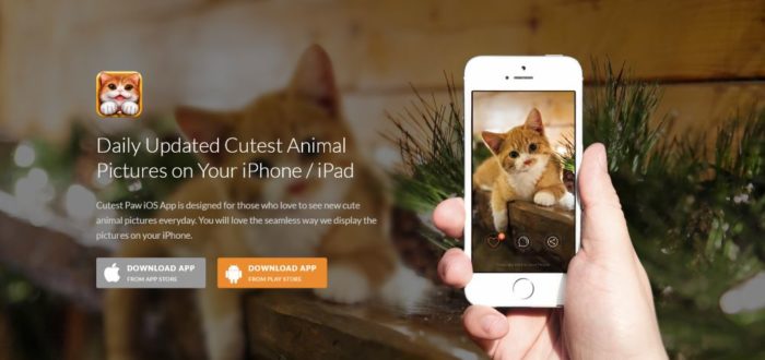
CutestPaw is a pet-lover’s dream app. It uses but a single hero shot to show how the app works AND what it looks like on a smartphone. (An image of a kitten is also an irresistible marketing ploy).
Step 4: (Over)use “white” space
What’s the number one app website visual element? How about white space? You can accomplish a great deal with white space, and in some situations the more you use the better.
As you will see below, there’s nothing quite as good as white space for highlighting your main message, heading, subheadings, content sections, and product shots.
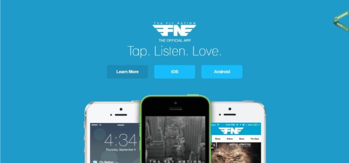
Tha Fly Nation has a clean, airy design throughout that’s easy on the eyes and allows the visitor to focus on every key element.
You could create a similar app website with BeProduct4 or BeHosting2— these pre-built websites effectively use white space to enhance the experience and emphasize the critical elements on the page.


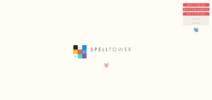
SpellTower is perhaps THE most extreme when it comes to using white space. It’s part of their brand and it clearly drives their message home. It’s a perfect example of how once you’re sure you’ve created enough white space; you can still create some more.
Step 5: Make your CTAs grab them by the eyeballs
CTA’s were never intended to be half-hidden or used as an afterthought. Their main purpose in life is to convert visitors into users and eventually into customers. You want to design a CTA button that simply cannot be ignored, which means it has to be big, bright, bold, and perfectly located.
Wire’s CTA button clearly stands out above the fold: it’s bold, big enough to draw your attention to it immediately after reading the headline, and it’s centered on the page, so it acts like a “gate” that needs to be clicked to proceed.

BeERP uses the exact same bright-green button for its main CTA; the one you want your visitors to click. A secondary plain button is located on the right.

You can also direct attention to your CTA by having it match other elements on the page. BeKids is a great example. The blue of the CTA button matches various visual elements in the hero section.

Summary
These are just a few of the steps you can take to create an app website. It can be both attention-getting and built for conversions. There are others, but these simple tactics work, as can be seen from the examples.
If you time to spare, you can follow them to the letter. On the other hand, you might be juggling multiple projects. Or, perhaps, you are constantly facing tight schedules. Then, there’s another, equally effective, approach.
You can build your app website from a pre-built website specially designed with apps in mind.
You’ll find the most generous, comprehensive gallery of pre-built websites on Be Theme. More than enough to choose from and customize to fit your needs.
These pre-built websites are fully functional and visually impressive. They feature interactive elements, intuitive navigation, and awesome effects. Personalize one to fit your app and you’re good to go!
The post 20 Amazing App Websites And What Makes Them That Way appeared first on Design your way.
Source: http://bit.ly/2F50CQm


No comments:
Post a Comment