If you live near media or television, you’ll be completely familiar with the Batman logo. Batman is one of the most mysterious superheroes of all time and has fans around the world.
The Batman logo was first introduced in 1939, when Batman comics offered a thrilling read. However, Batman has been transformed over the years, so that The Dark Night is one of the most well-loved superheroes of all time.
Just as Bruce Wayne’s costumes have evolved over the years, so has the logo. Let’s explore how Batman’s logos have evolved over time.
Let’s look at the Batman logo evolution
1939 – Detective Comics #27
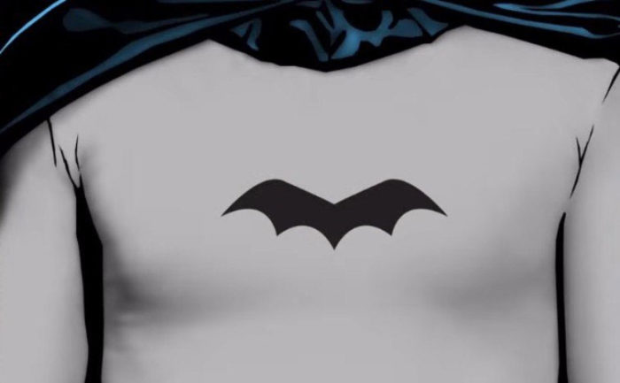
Batman began in 1939, in a Sunday comic. The images were very simple and the logo had neither ears nor a head. The number of points on the bottom of the logo varied but was often five. The cartoon itself was part of a simple Sunday newspaper storyline without much detail. Bob Kane worked on these early Batman comics
The updated 1939 logo
The old logo was quickly updated, with ears emerging and the tips of the wings becoming sharper and more pronounced.
The number of points in the original Batman logo was increased to seven.
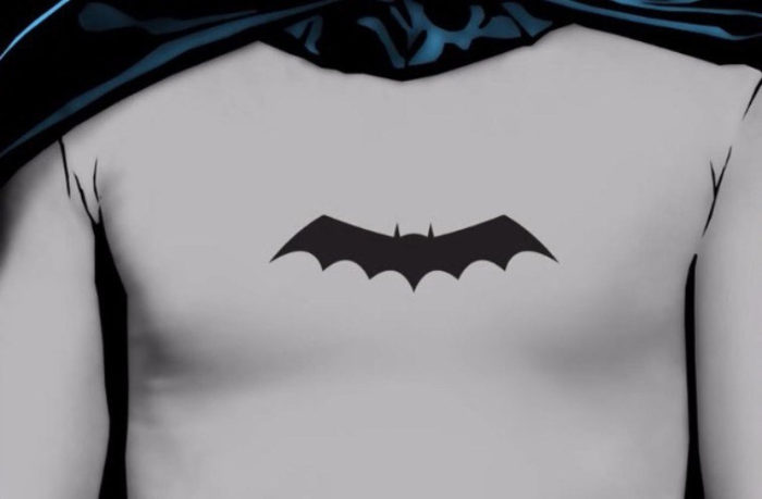
1940 — Batman #1
![]()
The original Batman logo appeared in detective comics but Batman proved to be very popular and was soon given his own comic book series. Once again it was time to make changes to the logo.
Batman’s logo increased in both size and detail. The points on the wings became more visible and, on the underside of the wings, blue lines and splashes were added, though these were often lost in the printing process. Though these changes were made, the logo still resembled a man in a cape.
1941 — The third update in as many years
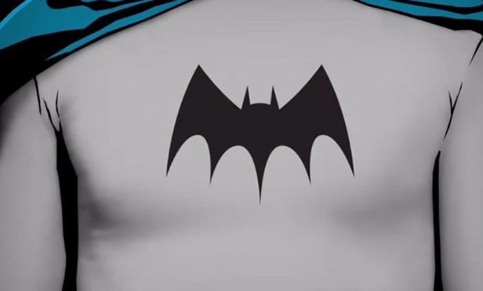
In the early years, Batman’s logo went through many different transformations. As soon as Batman became a part of DC comics, the logo began to change. The DC artists altered the designs to create a new and exciting Batman logo.
The head receded, the wings became more angular and the points at the bottom were decreased back down to five but became pointed and prominent
1943 — Batman makes an on-screen debut
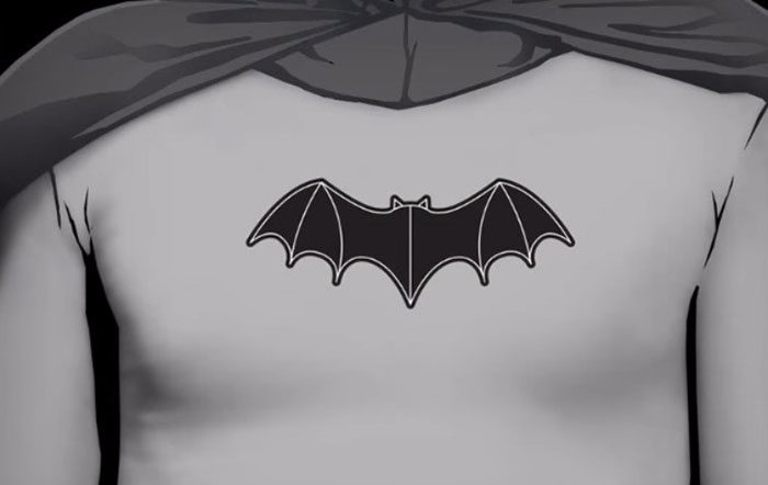
Batman quickly became a big hit, and only four years after he appeared in comics, he appeared on serials with Lewis Wilson. Once again, the logo was transformed. This time, the bat was introduced. Wide and thin, the bat had exquisite wing detail and paid tribute to the original Batman logo.
Batman’s on-screen logo remained constant for six years, until a second series was introduced in 1949.
1944 — Wider wings for a comic book hero
![]()
Batman thrived on screen but he was also becoming increasingly popular as a comic book hero. This lead to changes in the comic book Batman logo. The logo became increasingly wide during 1944, with the points at the bottom remaining variable. At this time, the logo included anything from five to nine points at the bottom.
1946 — The first step toward the modern logo
During 1946, the logo was transformed once again. This logo most closely resembled the modern day Batman logo which came to the forefront of popular imagination during the 1960’s.
The head became more prominent while the wings softened. The logo began to resemble the modern day logo between 1941 and 1944, becoming increasingly familiar to fans of the modern day Batman form.
1949 — On screen in a second serial
![]()
Batman was becoming increasingly popular on screen and there was a demand for a second Batman serial. This second series was named ‘Batman and Robin’. The Batman logo had evolved once again and Batman now wore the logo further down his chest. The logo was more pronounced and had large, rounded ears
1950 — The logo takes a step backward
![]()
Although the Batman logo had modernized, comic book artists decided to take a new step, creating a rounder logo with curved bat wings.
In this way, the logo Batman has worn during the mid-forties took a step backward, drawing more on the original Batman logos, where rounded, five-point wings dominated.
1956 — A new form
During the mid fifties, it was time for another transformation for the Batman logo. This one would last for over a decade. The rounded wings were replaced with a sharper, sleeker look.
1958 — Thinning out the Batman logo
![]()
Although the sharp, sleek Batman logo of 1956 would last almost a decade, there was a minor detour. During 1958, the bat was made thinner and given longer, sharper wings. His head was raised to give.a long, thin appearance.
This small detour did not last long, and the original Batman logo from 1956 returned as the dominant logo on Batman’s heroic chest.
1960 — The return of an old favorite
Batman has become increasingly popular in the 1960’s and it was time for a new logo. This logo was a compromise between the bulkier logo of earlier times but kept the prominent ears of the later years. These changes to the logo were, however, very subtle and the logo remains very similar to the Batman logo of 1956.
1964 — The yellow background first appears
![]()
This was the time when the yellow circle was added to the logo. This may have been to assist with creating a trademark or it may have been to style a unique 1964 version of Batman which set him apart from the hero of the past. Whatever the reason, with his new logo, Batman was unique. This logo would appear on both the screen and in comic books all the way up until 1992.
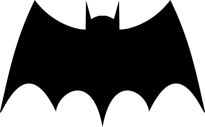
1965 – the year of the bat
Now was the time for Batman’s logo to truly transform. This version of Batman’s logo looked less like a man and more like a bat in flight. Our hero’s symbol was beginning to change.
1966 — The most iconic Batman logo is born
![]()
Batman’s logo transformed again in 1966, this time becoming iconic. The bat was ready to spread its wings, which it did against a yellow background. The rounded edges of the wingspan mirrored the oval shape of the logo.
This was the logo which became truly iconic, lasting for over 30 years of comic book history.
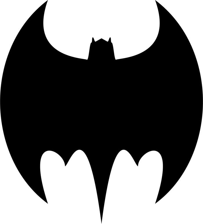
1966 — On screen: Adam West’s Batman
![]()
Adam West created an onscreen logo in 1966. Once again, the hero wore his symbolic icon right in the center of his chest. This logo combined the 1964 and 1966 comic book logos to create a shape which combined the yellow oval with rounded wings. The wings were just out of line with the oval. This logo also had a shorter head. Batman’s famous logo would spin while the Batman tune would play in the background.
1977 —The ” New Adventures of Batman ”
Batman became an animated hero in 1977 and the Batman logo was updated once again. With this animated television series came lots of new fans who were introduced to Batman for the first time. These fans knew Batman through the logo which appeared on screen and this became a visual representation of the dark hero.
1986 — Batman: The Dark Knight Returns
![]()
It was time for a true transformation in 1986, when the Batman comics eliminated the yellow oval from the logo Batman wore in his chest. The Dark Night Returns comic showed an older, sleeker superhero.
However, the yellow oval would continue to show itself in the 1986 Frank Miller comic strips. In these stories, the yellow logo was used to draw attention to Batman’s bulletproof vest, protecting him from malevolent forces.
1987 —a return to the past. Batman: Year One
![]()
It would only be a year later that Frank Miller began to create the Year One Batman comics for DC. This series gave insight into Batman as a younger man. A new logo emerged, and this one was original, and only loosely based on the logo Batman wore in the past.
The yellow logo continued to be used in stories featuring a modern day Batman.
1989 — Michael Keaton brings back the yellow oval
![]()
1989 was an excellent year for Batman. Warner released a hugely popular Batman movie, staring Michael Keaton, and the Batman logo was emblazoned in a range of different merchandise. This logo had a slightly different version of the yellow oval Batman logo.
Keaton also wore the Batman logo on his chest during the film, and this logo had two extra wing points in the bottom.
1992 — Batman Returns
![]()
With Batman’s return to the big screen, it was time for Batman’s logo to transform once again. This time the design on Batman’s chest matched the logo printed in posters and included on merchandise. The logo had a light yellow oval which matched the iconic logo of 1966.
This was the final time that the Batman logo poster would show the yellow oval
1993 — Batman: The Animated Series
![]()
While Batman’s yellow logo would no longer appear in movies and posters, it became popular in Bruce Timm’s animated Batman series. This series began with the Mask of the Phantasm. Fans were captivated.
This hero, who was given voice by Kevin Conroy, wore the iconic Batman logo with the yellow oval.
1995 — Batman Forever
![]()
With the launch of Batman Forever, the original and iconic Batman logos of the past became changed and a newer aesthetic began to emerge.
Val Kilmer began wearing a traditional Batman suit but changed to a black on black look. The yellow logo became a thing of the past and the Batman logo came in the shape of a large bat which covered the width of his chest.
1997 — Joel Schumacher’s infamous nipple suit
![]()
Batman was once again transformed, this time with an unusual Batsuit. Batman and Robin director made the offbeat decision to include nipples in the Batsuit. The Robin Batman logo excluded the yellow oval.
Many, including George Clooney, admit that this Batman portrayal was the very worst. However, the Batman logo art was interesting and combined the Batman and Robin logos into a single design.
1997 — A second Batman & Robin suit
![]()
When Batman and Robin returned to the screen once again, it was thankfully with a different suit. Clooney, as Batman, has a variation of Val Kilmer’s suit with added silver shapes. The Batman logo represented the hero.
1999 — Batman Beyond
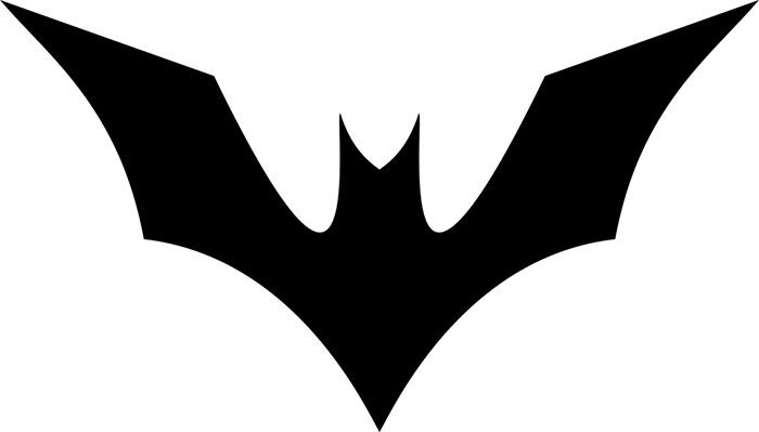
Batman’s logo art is simple yet sophisticated. It bears no relationship to the original Batman logo and instead introduces a new and exciting aesthetic.
2000 — The final resting place of the yellow oval
![]()
Of all the Batman logos, the Ellie oval was truly iconic. It was used in different media for over 36 years until finally being retired in 2000. During this time, the yellow oval was replaced with a bat.
This bat was based on the design first worn by Yvonne Craig when she played Batgirl. This design would finally replace the yellow oval as Batman’s logo.
2005 — Christopher Nolan enters the fray
![]()
When Christopher Nolan decided to work on Batman’s story, he completely changed the atmosphere Batman has always projected. It was time for a new Dark Knight, and Nolan introduced him with Batman Begins.
Batman’s logo fitted in with his black armor. The hero was pitch black, a mortal threat to Gotham’s criminal forces.
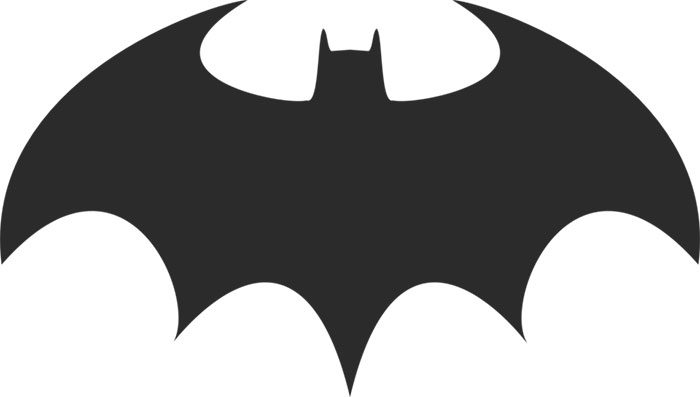
2008 — The Dark Knight and The Dark Knight Rises
![]()
Once The Dark Night had been launched, there was no going back. A new Batman has been created, with a new aesthetic. Later films would show some twists. The Batman logo took on a new bat shape with wings which spread out horizontally.
2016 — Batman v Superman: Dawn of Justice
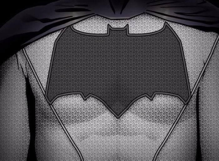
When Ben Affleck played Batman in Batman V Superman, the Batman logo had once again undergone a transformation. With Batman well past his prime, the logo was both taller and wider. It points to a worn and slightly jaded hero who has lost the idealism present in his prime.
If you enjoyed reading this article about the Batman Logo, you should read these as well:
- The Adidas logo: What makes it so special
- The Coca-Cola logo: Over a hundred years of logo evolution
- Iron Man Logo Designs: The Official And Rejected Versions
- How To Make A Comic Book: Design, Characters, And Cover
- The Disney logo: All there is to know about the brand
The post The Batman logo and how it evolved over the years appeared first on Design your way.
Source: http://bit.ly/2Lc0dPZ


No comments:
Post a Comment